|
6/24/2024 the semi-finalist is: dennis foster Untitled 2023, gouache on newsprint, 19 1/2" x 29 1/2" (photo by Dennis Foster) Color in Dennis Foster’s work is its own language. In place of words, hues and shades present themselves as a complete story told in a single viewing. A painting by Foster is a book in which every single word on every single page is being uttered at the same time and still, somehow, it all makes sense. Perimeter (2023), for example, announces itself with a measured mix of confidence and vulnerability, with colors that are both bold and remarkably personal. Each one is a voice that holds its own. Instead of drowning each other out, however, they amplify one another like accomplished actors on a stage or singers in a choir. These colors are there, in part, to pull the best out of those around them. Structure in Foster’s paintings is a vehicle and a scaffold. It carries hues and intensities forward in compositions that feel more snug than forcibly penned in. Everything that appears fragile or elusive - a color, an edge, a subtle chromatic shift - is held tight by an uncomplicated armature that knows exactly how much pressure to exert. In a painting like Morning Room (2024), the motif of the somewhat irregular grid presents two colors - blue and green - that breathe and nearly escape from either side of the centrally checkered “T.” The generous size allotted to them is their getaway car and best option for exiting the frame, but the composition gently guides them back into place. Adding to the visual load and tension, four colors up top (purple, ochre, maroon and orange) weigh down as if influenced by gravity. As in all of Foster’s work, however, the framework is sound and it’s clear that the top of the “T” will hold. This is a painting that is as solid as it is beautiful. I’m so pleased to be able to share my interview with Dennis Foster this month on The Semi-Finalist. In it he talks about color, process, music and more. I have such a strong visual memory of being in his studio last March, surrounded by his paintings, and I’m already looking forward to my next opportunity to see more of them in person. - David Schell  Dennis Foster in is studio. (photo by David Schell) The Semi-Finalist: Tell me a bit about how your life as an artist started. What was your path and who were your mentors (if any)? Dennis Foster: I grew up in Southern California and spent most of my teenage years skateboarding and snowboarding. I got into photography around this time and started making photos of my friends while on trips or just being around one another. I really enjoyed the documentative aspect, but at some point I found myself more interested in trying to make photographs without being reliant on a set of people that would need to be present for the process to happen. I really enjoyed just aimlessly driving around looking for things to photograph and for situations to present themselves. It should be noted I was not making any good photographs at this time - ha! In 2005 I moved to Portland, OR, where I decided to attend Pacific NorthWest College Of Art with photography being my focus. I had no business at the time being a student. My scope of artistic inspirations was so narrow and uninformed that I had no idea what I wanted to be making. (A sincere apology to all of my professors at this time) I think arriving completely unprepared for that experience woke me up to the realization that I had never arrived at a discipline and was therefore under-equipped to gain anything from continuing schooling. Around this time, and I credit the Northwest's particularly isolating feeling, I started to do a bit of drawing and experimenting with paints. My inspirations were still coming from, or rather culturally adjacent to, skateboarding - Artist/ Surfers like Barry Mcgee and Thomas Campbell, but I also now had been exposed to people like Frank Stella, Ellsworth Kelly, Bridget Riley. I arrived very late to any sort of Art History and grew up in an area of California not particularly hospitable to The arts, but seeing work like that really clicked for me in the sense that it could be reduced to a few elements and be very effective.  Italian Stained Glass 2024, flashe/acrylic on canvas with pine frame, 9" x 12" (photo by Dennis Foster) S-F: When I was in your studio, we talked about feeling connected to other artists and the fine line between inspiration and overt influence. Who’s in your visual family and how do you think about carving out a unique voice while using a reductive approach to image making? DF: There's only so many visual languages to tap into and I rather like seeing work where I can identify the reference point it's coming from while still retaining its own essence. I think especially as I feel like I'm honing in on my own personal visual language, I can look back and identify work that self-admittedly leans overtly into particular influences. I think dealing with color field paintings, it's going to be an obstacle to navigate. Painters like David Novros, Brice Marden, Jack Bush - work that's relative to each other and seems to be pulled from the same well, though they all have their own personal imprint. What's remarkable is taking a distilled element such as color and making it your own. I think for that to be possible it must live within an actualized body of work. That's where the personal visual language is born.  Above and below: Wake Up New in the Project Room at Nationale, 2023 (photos by Mario Gallucci)  S-F: Your work strikes me as being primarily about a visual experience. Is that accurate? And can you talk about why it is or isn’t (in an age of global upheaval, how does this fit in)? DF: In a sense, yes. Ultimately, what gets produced is purely visual. But painting is largely, for me, an act of therapy. I think a lot of subconscious emotions come to the surface when I am actively working, so in a way the paintings are instilled with personal conflict. The overall goal I'm hoping to achieve, especially with current work being made, is a sense of calm. That's an especially sought after feeling for all things considered within a worldview.  Long Thought 2023, flashe/acrylic on canvas with pine frame, 16" x 20" (photo by Mario Gallucci) S-F: Your work also has a musical quality to it. Talk about that. DF: Well, I want the work to activate each other, so much like the instrumentation of a song, I want the individual elements within each painting to be communicating to one another. I like to borrow color schemes and reintroduce them into paintings when working on a series. There's a rhythm to color that's visceral, so if I want to present a particular thematic feeling, I'll employ recurring color to tell the story. I think this acts as a good tool for grounding the work. You can identify a storyline of sorts and the paintings come back to each other.  Above: Morning Room 2024, flashe/acrylic on canvas with pine frame, 9" x 12" (photo by Dennis Foster) Below: Untitled 2024, flashe/acrylic on canvas with pine frame, 16" x 20" (photo by David Schell)  SF: When I first entered your studio, I remember thinking about how your work has a wonderful way of activating the space around it. Can you talk about your paintings and their relationship to architecture and how you want them to interact with context? DF: I've always made work that was in relation / response to whatever space I was making the work in at the time. Currently my studio has a rather tall ceiling on one side with a slanted roof, but the overall space is quite small. I had been making these somewhat large striped panel pieces that I intended to hang together as one solid painting but the spatial restraints were becoming unsustainable. Eventually what came of that was to hang them towards the top of the ceilings, acting as almost columns or pillars and freeing up space on the walls beneath where an entirely smaller yet complimentary body of work could be hung. It becomes an extension of the problem solving that occurs within the canvas but opens up new possibilities in regards to interacting with the work.  A view of Perimeter and smaller works in the studio. (Perimeter, 2023, flashe/acrylic on canvas, 48" x 108") (photo by David Schell) SF: Who are you looking at (dead or alive)? DF: I love how musical and alive the paintings of Stanley Whitney are. The movement in Marina Adams' work. Suzan Frecon while we're on the topic of calm - also Lynne Woods Turner. Harriet Korman, Matt Kleberg, Ethan Cook, Mary Heilmann, and especially Patricia Treib!! What a painter!!!  Above: Works on paper in the studio. Below: Objects in the studio. (photos by David Schell)  SF: What’s next (shows, residencies, etc.)? DF: Making paintings for a TBD show in Los Angeles in the Fall? I'd love to show beyond The West Coast if the opportunity were to arise!  Above and below: in the studio, Los Angeles, CA. (photo by David Schell)  Warm Room 2024, flashe/acrylic on canvas with pine frame, 9" x 12" (photo by David Schell) You can see more of Dennis Foster's work: - on instagram: @finessedobson - on his website - on the Nationale site (Project Room)  Dennis Foster in his studio
(Photo by Kara Holekamp) 4/11/2024 The Semi-finalist is: Pat Boas Untitled 2023, acrylic and flashe on canvas over panel, 24" x 22" I have been a fan of Pat Boas’ work for over a decade, and its evolution has been a source of both fascination and inspiration. As a longtime viewer, it’s been interesting to note how the visual grammar in her recent paintings is related to her earlier conceptual and text based works. In Script 1 (2023), for example, sweeping, fluid gestures paired with skittering, semi-transparent dry-brush strokes and geometric sharpness hint at numerals and the alphabet. And it’s not out of the ordinary to find cartoonish profiles or the silhouette of a bottle tucked into some of her newer compositions, as in SL3 (also from 2023). It’s in this new work, too, that another side of Boas’s temperament starts to assert itself: overt signs and cryptic symbols regularly give way to unnameable forms and the allusion to language dissolves into planes of color, shape and texture. Even here, however, one can see that she is hanging onto her past aesthetic temperament as much as she is letting go of it. A piece like Saturday Painting #10 maintains the swooping cadence of a calligrapher even as the brushstrokes resist giving us a recognizable reference point. I get the sense that Boas is not so much saying goodbye to what has come before in her decades long career, but is instead greeting new interests with an open mind to what’s possible. In several of these charming and fresh “Saturday Paintings,” the directness of Boas’s hard-edged geometry is supplanted by lush atmospheres that skillfully retain their chromatic intensity. In these small works (often only 10” x 8”) we see the artist’s penchant for rigorous definition giving way to the joys of unapologetic ambiguity. It’s as if a singer on stage has graciously and confidently stepped aside so the band can have a go at improvising without vocals; narration takes a well deserved break while the feeling carried through pure sound is given an opportunity to move the story forward. Under Boas’s direction, this is never a complete rejection of the recognizable signs that illustrate, but rather an understanding that it’s often the suggestive pull of what is unsaid that slips in under our skin and stays with us. This month I'm happy to share a recent interview with Portland, Oregon based artist Pat Boas. -David Schell  Saturday Painting #11 (float) 2023, flashe on panel, 10" x 8" The Semi-Finalist: How did you get started as an artist? Pat Boas: I had one of those hero art teachers in high school who opened a lot of things up for me. As a child of the ‘60s, though, there was no straight path. I graduated from high school a year early and was making my way through my first year at Kent State University, but that came to an abrupt end when, during a protest against the US invasion of Cambodia, the Ohio National Guard shot and killed 4 students and wounded 9 others. Though I didn’t see the shooting, I was on campus that day and it shook my world. Naturally, the school shut down and I went to visit a friend in New York City for a two-week trip that stretched to a year. Coming from a small town in northeastern Ohio, it was pretty intoxicating. I took classes at the Art Students’ League, worked at various jobs, and explored. When I went back to Ohio, I made a serious attempt at finishing up my BFA. I’d say that Don Harvey, an artist who taught modern and contemporary art history at Akron University, filled the mentor role. Don organized frequent student trips to New York to look at shows and meet some of the working artists he knew. A handful of us rented a huge space for studios in a former dance school over a dive bar in downtown Akron (my rent for the year was $130). There was a lot of good energy, good music, and a sense of community. Despite that, or maybe because of it, earning an art degree became to seem less educationally important than being out in the world. I had an invitation to join friends who were living in rural New Mexico, so I left for the west and lived for about a year in a small, reclaimed adobe house east of the Sangre de Cristo mountains. For the next couple of decades, I traveled and lived for spells in Berkeley, Paris, more NYC, Boulder, Los Angeles, San Francisco, and Amsterdam. Many of the people I met and things I got involved in made an impact. In Paris, I stayed for some months at the storied Shakespeare & Company bookstore when George Whitman (who claimed to be a descendant of Walt) was still there. In Boulder I sat in on classes at Naropa’s Jack Kerouac School of Disembodied Poetics and did chapbook covers and broadsides for a small press. I worked at the Social Public Art Resource Center in LA, first as a studio assistant to an older Communist artist from Odesa, and later led one of the teams that worked on Judith F. Baca’s “Great Wall of LA,” a quarter-mile mural depicting the ethnic history of Southern California. I co-hosted “Poetry Readings in the Old Venice Jail” and worked with Political Art Documentation/Distribution (LA PAD/D). Then motherhood and family life took over.  Above: Script 1 2023, acrylic and flashe on canvas over panel, 30" x 24" Below: SL2 2023, flashe on canvas over panel, 24" x 22"  S-F: I found so many of the things that we talked about in your studio to be relevant to your work, and I wanted to dig a little deeper into them here. Let's start off with your “Saturday Paintings” and how they fit into your overall approach to painting. PB: These are small panels I keep hanging around alongside larger work. I call them “Saturday Paintings” because Saturday mornings in my studios are usually times when I feel very focused. There’s no one else in the building, no trucks idling in the parking lot and somehow I seem to know what to do to with one or another of these little paintings that I keep brewing off to the side. Some finish quickly while others may go through multiple stages and redirections. I guess they serve as rehearsals, but their main importance is the way they help me think about what it means to resolve something. That keeps changing. It’s something that I’m always looking to change. I exhibited a few in a solo show at Elizabeth Leach Gallery this past fall and many more in a two-person exhibition with Michelle Ross last November at Ditch Projects in Springfield, Oregon. To show them at Ditch, which is a very large, beautiful white space, I had to bring them from the periphery to the center. And this meant I had to quickly finish (or declare finished) some that had been only lightly touched. I have some uncertainty about that but the shift has made a difference in the way I’ve been working since.  Above: Saturday Painting #4 (flame) 2023, flashe and milk paint on panel, 13" x 9" Below: Saturday paintings (and other things) on the studio wall.  S-F: How do you cope with “the treachery of titles?” PB: I used to think it was ungenerous for an artist to not take the opportunity to position a work with words. Earlier, my titles tended to be descriptive or referenced a source, sometimes with an element of word play. Now I try to think about what each piece needs and don't see a reason to be consistent. I like the idea of placing language alongside an image, like an echo, or finding something that anchors it. I collect words or phrases and look for a good match, but sometimes it takes a while to know what a painting has become. A title that earlier made sense may not stick once the painting is done. In some cases, any language can seem too heavy or limiting. I sometimes envy painters who simply number works sequentially because that tends to make me focus on what is in front of me, on what I’m really seeing.  Hat Trick 2022, acrylic and flashe on canvas over panel, 30" x 24" S-F: When I was in your studio, you described the experience of a painting "looking back." Can you talk about that? PB: This thought took hold during a discussion in my painters’ group about one of Amy Bay’s gorgeous paintings. I think of it as a particular place in a work where formal and material forces draw together and create a node, a sense of presence, some kind of “aliveness”. Maybe it’s related to Roland Barthes’ idea of the punctum in photography: literally a sharp point or tip, something that pierces. We all know it’s just inert material on a surface, but nonetheless I look for some point of tension, something that draws to it my own subjective looking and, crazy as it sounds, seems to return the gaze.  Good Listener 2021, acrylic and flashe on linen over panel, 19 1/2" x 15 1/2" (installed on Bliksem, artist-designed wallpaper at Oregon Contemporary, February - March, 2022) S-F: Pat, your work over the last couple of decades has slowly inched away from overtly referencing its own conceptual foundations. Your current work - more than any other part of your career that I’m familiar with - appears to be painting that is about painting. Do you agree with that assessment? If so, can you talk about what is driving this transformation and where you see it going? PB: On the whole I think this is true but it does give me pause to think I am making paintings about painting, for that’s exactly the kind of thinking that drove me away from painting in the first place! Like many who had a 70s (or 80s) art education, my introduction to painting was that it was an indulgent and retrograde enterprise where ideas were not welcome. Harsh, right? (Amy Sillman has written about this in some of her essays.) For many years, I was all about concept, scuttling back and forth between drawing projects and printmaking – the latter for its distancing quality and relationship to commercial media. It was important to me to start with material that existed widely in the everyday and devise operations that would uncover something that was already there. I concentrated on visual constructions of reading and writing because I regarded text and the activities that generated and deciphered it as an incredibly mysterious brain technology – quite miraculous, actually. This is still important to me and always hovers somewhere around my work.  ...we, we, waves (LG) 2014, gouache on paper, 22" x 15" Continued... Eventually I became frustrated with the limitations I was setting for myself and was drawn back to painting. I first made small, very detailed renditions of ordinary people who appeared on the front pages of the New York Times and then began using handwriting-as-image in larger works. Handwriting gave me a roadmap with a loose set of rules and unpredictable destinations. It was a kind of halfway-house that allowed me to confront my love-hate relationship with subjective form and the gestural mark. It took some time but eventually the space of the page in my earlier work became a field with figure-to-ground and object-to-frame relationships.  Above: Untitled (purple-eye) 2019, acrylic and flashe on linen over panel, 19 1/2" x 14" Below: Saturday Painting #5 2023, flashe and milk paint on panel, 13" x 9"  Continued... For the past several years I’ve been working to find ways to step off the well-defined tracks I have to lay to keep myself moving without drowning in chaos. I do a lot of generative drawing, automatic drawing, trying not to “make a picture” but rather allow what filters in from years of attending to different visual vocabularies to come through. I look for ways to navigate the tension between structure and impulse and find myself asking “what kind of a thing is this?” It’s a question I don’t expect an answer to because it all lies beyond the threshold of language. This does leave me without an easy way of talking about current work, for there is no longer a “something” that it’s about. Unless it’s about painting, as you suggest. I now feel that in itself is a tremendous charge, that painting is temporal and rich and deep. I recently came across a statement by the Belgian painter Ilse D’Hollander, who left a tremendous body of work during her short life (she died at the age of 29). D’Hollander wrote: “A painting comes into being when ideas and the act of painting coincide. When referring to ideas, it implies that as a painter, I am not facing my canvas as a neutral being but as an acting being who is investing into the act of painting.” I like this. It makes sense to me.  Above: Saturday Painting #10 (amber) 2023, flashe on panel, 10" x 8" Below: Saturday Painting #8 (red T.N.) 2023, flashe on panel, 10" x 8" 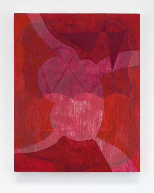 S-F: The surfaces in your recent work have become so richly varied, not just with color, but with texture and density as well. Talk about that. PB: I’ve always been interested in the tactility of vision, so the surface quality of a painting is important. At some point – it may have been when I took another look at the Pattern and Decoration work of the 70s – a long-dormant part of my visual DNA was activated, reaching back to the Polish immigrant side of my family whose tastes in decorating ran toward weirdly clashing colors, patterns, and tacky textures. I realized that most of my childhood memories involve interiors that were not at all aligned with American or western European ideas of visual harmony. Maybe that attuned me to the visual force of putting together things that do not belong. Nabokov (Russian, right?) wrote: “I like to fold my magic carpet, after use, in such a way as to superimpose one part of the pattern upon another. Let visitors trip.” I also think a lot about how sight and sound are connected. When I began painting letterforms, for instance, I thought a line bent to form a shape that might be recognized as a letter might also carry with it a sense of that letter’s sound or produce in the viewer the impulse to verbalize. Maybe it has more to do with rhythm and intervals, the patterning and textures of text, the spaces between and the act of visually deciphering. Contrast and color have a big job there. And much of it comes from figuring out how to negotiate shape, and especially, edge – the way the body senses and the brain responds.  Above: Installation view at Ditch Projects (November, 2023) Below: Blue Grid 2023, acrylic and flashe on canvas over panel, 23 1/2" x 17 1/2" 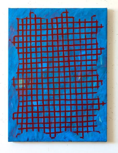 S-F: I love the title of your current show at Elizabeth Leach Gallery - Idiom. Can you talk about where that comes from and how it relates to your recent work? PB: The work I had been making for the show kept splitting off in different directions and I wanted to follow each one, not curtail anything just to make it fit, to make a show. Lately, as must be apparent by now, I’ve been working to see what happens rather than directing it. I don’t have an interest in making it all cohere. Or maybe it’s more accurate to say I want to see if I can make it cohere on its own. When it was nearing time to deliver the work to the gallery, some of the paintings seemed to have organized themselves into pairs that each shared a loose sense of genre (still-life-ish, landscapes, grid-based “scripts”) but there was no overarching theme. Idiom, which means a phrase whose meaning cannot be understood from the dictionary definitions of its component words, seemed to fit the situation. There’s an idea there about “compositionality” that I like, where one should be able to understand the whole if one understands the meanings of each of the parts. But with idioms, it doesn’t add up. They make a new meaning only through time and use.  SL3 2023, flashe on canvas over panel, 24" x 22" S-F: Who are you looking at (living or dead)? PB: I just got back from a trip to the Netherlands where I saw many early Mondrian paintings at the Kunstmuseum den Haag, and there also was a beautiful and comprehensive exhibition that traced his development alongside his contemporary, Hilma af Klint. Earlier this year I saw Rebecca Morris at the MCA in Chicago. It feels so good to look at work in person again. I recently got my hands on the new big book on Miyoko Ito. And I’m always looking at Prunella Clough and Thomas Nozkowski for the way they made compositions that cannot not be taken apart. Historically, Arthur Dove, Marsden Hartley, Matisse, ’80s de Kooning, Shirley Jaffe, Raoul de Keyser, Kimber Smith. I cycle through a long list of contemporary (mostly women) painters such as Victoria Morton, Patricia Treib, Jana Schroder, Marley Freeman, Elizabeth MacIntosh, Julia Dault, Jonathan Lasker, Tomory Dodge. And lately I’ve been looking at Sherman Sam, Ilse D’Hollander, Varda Caivano and Cora Cohen. 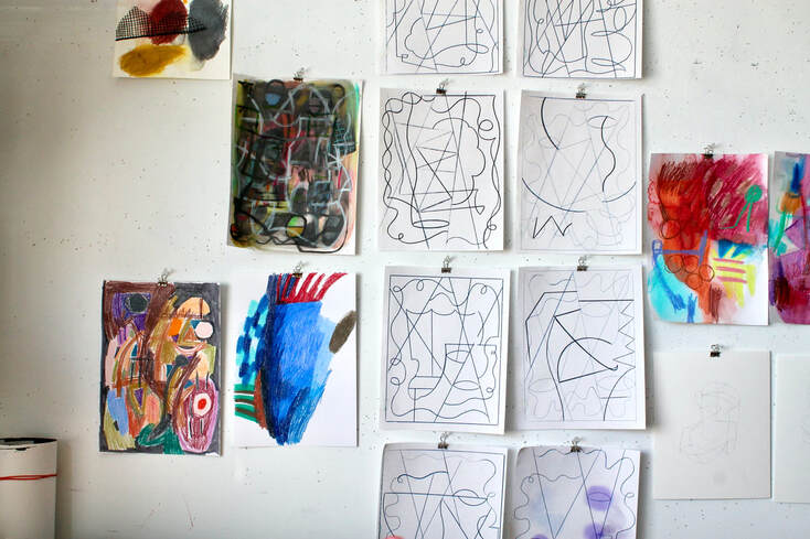 Above and below: on the studio walls.  S-F: What’s next for you? PB: After my two fall exhibitions in 2023, it feels good to be working without a looming deadline. I’m represented by Elizabeth Leach Gallery in Portland, Oregon, and will likely do another solo there in 2025. I enjoyed working with Ditch Projects and would like to build more connections with artist-run spaces: it’s useful to see work in different contexts and I like working collaboratively with other artists. You can see more of Pat Boas's work: - on her website: patboas.com/work/view/3369696/1/7614193 - on the Elizabeth Leach Gallery website - on her instagram page - on the Ditch Projects website More Boas: 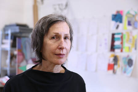 The Artist in her Portland, Oregon studio. 
 Saturday Painting #1 2023, acrylic and flashe on canvas over panel, 15" x 12"  Saturday Painting #3 2023, flashe on panel, 10" x 8"  Saturday Painting (plus-blue) 2023, flashe on panel, 10" x 8"  On the studio walls in 2024.    12/3/2023 The Semi-finalist is: japeth mennes Security Camera 2022, acrylic on canvas, 12"x 15" One of Japeth Mennes’ many artistic gifts is the insight of the pragmatic optimist, a vantage point from which nothing is too ordinary to be seen and celebrated. His creative process starts by photographing common yet easily overlooked signs - such as laundromat icons and surveillance advisories - from the streets of New York. These regionally familiar symbols are nothing special on their own, but in the hands of Mennes they are transformed into moving studies of both color and shape. Scouring the city for examples of the ordinary is the work of the artist, and Mennes seems to enjoy the undertaking. His visual lexicon keeps expanding and now includes shutters, pull shades, and stationary (the design of that last item looks like it was transported directly through time and space from my middle school in the eighties). As the viewer, however, we are invited to join him at a moment post-transformation, a point at which the sign has become a motif. A completed Mennes painting is no longer a mere secular icon inviting us in or warning us off; it is instead an armature for a highly personalized and abstracted world that sings with color. In effect, Mennes turns the perfunctory visual utterances of an often cold, unfeeling city inside out and finds something new and beautiful in the inversion. The Big Brother undertones of constant supervision implied in a work like “Security Camera” (2022) become an opportunity to share a study in nuanced hues. And instead of glorifying an object due to its rarity or ephemeral nature, Mennes’ “Laundromat” paintings argue that even the consistently un-special can be elevated and act as brick and mortar to house an idiosyncratic rendering of the world. This month I’m very happy to share my Semi-Finalist interview with Queens, New York based artist Japeth Mennes. - David Schell  Japeth Mennes in his studio, June 2023 The Semi-Finalist: I'm always interested in what an artist's early path looks like, and your formative years had a few twists and turns. Can you talk about where you went to school and how you got started as a painter? Japeth Mennes: I studied painting (Cranbrook Academy of Art, Kansas City Art Institute, and for a brief moment at the School of the Art Institute of Chicago), but never really made straightforward paintings until fairly recently. I was very interested in media and the nuts and bolts of how images were created so I made drawing machines, sculptures, videos, and invented my own printmaking techniques. After a musical art-hiatus that lasted five years, I had the ideas for the paintings that I’m making now. Painting feels like the perfect vehicle for these ideas, so that’s where I am.  Double Glazier 2021, acrylic on canvas, 27" x 23 1/2" S-F: When I visited your studio, I was really taken with the process that you’ve established for yourself. Can you describe your method of painting and how it developed? JM: It’s pretty simple on my end! I look for objects and imagery that I think I can work with, I like things that can slip into abstractions and that have some sort of reflection of my landscape here. Most often it starts with photography, walking around the neighborhood. 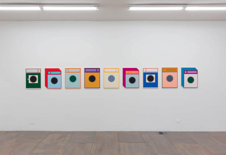 Nine Laundromat paintings. Installation at 65 Grand, Chicago, IL (photo by Holly Murkerson) S-F: I’m very interested in how your paintings balance structure and improvisation. They always seem to be hinting at how subtle variations inevitably arise, even in a world dominated by mass production. Can you talk about that? JM: I’ll talk about the Laundromat paintings. In my neighborhood in Queens there is a laundromat on practically every corner, they each have their own way of illustrating a washing machine on the signs. There are 800 languages spoken in Queens, so it makes sense that everyone would use this as a way to bypass text based advertising. When I first noticed them I thought that they were really amazing, how everyone does it a little differently; sometimes it’s just lame clip art, but sometimes it’s a really weird handmade design that comes close to abstraction. At first I painted them because I just wanted to have one for myself, to hang it in my home. But the first one led to the next, and then another, and another, and so on. I find that there are endless ways to shift the color and the design (just like the different signs), and that when the paintings hang together on the wall they come full circle back to the actual washing machines in a row inside the laundromat. It’s a strange thing to paint a machine by hand, and to do it over and over again like a machine. Although I’m not painting a machine, I’m painting an image of an image of a machine. And I think the small shifts are inevitable and mean a lot to me.  Window Shade 2023, acrylic on canvas, 26" x 11" S-F: So much of your work is about understated but repetitive signs that act as warnings or wayposts (security cameras and laundromats). You also have a developing interest in depicting the barriers that we use to help us separate interior and exterior spaces (shades and shutters). How did these themes develop and where did your initial interest in them come from? JM: I also started painting the window paintings from signs I noticed above glazier shops in NYC. The same with the security cameras, sometimes you’ll see a sign for a security camera right next to an actual security camera, which is very funny. I went from there to painting some actual windows and then to the shutter paintings (which came from Brooklyn, not Queens). I’ve always liked art that can reflect upon itself, and the window is an old trope in art history that is nice to think about. 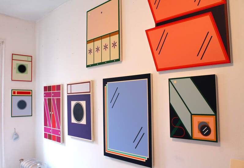 In the studio. 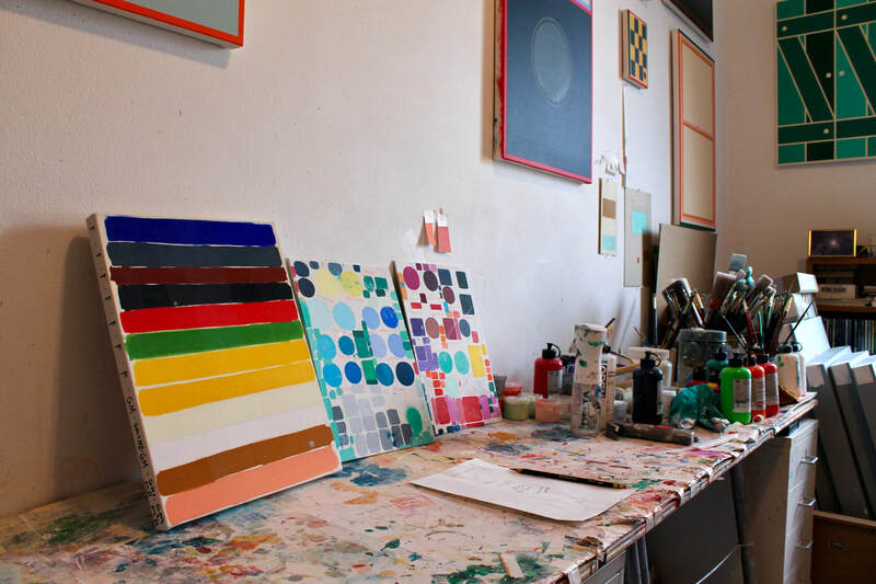 S-F: Do you see yourself connected to a tradition of landscape painting, or is your engagement with the contemporary urban environment fundamentally different from other representational movements? JM: We talked about that a little before, and I think that’s a very nice way to think about the work. I sometimes think about how art can conflate different ideas or create paradoxes. If you think about landscape painting in terms of coping with or processing an environment, then for sure. On the other hand I sometimes think about the paintings as somewhat figurative, especially the laundromat paintings. Then there’s also an easy jump to still life.  Stationary 2023, acrylic on canvas, 32" x 27" S-F: There’s an element of Pop Art in your paintings, but it’s infused with a quiet, elegant, sometimes-eerie-sometimes-bittersweet sensibility that I don’t see in the work of, say, Roy Lichtenstein. Where is that coming from? JM: I hope that a psychological or emotional experience is what stays with the viewer, even though it may not be apparent at first. I think that I’m working in a roundabout way of getting there, but it’s important to me to do so. I think that forms and color can hold a lot of elusive feelings. 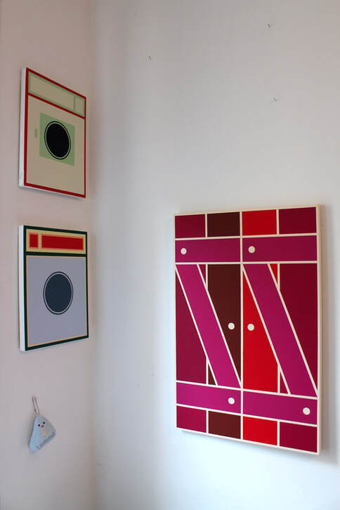 A corner of the studio. S-F: Who are you looking at (living or dead)? JM: I find doing studio visits with my community here very enriching, I wish I could do it more. I just went to Elise Ferguson’s studio and was really blown away by how adventurous her way of working feels. Stacy Fisher (who you also recently visited!) too, she’s one of my favorite artists right now. There was a great Tony Feher show at Gordon Robichaux this summer. The Ed Ruscha retrospective at MoMA is incredible. 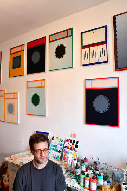 The artist in his studio. S-F: What’s next for you? JM: I’m working towards a two person show at Left Field Gallery in California. When I went back to Chicago earlier this year for my show at 65 Grand I met Mie Kongo and was really impressed with her work. She is the other artist in the show and I think it will be a nice pairing. You can see more Japeth Mennes: - on his instagram: @japeth_mennes - on his website: https://www.japethmennes.com/ - from his show at 65GRAND in April/May of 2023 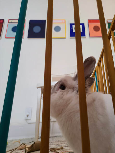 Above: rabbit's eye view of Mennes's work. Below: visitor's eye view of Mennes's work. 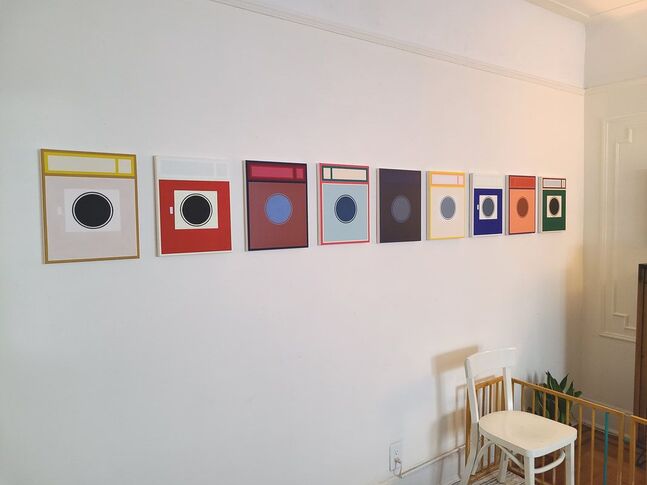 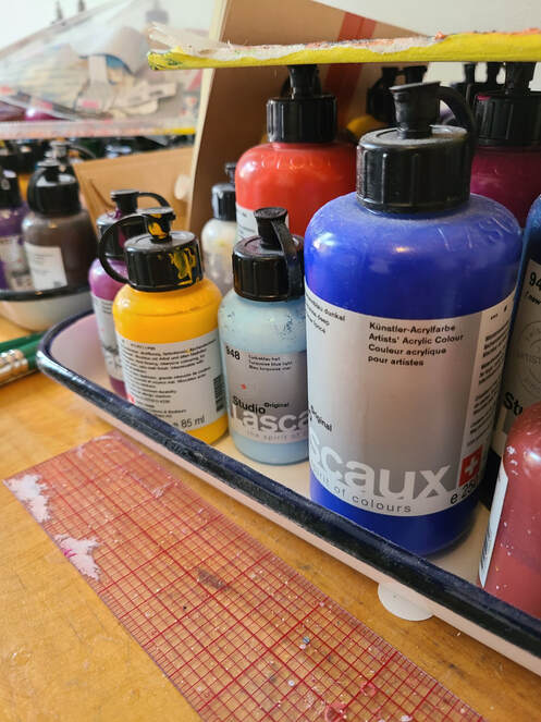 More materials and techniques.    Not far from Japeth Mennes's studio in Queens, New York.
10/22/2023 the semi-finalist is: Pat Barrett Untitled 2022, acrylic on canvas, 50" x 45" As far as I can tell, Pat Barrett happily lacked the chameleon gene and was impervious to trends. He was an artist that was dedicated to his work, and I loved it when he described his time in the studio as “cheap thrills.” I am certain that both the irony and the sincerity of this frequently repeated declaration were entirely intentional - the irony being that after adding up art school, supplies, a studio, and time, nothing about being a painter is cheap; the sincerity being that, for all it’s potential for frustration, heartbreak, and tears, a single bad day of painting and drawing is infinitely better than a week at a fancy resort or five-star hotel. That may be overstating it a bit, but you get the picture. Pat spoke about painting in a way that resonated - and still resonates - with me. He described it as being in touch with materials and techniques as well as rhythms and movements; of letting go of a strict, linear narrative; of allowing gestural, figurative suggestions to casually saunter into an otherwise abstract composition; of not repeating himself and always feeling like he was moving forward; of not being bound by anyone else’s rules, only his own. He knew a painting was finished when it felt right, and he wasn’t afraid to paint over entire canvases when they felt wrong. He had a fearless, unsentimental streak that served him well in the studio. When I look at Pat’s work - especially the work of the last five years - I’m struck by his ability to hint at stability emerging out of chaos. His compositions are overflowing with calligraphic marks that at first appear to be endlessly speeding up, ramping up dangerously close to light speed. The more I look, though, the more I see his brushstrokes coalescing, linking up in ways that suggest conversations taking place rather than a detached series of intersecting monologues. These are paintings that know how to both speak and to listen. The intimate exchanges tucked into his highly gestural compositions slow Barrett’s paintings down enough to see how they are truly in the moment. In an untitled painting from 2022 (see above), for example, thick, steel and sky blue strokes pull over the top of the canvas, partially blocking out three or four horizontal bands in deep indigo and a tangle of yellow and brown. Rather than canceling each other out, they amplify one another, linking up to create an idiosyncratic sense of structure that is both solid and open. I also can’t help but see the angles, twists, and turns of arms, legs, and torsos. As in so many of Barrett’s paintings, they are forms and marks at the three-way intersection of architecture, the body, and nothing at all. Pat died recently, and I have to admit, this is a tough one. There’s no other way to describe it. Although the word disorienting keeps coming to mind, so I’ll add that as well. It’s tough and disorienting to start a project (this interview) with someone, and then finish it alone. The same goes for knowing that after multiple conversations and two hefty studio visits, Pat Barrett will never see this little bit of writing that tries to express how much I admired him, what I was drawn to in his work, and why I keep looking at it. Barrett did his part, though, for which I’m forever grateful. With the help of his wife, Gail, he spent a portion of his last summer responding to the Semi-Finalist questions, and I feel so incredibly lucky and moved that he did. 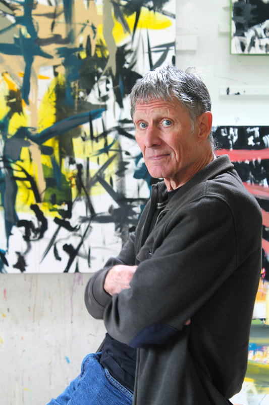 Pat Barrett in his studio. The Semi-Finalist: Talk about your early years as a visual artist. I know that you also spent some time playing music. What was it like trying to balance two creative outlets while still in your twenties? Pat Barrett: I grew up in orchards planted by my great grandparents in a rural part of Northern California. My childhood was filled with sensations of the natural world, space, shape, and color. The generations in my family before me were all makers. Master builder, seamstress, writer, inventor, photographer. They did all of these things in the context of still running a ranch. I started drawing when I was very young and a foundation in drawing forms the groundwork of my painting. After my mother’s death, I found a portfolio of drawings saved in a closet that I thought was work that could have been done by me. It turned out the drawings were done by my mother when she was young and I was surprised by how they had the same hand, the same choices, a similar sensibility to my work. I never knew that she could draw. But looking at her drawings confirmed for me how the urge to draw is the substance of what informs me as an artist. I earned my BFA and MFA at Otis Art Institute in Los Angeles. After graduation I maintained a studio in the city and continued to explore my interest in abstract painting. At Otis I had discovered avant garde music (John Cage, Luciano Berio, Kathy Barberian, David Tudor, Robert Ashley and others) and would spend time making sound collages of their work using a tape recorder. That form of music, which is essentially abstract, synced up with my understanding of how the elements and principles of painting worked on an abstract level. When I look back at those early paintings, I see the beginnings of a movement towards more expressionistic imagery. In graduate school I worked a lot with serial imagery and in that LA work I can see where I was working to resolve one form in the context of the other. 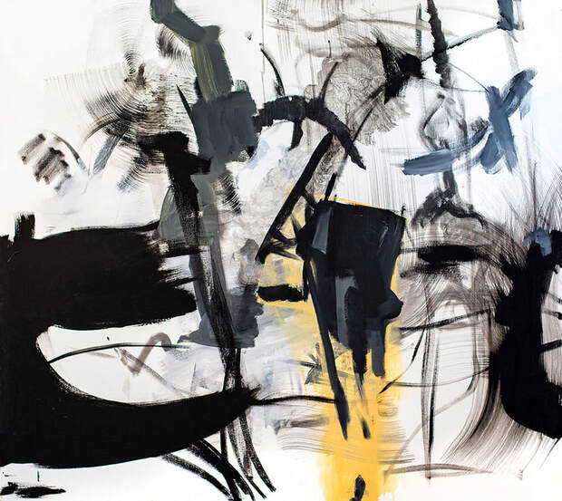 Untitled 2022, acrylic on canvas, 44" x 48" I eventually moved back to rural northern California and began working on what I think of as process oriented abstract paintings. I didn’t have a lot of money to spend on supplies and I had to work with a kind of economy. Working with less trained me to listen closely to my intuition for direction, to make decisions while working that were based on signals that were unclear but motivating. That is what I mean by process. I still find that it is feeling that lands me on the painting surface, an urge to articulate what isn’t yet formed. Music has always been integral to what is happening in my paintings. In my late 20’s and into my 30’s I was in a band. We wrote and played original work, grown out of improvising words and sounds, and performed in venues in San Francisco. I sang and played trombone. I also experimented a lot with playing the shortwave radio. I combined that work with the visuals of my paintings. I loved playing live music, but it was hard to sustain both painting and playing, not creatively, but time was the issue. There wasn’t enough of it. People have often commented that they hear sound when they look at my work. When you are asking me these things about early years and balancing music and painting, I am reminded that I don’t really have a linear sense of time. 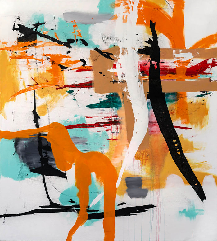 Eros 2020, acrylic on canvas, 56"x 50" S-F: One of the things I really enjoyed talking about when I was in your studio was the process of painting and the process of finishing a painting. Can you elaborate on your relationship to those two inevitably coupled subjects? PB: For me making a painting is making an object. I decide on a size and shape, choose stretcher bars and canvas and build it. At that point, I am committed to evolving the object as a painting. It is more of a commitment to see it through if I already have the canvas on the stretcher bars. Some paintings resolve and come together quickly. Others take weeks and months to come to a resolution and there may be lots of attempts to make one of those paintings work. What gets me painting are essentially formal concerns: creating structural opportunities to enter the picture plane with content. My approach beyond mechanical structuring is in large part emotional. The way I use color is subjective and sometimes random. Composing is improvisational, around some kernel of an idea or feeling. I am interested in creating a visual representation that has impact psychologically, emotionally and intellectually. 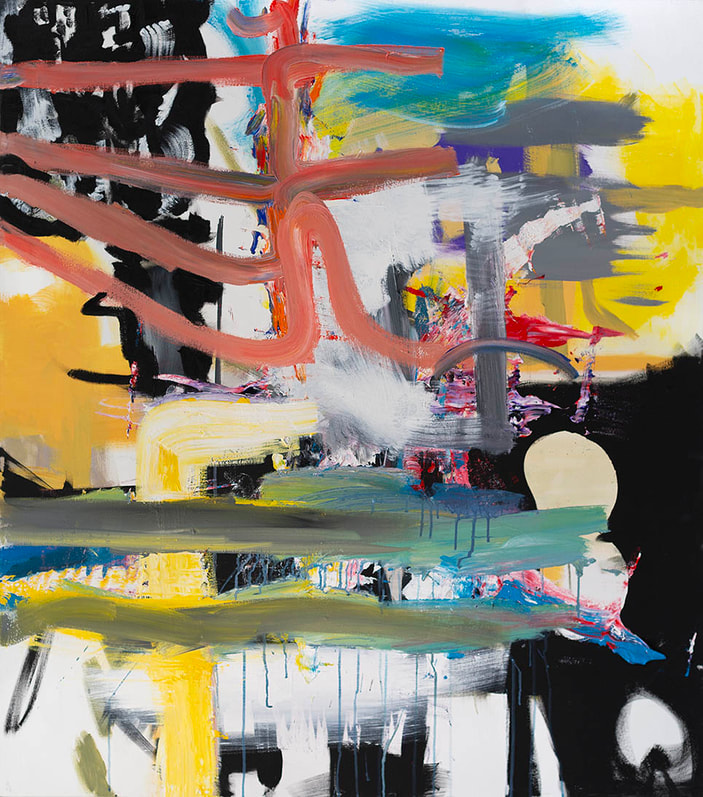 Untitled 2022, acrylic on canvas, 56" x 48" Much of the time working on a painting is spent observing the painting. The series of actions are layered over time. I know it is done because it works on a formal level and then on subjective levels of feeling and intuition. When you are forming a painting it begins to draw you in, it can repel you as well, but when the painting draws you into itself more than demanding of you that you solve something, then you know you want to look at it instead of changing it. The trick is to keep the painting fresh. A lot of times my paintings can become really dense. I have to really work to keep it fresh so that it doesn’t look confusing and overworked. I often refer to these paintings, the dense ones, as being in the trenches. 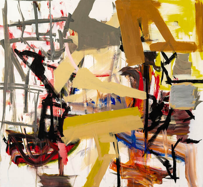 Untitled 2022, acrylic on canvas, 46" x 50" S-F: Your work is largely abstract, but you don’t shy away from gestures, lines, and forms that suggest the figure or objects in space. Talk about that. PB: Playing with light and gesture, for example, puts my painting into a realm that evokes a sense of place and a kind of ground for interaction not unlike improvisation around a musical idea. The way that I work chose me. I have a huge appreciation for all forms. I am in love with figurative drawing and painting as well as with highly reductive, abstract work. I think that working the way I do gives me opportunities to tap into a kind of ineffable area that transcends linear time. Imposing linear concepts would only interrupt my intuitive flow. 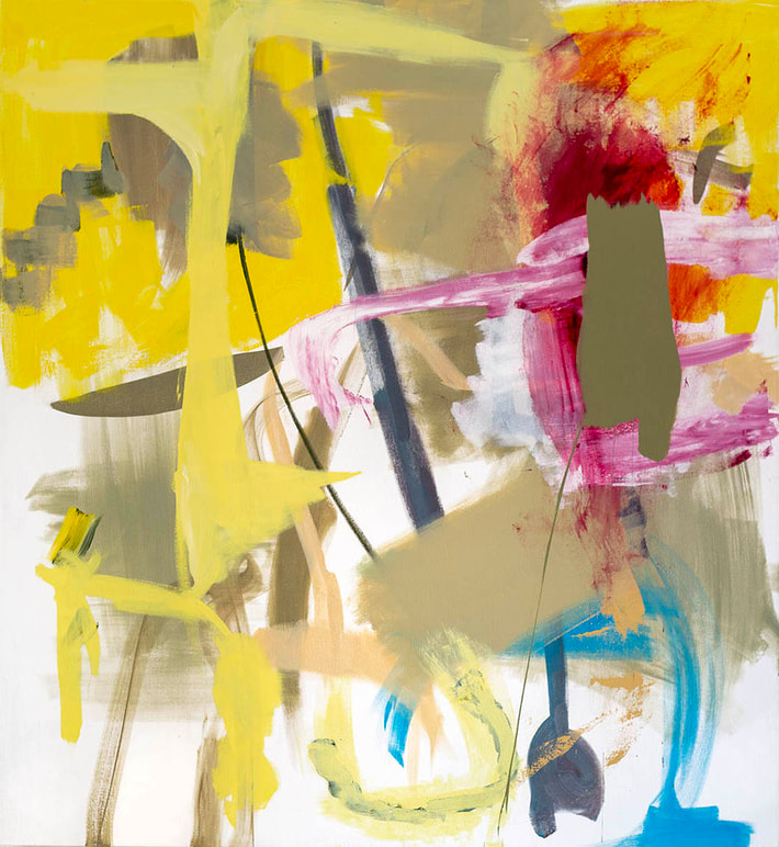 Untitled 2021, acrylic on canvas, 50" x 46" S-F: When did you start your series of ink drawings on Yupo and how do they relate to your larger acrylic paintings? PB: In 2018 I had a surgery that for a couple of months left me unable to build large canvasses or move bigger pieces around. I needed to work. I had done some small pieces using acrylic ink on paper and decided to try ink on a non-absorbent surface. Working on a slick surface using a transparent medium gave me effects that pleased me. I also experimented with non-conventional tools. The imagery and marks in both forms are related but the process of creating them is different. Light and white in the drawings are the paper, not ink or paint. The yupo drawings take minutes to work and are purely spontaneous. I don’t labor with them. You get what you get. I think of them as haikus. I like their scale. Paintings feel like novels. They are always getting reworked. I use tools on the yupo that I also use on the canvas, but the scale and either ink or paint create a very different range of shapes and characters.
Ink drawings on Yupo paper and a little corner of the studio. S-F: One question that came up in your studio and has stayed with me ever since is “what do you want from a painting?” It came up in a general way and I can’t remember who asked it, but I think it’s a haunting question because it really gets to the heart of this whole business of trying to be creative. So, Pat Barrett, what do you want from a painting? PB: I want a painting to call out to me, to get my attention throughout the making of it and at the point at which I stop working on it. So, I guess that means that there’s a conversation initiated and sustained throughout the process of making and beyond. I recently found a photo of a piece I did when I was about 24 that appears to be describing a significant personal event that I am in the middle of right now. I guess you could say that I value nonlinear and intuitive perceptions. I want a painting to be formally sound on my terms. It’s important that its structure has the integrity to get the most out of it. You have to make yourself vulnerable. I like a sense of bravery. What I want in my work is often what I look for in other’s work. I like to see facility but what I really want to see are inexplicabilities. The awkward messiness that has nothing to do with trying to impress with ego or personality but makes you curious about why these images come up.  Materials and the evidence of process. S-F: Who are you looking at? PB: I follow a lot of regional painters. I like painterly work. I like Instagram because I can follow painters all over the world. I have a roving eye that is not inclined towards editing and I don’t have much of an academic approach. You can see more Pat Barrett: - on his website: www.patbarrettstudio.com/ - at Gallery 114 - on his instagram: @pathbarrett  Pat Barrett 1949 (San Jose, CA) - 2023 (McMinnville, OR)  Blindsided 2020, acrylic on Canvas 54"x 46"  Untitled 2021, acrylic on canvas, 62" x 56"  Untitled 2023, acrylic on canvas, 54" x 48" Early Drawings      Untitled
2023, acrylic on canvas, 54" x 48" 8/1/2023 the semi-finalist is: stacy fisher Untitled 2023, oil and hardware on wood, 14" x 11" x 2" Stacy Fisher’s paintings have a directness about them that initially intimidated me when I thought about writing this introduction. What can one say about objects that already present themselves so clearly? How can words possibly reveal anything when nothing is hidden to begin with? Had she been poured into the body of a writer instead of a painter, one could imagine Fisher producing the shortest of short stories and the briefest of poems, all hitting the mark with just a few well chosen words. What more could I add to that? Fisher’s paintings, however, have a thingness about them that I am temperamentally drawn to. They are singular in both their originality and in the sense that they don’t act as metaphors (at least not to me). They are what they are and that, I think, is something I can put words to. That’s a starting point. A captivating mix of structure, improvisation, and understatement, Fisher’s paintings hold my attention as they shift in space like restless performers on the thin line between form and its opposite. At times her paintings playfully whisper, at others they state their intentions with a clarity composed of vivid colors and decisive contrasts. She wisely shies away from anything resembling an earnest lecture stiffly or monotonously delivered. Instead, it’s as if she’s realized that casualness is its own hungry beast and she’s let it out of its cage. Fisher is an artist adept at articulating the personal and the subjective in a way that makes both seem inevitable and true. Her off-kilter forms and soft touch fuse her materials with her supports, suggesting an airy effortlessness that any painter knows is hard won over years, if not decades. Her paintings lean into a visual language that is more like Saturday-feral children rolling down a hill in a park and giggling wildly; much less like a formal team practice focused on rules and technical ability. Both have their place, to be sure, but I get the sense that Fisher is more excited by the idea of losing a bit of control than by obsessively cultivating it. This month I’m very happy to share my Semi-Finalist interview with New York based artist Stacy Fisher.  Stacy Fisher in her studio. The Semi-Finalist: Stacy, thank you for taking the time to talk with me. I really appreciate it. I like to start most of my interviews by asking about an artist’s formative years. How did a life in the arts begin for you? Stacy Fisher: I grew up in Norwalk, Ohio, which is a relatively small town, and have been drawn to art and music for as long as I can remember. While I was a student at the Cleveland Institute of Art we took class trips on a bus to New York and I immediately fell in love with it. We had a literature teacher who had an apartment on Mercer Street, she made us all subscribe to the New Yorker and I think we watched Slaves of New York in class like three times. But it was through doing a residency at the Chautauqua School of Art that really sealed the deal, most of the teachers were based in the city and gave us great info on how to move there. It’s funny to look back at those years and how information was so precious. We didn’t have all the internet resources, so meeting the right people was key.  Untitled 2023, oil on wood, 16.5" x 17" x 1.5" S-F: When I recently visited your studio, you mentioned that at some point your work transitioned from being sculpture-centric to being painting-centric. Tell me more about that. Stacy Fisher: I’ve always had a foot in both worlds, but the starting and finishing points were previously aimed at being sculpture. I made abstract paintings for years on the side and hid them away because they didn’t necessarily have the same intent as my sculptures. They were more of an outlet for painting in a freer way since painting on sculptures can be so tricky. But in the early stages of the pandemic, I found myself at a bit of a loss in the studio. I’d run out of materials and wasn’t in the right frame of mind to bother with restrictions. I did find a stash of oil paint and was really inspired by Fortnite, which my son had just started playing. I was blown away by the look of it and the skins, I had never really appreciated the virtual world. With the insanity of the lock down on top of the political anxiety in the air, I figured if there was ever a time to explore painting that this was it- not only because the process of painting can be so pleasing (even like traveling), but I discovered a new way of setting up and exploring ‘moments’ by painting on wood. It had never occurred to me that I could build my own structures to paint on and they didn’t have to be flat. This was the beginning of the shift- when my focus became oriented towards pattern and using color, and I was making structures with the intent of painting them.  Above: Untitled 2023, oil on wood, 20" x 11.5" x 1.5" Below: Untitled 2022, oil on wood, 13.25" x 10" x 1.75"  S-F: You also talked about your interest in making paintings that avoid the illusion of form and instead privilege literal form. That idea really resonates with me. Can you talk about the importance of that in your work? Stacy Fisher: The first iteration of these works were made pre-pandemic and were all white with minimal pencil markings. Layers of wood were stacked one on top of the other, or a strip would jut out to one side- whatever marks I added were in response to the shadows, sides, and edges. When I started painting them I followed the same strategy, with the structures being very much a part of the narrative. I found that if I added an illusion of space that all those little structural details would get lost. In many ways, the entire point to this work is found through what happens to the shifting spaces and how each work changes as you move around it. This idea of layering and the picture changing has really stuck with me as a metaphor for a point of view. I love to read fiction written in first person that specifically narrates day to day tasks. It seems so boring but I am really interested in how the mind works and responds to what’s happening around us, how certain events have huge effects on us and others don’t.  Above: Untitled 2023, oil on wood, 9.75"x 6" x 1.5" Below: Untitled 2022, oil on wood, 12.75" x 9.5" x 1.75  S-F: Your work is such a wonderful blend of rigor and play, geometric structure and casual brushwork, simple materials and sophisticated color choices. Stacy, I don’t know if I even have a question for you here! But maybe a good prompt for this section would be: “Where does your impulse to fuse opposites come from?” Stacy Fisher: I have always done this in my work- looked for some harmony between opposing parts or added something that didn’t seem to belong. I have a natural tendency to go against. It’s in my nature. If something I’m making seems too straightforward, I have to intervene. This leads to a lot of failure in the studio but I don’t think I could do it any other way.
Where and how it all gets done. S-F: Who are you currently looking at (living or dead)? Stacy Fisher: I really loved Gedi Sibony’s last show at Greene Naftali. He is a master of making something/nothing come to life. I love Joanne Greenbaum’s paintings because they go against every impulse/instinct I have in composition, they mystify me, I could never make them. I also love Richard Aldrich’s work, he touches on something very personal by having a narrative that’s slightly out of reach, but you can still sense it. That’s all I need in art, really, that sensation that you’re being communicated to. When it starts to get too specific I tend to lose interest.  A studio wall S-F: What’s next for you? Stacy Fisher: I was thrilled to be in my first painting group show at Mother Gallery in Beacon this summer, organized by Paola Oxoa, Trudy Benson, and Russell Tyler. I’m going to be showing work at 57 W 57th Arts new space in the fall- I've been a fan of their programing, which focuses on showing minimal, abstract artists (like you!). I’m looking forward to that, as well as a group show at the University of Vermont curated by Steve Budington that opens in September.  Untitled 2022, oil on wood and craft stick, 11.5" x 8" x 1.75" You can see more Stacy Fisher: - on her instagram: @stacyfffisher - on her website: www.stacyfisher.net - in I Am the Passenger at Mother Gallery in Beacon, NY - at Left Field Gallery in Los Osos, CA  A work in progress on the studio wall.  Untitled 2020, oil on wood, 11" x 7.25" x 2"  Above and below: Untitled 2022, oil wood, 11.5" x 8" x 1.75" 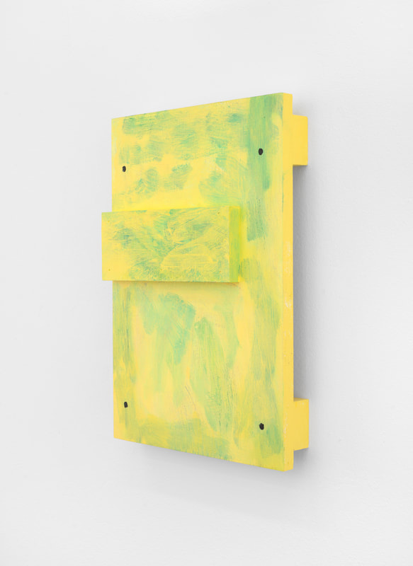 7/5/2023 the semi-finalist is: Gwen hardie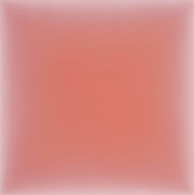 04.03.23, Light Orangey Red on Indian Red 2023, oil on canvas, 30" x 30" I thought a lot about Gwen Hardie’s work on a recent trip to northern Spain and southern France. For about two weeks I found myself stumbling daily (hourly, even!) upon beautifully crafted and emotionally stirring images and objects, not to mention the dazzling structures that house them. For someone who’s not particularly spiritual, I found it all to be so beautiful and uplifting. Any barriers I might normally have to being seduced by the trappings of organized religion were also on vacation, and I was left with a feeling of fervor, even if its source couldn't be accurately credited. I can’t even imagine what it must be like for someone who is a true believer: heads and hearts must spill over with joy when pilgrims replace tourists and prodigal children make their way home. I had a similar feeling in Gwen Hardie's Brooklyn, NY studio when I visited her last March. Not of being an enthusiastic sightseer or an appreciative outsider, but of standing in the presence of work that is both resolutely physical and communing with the unknown. Hardie’s canvases have a glow that transitions subtly like the slow curves in the arches of a Romanesque church. Her canvases are lit from within, reminiscent of an icon or distant piece of stained glass placed lovingly in a window 100 feet above anyone’s ability to make out the subject matter embedded in it - in the end, it’s just light hinting at form. Hers is the work of an artist insisting on a quiet, tender and bewitching moment in a ridiculously loud, cruel and frenetic world. It’s an attempt at making sense of - or perhaps coming to peace with - the unexplainable. In front of it I become a true believer in stillness and beauty. It’s been months since Hardie welcomed me into her luminous, dazzling studio, and her work is still with me - a persistent glow lingering in my head and in my heart. I’m so happy to be able to share my interview with her here.
Gwen Hardie in her Brooklyn studio. The Semi-Finalist: How did you get started as an artist and what were those formative years like? Gwen Hardie: My first ‘Artwork” probably happened in my post graduate year at Edinburgh College of Art in Scotland. I had been studying the live model for 4 years, and then was given a private studio and a model - how generous of the Art College when I think back! Suddenly, I found a new freedom - I zoomed into the model, expanding scale to much larger than life and experimented with how to apply the paint, seeking a way to use it that evoked atmosphere and body as interchangeable. They were large paintings and the result was like stepping into the field of the face or figure. The practice of sustained looking at the life model felt oddly privileged. Existential questions about self, other - what divides and connects us - arose out of it. At that time, I couldn’t convince myself of anything I painted if it weren’t from direct observation. I also recognized that I didn’t want to become a figurative painter and had no idea how I could bridge the gap to the kinds of work I was attracted to in galleries and museums. (A good example are Rothko’s Seagram paintings at the Tate). Now, I understand that this act of being ‘convinced’ is to do with how color reverberates and creates an illusion of life/living. These paintings at ECA (Edinburgh College of Art) were successful to my surprise - they all sold in London - yet I felt like I was just at the beginning. I wanted to broaden my base of knowledge and understanding in art. A DAAD (Deutscher Akademischer Austauschdienst) scholarship enabled me to move to Berlin, 1984-1990, studying briefly with Georg Baselitz and testing new approaches to painting. Influences came and went - I subjected the single figure to expressionist color (decided I wasn’t an expressionist exactly!), split the figure in two, made huge sculptural wall reliefs of abstracted single and multiple figures interwoven. Offers to show my rapidly changing work also came and went - I had to create a kind of distance between my creative journey and the public’s response to it. I was lucky to gain the attention of Keith Hartley at the Scottish National Gallery of Modern Art, who gave me a solo show there of this work. These are some of the most formative experiences in my beginnings as an artist. 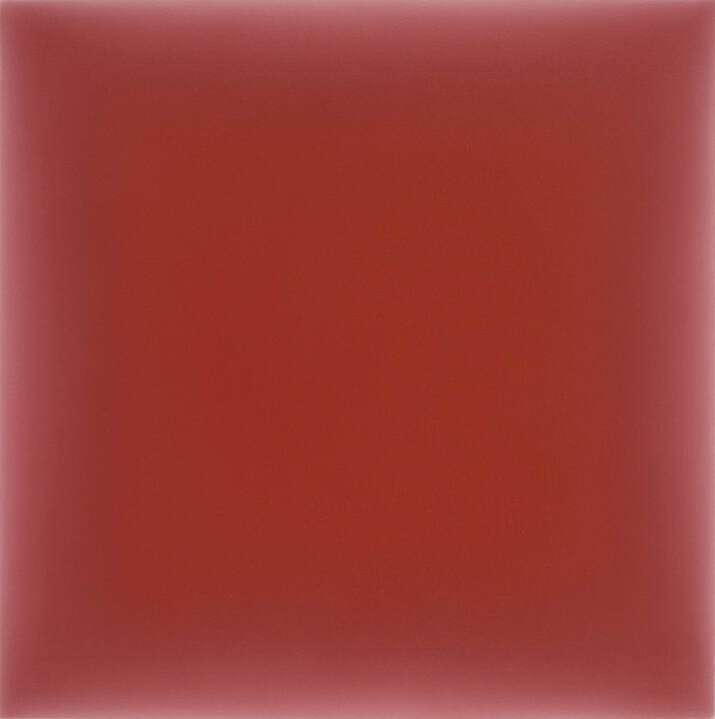 04.13.23, Venetian Red on Indian Red 2023, oil on canvas, 30" x 30" S-F: Your abstract paintings from 2018 on are so rooted in a tradition of visual experience that is consistently non-narrative. Does language trip you up when you try to describe your work? And how do you describe it? GH: Actually yes, language can trip me up …on the one hand I feel that all my previous studies, experiments, struggles, discoveries are what enables me to create my current work - on the other hand, for the viewer, it’s not important to know the background history. Indeed, as you suggest, it can get in the way! In my language of color and tone, it's as if I see through a magnifying glass. I blend colors in a way that is connected to how light and shadow move across and through surfaces, evoking varying densities and depths of field. Colors have their own peculiar interactions with each other and I discover their possibilities while making the painting, continually adjusting the temperature and tonality of both grounds until the foreground reverberates in the way I am searching for. Background references can interfere with this open ended, perceptual experience. I keep my titles deliberately simple - referring only to the date on which they were painted and their foreground / background colors. I am considering omitting the colors, as they are often too ‘hybrid’ to summarize! I keep notes for my own reference to remember the color ‘events ‘ that happened at the time of painting. 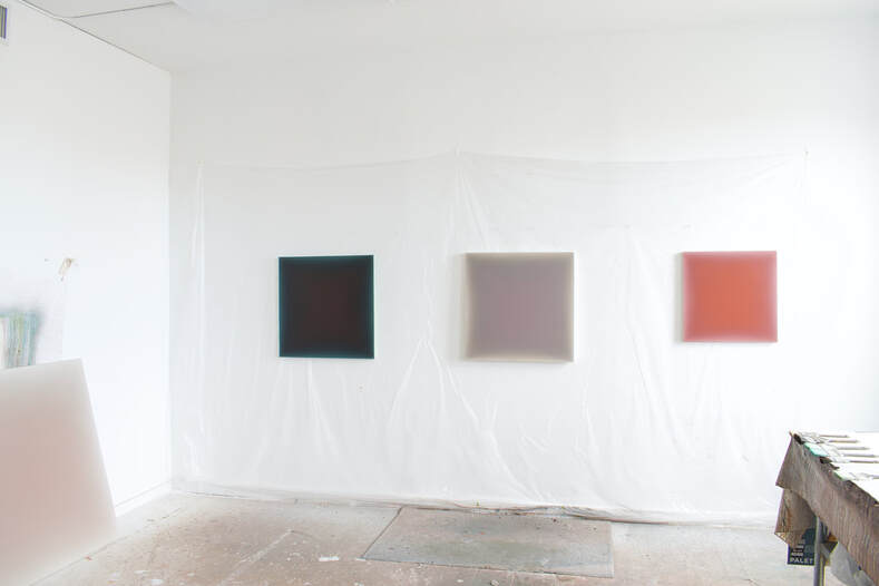 Above: Three works on a studio wall. Below: 04.20.23, Muted Violet on Umber Grey 2023, oil on canvas, 36" x 36"  S-F: When I visited your studio I was struck by how much variety you’ve been able to tease out of your minimalist tendencies. It was really exciting to see. Can you talk about how you developed your current working method and how you push the boundaries of this process? GH: Thank you! My practice feels very rooted in the present while I am working - but there’s this thing where one painting suggests another - there’s a sweet spot for a moment of completing a painting to my satisfaction - often after a struggle - but almost a second later - I mentally start imagining the next work… there’s a …”what if I try the foreground a little darker/lighter ” or …”bring the radiance of the foreground out to a greater or lesser extent..” etc., etc. I also tell myself that I have no investment in the result, that I am happy to try again tomorrow - its fine to get rid of the paint at the end of the day - this allows me to push forwards in a kind of free abandon (the dark patina of my studio floor bears witness!). However, to your question - the longer answer might be that there is an accumulation of inner resources that are sustaining my ability to "tease out variety." Elements of past research and work resurface in different ways. For example, looking back, my ‘inner library’ of color and tone likely began in the life class at the aforementioned Edinburgh College of Art. More recently, between 2008 - 2018, this ‘inner library’ grew with my tondo project of magnified portions of skin. I expanded the reach of my palette to include the full range of skin tones from darkest to lightest, coolest to warmest. The fascination in each painting was the subtle beauty of an individual’s skin tone - in particular how the skin tone ‘glows’. I bring that animated radiance into a more distilled and abstract language now. Another resource of infinite variety is the full spectrum of light and shadow in nature. I am particularly interested in the variations of temperature (from warm to cool) that sunlight, moonlight and their corresponding shadows produce in any given 24 hour cycle on the earth, both on surfaces up close and in open vistas across great distances. A new fascination is with how foreground colors appear to absorb or reflect light. The interaction between background and foreground determines this - in some cases it’s possible to create a foreground that appears to do both. These kinds of perceptual effects are so subtle and can only be realized in the moment while painting.  Above: work on the studio wall. Below: edges and corners.  S-F: As reductive as they are, your paintings always seem to be leading dynamic, layered lives: first, as atmospheric and mysterious portals to nowhere in particular; and second, as objects with a strong physical presence. Can you talk about how you balance these two tendencies in your work? GH: I love this incisive question! Holding these two fundamental elements in balance - the physical and the non physical - are somehow what it’s all about - in life and in art! Your own work, if I may mention, really comes to mind! My painting is an alchemic process. For me, the transformation from the flat shape to a three dimensional illusion is what brings the painting to life. I like the taut canvas, the folded corners, the flat shape. When you look from the side, you see a trace of the stain of the background color, but the oil film stops at the front edge- revealing exactly what it is in physical form. The act of painting is very time pressured for me- the film of oil paint starts to stiffen at a certain point while blending - I also think of the oil film as a concrete thing that has its own integrity. The magic occurs for me when the colors start to reverberate and somehow come to life within this film of oil paint. Each painting presents a floating foreground color over a background color - but rather than just floating - the foreground color seems also embedded into the background color and by extension the actual canvas. I keep manipulating / blending the gradients of color saturation and tonal levels until the foreground radiates both outwards and inwards in space. The transitional ‘walls,’ as I think of them, play such an active role in achieving this illusion. In fact, sometimes I think these transitional walls are the key to everything, and yet they engage almost on a subliminal level! It's here in the interstices between grounds that the transformation between the physical and the non-physical can be realized.  Finishing 05.04.23, Venetian and Napthol Red on Indian Red 2023, oil on canvas, 52" x 52" S-F: I’m drawn to the way your paintings confidently exist as quiet alternatives to a world filled with noise, lies and a million reasons to be anxious. Can you talk a bit about how you see your work in relation to the moment we’re in right now? GH: Thank you! Indeed the world is so polarized, unjust and violent, though I wonder if it has always been like this ..maybe it’s just that we are more aware now in this digital age? To your question: I can’t find much in the current socio-political moment to be inspired by, actually, so I look for inspiration where I can find it - I look to a broader context across cultural and historical divides to find connections. At the moment, I am reading Dore Ashtons book, “About Rothko.” Interestingly, most of the liberating steps towards abstraction in the New York School of painters in the the 50's grew out of the context of despair after World War two. It’s true, too, that Buddhism is a source of inspiration to me. Maybe I should say ‘was’ in that I hardly ever meditate now - the daily practice of painting bears some connection to meditation though it’s clearly also very different. One amazing human being who inspired me towards Buddhism was the late Vietnamese zen master Thich Nhat Hanh, who was very active in promoting peace after the Vietnam war (and was expelled from Vietnam for being too neutral as a pacifist). I went to several mindfulness training retreats in France with him when I lived in London. Ultimately, I felt a bit of an imposter as I knew that I wanted to take the revelations I was experiencing through meditation and the dharma back into my life as an artist (the more noble goal in this context - and rightfully so - is to bring the practice into the community through engaged buddhism). Nevertheless, the experiences I had through meditation were profound - they gave me a depth of sense perception that I cant ‘undo’ and that are always present and pushing forwards in various ways in my work. Buddhism - in particular zen - is a way of thinking and being - a devotion to practice, the importance of cultivating awareness rooted in the present. I can see connections between this way of thinking and certain art practices, throughout history and in our time - the insistence on the present, reducing language to essential components, engaging in actual experience rather than narratives of experience. The possibility of seeing for the first time - being able to see and experience beyond mental constructs - is something that both art and buddhism share. It’s not necessary to declare it. Indeed, another way of "tripping up" (to use your phrase) might be to draw emphasis to any spiritual practice in relation to art, as the word ‘spiritual’ is too loaded with preconceived ideas. 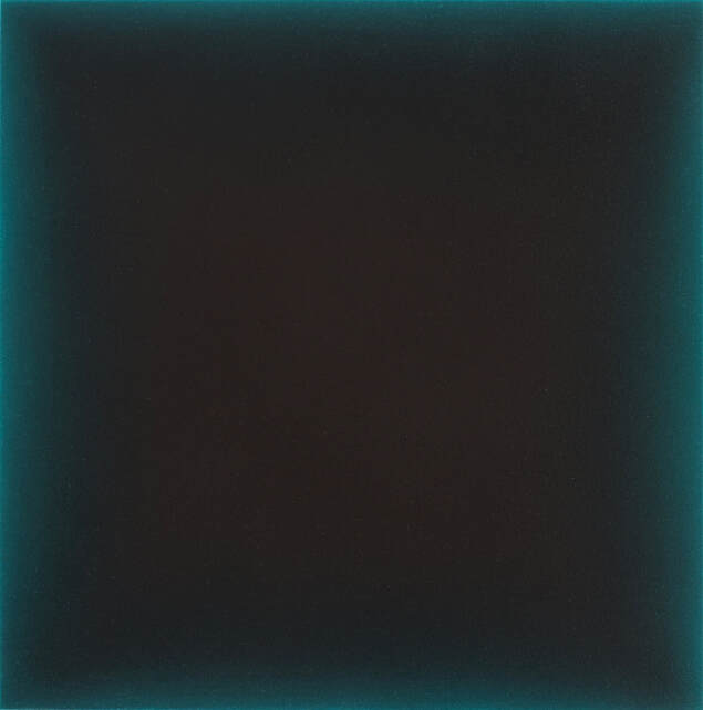 02.09.2023, Reddish Black on Pthalo Green 2023, oil on canvas, 24" x 24" S-F: Whose work have you been looking at recently? GH: Recently, I am grateful to 57W57 Arts for showing my work here in NYC and connecting me to a community of artists such as yourself, where I find strong aesthetic connections. The notion of relativity, for example, embedded into your work, where the outer edge determines how the interior of the work is perceived, strikes a chord with me. I also continue to be inspired by the New York school of early abstract expressionists - in particular Rothko - also Albers, Ad Reinhardt and the Light and Space movement artist James Turrell. Beyond the US, some of the artists that inspire me are the late Morandi and the contemporary South Korean artist, Taik Kim Sang. S-F: I love that list of artists and I appreciate the shout-out. Thank you. 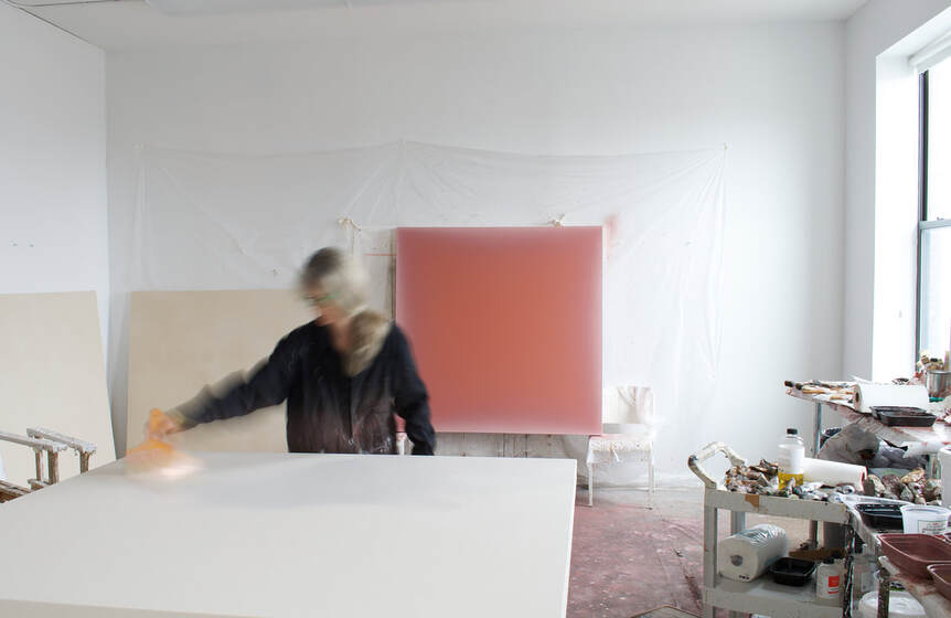 In the studio. S-F: What’s next for you? GH: I will be showing with Arden and White in New Canaan, Connecticut from July 5 July to August 20th, then in October at The Hague Art Fair in the Netherlands, represented by ASAP Gallery and Chabot Fine Art. I am collaborating in upcoming new projects for larger scale works with Dolby Chadwick in San Francisco and will be represented by The Finch Project at The London Art Fair in January 2024. My work will also be available with Dimmitt Contemporary Art in Houston and in ongoing collaborations with The Spaceless Gallery, based in Miami and Paris.
Gwen Hardie's studio in Brooklyn, NY. You can see more of Gwen Hardie's work: - at Arden + White Gallery, New Cannan, CT - at The Spaceless Gallery - at 57W57ARTS in New York (and @57w57arts on instagram) - at The Finch Project in London - on her website: https://gwenhardie.com/ - on instagram: @gwenhardie1436 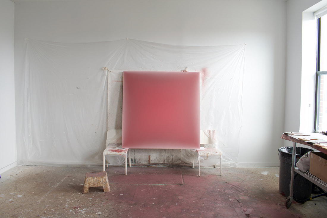 Above: 06.23.23, Radiant Pink on Indian Red 2023, oil on canvas, 60" x 60" Below: 04.21.23, Pale Lavender on Warm Umber 2023, oil on canvas, 54" x 54" 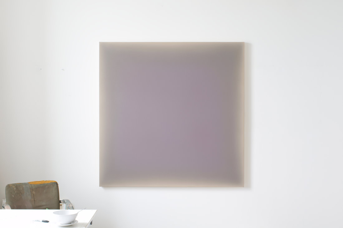 5/23/2023 the semi-finalist is: Benjamin Terrell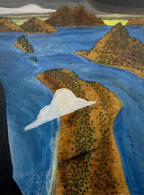 Untitled 2023, oil and stain on wood panel, 12" x 9" In Benjamin Terrell’s compositions we are habitually positioned as an elevated observer, viewing his invented worlds from upstream and up in the air - a vantage point shared by intrepid clouds and stoic mountain tops. His distant horizon lines can often be caught inching their way towards the upper registers of his intimately scaled compositions, suggesting a vast calm that stretches beyond the borders of his wooden panels. Spatially, however, the magnitude of Terrell’s invented scenes is customarily upended and reversed, and all of the idyllic calm associated with a peaceful landscape or seascape is suddenly infused with a subtle churning. His bodies of water - oceans, rivers, and gravity defying waterfalls - often look as though they are about to break through the surfaces they are painted on and pour into the space of the viewer, dampening shoes and pant cuffs along the way. The source, it would seem, is ready to flow back into us. The reflection of midnight’s stars or a setting sun on the ocean’s tranquil surface transforms into a thin, delicate skin barely covering something deeper and incomprehensibly complex. Thin slices of sky and land are pieced together on a stage set for a play ready to unfold in geological time. As peaceful and idyllic as Terrell’s landscapes may initially appear, these are depictions of a world in motion, of a universe whose inner clockworks are momentarily revealed to show us that the laws of physics don’t always apply. When standing in front of a painting by Benjamin Terrell, I am always aware of being the viewer, of being positioned in front of a poetic distillation of the rural Oregon that he knows and loves. They are visual evidence of the fragile theory of perpetual motion: exterior expressions of an interior world that is informed by a deep connection to a very real place. When standing in front of a painting by Terrell, I also see an invitation to step into his world and be reminded of the journey that each of us is on: we are the log on the back of a truck, the impossible to see inhabitant of a small dwelling tucked into its surroundings, the boat sailing downstream, the restless cloud and the occasional tree. For this edition of The Semi-Finalist I'm excited to share my interview with Oregon based artist and writer Benjamin Terrell. In it he talks about his process, past and present influences, and his relationship to place.  Benjamin Terrell in his studio. The Semi-Finalist: Let's start off with a boiler plate question that I still find to be useful when I'm interviewing an artist, even one that I've known and admired for close to 34 years: tell me about your formative years. Who were your influences and what was your path to becoming both a writer and a painter? Benjamin Terrell: We find ourselves here, all sent to the same odd, opulent wilderness with similar yet unique sack lunches. Painting and writing about painting are the ways I unpack what I was given and how I process getting to the bottom of a bottomless bag. Expression is the yardstick that can measure between the specific and the universal. My Mother was a painter and my Father was a writer. These days, in their absence, I do both things as a dialogue between writing and painting and to feel close to both of my parents. Although I was born in Portland, I was raised in Memphis, TN where I was introduced to the work of Walter Anderson and Carol Cloar. I met Cloar once; I would walk past his house and one day we had a brief curbside conversation about a bird hopping between us and the sidewalk. It was a short yet slow, typical southern exchange, as if taken right from one of the artist's paintings. Also, Cloar wore the best ugly shirts. In college (at the School of the Art Institute of Chicago) I was still thinking about artists I had discovered while living in the south, like Jacob Lawrence and Romare Bearden. Standouts from the Art Institute collection were the paintings of Marsden Hartley (the intimacy of the outdoors) and Edward Vuillard (vast relational interiority). 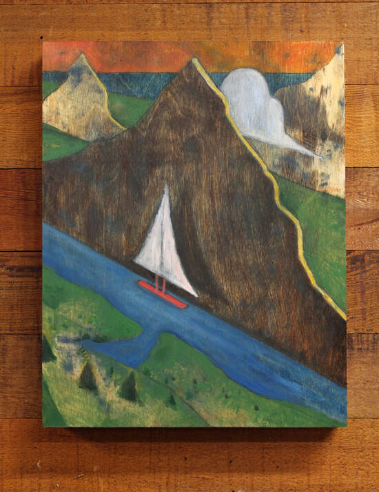 Above: Mountain with Boat 2023, oil and stain on wood panel, 14" x 11" Below: Mountain and Shore 2023, oil and stain on wood panel, 14" x 11" 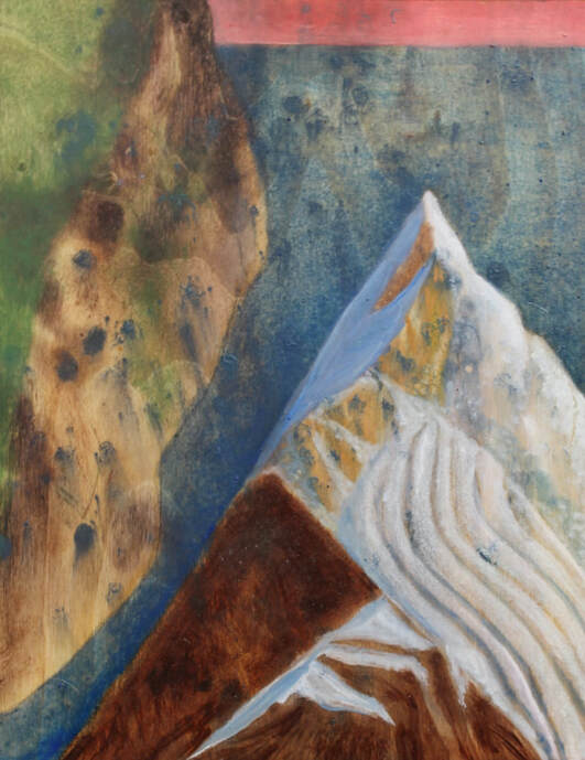 S-F: I’m also interested in how you currently balance writing and painting. Do you keep them separate, or do they overlap in some way? BT: I am fortunate - I am always painting and I write about painting, so there is a natural, easily accessible segue between the two things. One separation: I mostly write about other artists. But, for me, writing is like sending fan mail to the act of painting, and in the honoring I bring back depth and perspective to my visual practice. I walk a lot and am always reading and looking at other artists, so it feels like I am always processing. Also, Instagram - and even Covid - has created additional closeness and online intermingling of artist and admirers, and I think that has led to more expansive conversation. Finally, having a habit (like painting) and having your habit have a habit (like writing) allows a necessary inversion of interior and exterior voices. These days painting for me feels plural, whereas writing is more intimate and singular. Or perhaps writing feels like a second child - my expectations of it are different and it gets to wander outside of the expectations given to the firstborn, my visual practice. 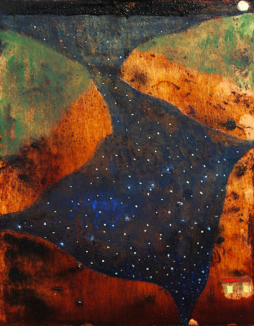 Above: Untitled 2023, oil and stain on wood panel, 10" x 8" Below: Home in the Gorge 2023, oil and stain on wood panel, 8" x 10" 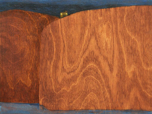 S-F: At times your work features isolated homes tucked into impossibly grand landscapes; at other times the main event is a log truck cruising down a highway. Can you talk about your connection to these symbolic subjects and why you keep coming back to them? BT: Living in the Willamette national forest I see many log trucks, especially after the big fire a few years back. It occurred to me that we, like the logs on the truck, exist in a state of in between and are always in a process of becoming. The trucks moved through the painted landscapes as a nod to the type of transformation that can occur when we recapitulate the slight, malleable and fluid relationship we have with our surroundings. The little houses, too, are like impermanent stances, our temporary lenses that look out at something grand, hard to name, unique and ultimately unexplainable. The landscape I want to paint is a meeting place, somewhere where something immense meets something immeasurable.
House Between Two Cliffs 2023, oil and stain on wood panel, 10" x 8" Log Truck Overpass 2021, oil and stain on wood panel, 10" x 8" S-F: Over the last few years you've been developing a deeply personal approach to painting. Can you talk about your technique and how it came about? BT: I've been painting on wood panels for three or four years now. Originally I covered them with canvas to create a more taut surface to push back against the brush. But I liked the grain and the give of the porous wood beneath and the way the paint would both sit and soak into the surface. I bought different stains from the hardware store to highlight the natural patterns specific to each board. Somewhere along the way the wood became as important as what I could put on top of it. For me, a more interesting dialogue occurred when I approached the blank wood as a work already in progress rather than a conversation that began with my voice or assuming anything is ever a blank page. When I applied the stain thin it felt like watercolor's relationship to paper. Also, I occasionally carved into the surface and that reminded me of wood block prints - both things I like. Different, less traditional techniques felt inexhaustible and less controllable, whereas when I built up with too much oil paint it felt too straight forward, like I was forfeiting a sense of discovery. I love it most when a material surprises me or doesn't do exactly as I want.
Benjamin Terrell in his backyard studio in Springfield, Oregon. S-F: In our conversations about painting and creativity, you’ve talked a lot about nature and your interest in unknowable origins and unanswerable questions. Can you talk about how you approach these subjects when you’re in your studio? BT: I think to have a path or practice asking or answering important questions by creating something new requires a willingness and a foolishness to perpetually begin again. Because invariably every creative effort will fall short, every mood or moment is often obscured by egoic cloud cover and you are sent back to the studio to rename and recommit. "Deciding" is both enemy and awkward officiant of the dance necessary to advance beyond knowing and not knowing. I was told recently "not knowing" is intimacy, which I imagine as the ultimate open and unarmored place where oneness can occur (the place prior to the mind's limited explanations). I see oneness as a natural state, but art is always a byproduct of that, always a ripple away once a stone is thrown. Ultimately, art isn't evidence of a self, it is a self-annihilation, the realization that the ripple was never the rock. I remember a poem where the author proclaimed that he felt sorry for those who skated the surface of the pond, never to fall in. Rather than an analogy suggesting creativity requires pain or is born from misfortune, I understood it to mean that life is about infinite immersion and that a goal is to be ok with the merging that occurs on uncontrollable and unknowable terms. 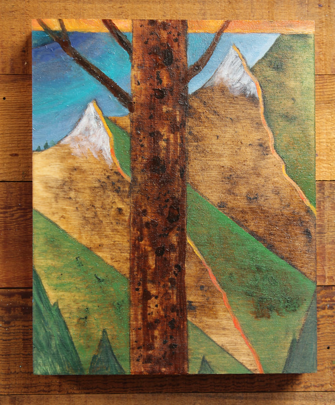 Two Mountains 2023, oil and stain on wood panel, 10" x 8" S-F: Who have you been looking at recently (living or dead)? And who have you been reading recently? BT: I think a lot about Ken Price, John Dilg and Umetaro Aziechi in terms of their personal iconography and regionality. I often return to and admire the worlds of Bill Lynch, Thomas Nozkowski, David Milne and Bernard Leach. Contemporary artists I admire are, Erin Okeefe, Kaitlyn Eichwald and Sean Noonan. I benefit from being in orbit with Uwe Henneken, Spencer Shakespeare and Brian Scott Campbell. I love reading Cole Swensen, John Yau and Annie Dillard. I think Barry Lopez’s and Peter Schjeldahl's voices have been tremendously important to me. My friend Dan Gluibizzi once told me there were certain painters from history he "wouldn't let in the studio." I love that idea and think about it often. I do spend much of my time in parallel with people I admire. But I think of creativity as a choir, and I can easily imagine between the singing, in the silences, are the richest, most important parts of the song. 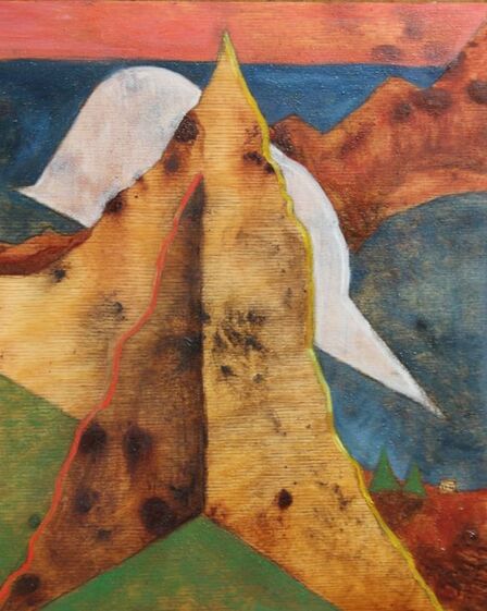 Mountain and Cloud 2023, oil and stain on wood panel, 10" x 8" S-F: What's next for you? BT: In June I will show work with John Richardson at One Wall Gallery in Eugene. I am also looking forward to traveling this year and to some new writing projects, some known and others yet to be known. I am always looking for new voices and venues for other opportunities, I encourage feedback if this speaks to anyone reading. You can see more of Benjamin Terrell's work: - on his instagram: @benjamin_terrell_painting - at One Wall Gallery in Eugene, Oregon: @one.wall.gallery - Terrell has also shown work at BARK Berlin Gallery (Berlin, Germany), Meyer- Riegger Gallery (Berlin, Germany; show curated by Uwe Henneken) and was recently included in an online show with MePaintsMe (on instagram as @mepaintsme). 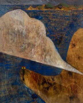 House and Cloud 2023, oil and stain on wood panel, 10" x 8" 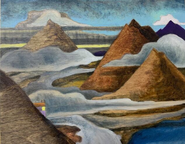 Mountain Home 2022, oil and stain on wood panel, 8" x 10" 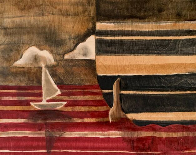 Little Boat Big Boat 2021, oil and stain on wood panel, 16" x 20" 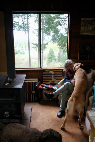 4/30/2023 the semi-finalist is: Tom bunnell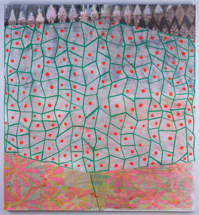 Fortune Teller 2021, oil on canvas, 58" x 60" Tom Bunnell’s work hints at both the strength and fragility of systems and organization in a series of paintings that often put the merciless evolution of their development on full display. Nothing is sacred or safe from a temperament that relishes destruction as much as creation. What is destroyed, however, is often done so in a way that softens the blow through ethereal, thin layers of paint or the gestural wipe of a studio rag. The brush in Bunnell’s hand is at times a skilled creator of soft mists and staccato marks that suggestively blot out portions of meticulously arranged patterns and designs. At other times it is a wrecking ball that- instead of making his paintings uninhabitable- cracks open a portal to a universe where the structure of repetition and its chaotic opposite can coexist in a mature, understanding relationship. These opposing forces are like a couple that has stumbled upon the revelation that true love is about embracing and celebrating differences, not just accepting or tolerating them. The contrasting forms and styles amplify one another rather than cancel each other out; a sort of alchemical transformation takes place and the resulting whole is so much more than the individual parts ever dreamed they could be. I'm so pleased to be able to share my interview with Washington, D.C. based artist Tom Bunnell. In it he talks about his early days as an artist, his current process, and his ongoing interest in pattern and design. - David Schell 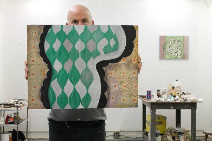 Tom Bunnell in his Washington, D.C. studio with Aragon 2023, oil on panel, 16”x20” The Semi-Finalist: Tom Bunnell, thank you for doing this interview with me. I’m such a fan and it’s been a joy to spend time with you and your work. This is a bit out of character, but I’d like to jump in and start with a couple of questions that came up as we were talking in your Washington, DC studio a few months ago: what does a painting do? What is its function in contemporary culture? Tom Bunnell: What does a painting do? What is its function? Well, I guess they just kinda sit there, don’t they?! Sit there and make us crazy. No, I’m kidding. Sort of. Maybe the function of a painting is to be that mute thing that holds light and pigment in its skin and holds us captive. We make paintings- human beings make them. I’m always fascinated at the beginning of the painting process and how much is happening inside my head (when really nothing is happening in the big scheme of things). It’s like a secret little melodrama kicking off. I think the “function” is up for grabs. I think paintings have their own lives that we coax out of them through time. I don’t think the images or what you end up painting is as important as how it’s painted. We live in such a visually over stimulated world. Look at us crossing busy streets while staring into the chasm of our cell phones! We so want to be in there. Not here. I think paintings are the opposite of the cell phone screen. The surface is made up of pigment and cotton, wood, or linen (if your fancy), and though we want it to be a fixed thing, it’s constantly changing. Reacting to whatever light it’s in or if it’s cold or warm- it’s reacting. 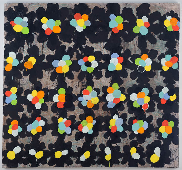 Chemistry 2018, oil on canvas, 58" x 60" S-F: Now we can backtrack a bit. Talk about how you got started as a painter. What did the formative years look like for you? TB: I was really fortunate to have gone to the University of Oregon for my undergraduate degree. I actually got my BA in art history. It was required to take some studio classes and that’s where I really fell in love with painting. But I was awful! I hadn’t really painted before. So it was a super steep learning curve. But working with professors like Ron Graff and Frank Okada was totally key. They were tough, but they both brought this level of seriousness and excitement about painting that I really reacted to. And the other students in the classes were so vital. Many of whom became my friends. Man! I learned so much just from watching them paint. They seemed so chill and fluid with the whole process. But also very serious about their craft. It was a very formal and inspiring environment. But we had lots of fun. I went to the Chautauqua Institution right after getting my BFA. That was a critical summer. It was a great environment with loads of super talented young artists from all over the world. I got my butt handed to me from the various visiting artists coming through…it was tough. Again, I had a lot to learn. In desperation, I ended up making a large scale painting of a small, scrubby tree outside of my studio. The tree was like 4 feet so made a painting roughly the same size. So literal!! Hilarious. Anyway, It felt like I was making a painting that was truly mine. From there I went to American University for my MFA. I had the honor of working with people like Deborah Kahn, Stanley Lewis, Don Kimes, and Luis Silva. It was a very painterly grad program at the time, which I loved. Wonderful visiting artists like Bill Jensen and Ron Gorchov came through. 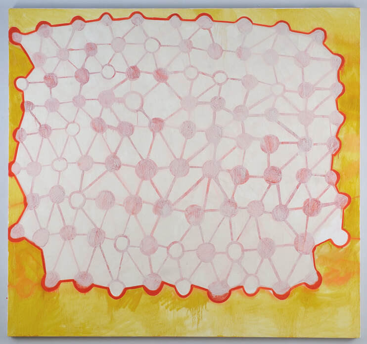 Big Talker 2021, oil on canvas, 58" x 60" S-F: You engage with pattern, repetition and seductive color palettes in many - if not most- of your paintings. Can you tell me about your relationship with decoration, beauty and the joy of looking? TB: The idea of a painting being decorative is a big no-no, isn’t it? Or it was! Not anymore, thank god. What a silly rule to have in the back of one’s head. I guess I started using a kind of grid in my drawings and paintings as a way just to think about holding the picture plane together. I’m so good at making bad first choices in my work. So I felt like the patterns and grids would allow for some logic or rationale at the outset. I don’t necessarily stay true to the first sort of grid I lay down. I find a way to undermine it during the painting process. I do actually look at a lot of decorative patterns in textiles, medieval decorative designs, and of course nature. Everything from Marimekko dresses to honeycomb patterns are up for grabs, I suppose. I’m trying to let more things in lately. There are so many ways of looking. Of seeing. I think if you’re being honest, it takes a lifetime to really learn how to see and know at the same time. Or see and feel, rather. 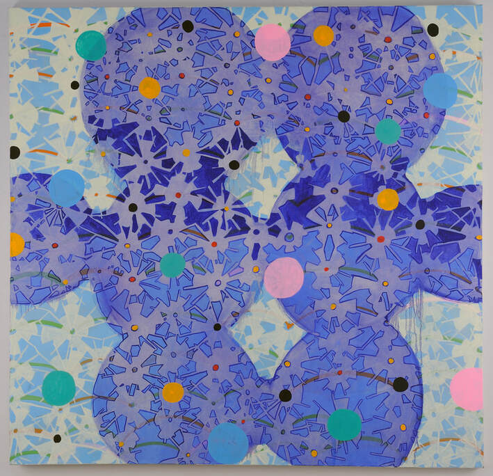 Bather 2022, oil on canvas, 58" x 60" S-F: Tom, when I visited your studio you talked about a sense of inevitability in your process, about things feeling right (or wrong) as you work. Talk about that. TB: You know, when I start a painting, I do try to have some underlying grid or pattern that creates structure. But almost always, when I come back to the painting, I’ll have second thoughts, third thoughts, 15th thoughts!! And then I begin to undermine my original idea. Like wiping it all down or inverting some pattern or color. It’s not like I want to do it. It’s more like it’s a call and response with the painting. I guess I’m really not conceptual at all with my work. It’s always a scruffy search. If something is found in a painting, I seem to have a moment of doubt. And this is the cycle I find myself in. The idea of something being inevitable in my work is that the paintings kind of “arrive” at a place that seems genuine and their own. It’s the result of a lot of chasing one idea down only to see it disappear over the horizon! It sounds angsty - and it is at times - but it’s really joyful, too. 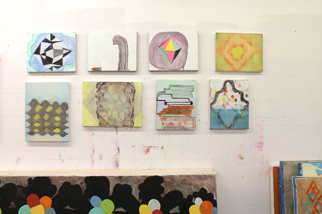 Above: the studio wall with paintings in various states of completion. Below: where the scruffy search happens. 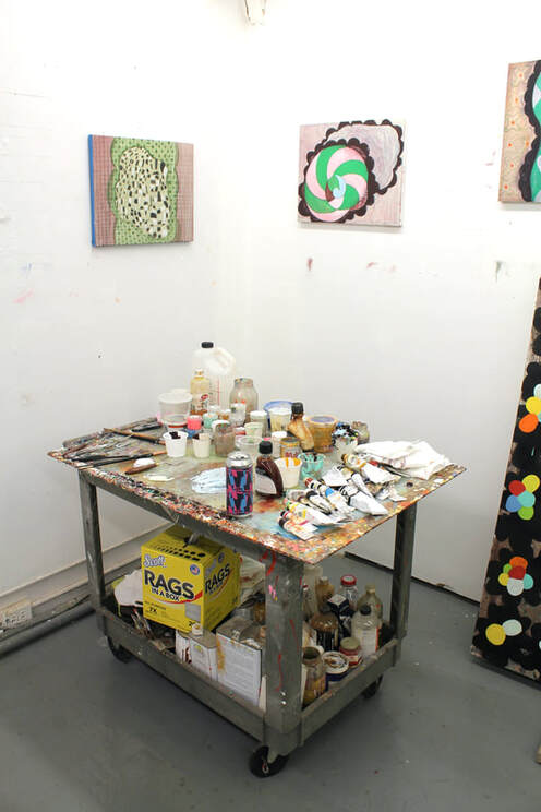 S-F: Your work often has a cartoonish edge to it that I really respond to. There’s a bounciness and comical energy mixed in with the creation and destruction that are a part of your process. Where does that come from? TB: I have a painting in my studio that I did in graduate school. It is a very dark, scraped up, and humorless peice. It was the kind of painting one does in graduate school when there’s just too much going on mentally and you feel like everyone’s up in your business. I keep it around to remind me of how low we can feel with our work. About ten years ago, I really started to make an effort to let more into my work- more goofy marks or shapes, colors that would be better in a cartoon. I had to be honest about my love of things like 60’s psychedelic art and all that. But also taking comedy seriously. Like with Shakespeare. His comedies are so wonderfully constructed but they also always have a moment when they could turn tragic! I love that fine line. There are very few paintings that are just funny. Like anger, it’s probably hard to sustain that the whole time you’re working on a painting. 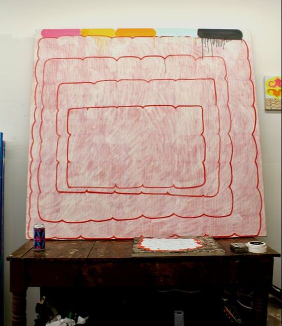 "About ten years ago, I really started to make an effort to let more into my work- more goofy marks or shapes, colors that would be better in a cartoon. I had to be honest about my love of things like 60’s psychedelic art and all that." Above: Red Line, 2019, oil on canvas, 60" x 64" Below: Green Diamond with Pink, 2023, oil on panel, 8" x 10" 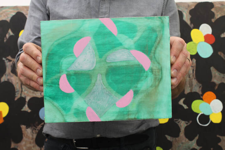 S-F: Who are you currently looking at (alive or dead)? TB: Well, you’re always looking at someone or something, aren’t you? Artists don’t and can’t exist in a void for long. You gotta go have a look. But galleries and museums aren’t the only places we should be looking. Or on our Instagram feed, for that matter! Like everyone else, I was super excited to see the Hilma af Klint paintings. I knew of her drawings, but not those big paintings! Whoa! I’ve sort of cooled out on looking at Cezanne and those guys for a while. I feel like the concerns in a post-impressionist painting aren’t mine at the moment. There’s just other stuff that’s more exciting. Like Japanese Sashiko Stitching! Annie(my wife) got me to look at that work. So amazing. Light years beyond me aesthetically but it’s great to study it. About 5 years ago we were in Santa Fe visiting friends and family and we went to the New Mexico Museum of Art. They happened to be having a show of Agnes Lawrence Pelton’s work. I was completely blown away! I had never heard of her and the paintings just really moved me. They’re so personal and transcendental. And so much a meditation on her spiritual experience in the west! I love her. And the fact that her work was rediscovered by a person who bought one of her pieces in a garage sale in California!?! Now I know the art market loves a good “rediscovery” story to help line its pockets, but with Agnes Pelton’s work and Hilma Af Klint you just get this sensation that their paintings were just sitting patiently. Waiting for us all. Quietly humming in this great vastness. 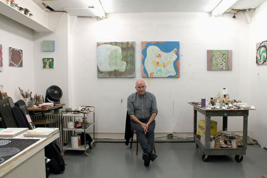 Tom Bunnell in his studio. You can see more of Tom Bunnell's work: - on his instagram: @electriczither - in a Studio Visit interview - in Holy Inventions at DC Addison Ripley Fine Art (curated by Isabel Manalo) - on Artsy 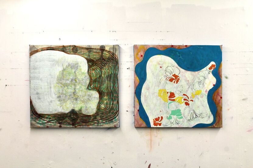 Above: left- The Curtain, the Sky, and it’s Ghost (I), 2022, oil on canvas, 30”x36” right- The Curtain, the Sky, and it’s Ghost (II), 2022, oil on canvas 30”x36” Below: Funny field (black and white), 2022, 16”x 20”, Oil on Panel Candy-O, 2022, 16”x 20”Oil on panel On table: 3am Drawings, colored pencil, graphite on black Rives BFK 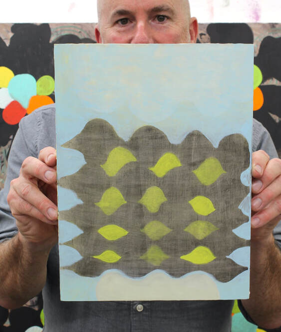 Tom holding Mirage, 2022, oil on panel, 8”x 10”
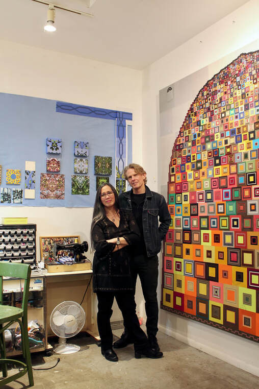 Maria T.D. Inocencio and Mark R. Smith in their shared studio space (Portland, OR). In the work of both Maria T.D. Inocencio and Mark R. Smith, beauty and visual delight never exist for their own sake. They are always present, but as pathways to a better understanding of the human condition, doors that open up and reveal something about our manners, habits and ways of being. Both artists have strong formal sensibilities that I immediately respond to – they each play with geometry, symmetry, bold and undifferentiated blocks of color, and unexpected material choices (discarded clothing, hair on rocks). And they each have an ability to navigate both representational and abstract impulses. Found photographs, for example, are as much a mainstay of their finished artworks as painted shapes or squares of fabric. Their comfort and confidence in both worlds is inspiring and a reminder that they each build their work on solid conceptual foundations. Their starting points – filled with essential questions about people and the world we inhabit – allow their work to take shape in ways that best suit the subject. Rigidly adhering to a medium or aesthetic gives way to simply bringing ideas to life. The way the artists describe their processes, it’s almost as if their materials and techniques at times rise up with agency and announce themselves as obvious choices for illustrating a given concept. In these moments, it is the job of the artist to listen, and both Inocencio and Smith are able to hear what few others can. For over two decades I have both admired and been fascinated by Mark R. Smith’s and Maria T.D. Inocenio’s careers in art. They have individually developed strong and personal voices as artists. Each is also able to occasionally set a healthy portion of their independent vision aside in order to work together as a team. Collaboration in the visual arts usually appears risky to me, maybe even unpleasant. I’m fond of long hours alone in the studio, and the thought of sharing that space with someone else immediately takes me to a place where I imagine the pitfalls – clashing egos and dampened creativity – much more easily than the benefits – the amplification of ideas and the ability to scale up that comes with shared passion and shared labor. Maria and Mark land squarely on the latter, and spending time with them makes it clear that part of the reason for their success is that they truly like working with each other. It might also help that each artist creates work that is linked to process oriented art, a strategy that lets them side-step a bit of themselves and arrive at something that can only be achieved by letting go of hubris and vanity. They’ll be the first to admit that compromise is a well known traveling companion on any shared journey and that their occasional joint efforts are not without their struggles. For them, however, the joy that comes with a common sense of purpose is more buoyant and uplifting than any baggage that might otherwise slow them down. I'm so pleased to be able to share my interview with Maria T. D. Inocencio and Mark R. Smith. In it they talk about their individual inspirations and processes as well as their collaborative projects. - David Schell The Semi-Finalist: Maria and Mark, what were your formative years like? I’m curious about teachers, classes or experiences that influenced you. Maria T.D. Inocencio: Art school in New York in the early 1980's was amazing. Everyone was talented, rents were cheap, there was so much going on, so much diversity and it felt like anything was possible and you could do whatever you wanted and call it art. The teachers that influenced me the most were Niki Logis and Reuben Kadish. Niki was no nonsense and had a great sense of humor; she taught me how to build smart and how to persevere. Reuben was solid and steady; he taught me to see better and to look beyond the western tradition for artistic predecessors and for inspiration. The thing that had the most influence on me was my independent study in the Philippines. While there I spent time with the Bontoc, an indigenous people who live in the mountains of Luzon. The Bontoc women use backstrap looms to weave clothing that is worn on special occasions or in ceremonial settings. These fabrics have various symbols woven into them. The women also have tattoos on their arms. They explained that the symbols and tattoos represent important things in their lives and in their environment; chevrons, dashes and zigzags are mountains, rice crops or water. That principle of how imagery works – that it can be integrated into everyday life, as well as at significant moments, that it can hold meaning that is specific yet universal – and that how an image is made is as important as what it depicts, is a principle that guides how I make art.
Above: examples of Bontoc weaving in the Philippines. Below: Symbolic tattoos on the arm of a Bontoc woman. (photos courtesy of Maria T.D. Inocencio)  Mark R. Smith: I had two types of formative experiences in education, originally studying at Western Oregon University in the town where I grew up and then at The Cooper Union in NYC (1980), where I met Maria and lived for fifteen years. My first group of professors at WOU were all military vets and had gone to school on the GI bill in the 1950s. They had been shaped by Abstract Expressionism and SF Bay area Funk. A lot of that rubbed off on me in terms of making one's own work both friendly and eccentric. My professors James Kirk, Larry Stobie, James Mattingly and John Casey were all wonderful and supportive people living quiet lives as makers who helped their students believe that it was possible to call oneself an artist. At Cooper Union, my big regret was to never have found a true mentor, since I was only there a couple of years before graduating. I doubt he would have remembered me, but I did feel I had a real connection with Jack Whitten, who at the time was a figure in the margins of the art community. He was one of the few (very kind) teachers I've had, who seemed to want to see through your eyes as an individual and help you get to a place where you could best express your ideas. And he supported the notion of making formally abstract, process-based work that could convey personal as well as cultural and political experiences. I hardly knew or understood his work back then (there was no internet and unless someone had an exhibition, it was hard to see the work) but now it's amazing to me how closely I align with his micro-collage assemblage methodology. It's great to see his work being celebrated now, even if he isn't around to enjoy the accolades. 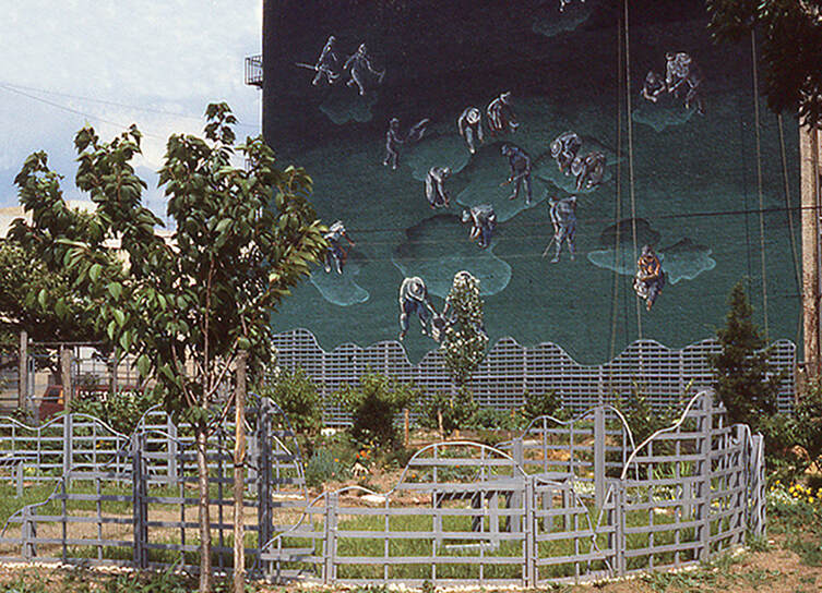 Maria T.D. Inocencio and Mark R. Smith, Significant Movements 1985 , Enamel paint, wood, copper tubing, vines Mural with trellis 49' x 60' Sculpture 14' x 30' x 4" Mural by Smith and trellis and vine installation by Inocencio. S-F: And I know that you two did at least one project together early in your art careers. Can you talk about that experience? Maria: Our first project, Significant Movements, at the Pleasant Village Community Garden was a wonderful experience. New York City had a program, Operation Greenthumb, where they leased empty lots – in economically challenged areas to neighborhood groups for $1 a year – to create community gardens. The Artists in the Gardens program paid artists a small stipend to make art in those gardens. I don't remember why we decided to apply as a team, but it was a great idea because the space was so big. Mark: We met with the residents and went to work on a mural and sculptural installation that incorporated climbing vines. It was a life-changing experience and we made life-long friends there--our daughter is named after the garden's principle organizer and beloved neighborhood activist, Rose Gardella. We even got married immediately afterward because the experience gave us confidence that we could get through anything together. It was a perfect moment and it didn't seem to matter much then who had the agency to be there, it was such a mix of collaborators. Maria: Mark painted a mural, and I built a sculpture of trellises and vines. So, while we collaborated on ideas, we were still working on separate pieces. The artworks were pretty good for a couple of first timers, but for me the best take away was the engagement with the people living in the East Harlem neighborhood. We worked closely with the gardeners and got to know about their lives. One gardener, Manuel, helped me a lot with digging holes and pouring concrete, but I could only speak high school Spanish and he had limited English. Mark worked with a Vietnam vet who helped him with scaffolding for the mural. After the piece was installed, I taught summer art classes to some local kids. Mark: And as far as our collaborations are concerned, I think Maria and I just liked connecting with people. We met and fell in love in art school and we were living in these vibrant but infrastructurally challenged neighborhoods, the East Village, Long Island City, and Greenpoint, which were full of a cultural mix. In the early 80s New York City was just emerging from the urban collapse of the prior decade and artists were doing all kinds of improvisational things in taking over abandoned spaces and creating place. When we do work together, it is a challenge to sync up our creative ambitions, but we manage all right-- one of us usually speaks up if the other seems to be going off the rails. We're both hard workers and are each very process-oriented. Process is how we imprint ourselves on the work. As a result, our projects usually end up involving a ton of labor, but hopefully there is a sense of love and commitment that emerges as a result.  Maria T.D. Inocencio and Mark R. Smith Significant Movements, 1985 S-F: Maria, over the years you have employed a variety of creative strategies and materials to make work that incorporates geometry, abstraction, representation, radial symmetry, collage, text and more. I’m alway surprised by each new direction and in awe of how your results are without exception so formally striking. Can you talk about your various approaches and how they developed? Maria: At Cooper (Union), we were required to take foundation courses in every medium and a shop techniques class that introduced us to various materials - wood, metal, plastic, etc. As a result, I feel a flexibility to use whatever means is appropriate to get my message across. When I make something, I come up with the message first, then decide what method and materials to use. For example, in Remembering Every Day, I wanted to express my feeling of loss when my mother-in-law, Jean, passed away. So, I created a process: every day for a year I tried to remember something about her, then make a color association, and paint the color in gouache on a square of paper. I chose gouache because it is easy to use in a daily exercise, and because it is so warm and velvety. Using that material made the experience of recording my memory pleasant, and the experience for the viewer more inviting. I used the geometric forms of a grid and a spiral because they are familiar and common; the spiral in particular is meant to draw the viewer into the piece. 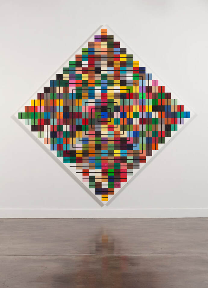 Maria T. D. Inocencio, Remembering Every Day 2018, paper, gouache, Flashe, glue, colored pencil on wood panel 113" x 113" (Photo: Stephen Funk) Maria (continued): In Come Together as Light I wanted to create a feeling of shelter and comfort, while talking about time, and the idea of reflecting on one's daily experience. The audience for the piece would be workers in an office and I hoped that the art could function as a way to take a break, while continuing to engage after many viewings. I chose photography because it is a literal representation of a moment, and as a medium, it is easily manipulated in designing for symmetry. The trees convey shelter, nature and comfort; the symmetry represents reflection. Collage makes sense here for the ease of installation in a large space, but also because of the idea that time is made up of parts, equal and unequal, similar and different. I used stitching as a reminder of the hand, the individual, and the quirkiness and unpredictability of each step as we move forward each day.  Above: Maria T. D. Inocencio, Come Together as Light 2022, digital prints, wood panels, paper, paint, glue, thread, 10' x 20' x 7' (Photo: Dominic Nieri) Below: detail of Come Together as Light  S-F: Mark, one of the distinctive elements of your work is how you often transform something so ordinary (fabric swatches, a zipper, etc.) into completed objects of monumental beauty. Can you talk a bit about your relationship to repurposing materials in a world that is so full of discarded objects? Mark: I've always been drawn to taxonomy and collections of sorts. I've gathered things forever and really started thinking about it as an aesthetic after visiting the bird and insect collections at the NYC Museum of Natural History. When I returned to Oregon, I got busy collecting artifacts and little bits of decaying debris from a farmstead that was still in our family's possession. There were some old quilts and clothing there too. That process somehow evolved into what I'm doing today, in going to the Goodwill bins and digging out discarded clothes to make into art. I like the idea of fixing or rescuing these items and having the opportunity to respond to a pre-existing palette of colors, textures and patterns to work from. It seems like less of a responsibility than starting from scratch. There's always some kind of history embedded in these things which is powerful whether it visibly surfaces in the art I make or not. I'm not a hoarder, but I have lots of stuff at home that is invested with so many histories and residual content. It's an overwhelming sensation at times but very potent and worth exploring as art.  Mark Smith, Stress Formations ( Pyramid Assembly) 2023, Laser engraving, acrylic paint, laminated papers, 13" x 13" Hand-cut paper figure cutouts and crocheted doily. These items are directly scanned and assembled into an image file for engraving. (photo by Stephen Funk) Mark (continued): Another part of me is drawn to sports and its ritualized conflict. In another life I would have enjoyed designing athletic uniforms. When I look for clothing, I'm always after the perfect stripe and for the past few years I've worked almost exclusively with striped fabrics, cutting and reorganizing them into segmented, interlocking forms. Thinking about the collective history of all these materials, I've been organizing my forms based on communal dwellings and gatherings, Fourier's visionary phalansteries and sports arenas, also beehives and termite mounds from the natural world. These are spaces where conflict and cooperation play out. I'm really bothered by all our cultural rifts. This is how this concern manifests in my work I suppose. 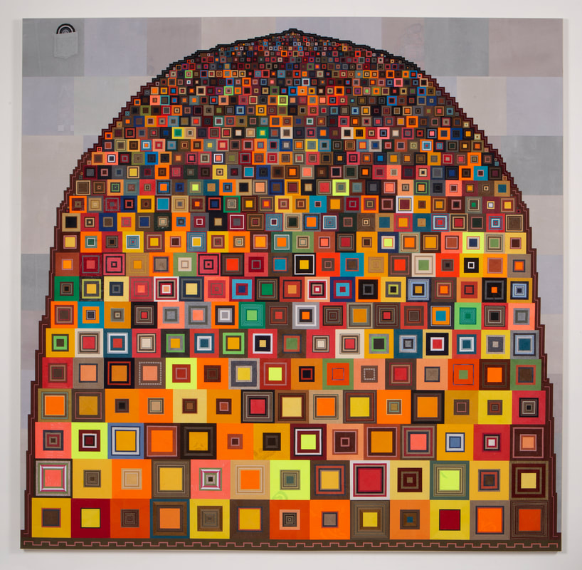 Mark Smith, Large Tent with Lanterns at Half-light 2023, repurposed textile construction, 94 x 96 in. (Below: detail of Large Tent with Lanterns at Half-light. Note: the concentric moon design in the upper left can be removed from its pocket.) (photos by Stephen Funk) 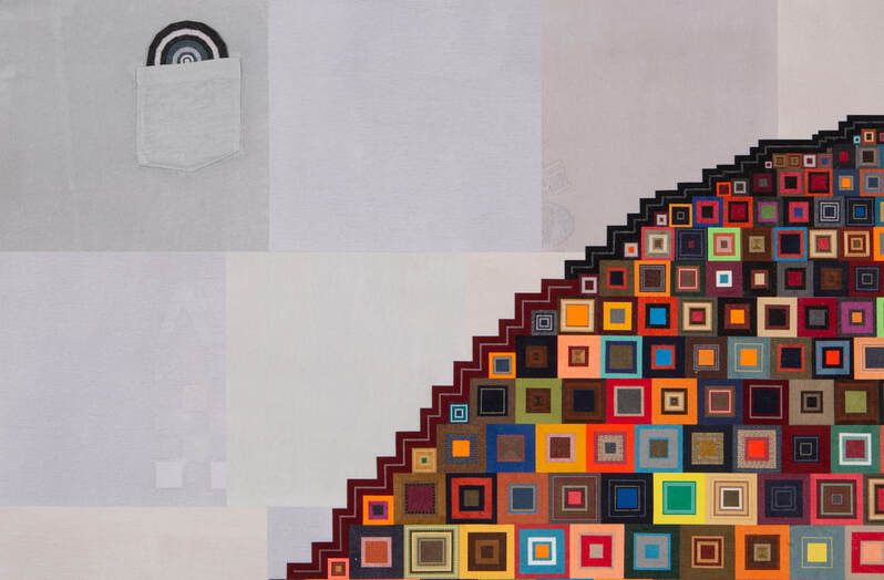 S-F: Mark and Maria: It looks like you both use a lot of systems, math and planning to engineer your finished pieces. I’m so curious about how you each balance organization and improvisation. Mark: I use very minimal math in organizing my work--only to the extent that I need to plan out the scale progressions of shapes. Ultimately, I tend to work very intuitively, based on structural relationships and color interactions, already having that social collectivism content as a driver. The recent large fabric collage work you saw in our studio resembles the shape of a beehive, but more specifically, an enormous tent. The neighborhood where we live has a large concentration of urban campers. It has prompted me to remember the Democratic "Big Tent" philosophy from the Clinton years, where social priorities were all about inclusivity and making all voices matter. Obviously, we've failed miserably in meeting that mark. But as a meditative rumination on that ideal, I designed this work by stacking mitered fabric squares, large to small in progressively diminutive rows until the tiniest square of all, at 1/4 in. scale, rests by itself on top. I had to figure out the math of making the squares in each row smaller, while still conforming to the overall shape. I used a calculator to figure it out, but it was still a somewhat comical process. And certainly there is no perfect symmetry in the piece, intentionally so. 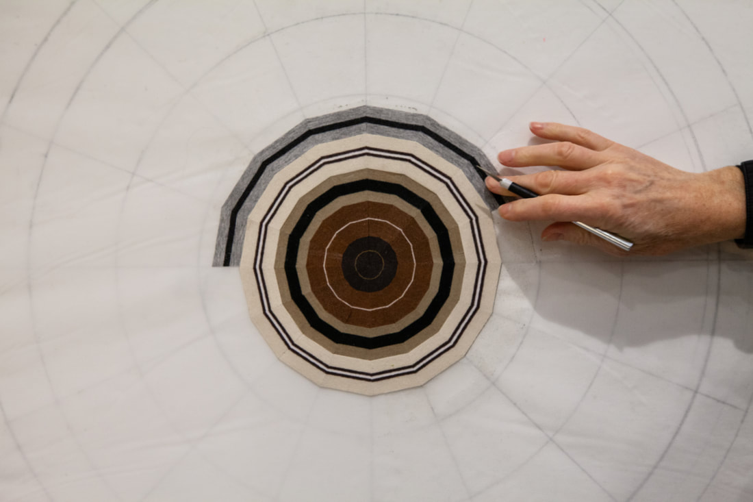 Mark Smith mapping out one of his fabric constructions. (photo by Dominic Nieri) Maria: I love math! My dad was an engineer, and I was a good math student. In the past, making work while raising children, and now, while taking care of my mom, requires planning because there is no time to waste. So, my strategy is to create a process and then follow through. The process may be "sew for 100 days" or "take a photo while you walk" or "record how long it takes to do a task." But within each process there is variability built in. In Thirty-One Days I took a walk or drive every day for a month, found a color that caught my eye, took a picture and recorded the time and place. I painted the colors and arranged them on a square panel, one per day, in the order that they happened. Then I put the squares together as a calendar of days. That is the organizational part. The improvisational part is that I didn't control what I saw on my walks, I didn't control how they were arranged on the squares or how the colors interact when put together. The planning made the painting without me making design decisions, which can be stressful and take up a lot of time. 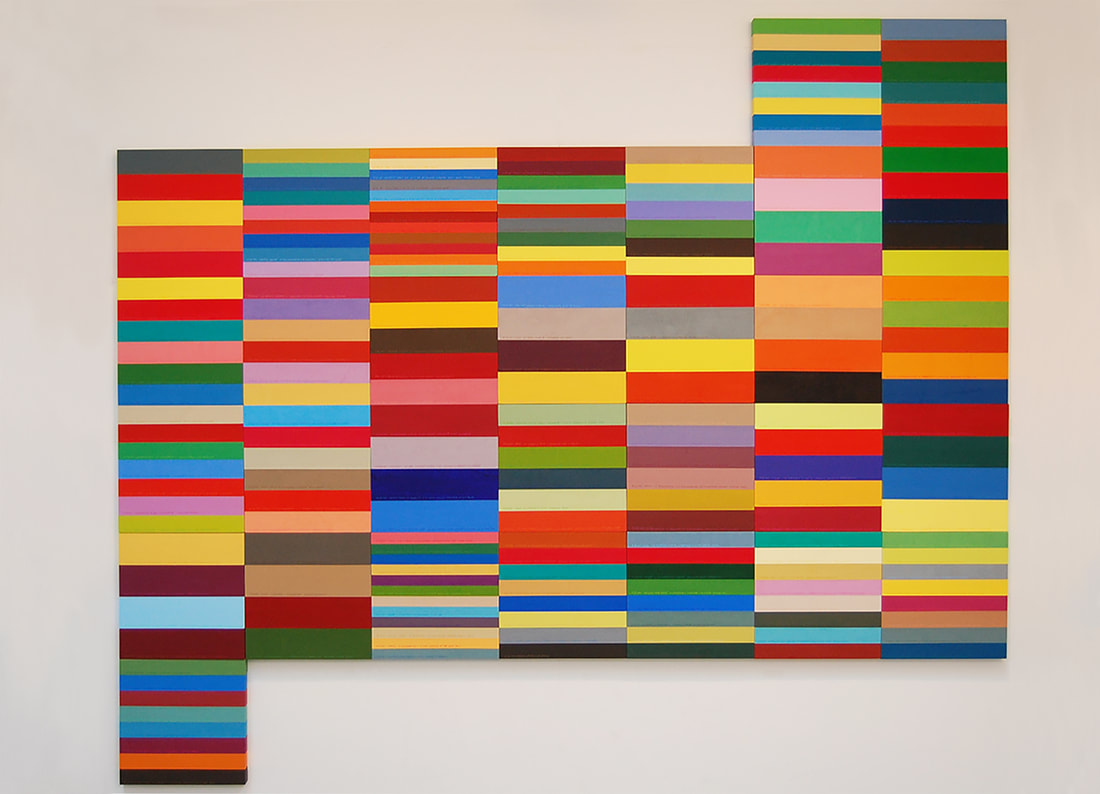 Above: Maria T.D. Inocencio, Thirty-One Days 2011, wood, acrylic paint, paper, glue 72" x 84" x 1.25" (Photo: Maria T.D. Inocencio) Below: A glimpse of Maria's process for a project she is currently working on. 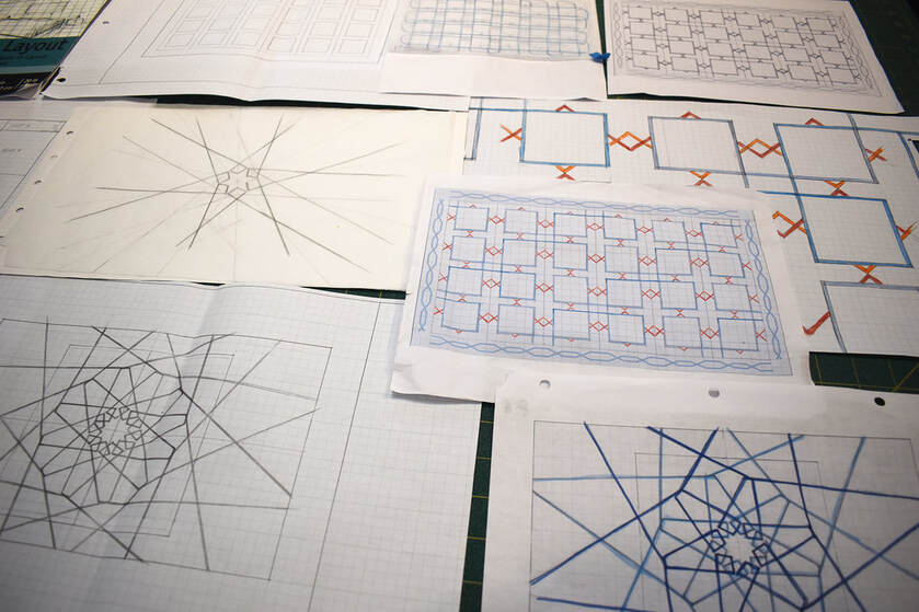 S-F: Neither of you shy away from incorporating overt beauty into your work. Can you each talk about your relationship to this elusive, subjective and at times fraught subject matter? Maria: I was always concerned about making something beautiful; as if it is a dangerous thing to pursue, that maybe by trying too hard for beauty you might create something empty or cloying. I try to set up situations that sidetrack my ability to make the artwork beautiful. Following a predetermined process helps with that. I am often inspired by a beautiful idea and want to make art about it. So, I make a plan and trust that the result will succeed in conveying that beauty. For example, Where We Touch is based on my volunteer work at the two schools my children attended. Teachers, students, parents, neighbors all worked together to build large projects - one for each school. I was struck by the cooperation, accomplishment and enjoyment among the wide variety of people. They were different in every way - culture, politics, colors, ages, but were able to work together towards a common goal. That was beautiful, and I wanted to share that beauty through an artwork.  Maria T. D. Inocencio, Where We Touch 2006, string, paper, thread, 93" x 100" (Photo: Aaron Johanson) At the time my daughter and her friends were middle schoolers making friendship bracelets for each other, which seemed like a lovely gesture. So, I decided to make the artwork with friendship bracelets. Each bracelet would represent an individual in the community. My process started by asking each person to measure their wrist and choose their favorite colors. Then in the studio, I hosted bracelet making parties and people came, had cookies and coffee, and sat side by side helping each other make bracelets. It was so much fun. I sewed the bracelets together (in a grid) so that each person's bracelet was connected to the bracelet of a friend or family member. The elegant result was reminiscent of a safety net. It was a nice metaphor for the community of relationships that we create around us. In Heirloom Waterfall I wanted to honor the women who came before me – the tradition of weaving, stitching, sewing and everything that is called "women's work", their earnest labor, their knowledge – all handed down for us to appreciate. It made sense to place the handmade linens and dresses in layers and descending from the oldest on top to the most recent at bottom, flowing like a waterfall. (By the way, none of the pieces was damaged by the installation.) It's hard not to find beauty in the detail, the intricacies, and the material delicacy of the heirlooms, each containing a story and asking the viewer to connect it to their own. Mark: When I engage with art, I tend to enter through its physicality, looking at and thinking about how something is made. I like to be affected viscerally. There's so much information embedded in the physical manifestation of a work and that point of entry leads me to the content. It's just how I make sense of things. So beauty tends to be synthesized with the process of making and if I can demonstrate some kind of deep commitment to realizing a visual form, I feel like it's my most potent tool. I wouldn't want to deny or withhold anything from someone who's willing to consider my work.  Mark R. Smith, Stress Formations (Small Tent Beating Heart) 2023, laser engraving, acrylic paint, laminated papers, 13 x 13 in. each (photo by Stephen Funk) S-F: As an occasional creative team, you both seem capable of setting your egos (at least partially) aside and working on a project together. How did you get started collaborating and what’s it like to go through that process as artists that each have such strong, independent and well developed voices? Maria: We've been making art and have been together for over 30 years and have evolved as artists together and honed our communication skills. We respect and admire each other's work. I think we have complimentary skills; I can do some things he can't and vice versa. We are mindful of celebrating each other’s ideas and talents. Most importantly, we want the piece to work, so every element that goes into the artwork has to contribute to its success. Typically, the reason we collaborate is to accomplish a particular project with a specific purpose. We approach the project from the same starting point, so there isn't one lead and we are equal contributors. The great thing is that his strengths and perspective are different enough from mine that the process is additive, and we often get more than if either of us worked alone. It gets layered, more complex and hopefully more effective.  Above: Mark R. Smith and Maria T.D. Inocencio, I Used to Think I Knew Everyone 2017, muslin, paper, newsprint cutouts, thread, glue, 84" x 83.5" Below: I Used to Think I Knew Everone (detail)  S-F: Both of you do work that is so engaged with notions of human connection and relationships at a time when a lot of people appear to be giving up on humanity in general. Talk about where that comes from. Mark: Maria and I are both very empathetic people and that condition just seems to be getting more acute as we age. I can't speak for Maria, but I am most comfortable straddling the art community and culture at large. I think I'm good at being a bridge. While I have so much appreciation for my artist colleagues, gallerists, writers, arts activists and patrons who drive this whole enterprise, I've never been wholly relaxed as an inside participant. I'm always concerned about the person who doesn't get it and needs to be brought into the fold. I've served as a community college art instructor for twenty five years and I've realized over time my real function there is to be a facilitator. I work with a lot of people who feel like they're on the outside and might not be deserving of or just don't know how to get access to this broader world of information and education and ultimately empowerment. So I try to help them build their confidence and find their voice and it doesn't matter so much in that context if I'm making work of my own, beyond providing the vocabulary. I love these students I work with and I think I'm effectively functioning as an art regular guy.  Above: Mark R. Smith, Stress Formations ( Circle Meet-up) 2023, laser engraving, acrylic paint, laminated papers, 13" x 13" Below: Mark R. Smith, Stress Formations ( Ornate Tower) 2023, laser engraving, acrylic paint, laminated papers, 13" x 13" (photos by Stephen Funk)  Maria: I was born in Manila, lived in Nigeria, then came to the states and, as a child, lived in 3 vastly different neighborhoods in different parts of New York. I have met so many different kinds of people from a variety of cultures, and each time lived within their worlds and adapted. There is always commonality to be found, always a friend to make. The work at Pleasant Village and then my volunteer work at my children's schools were experiences that deepened my belief that people are a lot more alike than they are different, and that they want to work together and can accomplish great things. Cooperation and accomplishment can encourage more of the same. Meanwhile, people have a good time and build goodwill and trust. I've done work that literally engages many individuals, and work that just presents the things we have in common. It's fascinating for me and I hope what I do is helpful. I'm happy if my work can connect, even if it is just one person at a time.
Maria T. D. Inocencio: projects underway in the studio. (photos by Maria T. D. Inocencio)  S-F: Who are you looking at (alive or dead)? Who is inspiring you in early 2023? Maria: In my job, I get a chance to look at a lot of local artists and it's especially good to see the work of people who are younger than I am. Zeinab Saab (@zeinab.saab on ig), makes thought provoking pieces on paper and she manages to talk about important ideas like identity, in such an elegant way. David Torres (@djtorresll on ig) is a media artist whose work I was recently introduced to. Both of them have amazing energy and I'm looking forward to seeing what they make in the future. People who are inspiring me include: Michele Obama, for her work and her representation of women of color; Tamar Benzikry, for her ability to raise two small kids while working in a corporate setting; my daughter Rosa, for her fearless pursuit of her art and her desire to have a positive effect on the world; and my son Richard, for his brilliant facility with all things technical and his steady commitment to a job well done. Mark: I greatly admire the work of George Johanson, who was always a hero for me through his full embrace of color, use of pattern and the general experimentation and playfulness of his work. He was also a genuinely kind person and perpetually curious about everything. I wish I had been his student. I've been inspired forever by the symmetry of lace and crochet patterns, quilts and all that hand work produced anonymously by women for time on end--the patience and commitment required to produce these works is astounding. Maria has a collection of crocheted doilies at home that has crept into my dreams. I have been a big fan of Brice Marden's Gonshi-inspired works--what I call his spaghetti paintings--featuring interlocking webs of calligraphic marks. They are wholly enveloping and mesmerizing to experience. Louise Bourgeois' fabric works are uncomfortably familiar and deeply psychologically felt. And finally the collage-based work of Jack Whitten, who I mentioned before, is monumentally elegant, quiet but expressively powerful. It serves as excellent proof that abstract work can be both beautiful and embody a social conscience. S-F: What’s next for each of you? Mark: I am working on an exhibition at Elizabeth Leach Gallery in Portland scheduled for March-April '23. The working title is Stress Formations. The idea came about by considering the events of the last few years punctuated by the covid pandemic, the large public demonstrations surrounding Black Lives Matter, the Women's March and of course, the January 6th Capitol riot. There was a fascinating contrast between what people were doing privately at home to cope with stress and the mass events that were unfolding in public. Our daughter Rosa had written a short essay about historical periods of stress such as the Irish potato famine and the two great world wars, where women (for the most part) turned to handcrafts, both as a coping mechanism, and as a means of income and production--think of Irish lace and Victory knitting. I used that as a starting point. My project will include a number of laser engravings which feature groupings of figures (cutouts from the NY Times) overlaid by scanned examples of Maria's doily collection here at home. The figures symbolize the crowds and public manifestation of our collective angst. Maria: Right now, Mark and I are working on a commission for a private client, and I've got a large-scale commission that is supposed to be completed by September. I also have a show scheduled for November of this year. Extra Credit: S-F: Is there a text that you would consider a touchstone or that acts as a sort of scaffolding for your work? Maria: Lucy Lippard's Overlay is important to me in the way it connects the art of prehistory to that of the present. Islamic Art by Lucio Mozzati is a book that I turn to often. It's an overview of art and architecture from the Islamic world over the centuries and it's gorgeous. It has an explanation of the relationship between geometry and spirituality that is so poetic, and diagrams of how geometry was used in creating the beautiful tile mosaics Islamic architecture is known for. Also, I read whatever I can find on the subject of time (most recently, Carlo Rovelli's The Order of Time) to try to better understand what time is and how we experience it. Mark: There is a book I've been informed by for several years, (first recommended to me by art historian Sue Taylor), Crowds and Power (1960), by Elias Canetti, which I've used before as source material that is also informing this show. It's a huge poetic treatise on crowd psychology and dynamics which continually returns to the notion of touch as a fueling mechanism. It's a hard read but is full of compelling imagery. As a person of Jewish ancestry in Europe, who somehow escaped the Nazi pogrom prior to and during WW II, he writes with a lot of generous compassion about unruly mobs of people. You can see more of Smith's work: - at Elizabeth Leach Gallery - on his website - on instagram: @markrsmithstudio You can see more of Inocencio's work: - on her website - on instagram: @mariatdinocencio
 Above and below: Maria T.D. Inocencio, Stones from her installation at Nine Gallery: Sometimes It's Hard To See 2021, stones, glue, hair, varnish, dimensions variable   Above and below: Mark R. Smith, Portals and Rabbit Holes 2021, installation at Meta headquarters, Seattle, WA  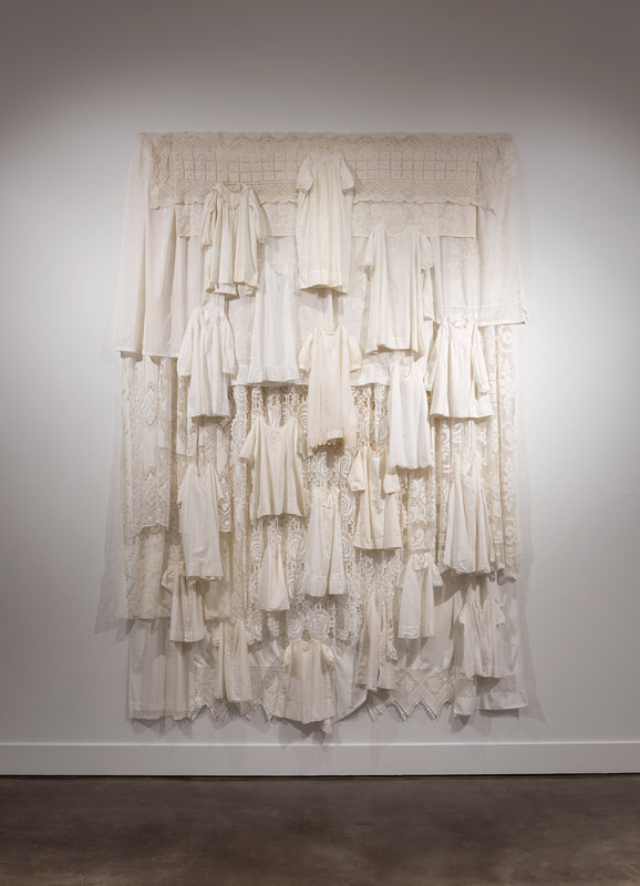 Maria T. D. Inocencio, Heirloom Waterfall 2018, linens, baby clothes, 108" x 77" x 7"  A corner of the studio.  A corner of the dining room.
7/31/2022 the semi-finalist is: brenda malloryBrenda Mallory was recently awarded a 2022 Hallie Ford Fellowship in the Visual Arts.  Proximate Parcels 2019, Deconstructed thread spools and cores, 70" x 34" x 4" photo by Mario Gallucci I find Brenda Mallory’s sense of craftsmanship to be endlessly appealing, in part because it never wades too deeply into the still and sterile waters of perfection. She instead opts to explore the swiftly moving stretches of a twisting river that brims with life and unpredictable currents. Mallory’s process is rigorous and exacting, but her finished products retain a handmade sensibility that is both idiosyncratic and graceful, equal parts animated and refined. Even when her work veers towards geometric abstraction, Mallory avoids the outer extremes of austerity and instead puts her energy into breathing new life into old objects, a process she refers to as “disruptions.” It’s an undertaking that is as much about a creative alteration as it is about telegraphing an optimistic take on humanity’s ability to mend what’s been broken. The treasures she creates out of rejected scraps are the result of hours of dedicated labor; they are also evidence that we can transform physically and conceptually. Through Mallory’s work I see a path forward that involves both caring for what was once neglected and placing what was previously discarded at the center of an essential conversation about our collective future. On top of all that, her work is just beautiful. When I visited Brenda Mallory’s studio in NE Portland, it quickly became clear that she’s a natural raconteur who effortlessly narrates the story of her life and work with an uncommon command of details and nuance. One of my goals with the Semi-Finalist interview series is to create a space where artists get to talk about their work on their own terms. Mallory makes that easy and this month I'm honored to present my interview with her. In it she talks about her Cherokee roots, making do, materials, process and more. Photos without credits are by me.
Brenda Mallory in her studio with a piece from her iconic Reformed Packings series (honeycomb paper, paint, encaustic) and a detail. The Semi-Finalist: Brenda, let's jump right in. Can you talk about any formative experiences in your life that had an impact on your work and career? Brenda Mallory: Growing up in Oklahoma as a child gave me an awareness of truly living in the land. My dad was a farmer, a hunter, a gardener. My grandfather was a beekeeper and also fished a lot so there was always good food on our table. We butchered our own meat, grew and canned a lot of our own food, gathered wild greens and mushrooms. We were pretty broke most of the time I think, but I didn't really know that. Living with those resourceful, scrappy relatives who truly held things together with baling wire informs who I am to this day. Visiting Oklahoma feels like a very different time and place to me now, but then it was a rural existence that left a bold mark on who I am and my visual language. In the 1980s I got a degree in Linguistics and English at UCLA. After that I worked as a preparator at the Museum of Contemporary Art. It was an exciting experience to handle the work of artists like Bourgeois, Nevelson, Hesse, Kounellis, works from Arte Povera movement - artists who I now consider big influences on my own work. 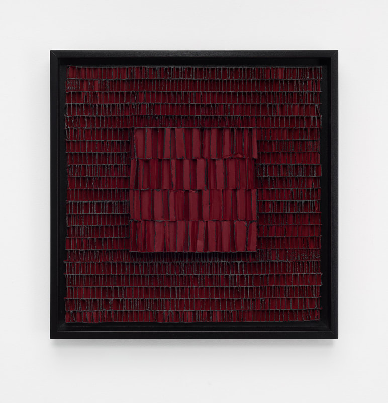 Reformed Packings #27(Emergent) 2022, honeycomb packing sheet, paint, encaustic, 18" x 18" x 2" photo by Mario Gallucci S-F: So much of what you do involves the transformation of ordinary objects (and sometimes literal trash) into objects of beauty. Where did the concept for this come from and how did your process and style develop? BM: I like the challenge of working with literal trash and found materials. It's like alchemical magic when something goes from looking like trash to become compelling, beautiful, "valuable". If it still looks like it came from the dump when I'm done, then I don't think I've succeeded. The idea that an object has more than one use, more than one life in it is what appeals to me. I talk sometimes about the idea of "making do" with what you have on hand as a survival technique - and in the bigger picture, that "making do" isn't only about objects - it can be about learning a new place as displaced immigrants have to do, learning new plants and weather patterns, new ways to function in a new society to make a place your home. Some of this comes from thinking about the Cherokee side of my family with the history of forced removal from historical homelands to an unfamiliar place. Resourceful people turned what no one else wanted (at least until they did) into a new home. 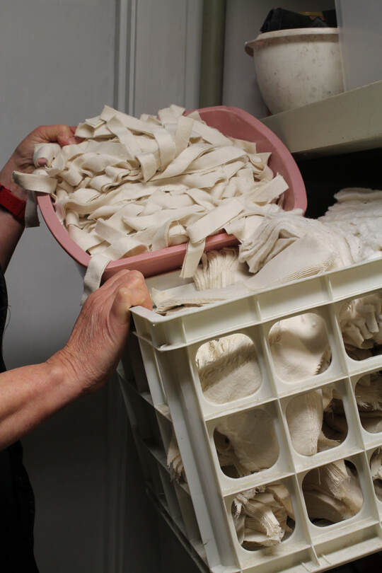 Above: Scraps in Mallory's studio that will inevitably have more than one life. Below: Seeds embedded in handmade paper (WIP). 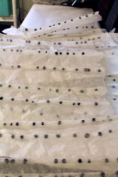 S-F: During my visit to your studio you expressed some frustration with one of your unfinished pieces and casually mentioned your desire to make it “sing more.” Later you stated that for you the studio is a place where “meaning is emerging.” I love that evocative language in reference to form and content. Can you describe what you mean by “singing” and “emerging” in relation to your work? 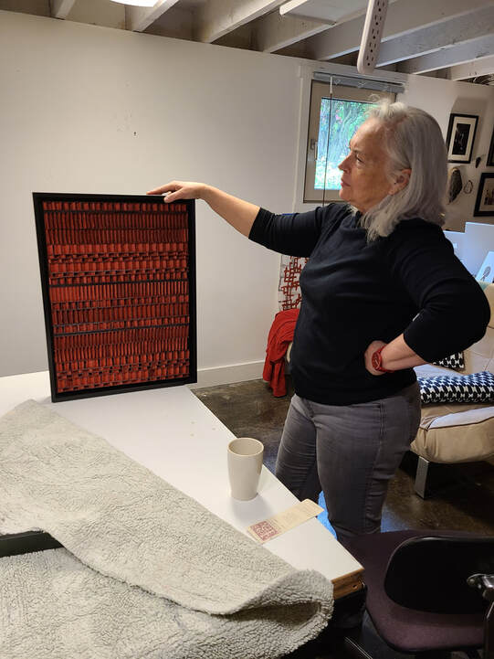 Brenda Mallory in her studio. BM: In that particular red piece I was talking about, I did end up repainting it and adding two bands of black. Honestly, I'm not quite sure what is going on formally that it is better now - maybe it was too much of the same thing before without enough variation. Or maybe there was too much variation! Perhaps these bands of black became an organizing device. I like to think of my work as complicated minimalism. There's so much going on in every piece, but it's often a repetition of the same shape or form - like a field of wheat. It's lively, full of motion and variety, but really just a field. 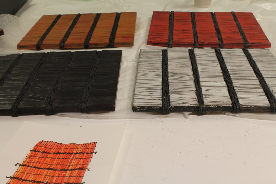 Works in progress in the artist's studio. "...the patterns, the repetition, the material richness are all compelling aspects in the same way an ocean view is pleasant, or a box full of blueberries." 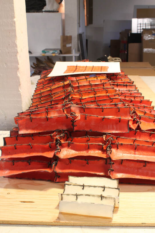 S-F: At a time when a lot of art is overtly engaged with social and political themes, your work remains largely abstract. Talk about that. BM: I think a lot of information can be found in abstraction and I think it engages your brain in ways that allow for nuances and multiple interpretations. I'm not interested in the "overt." There are definite social and political themes in some of my work, but maybe it's not obvious at first glance or without reading my statement or without knowing my history. That said, I think any viewer can access my work in some way - the patterns, the repetition, the material richness are all compelling aspects in the same way an ocean view is pleasant, or a box full of blueberries. But some of the ways I put things together (the hog rings, the nuts and bolts, the obvious seams) are unexpected and a little "wrong", and those elements move the pieces out of just the "pleasant-view" realm and cause questions to arise. 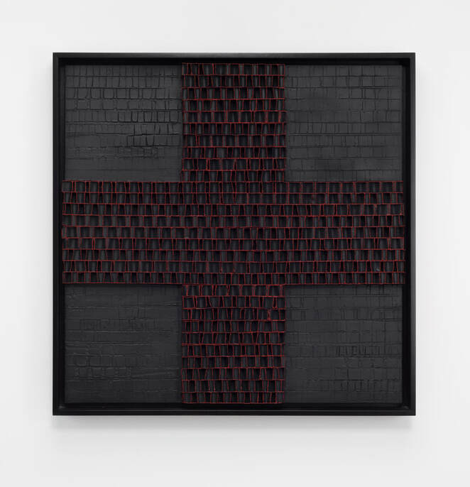 Reformed Packings #23 (Star) 2022, Honeycomb packing sheet, paint, encaustic, 32" x 32" x 2.5" photo by Mario Gallucci 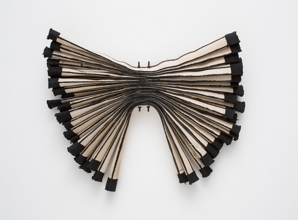 Firehose Experiment #3 2015, deconstructed linen firehose, paint, threaded rods, nuts, 24" x 28” x 3” photo by Mario Gallucci S-F: You recently spent a bit of time on the east coast for a residency and a theater collaboration. What were you doing in each and what kind of impact are they having on your studio back in Portland, OR? BM: I collaborated with Christopher K. Morgan and Artists on set design for his work, Native Intelligence/Innate Intelligence. My first residency was with this company at the The National Center for Choreography Akron back in 2018. We built sets in 2020 at a two -week residency at EMPAC (the Experimental Media and Performing Arts Center) in New York and then boom, COVID hit and everything shut down. It's finally scheduled for a premier in DC in October, then will travel to multiple venues. Working on a collaborative project has been a real growth experience and different from how I usually work. I’d like to do some more work with him.  From the performance at the end of Mallory's EMPAC residency in NY. The set design was the result of a collaboration between Mallory and Christopher K. Morgan and Artists. photo by Brenda Mallory S-F: What's next for you? BM: I am working toward a show that opens in April 2023 at the Heard Museum in Phoenix and also a show at Russo Lee opening in May.  At the Fringe 2019, waxed cloth, paint, nuts, bolts mounted on wood panel, 33.5 x 74 x 2 inches photo by Mario Gallucci  Zen Scrubber #1 2015, Nylon industrial scrubber pad, rubber drive belt, plastic cable, 60" x 18” x 6” You can see more of Brenda Mallory's work: - On her website - At Russo Lee Gallery in Portland, OR - On instagram @brenmallory - At Atlanta Contemporary (through September 4, 2022) - and many other places (see links on her website) Below: More Mallory.  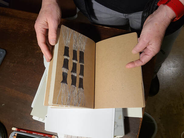 Above and below: Mallory's studio in the basement of her NE Portland bungalow acts as a staging ground for all phases of her process, from research and initial drawings to packing work up for shows happening locally and around the country. 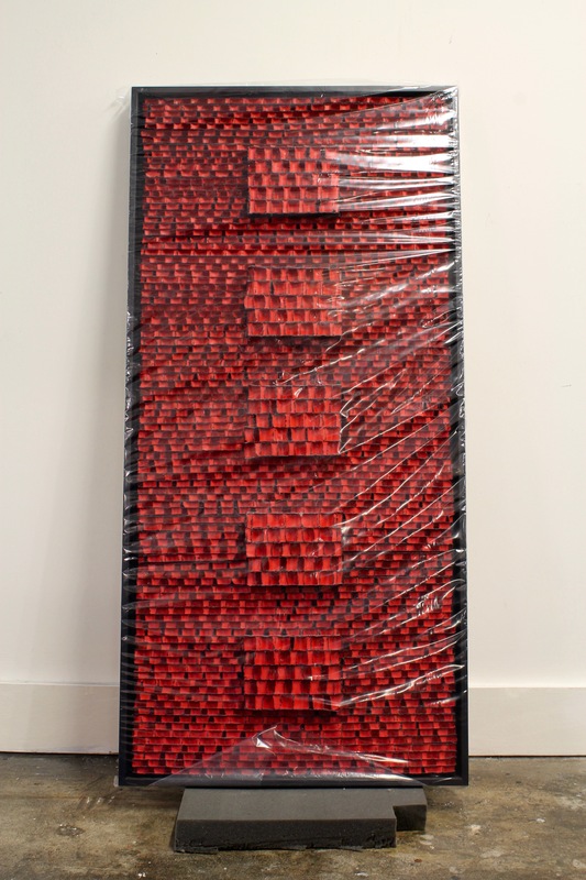 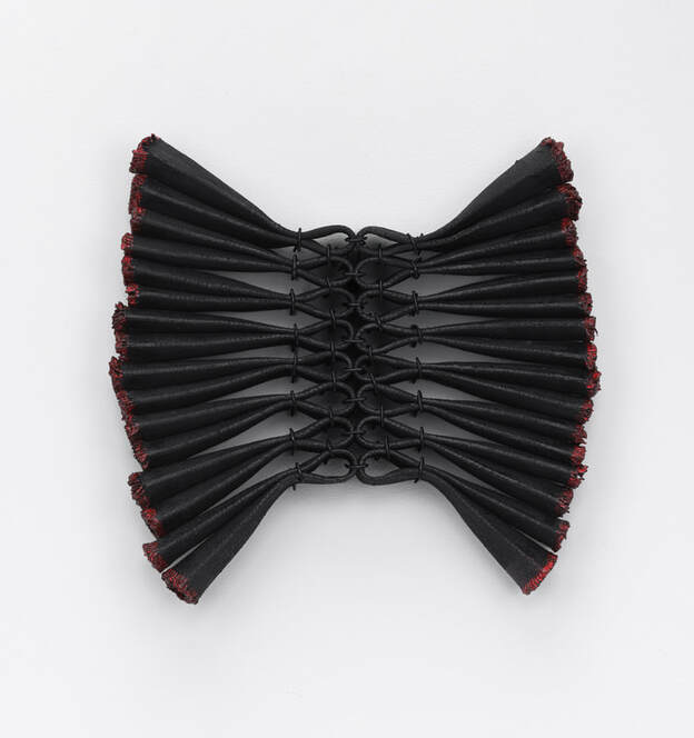 Firehose Experiment #15 (black_red bioform) 2022, Linen firehose, paint, hog rings, 13" x 15" x 2.5" photo by Mario Gallucci 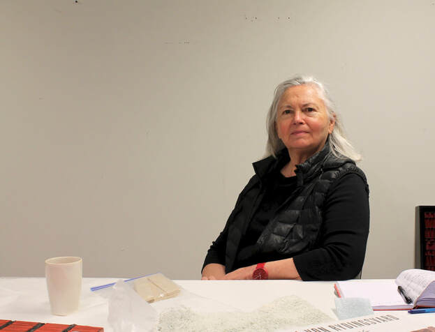 Brenda Mallory in her studio.
|
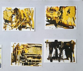
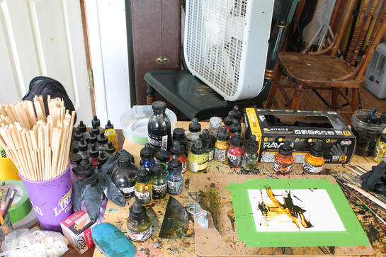
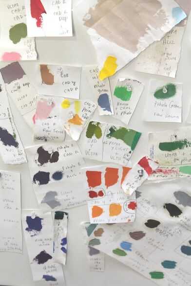
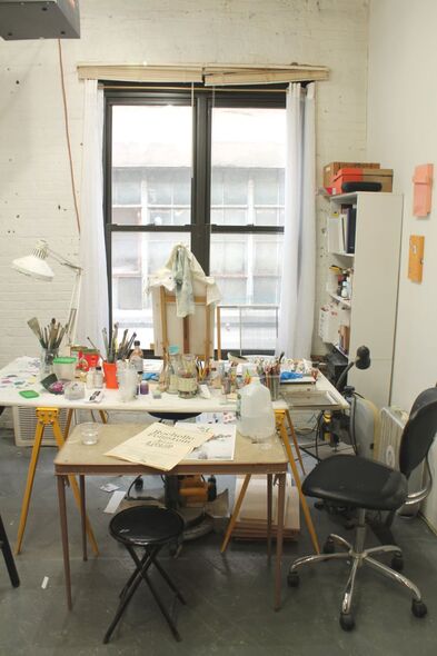
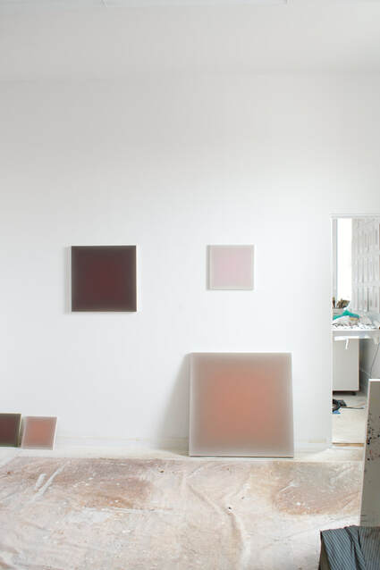
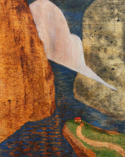
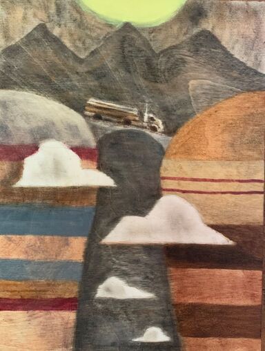
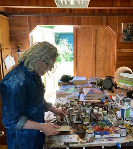
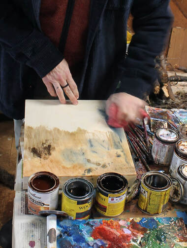
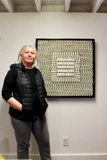
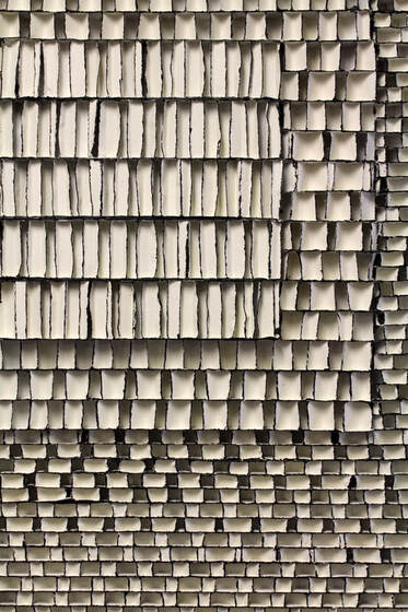
 RSS Feed