|
3/6/2022 The semi-finalist is: Dan gluibizziLake Swim 2021, watercolor, acrylic and colored pencil on paper, 36" x 30" The work of Dan Gluibizzi refuses to be superficially defined by its subject matter, a trick that seems almost impossible to pull off given its overt nature. Instead, Gluibizzi leans into his preferred themes of sexuality, identity and human connection, giving his paintings a solid conceptual foundation that supports both their depth and complexity. What could have easily become a simple homage to prurient interests in another artist’s hands is instead a tender yet comical investigation of our desire and willingness to be exposed; what could have been a cheap punchline turns into a poetic story that slowly unfolds, allowing its characters to be seen as whole human beings. I’ve spent a lot of time thinking about why Gluibizzi’s paintings resonate with me, a process that has resulted in an ever expanding list rather than a succinct, clarifying statement. They are of course fun and cheeky. And the directness of them - even the portraits- is somewhat shocking in an era when it is nearly impossible to be shocked. But I’m also drawn to Gluibizzi’s unapologetic use of bold colors, simplified shapes and compositions that resist predictable hierarchies. He is an artist that knows how to deliver a graphic punch that is both technically rigorous and visually seductive. I’m charmed by how his figures interact with one another, retaining their humanity even as they are reduced to an essence that sits somewhere between characters in a village scene by Brueghel and individuals populating the pages of a Tintin comic book. They are anonymous yet specific, immersed in a bath of color that merges the projection of confidence and unabashed sexuality with the fragility and insecurity that at times makes a home in all of us. This month I'm pleased to bring you my interview with Dan Gluibizzi. In it he talks about his process and shares some thoughts on intimacy and human connection. The artist in his SE Portland studio. The Semi-Finalist: I’m always interested in an artist’s first steps. Can you talk a little bit about how you got started? Dan Gluibizzi: I grew up surrounded by art, art books and art magazines. My father is an artist and my mother is passionate about art and early childhood education. I grew up in Lancaster, PA. Museums and galleries in Philadelphia, Washington D.C. and New York City were regular family destinations. Family friends were artists and I enjoyed listening to the banter and debates. I loved drawing. As a child, I received a lot of encouragement with endless art supplies and dedicated spaces to make a mess. I spent countless hours in my father’s studio watching him draw and paint. I equate the smell of turpentine with childhood. It felt like a seamless transition to art school and early adulthood. I worked for over 10 years in galleries, museums and auction houses in Boston, LA and New York City. I participated in the logistics of the art world and art market while slowly learning what kind of artist I wanted to become. Cast 2020, watercolor, acrylic and colored pencil on paper, 40" x 32" S-F: During my recent visit to your studio you mentioned being grateful for the opportunity to put in a lot of studio time. What does a typical day look like for you? DG: My studio is in our backyard in a detached oversized garage. My wife leaves for work very early. I do the morning breakfast and off-to-school routine with our child. I turn on the studio lights around 8:30-9. I create daily to-do lists to attempt to hold myself accountable, I always have one or two top-of-mind projects in the works. Depending on deadlines I will be making things in the studio all morning or prepping for future projects, organizing and looking. I am chatty, and though I enjoy working alone, I need conversation. Thankfully I have a network of friends and colleagues that are willing to share a few minutes of their day for regular phone conversations. I like talking while I work. After school pickup and family dinner I return to the studio to tinker and consider what I did during the day. The flow of continuous shorter sessions keep efforts in the studio feeling fresh. I often do a few hours throughout the weekend. I especially enjoy predawn studio time on a Sunday if I can force myself to get up. A corner of the studio. I keep the studio simmering if not boiling at all times. Something must be new, in-the-works and almost done. I drag out old work often to remind myself what I was thinking about and striving for weeks, months and years ago. I have piles and piles of works on paper. All holding potential for rediscovery. A confirmation of my current direction or a reminder of alternative directions. My studio feels like my childhood bedroom: a workshop, a laboratory and a hideout. I aspire for my studio life to measure up to these lines by Robert Frost: My object in living is to unite My avocation and my vocation As my two eyes make one in sight. S-F: Your work makes me think so much about how people open up to others and present elements of their private selves in relatively public forums. Can you talk about how the role of intimacy and exposure entered into your work and how it’s developed over time? DG: I watched my father make countless portraits of friends and family as a child. Though I did not understand fully at the time, I was witnessing an act of intimacy between the artist and the sitter. Conversations about the intimate relationships between artist and subject continued when we visited museums and galleries. I vividly remember peering through the hole in the door of Marcel Duchamp’s Étant Donnés at the Philadelphia Art Museum around twelve years old and wanting to know more. Voyeurism, intimacy and art began to blend. Six Men at Camp 2021, watercolor, acrylic and colored pencil on paper, 40" x 34" I’ve long been an avid collector of images. Found snapshots, newspaper clippings, scrapbooks and pornography piled up as source material. As a young artist I would seek out the lurid and transgressive. The explosion of online imagery allowed for image collecting at an industrial level. I found titillation in the sheer volume and repetition of imagery. Despite the staggering abundance of available imagery, drawing hundreds of nudists at the beach and exhibitionists exposing themselves at box stores has felt like an intimate experience. Six Women at Camp 2021, watercolor, acrylic and colored pencil on paper, 40" x 34" S-F: One of the things that I really appreciate about your work is how you resist automatically lumping together nakedness with eroticism. That conflation is something of a default setting that we often see in movies, television and on social media. But there’s something more nuanced happening in what you present. Can you describe what you’re going for in your paintings and drawings that feature a lot of skin? DG: Thank you! I certainly enjoy drawing and painting all manner of frolicking and canoodling however I am not making entirely prurient works. I aim to make associations between my source material and the depictions we have made of ourselves over thousands of years. Especially those of nudity and joy. Distilling images and creating unlikely pairings makes me feel like I am connecting to the continuum of human expression. Left: Studio drawings Right: All Elbow 2017, watercolor, acrylic and colored pencil on paper, 60" x 42" S-F: During my visit to your studio you stated that some of your recent paintings and drawings use computer generated portraits as their source material. The final images, however, still adhere to your distinct (albeit developing) style. I find these recent pieces to be graphically seductive and at the same time conceptually really curious. Tell me about what’s going on with them. DG: I employ a lot of repetition in my work. Recent bodies of work feature a recurring cast of characters drawn from social media, current events and vernacular imagery. I enjoy how, with just a few changes, the recognizable can be obscured while still holding on to a sense that this is a real person. I am intrigued by computer generated faces. I want to engage with them. A.I. is now creating new beings. They may only exist for a moment or they may become stock characters for ad campaigns. The A.I. generated faces remain uncanny. Our eyes are so good we can read the slightest bit of wrongness in these nonhuman faces. Yet when I draw them they come to life. I am excited about the potential. A viewer might not see the difference but I think I use the material in a different way. I feel I can push and pull the faces in ways that I resist when the person is real. It is a curious and energizing feeling. Above: Small Cast 2021, oil on canvas, 50" x 42" Below: Two Groups of Three 2021, oil on canvas, 11" x 10" S-F: Talk a bit about your new 3-D work. What inspired you to try turning your unapologetically 2-D paintings into sculptures? DG: I have been making cut-outs since art school. I enjoy making carvings and low relief sculptures but rarely exhibited those efforts. I’ve always admired painted sculptural works by Alex Katz and Tom Wesselmann. For a recent exhibition in Tokyo, I designed a small sculpture created with laser cut transparent acrylic that captured the look and feel of my works on paper. The table top size was very appealing as I am a fan of bric-a-brac. I am also beginning to see the possibilities for large scale pieces that can move into large spaces. Now I look at finished 2-D work and wonder how will it could become a sculpture. Still developing… Studio shot with cut-outs and MFMF (Pink) 2019, acrylic and baltic birch, 16" x 6" x 9.5" S-F: Which artists are you currently looking at (alive or dead)? DG: Like many of us I scroll Instagram often. I enjoy following my friends and discovering artists I have not seen before. The phone is frustrating as I know it is not providing an accurate experience but I still feel like I am making a connection with art outside of my sphere. Recently I have been looking at Pace Taylor and Nora Riggs. Also Nicolas Poussin, Frans Hals, Jared French, Joan Brown and Ellsworth Kelly drawings, especially his lifetime of self portraits, I am currently listening to an engaging biography of Rene Magritte. I feel connected to the discussions about Magritte’s image sourcing, the approach to making an object and the ways personal experiences enter a work of art. Russian River 2021, watercolor, acrylic and colored pencil on paper, 38" x 21" S-F: What’s next for you? DG: I just curated a spread for Math Magazine, an inclusive sex-positive publication that features a range of art and eroticism. I was delighted to feature works by Amy Bessone, Howard Fonda, Trulee Hall, Jo Hamilton and several other wonderful artists.New paintings are underway for my next show in Portland at Russo Lee Gallery. You can see more of Dan Gluibizzi's work: - On his website - at Russo Lee Gallery in Portland, OR - On instagram @dangluibizzi More Gluibizzi Four Kisses 2021, watercolor, acrylic and colored pencil on paper, 30" x 40" Above: Nine in the Waves
2020, watercolor, acrylic and colored pencil on paper, 36" x 32" 12/13/2021 the semi-finalist is: andrea borsukSilence and Revery From The Virtues: Surviving a Pandemic 2020, mixed media on paper , 11’ x 15” From my first visit to her studio in the early 2000’s, I have felt that Andrea Borsuk’s core personality is being mirrored in the compositions that she builds from memory, photos and observation in her Santa Cruz studio. Borsuk is honest, open, and radiates a warmth that immediately makes anyone in her orbit feel like family. It shouldn't be a surprise, then, that she also approaches image making with a deep well of compassion for human relationships and a seasoned skill set that allows her to depict them. She understands that life’s big moments can often seem ordinary, even lonely. And with the keen eye of an illustrator and the sharp wit of an editorialist she’s also capable of showing us how simple gestures and the mundane can somehow feel monumental. Her depiction of a boy mowing a lawn has stuck with me since I first saw it a few years back. The scene is a small moment embedded within a larger composition (A Life Span), but in Borsuk’s adept hands the quirky adolescent doing his chores becomes an awkward sisyphus performing what to any young person feels like an eternal task. Striking a more serious tone, her 2016 paintings of embracing figures are more relevant than ever and are the perfect antidote to a world built around various forms of isolation. The small but tender gestures of consolation have an immensity of feeling that stretches far beyond the modestly scaled surfaces they are painted on. Andrea Borsuk’s gracious acceptance of both the joy and absurdity found in so much of life is infectious and ultimately up-lifting. Even at its most surreal, the work is often infused with the sense that the good gals (and occasionally guys) are winning. And when they’re not, they are depicted with the respect that they deserve. My personal theory about the optimistic tenor of Borsuk’s work is that it comes in part from the poses that her figures take. From the quotidian to the stylized, isolated or in groups, they always seem resilient enough to take on what life is offering up, which alternates between run of the mill malaise and the truly apocalyptic. But I also sense optimism in another part of Borsuk’s practice: her unapologetic embrace of decoration, flourish, pattern, design and all things beautiful. It’s as if the work itself is saying that no matter what sort of shit-show we’ve found ourselves in, we’re going to pull ourselves together, rise above our circumstances and build something wonderful for tomorrow and the tomorrow after that. Well, today I am very pleased to have the opportunity to bring you my interview with Andrea Borsuk. In it she discusses her process, what inspires her and the never ending allure of Italy. Andrea Borsuk in her studio. Santa Cruz, CA The Semi-Finalist: Tell me about your formative years. How did this all get started and who influenced you early on? Andrea Borsuk: I learned to how to appreciate art and paint while studying in Florence, Italy as an undergraduate almost forty years ago. Before leaving, I took a landscape watercolor class and I fell in love with painting outdoors. I discovered the work of artists, Piero della Francesco, Giotto, Caravaggio and Pontormo while studying and I traveled around a lot, painting small on-site watercolors. When I returned to California, I finished my art degree at UC Santa Cruz, then left for 20 years, and now I am back again in this beautiful town. Fighter From The Virtues: Surviving a Pandemic 2020, mixed media on paper, 11’ x 15” That pivotal year in Italy was when and where narrative painting was planted in my heart. Storytelling would continue to be meaningful to me. I discovered at a young age that paintings could be loaded with content and beauty and it was the first time I was introduced to the power of allegory— people might not have been able to read words but they sure could read images! So I became a die-hard figurative/image- based painter all through graduate school and “allegory” was my middle name. When I attended Columbia University for my MFA in the late 80’s, the artists I was looking at were David Salle and Eric Fischl, Cindy Sherman, Nancy Spero, Ida Applebroog, Marlene Dumas, Annette Messager, Sigmar Polke as well as abstract artists, Terry Winters and Brice Marden. They were all my heroes in the art world. While living in NYC for a number of years, needless to say, I drank up the art and devoured dance performances, in particular, Pina Bausch. Her poetic, dramatic and physically humorous stories on stage were riveting. I witnessed the popularity of video art, especially the work Bill Viola and his non-linear ways of story telling and his fondness for greater themes tied to human gestures. These influences confirmed my connection to the human body, performance, dance and narrative art. Above: Wind Has A Mind of Its Own 2011, oil on wood panel, 36" x 72" Below: Instructions Not Included 2010, oil on wood panel, 30" x 40" My work developed using concepts of seriality and multiple styles. I wanted to paint the figure, but not in a traditional narrative way. I was interested in exploring the female body, but with an acknowledgment of feminist discourse and the complex history of its portrayal in art. What I really wanted to do was stage performances but I loved painting, so I stuck with that. I have continued to be intrigued by possibilities of imbuing a painting with signs and messages about psychological and social issues concerning mortality, love, and what is it to be human. I also love abstraction about as much as I love figuration, so the combination of all of these things continue to be important to my work. Above: A Life Span 2016, oil on wood panel, 24" x 30" Below: Life Graph 2016, oil on wood panel, 24" x 30" S-F: I know that Italy is a big part of your life. Can you talk a bit about how traveling and periodically working there has impacted your painting? AB: The food is better in Italy… and a well-fed artist is a happy artist! I have been traveling back and forth to Italy for many years, mostly out of a pure love for the culture, the landscape, the museums and churches, and the improvisational “dance" that I observe on the cobbled-stone streets and piazzas. Talk about inspiration! I am fortunate that I also teach there in the summers, so it’s a good excuse to spend time in a place that is so dear to my heart. I can’t walk by a church without stepping inside in order to surprise myself with so much beauty. I feel like a tiny person in a HUGE jewelry box! The architecture and its ornamentation, the site -specific artwork, those in-situ narrative paintings and sculptures (REAL LIFE installation projects) have certainly had a big impact on me, despite the fact that I am Jewish and had never set foot in a church until I was 20 years old! I never knew the biblical stories and, no surprise, I am way more attracted to the formal aspects of pattern and ornamentation, pictorial structure, color and light, than religious messaging. Frustrated From The Virtues: Surviving a Pandemic 2020, mixed media on paper, 11’ x 15” I’ve looked at a lot of Renaissance and Baroque painting and so many amazing ancient relics throughout the years. I realize that everything I am attracted to eventually finds its way into my work, even if it is not intentional. For example, the predellas in Renaissance altarpieces, which are usually a series of small- scale narrative paintings depicting events from various lives (usually in a horizontal format on the bottom or side of paintings) have found their way into my work. I have been drawn to this format and aspect of storytelling, which is often intimate, forcing the viewer to come close and read the work like a scroll or like story boards that show sequencing and a disruption of pictorial hierarchies.The figures are usually small and the backdrops are dramatic. I am nuts for the over-the-top embrace of elaborate, decorative, frescoed or tiled walls, artifice and embellishment surrounding beautifully painted images AND, of course, the flowers, candles and sacred objects that dangle like jewelry in every nook and cranny, the beautiful altars, cameos and charms, the sacramental ornaments and the overabundance of memento mori, reminders of our fragility— all of these symbols of mortality have become part of my vocabulary. I am fascinated with the rituals and talismans that are regularly used in quiet places of prayer, but I also love the fact that we wear good luck charms, rosary/prayer beads, or animal teeth (!) on our bodies as personal prayers for the health and safety of those we love. To Console/Consolare 2016, oil on wood panel, 18" x 18" Museums in Italy and the Venice Bienalle are also a bonus for learning and inspiration and I can say that viewing so much art informs and inspires me on multiple levels. I love looking at art probably as much as making it and I see it as a gift, especially as a teacher and as an artist. I can’t remember dates or times, but I can recall an artist’s name and their work! When spending time in Italy, I treasure the details of life with the streets as “backdrops”, observing daily life as people who go about their routines like an improvisational dance or play. There is a quality of life that is so PUBLIC and essential— the eating and socializing, kissing in random places, putting laundry on the line, or watching elderly couples holding hands while taking an evening pasegiatta— these human gestures don’t seem to have changed much in all the years. Yes, it feels like I am in a Fellini movie- I love the ritual of parades and all ages walking and eating together, the piazzas filled with so many generations. There are not as many places to watch this where I live, and certainly being in travel /observer mode while in Italy makes me more aware of life cycles and family rituals— essential actives within a life span. I sketch a lot when I am there, but mostly as an excuse to sit quietly and observe. I am happy that I got to grow up in LA in the 70’s, but in an alternate universe I would have loved to have grown up in small Italian town. I am super fortunate that I can spend time there and I also love coming home to the studio to process it all. Entanglements 3 2021, water media on paper, 22” x 15” S-F: I think of you as a storyteller that loves to hint at a narrative through your paintings rather than spell things out. You often present a fragment of someone’s ordinary day, a moment of stylized dance, or a quick peek at a surreal fever dream. Can you talk about these glimpses into the lives of your subjects? AB: I have often thought that if I weren’t a painter, I’d be a fiction writer or a film maker. I love observing people and I am equally keen on human interest stories. All of the figures I choose to insert into my paintings are significant to me for one reason or the other. In every work I usually incorporate some aspect of human representation, trying to connect to a common thread in the long history of storytelling in art. The dance of human movement throughout the world, it seems, is a type of pre-verbal or primordial gesture. I see the figure as a hieroglyph or part of an alphabet of human emotions, like symbols from ancient calligraphy. I was recently looking at Egyptian drawings at the Met and I was amazed at the relevancy and universality of the human form. We are still eating, touching, fighting, dancing, and making love (ok, we weren’t using our phones yet). I am continually searching for ways to paint or draw a gesture showing how a person can be doing something with a simple posture or how an interaction with another figure or an object begins a story. My figures are often de-personalized or “generic” and often dislocated from the rest of the space. Generally, these are not portraits of specific people. They are instead archetypes of people or an action that might reference a psychological state of being —like an adjective or an expression. Gestures and postures on Borsuk's studio walls (2020). In my search for the essential postures of being human, I wonder how a gesture can communicate meaning that is open- ended, timeless and possibly universal, like movements that evoke a state-of- mind, like love and sorrow or what it feels like to be a baby (comfort), a toddler who is just learning to walk (precarious balance, growth and confidence), teenagers and how they stand while talking to each other (posture and rebellion), a parent or grandparent holding their first grandchild (pride, aging, love), people embracing (empathy, passion), or someone who is sick and being cared for (fragility, mortality). These are some of the characteristics that I am interested in depicting— humanistic symbols of our emotional connections as well as stages in life and how we age together. The figures that float in and out of my work often refer to themes that address mortality and fate, perhaps a direct reference to my own life (and middle age), parenting and watching my own family evolve, or references to current events that affect all of our lives, such as climate change, personal survival, and where we happen to live in the world. I do think of the evolution of my paintings and mixed media works are like ancient frescoes, where there are representations of the human form that have survived the elements of weather and time. What we are left with are fragments of people, landscape, color, textures and patterns. And we are left with the mystery of the message. As a painter using imagery and the figure, it is difficult to avoid being didactic, which is why I try to avoid more traditional narrative painting devices like putting figures in a specific place and spelling out a storyline. European classical tradition would be only one strand in my work, which feels constrictive to me. I certainly use images to tell parts of a story and by adding things and taking things away- a process of covering and uncovering- a new story is invented. The choices of what I bring into a painting (all of the elements) are very cloudy until they interact with a brush stroke, a color, a pattern or a drip. There are certain characters I use again and again, because they are like a word or a mark that needs repeating. The “story’ or content is not what it is all about for me— representation of the human figure is just one of many elements that I can use within the structure of a painting. I approach painting like a collage, with many disparate ingredients that could be read as surreal by the fact that there is disjuncture and an irrationality to the order of things, but I like to have open-ended conversations with paint. Above: Waiting to Breathe 2020, oil on wood panel, 24” x 30” Below: Trouble In Paradise: The Covid Gates 2021, gouache on paper, 11” x 18” S-F: One of the things I really respond to in your painting and drawing is your confidence with a broad range of techniques. It’s almost like you’re continually trying to coax these distinct modes of expression into living together on a single surface when many artists would rather be searching for one coherent, singular style. Talk about that. AB: I want to have it all in my work. I am greedy. As I approach a painting, it is always with an awareness of paint application and how many choices I get to use with paint. I am equally compelled to look at and create formalist, decorative, expressive, systems-based AND representational, narrative work. I don’t want to have to choose. Paint can do so many things and I know that I am never satisfied painting “consistently” within one frame (and one frame is often limiting to me as well!). It's a great challenge for me to figure out how the different approaches and applications with paint can coexist in one space. From a drip to a gestural mark with the brush, allowing accidents, creating contrasts with patterns and textures, introducing extraneous collage bits, and also rendering highly articulated forms— these are on my menu of options from the grand smorgasbord of painting techniques. The Bargain From The Virtues: Surviving a Pandemic 2021, mixed media on paper, 11" x 15” I want to create disjuncture AND harmony — how can these marks coexist to create beauty and meaning? The ingredients of the painting can consist of references to the ordinary, every- day life, or broader mythical stories, but these are also about using paint and celebrating its properties. Ultimately, I ask, how can these events —brush marks, stains, drips, and gestures, create a new order of existence and conversation? My painterly challenge is to utilize contradictory elements that speak to each other within a space. I am aware that ultimately, painting is an activity that can also have a life after it is created— to be read and interpreted — that there is not just one message. This aspect of forcing the viewer to do some of the work, to make connections between, for example, a brushmark that can mimic the human gesture or that stylization and repetition via paint can also be a metaphor for our own patterns of behavior, is what interests me. The Perseverance of Chance 2020, oil on wood panel, 24” x 30” The S-F: Who are you looking at (living or dead)? AB: I’ve seen a lot of shows this past year— between New York, San Francisco and Italy, there was a lot of see, post-pandemic. Recently (as in the last month) Gustav Klimt—the influences of Byzantine and Renaissance art within his work are so obvious, but it didn’t occur to me how much abstraction co-exists with the figure. Bruce Nauman— talk about using such simple ideas with gesture, seriality, format and symbolism! Hands down, he understands and delivers. I’ve always cherished the decorative and symbolic with Shazia Sikkander, Wangetchi Mutu, Leonora Carrington, Nick Cave, Nicole Eisenman, Firelei Baez, Inka Essinhigh, Etyl Adan, Jennifer Packer, Marcel Dzama, Salmon Toor, Hannah Hoch, Joan Mitchell, David Park, Piero Da Francesco, the ceilings at the Uffizi, The Giorgio Vasari House in Arezzo and Cy Twombly… to name just a few! Materials and inspiration. S-F: Whats next for you (shows, collaborations, teaching, etc.)? AB: I’m in a group show right now, called “Don’t Shut Up” at the Newhouse Cultural Center in New York. That was supposed to follow the election cycle, but was postponed 2 years because of Covid. I love the concept of participating in interesting- themed shows because I cover lots of topics in my work and usually something relates to something else. I am collaborating with a lighting designer and metal artist who have a beautiful new gallery in downtown Santa Cruz, which makes me excited to create more public work. During Covid, I have loved the time and space in my studio to create small works on paper, lots of experiments and also works that reflect what we have been through these past few years. Not having the pressure to produce for a show has actually been a good opportunity to re-evaluate my goals and to play with new topics as they arise. I will be teaching my Mixed Media Art (and yoga) workshop in Tuscany this summer, which will coincide with the 2022 Venice Bienalle —the exhibit this year is called, “The Milk of Dreams” and will focus on humanity and the body, so I will be curious to see that show. Emerge 2
2021, watercolor, graphite and collage, 11" x 15" 9/17/2021 THE SEMI-FINALIST IS: AVANTIKA BAWAPink Scaffold in the Rann 2019-2020, painted scaffolds, dimensions variable, Kutch, India photo by Arpan Films When I was asked last winter to create a satellite event in Portland, Oregon (USA) for “Que des Femmes/Only Women,” the 6th biennial of non-objective art in Pont de Claix, France, I immediately hoped for the opportunity to showcase the work of Heather Watkins and Avantika Bawa. Neither are exclusively non-objective artists, but both make work that defies easy classification and often resists the ever present prospect of rendering an illusion on a flat surface. Their work embraces it’s own objectness, even when it is alluding to something else in the world. There’s more about Heather Watkins’ work in the preceding post, but this one is all about Avantika Bawa. In a recent Instagram post featuring one of her 3-D printed modular scaffold sculptures, Avantika Bawa (@avantikabawa) wrote with understated precision: “#Scaffolds as Scaffolds.” Reading that short line was a moment of both comedy and clarity for me. I wanted to laugh out loud and at the same time I felt more deeply engaged with Bawa’s work than ever before. The phrase’s declaration that the scaffold simply is what it is was serious, cheeky, honest and transparent. As a sculpture, the scaffold makes no claims of mimicry or illusion. It simply asserts its ability to be two things at once - both a sculpture and a scaffold - and I was left wondering why I’d ever thought of the two as being distinct from one another. And this is how Bawa works- engaging in a sort of alchemy that, rather than producing gold, imparts a renewed perspective with which to see an ordinary object and its surroundings in an entirely new way. This month on The Semi-Finalist I’m pleased to present my interview with Avantika Bawa. She talks about her formative years, breaking down material hierarchies and allowing something to simply be itself. Avantika Bawa photo by Sam Gerhrke The Semi-Finalist: Your early years as an artist were filled with both the conventions of art school and the risks of moving to a foreign country. What impact did those experiences have on you as a young artist? Avantika Bawa: As the child of a naval officer in India, travel, geography, and the ability to constantly relocate nationally and internationally (New Delhi, Mumbai, Vizag and Baroda in India and Moscow and St. Petersburg in Russia among others) were always an intrinsic part of my life and have consequently shaped my art practice. In my early 20’s I moved to the USA for an MFA degree at the School of the Art Institute of Chicago (SAIC). The city’s orderly grid was a stark contrast to the chaos of the major cities in India where I was born and raised. Back home the built environment shapes and grows in response to people, whereas in the US it seems like the people are shaped by the built environment. In America, I was confronted by a layout full of repetition and redundancy: every US city has a Main Street, an MLK Street, and strip malls full of big box stores repeating like base pairs in the urban DNA. I realized that beneath this seemingly modular and redundant lifestyle there was something worth exploring artistically: the sameness that was never quite the same. Soon site, space and place, permutations and combinations of a single idea, became the core query of my practice. Since then, I have explored the diversity of topographies, the presence or absence of color in local environments, and the range of visual, tactile qualities of locally sourced and fabricated materials. A Yellow Scaffold on the Ranch 2021, painted scaffolds, dimensions variable Art Beyond, Ashland, OR, USA photo by Grace Prechtel S-F: How did your interest in minimalism - or a reductive aesthetic- develop? AB: In my formative years I was a bit of messy/ gestural artist. My line work was loose and organic, and my color palette earthy and full of chromatic greys. This aesthetic continued when I first arrived in Chicago, but soon I could see shifts in my colors, forms and choice of surfaces for both drawing and painting. During this time, I was working in a studio with clean white walls. Although it was just drywall, I loved that I could keep repainting it to maintain the starkness. This studio was one of several on the 15th floor of a building belonging to SAIC (The School of the Art Institute of Chicago). The common space of these studios was adorned with huge windows that overlooked lake Michigan and downtown Chicago. Office paper, ballpoint pens, mis-tinted house paint from Home Depot, etc., were much easier and cheaper to obtain than traditional art supplies. As a young artists, the abundance of low cost, manmade and everyday materials encouraged new ways of making. Realizing that the gestural, organic and messy were no longer interesting to me, I spoke with my advisor who challenged me to nail ten tacks in a row perfectly, and in a straight line. I did, and thought it looked beautiful. After a bit more pondering, I realized I really just needed 5 nails, but spaced further apart so they would engage the pristine white walls in the work. That may have been a turning point. And then the aesthetic grew. Or should I say reduced!? Or should I say I nailed it? I guess that would be tacky. Above: an early, gestural painting from 1993. Below: Box Blue, 2003, cardboard, tape and latex paint, 6’x4’x3’ photos by the artist S-F: Your past work has engaged explicitly with a location’s prior use, but your recent scaffolds suggest a different way of thinking about a space. How do you see them as being distinct from your past work and where are they headed? AB: From the late 90’s to fairly recently, I have been largely focused on site-specific installations. Bearing in mind a location’s prior use, I create wall drawings and/or paintings, and repurpose and rearrange functional objects to create temporary installations on-site. Often accompanied by field recordings, these installations create immersive experiences that invite viewers to experience the crossroads between the utilitarian, historical, and aesthetic qualities of the space they occupy. Mineral Spirits 2016, paint, scaffolding, looped audio, 68'x43'x23' photo courtesy of Disjecta The Scaffold Series is an extension of the same sensibility but purposefully uses only scaffolds. I have made several iterations that take the scaffold beyond its functional purpose to an aesthetic engagement with space, thus allowing me to explore the endless possibilities of a single structure. I can do this by pushing permutations and combinations of color, form, scale and location while responding to the topography and geography of site. I intend to expand upon this series by exploring new terrain and different ways of configuring these installations. A Pink Scaffold in the Rann 2019-20, painted scaffolds, dimensions variable, Kutch, India photo by the artist S-F: When I was at your studio I asked you about how your work differs from decoration and you replied, “It is stoically itself.” I love that response and I've been thinking about it ever since! Can you expand on that? AB: I mean exactly that! The works are always or ultimately about the time and space in which they exist. All previous narratives, sentiments or prompts that may have initiated or informed the work become secondary or inconsequential. The work is then about itself. Stoically and unapologetically. Above: a small scaffold on a stool in Bawa's studio. Below: components. S-F: The intersection of the sublime, design and technology. Talk about it. AB: Well, the intersection of these three as such is kind of a general idea, but if I were to talk about them in the content of my work, I’d say they all inform my practice, and I prefer not to create hierarchies. Drawing vs painting, art vs design, the sublime vs the ordinary, the functional vs. the non, are all opposite sides of the same conversation, but when they intersect, or even collide, good stuff starts to happen in the studio. Where reference and object collide. Above and below: recent experiments in glass completed at the Yucca Valley Material Lab. S-F: What’s next for you? AB: This past August I installed work at the University of Kentucky (Lexington) Museum for Template Days, a two-person show (May Tviet and myself), curated by Stuart Horodner. I was very, very pleased with this pairing and curation since May’s work and mine express similar ideas, using the same language, but in a very different dialect.In mid-September I will be part of E/MERGE, an inaugural group show at the National Indo-American Museum in Chicagoland, curated by Shaurya Kumar. My piece for it involves a lot of pink, echoing my 2019-20 installation, A Pink Scaffold in the Rann. Later in October I will be installing work remotely for The Show Windows, Mumbai, India, curated by SqW:Lab and TARQ, and finally in November I will showcase more scaffolds for a group show at the Bellevue Art Museum titled Architecture and Urban Design. I have few other shows for 2022, but I will wait to talk about those! As for teaching, my University (Washington State University in Vancouver) just resumed in-person classes. It’s good to be back as more than a pixel and I hope it stays this way. Below: a few more shots from Bawa's studio. Below: A small scaffold at Sørvágsvatn Lake during a recent trip to the Faroe Islands. "I have made several iterations that take the scaffold beyond its functional purpose to an aesthetic engagement with space, thus allowing me to explore the endless possibilities of a single structure. I can do this by pushing permutations and combinations of color, form, scale and location while responding to the topography and geography of site." - Avantika Bawa More Avantika Bawa: Photos by David Schell unless otherwise stated. 9/16/2021 the semi-finalist is: heather watkinsstill-opening, 2020, linen and silk thread, 15 3/4" x 15 3/4" photo by Mario Gallucci When I was asked last winter to create a satellite event in Portland, Oregon (USA) for “Que des Femmes/Only Women,” the 6th biennial of non-objective art in Pont de Claix, France, I immediately hoped for the opportunity to showcase the work of Heather Watkins and Avantika Bawa. Neither are exclusively non-objective artists, but both make work that defies easy classification and often resists the ever present prospect of rendering an illusion on a flat surface. Their work embraces it’s own objectness, even when it is alluding to something else in the world. There’ll be more about Avantika Bawa’s work in an upcoming post, but today is all about Heather Watkins. During a recent visit to Heather Watkins’ studio, the multi-disciplinary artist shared that finding titles for her works can often take a long time and be something of an arduous process. If one is not careful, she suggested, the title of a piece can limit a viewer’s interpretation of it. References to places and things other than what the object is can anchor a viewer’s response that might otherwise be free to explore limitless possibilities. It’s in the expanse- goes the thinking- that one can be guided to an emotional truth rather than be tied to a mere description. The title, then, has the opportunity - or maybe even the obligation - to function like a poetic map rather than a fixed set of coordinates. And this goes to the core of my interest in and adoration of Heather Watkins’ work and process. She has an ability to sit with and ultimately celebrate the unknown and the unnameable. Her work is an invitation to experience with her the beauty that exists in a lack of clarity; it is a reminder that we don’t always have answers and that answers aren’t always needed. This month on The Semi-Finalist I’m pleased to present my interview with Heather Watkins. In it she talks about her formative years as an artist, her inspirations, and how waiting became a part of her creative process. Heather Watkins in her SE Portland studio. The Semi-Finalist: Tell me about your formative years as an artist. Were you drawn to abstraction early on, or did that develop over time? Heather Watkins: I think of several starting points, each related to a different medium or practice. From the age of 10, I had a camera of one kind or another. In high school, I took all the darkroom classes available to me. I loved everything about it, the immediacy, the technical knowledge, the craft, the process—it felt like I had found a new language. My undergraduate studies were focused on the liberal arts (I majored in English and World Literature; and Classical Studies with emphasis in Art & Archaeology), and while I didn’t have access to a darkroom during those years, I always carried a camera. Photography has continued to be one of the ways I engage the world around me, even though I rarely show photographic work in my exhibitions. I’ve been thinking about this a lot lately—how photography informs the other aspects of my work. After graduating from college, my work-life led me to a position as Publications Coordinator at the then-named Oregon School of Arts & Crafts. I took full advantage of a benefit extended to staff members: one free class per term. I worked through most of the Photography curriculum—all darkroom-based at that time, a lot of alternative processes (Arboretum, below, was made during that time). I also took a lot of Book Arts courses as well as some printmaking and fibers classes and workshops. Arboretum 1997, contact print from spliced medium-format film negatives on silver gelatin paper, 5 x 8 in. After three and a half years working at OCAC, I went to graduate school at the Rhode Island School of Design to pursue an MFA in Graphic Design. I was attracted to this program in particular because of my interest in working with images and text. RISD’S MFA in GD offered a grounding in how we make meaning visually, how visual language operates. I also loved the fact that photography and book arts courses were embedded within the graphic design studio curriculum. For me, graphic design became an interdisciplinary field where I could both deepen my grounding in craft—book arts, typography, photography, printmaking—and expand my work in more conceptual ways that blurred or dismissed categorical distinctions as to whether something was "design," or "art," or "craft." Desire Path (1-4) 2021 pigment print on archival rice paper, 10" x 7.5" each S-F: Artists often see themselves as "painters," "photographers," etc. in relation to their creative identities, but I don't get that sense from you and your work. You seem to embrace process more than any one material, which is really interesting to me. Can you talk about how you see yourself as an artist? HW: You’re absolutely right. Process is key. My work is rooted in material investigation—looking at, say, how different inks flow on different surfaces, or working with the drape and twist of certain fibers. My studio practice involves a lot of experimentation to construct a situation that will lead to unforeseen results, which I can then participate in, observe, react to, transform. Often I begin working on something without realizing where it will go, without a plan, just working from a curiosity about a certain material, form, or technique. At other times, newness grows out of a desire for variation in the ritual of the studio—some shift or growth in the energy or gesture. I sometimes describe drawing as the core of my art practice, but I think it’s more accurate to say it is driven by an interest in the process of drawing—both how I can make a line myself, and studying how lines appear and occur in the world: twisted tree branches; ruptured cracks in sidewalks; rippling reflections in the surface of water; tangled threads, etc.. I think of these as inadvertent drawings, and it’s that kind of aliveness, that raw energy that I want to access and generate in my work. In the early 2000s I was working a lot with found materials that were all lines—snags from beaches, netting, twisted wire I’d pick up on the street, and all kinds of yarn, ribbon, cording, string, rope, thread. I made installations, sculptural wall drawings, and table-top scenarios that built on the inherent energies of these materials. Arranging objects as a way of investigating material relationships has been a part of Watkins' studio practice since the early 2000's. Around 2007 I began to make drawings by pouring fluid ink onto surfaces and bending and tilting them to make the ink flow across the page. This process opened up several things to me: first, it was physical, very embodied work. A way to short-circuit my brain, by limiting my absolute control. I was part of the formation of a line or a drawing in a way that felt different, more collaborative. A coherence would surface as I made drawing after drawing in this way. Things like whether and how lines would run off the page; how slow or fast different inks moved; whether the drawings would be presented horizontally or vertically; whether they would be presented as a grid, or in a more organic/erratic arrangement, or singly. Above: Surfacing (no. 15) 2010, pigment and dye based ink on paper, 22" x 30" Below: Surfacing (16) 2010, pigment and dye based ink on paper, 22" x 30" photos by Dan Kvitka The ink-flow drawings—although works on paper—also felt very three dimensional, especially how the paper absorbed the ink and began to warp and bend the surface. At the same time, I was working with a different drawing process, stitching thread loosely through translucent papers, and allowing the huge floppy stitches to accumulate into on both sides of the paper into amorphic shapes. I love this kind of restlessness between two- and three-dimensionality. I think I was basically trying to find ways to free the drawn line from the surface itself. This observation led me into more sculptural work with fibers: saturating soft materials, especially cotton cord—in kiddie pools full of ink in my studio, then arranging it to dry in tangled and twisted formations between sheets of paper and cloth. I used all the resulting materials in different ways: the cording became large-scale sculptural wall drawings and installations; the imprinted paper became suspended scroll-drawings. A moment of process. Photo by Abigail McNamara A moment of product. (my photo from a recent studio visit) In 2019 I was invited to create an installation work at Front of House Gallery in Portland, an installation space and program founded by Jessica Helgerson, housed within the building where her interior design studio is located. The characteristics of the space were both exciting and daunting (18 foot ceilings!). I began to see a way to shift from creating an object to creating a space, working with the same materials I had been using to make sculptural wall drawings. I freed the line, finally! This was new territory and I am still thinking about the possibilities of working with space in a more intentional and immersive way. Drawing Room 2019, installation using cotton cord and india ink, Front of House, Portland, OR (USA) photo by Dan Cronin In 2014 I was invited to work on an artist’s book with the Portland-based publisher Container Corps—an opportunity to extend my process-oriented working methods in exciting ways. After many conversations with Gary Robbins and Zoe Clark about possible, I began to focus on the color blue, and on a specific type of book: the medieval book of hours, one of the earliest books available to the laity in Europe. Books of hours are companion books, usually small, intimate, personal—and functional: a device to guide meditation, prayer, devotional acts. I created a series of twenty-four “images” on polymer offset printing plates, using substances that would adhere to the surface and hold the ink. We scanned images of book ribbon traversing each page or spread. The final book, Hours, was printed in twenty-four different shades of blue, had no words (other than the title and the colophon), and a dozen actual book ribbons. Hours 2014, artist's book, printed offset in 24 colors, 384 pages, sewn binding cased in cloth-covered boards with foil-stamped cover 4 1/2" x 6" edition of 150, published by Container Corps photo by Heather Watkins S-F: Tell me about the conversation that takes place between your studio work and your love of language. Is it tense? Tender? A bit of both? HW: Definitely both! So much of my work feels like it comes from a silent, wordless, maybe pre-verbal place. And yet language surrounds it, and sometimes defines it. The task of titling artworks and exhibitions or writing artist’s statements—I would say that process can be extremely tense and tender. It’s a balancing act—trying to find language that offers entry points that feel true to me, without enclosing or trapping the work in a set of associations that are too specific. I try to leave room for what else might be lurking in the work—what else might it say? I am always interested in readings of the work that are hiding in my blind spots. Then there is the work that is literally made with language: works on paper that feature hand-drawn or traced phrases that offer a layered, evolving reading, like a mantra. “this is the only one,” or “it just is,” “not like anything.” I’m interested in how language begins to operate as abstraction—how these words, infused with meaning, start to slip from their definitions, how language turns in the mind. this is the one (verso) 2015, carbon tissue, 10 3/8" x 12 3/4" photo by Evan La Londe My newest work, Oracle, also employs language that hovers at the edge of comprehensibility. The video installation emerged from a simple studio ritual: drawing two or three words from a box of hand-written words and photographing them on an inked surface that I use to make drawings. The words were culled from two sources: past artist’s statements discussing my studio process; and the Prologue of Ovid’s Metamorphoses, which describes creation - the world coming into being. Over time, these images began to feel incantatory—like a message with no singular interpretation, a meditation on the act of interpretation itself. Answers to unknown questions. Above and below: Oracle Video installation presented at PDX CONTEMPORARY ART as part of the solo exhibition still—moving. 2021, digital video, no sound, 9-minute loop, projected onto a drawing. photos by Mario Gallucci S-F: I'm really intrigued by how your work slows down everything in its orbit and where that deliberateness comes from. Can you talk more about waiting rooms, your tumor, or just thoughts on marking time? HW: In 2008 I was diagnosed with a brain tumor near my optic nerve. I have had numerous surgeries and treatments over the past thirteen years, and fortunately, my condition is currently stable. While this experience has never been an explicit subject in my work, the waiting, watching, and living with something I cannot control has no doubt informed my work in ways I continue to learn from. In 2018, I presented an exhibition titled Waiting Room, a series of densely hand-stitched abstract forms that were “made in waiting rooms of one kind or another,” as I described in my artist statement. Shape, color, density, pattern, rhythm—these decisions were determined by an urge to distill and integrate a variety of influences, information, ideas: how textiles carry meaning; the growth patterns of organic forms, both in the body and in nature; the visual structure of a text; images generated for diagnostic testing; how our senses, emotions, and intellect intersect; the sensation of reading. Two embroideries from Waiting Room, Watkins's 2018 show at PDX CONTEMPORARY ART. Above: Recording, April/May, 2015, 2015, thread and linen, 14 1/4" x 16 1/2" Below: Recording, March (no. 1), 2016, 2016, thread and linen, 14" x 16" photos by Evan La Londe The act of making small stitches repeatedly, following the regular yet imperfect structure of woven cloth, is at once meditative and obsessive—it requires and reveals different kinds of attention. This work activates waiting. It records the labor of being (a) patient. This work is made of time and representative of it. My recent series, still—moving, charts a period of suspended time and stalled movement. Twenty embroidered orbs ring a room. Viewed close-up, variations between stitches become visible, tender, imperfect. Halos encircle their stilled/spinning forms. Propelled by a rotational energy, each seems to float or drift. Together, they echo the movements of planetary orbits. Their scale slips and shifts: near/far, macro/micro. Turning the embroidery hoop around and around over weeks and months, I begin to see them as portals out of this moment, opening into a yet unknown future. Two embroideries from still - moving, Watkins's 2021 show at PDX CONTEMPORARY ART. Above: still-humming, 2020, linen and silk thread, 15 3/4" x 15 3/4" Below: still-shimmering, 2019, linen and silk thread, 16" x 16" photos by Mario Gallucci When I think about how my work might meet the crises that are affecting our world with such force and speed, I think part of my response has been to listen and watch for what needs care and attention—to make room for rumination, quietude, renewal. To make time, and also to make time feel different. S-F: Who are you looking at (living or dead)? HW: Always returning to: Agnes Martin, Cy Twombly, Sheila Hicks, Tantric painting, Ann Hamilton, Helen Frankenthaler. Roni Horn: especially how language and literature inhabit her work, like her sculptural retooling of Emily Dickinson’s lines in Earth Grows Thick, or the running footnotes in Another Water. Rachel Whiteread: drawings in particular. Cecilia Vicuña: especially her extraordinary exhibition About to Happen at The Henry in 2019) Always reading. Recently: Eliot Weinberger, An Elemental Thing; Arthur Sze, Sight Lines; Terry Tempest Williams, Erosion; Anne Carson, Decreation; Teju Cole, Known and Strange Things; Ovid’s Metamorphoses (Allen Mandelbaum, translator); Nina MacLaughlin, Wake, Siren; Ali Smith’s seasonal quartet Autumn, Winter, Spring and Summer. I’m a big fan of David Naimon’s podcast “Between the Covers.” His deeply-researched conversations with poets and writers are energizing. S-F: What's next for you? HW: My solo exhibition still—moving just opened at PDX CONTEMPORARY ART (September 1 - October 2, 2021). It includes series of twenty embroidered works and a video projection/installation.
Top, middle and bottom: works on paper in the studio. More Heather Watkins: Photos by David Schell unless otherwise stated. 7/13/2021 the semi-finalist is: Kendra larsonThe Springs 2021, acrylic on canvas, 24" x 36" I’ve always had a soft spot in my personal canon for artists that embrace a certain sense of illustration in their work. For some reason this term - illustration - carries with it a bit of the pejorative. It’s as if a clear depiction is somehow not to be trusted, the directness of it is ironically seen as a form of deceit. Maybe it’s that, for many, the word conjures up notions of simplicity or mere entertainment. But in the right hands - I’m thinking of Charles Burchfield, Charles White, Wayne Thiebaud, and Kathe Kollwitz at the moment- the ability to illustrate is a way of amplifying an emotional state. These artists are (or were) keen observers of the natural world that we are tethered to as well as the social-political world that we are embedded in, and their chosen techniques help to bring their observations to life. Portland, Oregon based painter Kendra Larson is an artist that does not shy away from her technical ability or her desire to illustrate the feelings she has for the natural world and our place in it. She’s a painter that deals with the everyday- holidays, natural disasters, a drive through the woods to who knows where- and often uses photography to get started. But the source is just a starting place in Larson’s capable hands, and she rarely (if ever) feels the need to mimic what has already been recorded. Instead, her aim is to pull the viewer into a heightened reality made from a mixture of recognizable details and intuitive - almost impulsive- decisions about color, line and shape. What is photographically real becomes abstracted, and that abstraction is in turn more emotionally alive than the image that she started with. This month on The Semi-Finalist I’m pleased to present my interview with Kendra Larson. In it she talks about her formative years as an artist, her inspirations and process, and how her relationship with nature helped her to develop her voice as a painter. Two small works on the wall and Kendra Larson in her SE Portland studio. The Semi-Finalist: Can you talk a bit about your formative years? When did you start seeing yourself as a painter and who were your influences during that time? Kendra Larson: Painting and art have always been a part of my life. My mom always encouraged me, signing me up for all sorts of art classes. She was also an interior designer, so I grew up surrounded by her collections of geodes, masks, and etchings. Art was something I felt good doing. When things were bad it lifted me up and provided a welcome constant for me. I grew up in Salem, Oregon and have a little sister, Ashley. My parents divorced when I was young and we moved around town a lot. My grandma has owned a wig shop downtown for 50 years, so that felt like my true home. The artists I met in my early teens made a strong impression on me. Their courage and dedication to honesty was what I wanted to achieve in my life. I remember taking art classes at the Bush Barn Art Center in Salem and later interning with a glass artist, Wendy Brockhaus, in high school. She taught me how to make a white Russian. She clearly loved what she did and had a deep passion for art. Around that same time, my art teacher, Ms. (Shirley) Giesbrecht, became an awesome mentor for me. I admired her blunt honesty and approach to life. One time she asked if I wanted to fulfill a commission. I was so honored that she would ask me. I spent weeks painting a portrait of Miles Davis for the unknown patron and she encouraged me every step of the way. That’s when I started to think of myself as a painter. I don’t know where that painting ended up, but I still keep in touch with Shirley to this day. Santiam Pass 2021, acrylic on canvas, 24" x 36" Other formative moments in my life appear in my memory as vignettes. They often happen outside on trips, camping and hiking. Some that come to mind are:
Mill City 2021, acrylic on canvas, 36" x 24" S-F: Your daily drawing practice with oil pastels is both impressive and an inspiration! How did this get started and how does it impact your other work? KL: Awe thanks. This practice started with the pandemic. Being at home so much made me want to create smaller, more intimate work. I also thought of the drawings as a preliminary step towards larger paintings. Then, I fell in love with the oil pastels and it kind of evolved into its own thing. Oil pastels are so physical. It’s not like painting with a brush – there is nothing that separates my hand from the material. Perhaps this visceral process is a healthy antidote to all that time on Zoom. Then the wildfires started. I was deeply moved by the destruction. The smoke was a constant reminder of the loss of Detroit (Oregon), a place we have visited every summer since I was a kid. I found a photo from that fire and drew it. Noticing that the color was off, I drew it again. Then again to capture a more accurate feeling. After that, I just kept drawing the same scene almost daily. It kind of became a meditation on the fires. I’m not all that confident with my use of color, so it also became a way to explore different approaches to color. I mimicked other artists’ palettes, tried manipulating the colors digitally before drawing, and aimed to connect color with my moods. I tried to make ugly and cheerful and dreamy color palettes. Wildfire 2021, 24" x 36" So, the oil pastels began as sketches (and still are), but have also evolved to include this meditation on our place in nature, wildfires, and climate change. The drawings have made my paintings more layered, playful, and abstract. The thick oil pastel drawings have really highlighted how luminous thin layers of acrylic can be. The brush strokes, pours, washes, and scrapes take on a new, exciting character in the paintings. Sometimes chance and other times control dictate my actions and process is always a part of the work’s meaning. An oil pastel sketch from a series of daily drawings. What commitment looks like. S-F: I’m drawn to what I can only describe as the magical realism in your paintings. Sometimes it manifests itself as a blend of very specific places bathed in supernatural light and color; at other times you invent vast spaces inhabited by small, somewhat anonymous figures. How did you get started with this series and what can you tell me about it? KL: So, I started drawing and painting landscapes back at Caldera in 2005. Despite trying my hardest to make serious, realistic pieces they have always had a playful quality to them. The trees kind of dance, I think it’s just how my intuitive hand wants to depict them. I then moved to Wisconsin to go to grad school and watched my work become more nostalgic. All the paintings I created there were specific places I was missing and emblematic of events I didn’t want to forget. When I returned to Oregon that nostalgia shifted to an exploration of mankind’s place in nature. I was trying to seek out what makes the Pacific Northwest unique and where that fits into the larger discussion/ history of Landscape painting. I painted specific places, locations tied to NW literature, and collaged amalgamations of places. Geometric abstractions sometimes embodied the spirit or sound of a place. Steam Clouds 2021, acrylic on canvas, 36" x 24" A few years back, I took stock of my past work to better understand my trajectory. I noticed a through line of light in my work, so I pursued it more with paintings of night skies, fires, and fireworks. The fireworks paintings were partially sparked by a conversation I had with another painter about imagination versus creativity. I had mentioned that I love the moment when your logical mind steps aside to let your imagination take the wheel. Like when you are watching fireworks and your eyes relax and you can almost imagine the lights are tiny sparks a few inches from your nose. We all know they aren’t, but the contrast of the light against the night sky can trick our perception in just the right way. Green Fireworks 2019, acrylic on canvas, 36" x 48" Anyway, that conversation helped inspire my interest in light and other ephemeral parts of nature as painting subjects. Some people may not realize the complexity enveloped in landscape paintings. Our psychology and sense of identity is strongly tied to the place we call home. Dreamy and mysterious, landscapes can hold our deepest fears and enchanting hopes. A season or time of day can shift the mood. Landscapes can be a symbol of commodity as well as the sublime. Our past and futures are tied to landscapes. The Group of Seven Artist, Walter J. Philips once said “A landscape painting is essentially emotional in origin. It exists as a record of an effect in nature whose splendor has moved a human heart, and according as it is well or ill done it moves the hearts of others.” I do not take lightly the subject I am pursuing, but I often try to amplify what magic is already in a place. The way I move the paint or mix the colors heightens the mood. This reminds me of another Canadian painter, Emily Carr, who once said “Do not try to do extraordinary things but do ordinary things with intensity.” I feel that if my work can mirror (even just a little of) the wonder in nature and get the viewer interested in sublime places, then empathy will grow and spark positive changes for our environment. As for the figures in my recent paintings, I am secretly always thinking of the figure. My undergrad thesis was all large-scale portraits. I have taught figure drawing for 14 years, so I know and love the history and psychology wrapped up in the figure. In my recent paintings, the figures stand in for the viewer. That’s why they are anonymous – so they can be anyone and everyone at the same time. They are often lonely or contemplative or awkwardly interacting with nature. This kind of mirrors myself and how I feel outdoors. "In my recent paintings, the figures stand in for the viewer. That’s why they are anonymous – so they can be anyone and everyone at the same time." - Larson Above: The Abyss 2021, acrylic on canvas, 24" x 36" Below: Breitenbush Hot Springs 2021, acrylic on canvas, 36" x 24" S-F: When I was visiting your studio you talked about becoming obsessed with a theme in your work (haunted places, for example), but also wanting the freedom to move on when it feels right to do so. Can you describe that process in your work? KL: I think of painting all the time, every day, but my work comes in spurts between teaching, mom-ing, wife-ing, and acting as general contractor to our ongoing house rehab. These short bursts force me to act quickly and take breaks, which allows for an unexpected freshness. I am now more likely to notice and leave a gorgeous drip or accidental wash than I was when I was younger with endless time to overwork a painting. Why was I saying this? I guess I just wanted to point out my process since it kind of explains why I so often work from intuition. I feel lucky that I have found a concept in my work that allows me the freedom to explore, invent, and play with a variety of subjects and varied paint applications. My paintings often belong to small series of 10 – 20 pieces centered around a subject like fireworks, celestial bodies, moths, etc. Some subjects I try once but don’t revisit because it either failed completely or felt dishonest or was complete with just the one piece. I know that my interests and concerns connect all my work, so I’m not too worried about whether a series will fit into my larger oeuvre. I work intuitively a lot, then critique my ideas in order to decide if I want to move forward with them or let them fail. And I love every part of this process. The Witch House 2021, acrylic on canvas, 36" x 40" S-F: You seem to love to invent and have an ability to get what's in your head onto a canvas or piece of paper. Can you talk about how that skill developed and how you see it in relation to your work now? KL: I do love to invent and follow my imagination, but it can’t be too hokey or ingenuine. In school I learned about ready-mades and this got me questioning what defines paint. Could caulking or tar or fur be considered paint as long as it was on canvas? This led me to experiment with those materials as well as beads, thread, beans, and other non traditional painting supplies. With all my inventing, I try to make everything I add to my paintings count - no frivolous additions. I had some great teachers who helped me find the courage to try things out. If a piece goes south, I can always paint it out. Reworking something often adds a sense of history to the surface. It’s kind of the embodiment of what Arvie Smith once told me about painting – that ‘things always get worse before they get better’. As a viewer of art, I seek out that history, that evidence of struggle. So, to me that skill of self-expression has come from my natural curiosity, then was developed through trial and error over years of practice and critique. Always seeking that kind of art honesty. Rapture 2021, acrylic on canvas, 36" x 24" S-F: Who are you currently looking at (alive or dead)? KL: As a teacher I have a huge list of artists that I enjoy and love to share with my students: Alice Neel, John Singer Sargent, Mickalene Thomas, Elizabeth Peyton, and so on. As far as artists I connect with in my own work: Georgia O’Keeffe, Lucinda Parker, and Michael Brophy come to mind. In graduate school, I was given an assignment of writing about an artist from each century since 1500 that I align my artwork with. I can’t remember all of them, but I saw my work connecting to the poetic nature of William Blake, the Romanticism of Casper David Friedrich, and the playful relationship with nature of Charles Burchfield. The color and materiality of paint in Van Gogh's or Frankenthaler's work also resonates with me. The Group of Seven is also an influence. William Mackinnon, Kim Dorland, Robyn O’Neil, and Dan Attoe are contemporary artists I have come across recently and whose work I adore. S-F: What's next for you? KL: I have a solo show of my drawings at the Newport Visual Art Center from August 7th through the end of September. Also, I'm in a group show at AMcE Creative Arts Gallery in Seattle during March of 2022. Below are a few more shots from Larson's studio walls. You can also follow these links to see more of her work: Above and below:
A wall of works in progress. Work by: Billy Gruner, Deborah Dancy, Ellen Weider, Jason Travers, Michel Carmantrand, Ulla Pedersen (in alphabetical order by first name) Painting is an animal that lives and thrives under a very big sky. It is eternally half feral, adapting to the world that it finds itself in but refusing to be fully domesticated by it (even though it has been known to enjoy the privileged status of being hung on a freshly painted wall). And despite multiple claims to the contrary, painting has not yet died. Quite the opposite- it's currently having a great deal of success and is arguably more confident and unapologetic than ever before about what it is and what it can do. It would be a mistake to think of this achievement as somehow requiring the exclusion of another art form. Embracing painting does not mean rejecting photography, sculpture, or digital art; it only means embracing painting, with all that it offers as well as its shortcomings. And it is the acceptance of both its attributes and limitations that opens the door a little wider for the guest of personal expression to be welcomed in. One area of exploration within the world of painting that has held my attention for decades is the impulse to reduce and abstract. It’s a challenging and ultimately intimate experience to interact with a modified surface that simply refuses (or almost refuses) to illustrate something that we could immediately recognize and attach to a story. Instead, the message is in the materials, colors, lines, and textures themselves. The meaning is about what happens when we are faced with an image that asks us to look without naming, to experience without the help of a narrative, to be present without the expectation of clarity. I recently invited six artists to participate in The Semi-Finalist’s second summer group post. It’s an international gathering with strong, independent voices that I admire so much. They approach their materials from varied- but always personal- points of view, and each is engaged with what could be considered issues of contemporary abstraction, from the playfully suggestive to the insistently non objective. I want to thank Billy Gruner (Sydney, Australia), Deborah Dancy (Storrs, CT, USA), Ellen Weider (New York, NY, USA), Jason Travers (Providence, RI, USA), Michel Carmantrand (b. France, working in Berlin, Germany) and Ulla Pedersen (Copenhagen, Denmark) for their generous visual and written contributions to this post. Their work moves me both emotionally and intellectually and I’m thrilled to feature each of them here on The Semi-Finalist. Billy Gruner (Sydney, Australia) Nonobjectform (Art & Architecture Series), 2021, metal and wood, approximately 24" x 24" Billy Gruner's description of his work and his process comes in the form of a video at: Nonobjectform. (At one point Gruner references RNOP, which is the Reductive Non Objective Project and can be found on facebook.) Deborah Dancy (Storrs, CT, USA) Mapping an Afterthought, 2021, oil on canvas, 38" x 34" Smoke Signals, 2021, oil on canvas, 66" x 60" Trapped #10, 2020, acrylic on paper Age of Aquarius #1, 2021, acrylic on paper I move back and forth between painting on canvas and works on paper. 2020 was brutal, and the work took on an agitated, fragmented sensibility- there was a sense of the elements being incomplete, like a puzzle where the last pieces are missing. As a concept this became more elemental in the paintings- with color playing a more significant role. I enjoy having lushness meet with the abrupt and the unexpected. -Deborah Dancy It's Now or Never, 2021,oil on canvas, 22" x 22" Morass, 2021, acrylic on paper Dancy's studio. Ellen Weider (New York, NY, USA) Short Story, 2019, gouache, acrylic, and graphite on linen, 16” x 20” Triplex, 2020, gouache, acrylic, and graphite on linen, 16” x 20” Square One, 2021, gouache, acrylic, and graphite on linen, 16” x 20” Open House, 2021, gouache, acrylic, and graphite on linen, 16” x 20” My images float in an undefined, ambiguous space. Some suggest houses, buildings, rooms, and other architectural or geometric structures. There are no inhabitants, but the structures themselves sometimes evoke human presence and human interactions, and can also be seen as metaphors for internal states of being. My paintings explore issues of isolation and connection; whether they are interpreted as pure abstractions or as self-contained narratives, an ironic humor with a meditative, existential, transcendental bent informs them. -Ellen Weider Weider's studio in NY, NY. Jason Travers (Providence, RI, USA) Cathedral, 2021, oil on canvas, 35"x49" Liminal State, 2019, oil on canvas, 36"x58" Masquerade, 2021, oil on canvas, 35"x34" Dreamer, 2018, oil on canvas, 48"x109" I began painting following in the tradition of plein air painters who studied light and color differences embodied in the landscape. Though literal references to nature have diminished in my paintings, I continue to seek a deep visual connection rooted in Romantic impulses that began in 19th century experience. I seem to always be preoccupied with the concept of part-to-whole. It’s a kind of visual game that I enjoy playing as long as the solutions are visually enticing, or even perplexing. Many of my paintings are diptychs and other multi-panel configurations, creating relationships that impart a sense of tension. An interesting byproduct of using multi-panel configurations is how the canvases veer away from a traditional illusionistic picture space and into the realm of being objects. I have become interested in the way the canvases imply a more sculptural experience. I like my paintings to play with the viewer’s spatial awareness, rather than having them hang passively on the wall. Though they may appear to be simple on first glance, given time I would like them to slowly open to the senses. -Jason Travers The Frog Prince, 2021, oil Travers in his Providence, RI studio. Michel Carmantrand (b. France; currently living in Berlin, Germany) STAR'S CASE, 2020, mixed media, 72.8" x 72.8" TOTEM, 2021, mixed media, 72.8" x 72.8" RESTRAINED BURNING, 2021, mixed media, 72.8" x 72.8" Flashback: it was in 2011, and at the invitation of my gallerist in this era, that i curated a group exhibition for the first time at the Zweigstelle-Berlin gallery. Other ones followed over the years. This movement (commitment), which involves quite a few studio visits, seems not to need to stop. It’s here that i allow myself to approach my point, let's say, from the ‘outside’, insofar as this activity has proved extremely nourishing, both aesthetically and humanly, since year after year i have been able to gauge the grandiose narcissistic indifference of colleagues as much as their wonderful ability to achieve a profusion of forms that i would have been hard pressed to conceive on my own. The upcoming in-person group show, which should take place (if the virus plays it soft) at the end of April 2021, brings together ten artists and is titled “Absent.” This time around there will be more objects and sculptures than actual ‘classical’ paintings, which is a change I couldn't foresee, certainly due to a kind of personal modification, this being probably the consequence of everything i have seen and done here. MIND THE GAP, 2020, mixed media, 67" x 67" x 1.6" In the same vein, for example, the titles (therefore the relationship to language) have become more important recently, to the point that it can make me decide to paint even if i don't really need special inputs for this. The title can become the subject, the motif, which has never been the case so far. The effects of this slight twist in perspective are that it is no longer the previous practice that decides the method and the tools, but the object, the motif, the subject of the painting to come. But nevertheless, this shift must come from further back in time, since it has been several years since i stopped working in a series, or even imagining that the next painting would be in part the result of previous paintings, that it will resemble the others in one way or another. It seems to me today that the dialectic brings me more fruit than the sequential arrangement. Actually, i'm not at all a specialist painter, quite the contrary. The works are supposed to capture and reflect the most distant echoes, whether these signals come from the history of art (which does not prevent History from being stories, from my point of view) and or from reality, political and social, past or future. So, as much as possible, no visual identity, but a permanent critique and self-criticism, insofar as it seems to me that a successful painting contains the elements necessary for its destruction in and through the eye and brain of the ‘other’. The ‘specificity’ of each painting is therefore not a specificity linked to aesthetic presuppositions, but an approach making each of the paintings a singular object, aiming at an individual goal, which would be to cross, to go through, to percolate as many different mirrors as possible. -Michel Carmantrand Caption: The artist fumbling on the table in search of some tool. Caption: The artist pictured from the studio's window as he was about to go buy food in his familiar Neukölln district. Ulla Pedersen (Copenhagen, Denmark) Untitled (Wall Sculpture), 2021, acrylic paint on MDF and canvas Untitled Paintings, 2021, acrylic on canvas Untitled Paintings, 2021, acrylic on canvas Untitled Paintings, 2021, acrylic on canvas and MDF “I work with acrylic paint on many different surfaces, including canvas, wood, paper and cardboard. My process is reductive. When painting a composition, I tend toward a limited color palette, often reducing the composition to minimal, hard-edged shapes on solid-colored fields. When making my assembled pieces, I cut shapes away and then re-combine them into new configurations, using both the positive elements (the shape I have cut out) and the negative elements (the part that was left behind). I use everything, juxtaposing notions of "form and non-form," and always leaving room for discovery and surprise.” -Ulla Pedersen Untitled paintings, 2021, acrylic on canvas
4/24/2021 the semi-finalist is: Michelle rossLike A Mountain (two fists of solid rock CM) 2021, acrylic, flashe, oil, graphite, and pastel on panel 65 ¼” x 83” Photo by Mario Gallucci The Not-Center and Synthesis Seeing Michelle Ross’s recent show at Elizabeth Leach was an hour of joy that almost felt tailor-made to mark the arrival of spring in Portland, Oregon. Ross is not a landscape painter, but her paintings paralleled the light outside on that day, from the atmospheric pools of indigo and silver to the punches of vivid color which act as stabilizing forces in her often tempestuous compositions. Ross’s recent paintings are, in her own words, de-centered. Visually, this means that the linear energy in her compositions is pushed out to the edges, leaving an interior space that is largely -but not entirely- atmospheric. The more concrete elements often suggest a geometric structure, but habitually avoid any obvious solutions. Buttresses - small, nearly solid shapes of vivid color - also make their way to the edges of these allusive forms. And like architectural buttresses holding up thin walls of stained glass in a gothic church, Ross’s small, colorful supports dutifully stabilize planes of luminous, ethereal color. One of Ross's many strengths is her willingness to embrace both the haptic and the literary. Her paintings stand on their own, but the titles - alternately poetic, clever, timely and suggestive - grant access to another level of her aesthetic stronghold. The titles function not so much as an open front door, but instead an unlocked window on the second or third floor. Scaling the trellis and shimmying over the sill is undoubtedly going to take time and energy, but it’s an effort worth making. Once inside, it's as if the space of the unapologetically visual begins to expand, opening up plenty of room for the conceptual framework that holds it in place. This is also the point where you’ll realize that you’ve just snuck into a fantastic party and you won’t want to leave. This month on The Semi-Finalist I’m pleased to present my interview with Michelle Ross. In it she talks more about de-centering, her competing aesthetic impulses, and making sense of the last four years. Michelle Ross in her studio. The Semi-Finalist: Michelle, we first met back in the 1990’s, but I have to admit that I still don’t know your full origin story. How did you get started with painting and when did you make the decision to forge ahead as an artist? Michelle Ross: My first art classes were at the Oregon School of Art and Craft (later known as the Oregon College of Art and Craft) – when I was 19 or 20. I had wanted to pursue writing when I was a high school student and I read a ton- but I never took any art classes. It was because of a dedicated mentor who basically challenged me to go to art school after doing some independent study work with them. I had returned to Portland after a year at an alternative college program in Bellingham, Washington called Fairhaven College. It was an insular little bubble and again I was trying to get started with writing but felt restless and unsatisfied. So I returned to Portland and eventually enrolled at PNCA (Pacific Northwest College of Art) – which was at the time still embedded in the Portland Art Museum as the Museum School. I graduated from PNCA in '87 and went up to Washington State University in Pullman for my MFA in '91. Sensor 2021, acrylic, oil, paper, silver leaf, graphite, pastel and colored pencil on panel, 24” x 30” photo by Mario Gallucci S-F: This next question comes out of our conversation about how one's temperament is connected to whether an artist's work is the result of slow accretion, spontaneous improvisation, or something else entirely. It's really a question about being true to oneself in the studio. So, with that in mind, can you talk about how you see yourself as a painter in relation to materials, techniques and the impulses that drive your work? MR: I think I often operate in a kind of dialectic between those poles you mention, and in the process of the back and forth some kind of synthesis emerges. At times I yearn to proceed in an either/or, fully committed, one way or another fashion, but I know that what drives the work is a kind of problem-solving mentality – so that neither approach totally satisfies what I want to see and therefore needs to be modified by the opposite approach. Which often creates a mess. This is true with materials as well – when I start to feel burdened with the preciousness and weight of the history of oil painting I end up introducing “low” materials- paper, textiles, scraps of detritus. Drawing materials also intrude into those surfaces. These things complicate the beauty and sensuality of the painted surfaces. Recently I have been using more aggressive techniques like pouring, smearing and staining, which then need to be corralled or harnessed with an overlay of geometry. This acts as a collision that results in the synthesis I am looking for. Twelve Twenty-One Twenty Twenty 2021, acrylic, flashe, oil, graphite, and pastel on panel, 65 ¼” x 83” photo by Mario Gallucci S-F: Your titles often insist on evoking the here and now while your paintings seem to enjoy navigating the intangibles of life. Can you talk about that? MR: Sometimes that is true, especially with this last body of work, for example False Flag – which smacks of the current political conditions in the US. That painting in particular was a thorny problem to solve, meaning I thought I could keep it simple and concise and it became quite convoluted with many competing forces- color, directionality, asymmetry. I had to accept those contradictions while resolving the painting. That struggle seems to mimic the intangible, perhaps mental struggles of a year living through the pandemic and a nerve-wracking political climate. False Flag 2021, acrylic, oil, vintage canvas, vinyl, silver leaf, pastel chalk, and graphite on panel, 30" x 40" photo by Mario Gallucci At other times the titles are quotations from poetry, or print media text. And with that the “here and now” and the “intangibles” can vary quite a bit. I think of titles as a way to point to a territory or context or lens through which to consider the abstraction of the paintings. Above: Lamplight Surprise 2017, acrylic, oil and graphite on panel, 12.5”x 10” Below: Chicken Little 2017, acrylic, oil and graphite on panel, 12.5”x 10” photos by Mario Gallucci S-F: You’ve talked a lot about the concept of de-centering in relation to the body of work you made for “I Am Your Signal,” your recent solo show at Elizabeth Leach Gallery. Can you expand on that concept and how you see it manifesting itself in your paintings? MR: De-centering is a literal and formal strategy in many of the newest works. I noticed the tendency emerging with this and other recent work. I seemed to be inclined toward the periphery. I was drawn to engage and activate the edges of the paintings with a compression of shape, compressed energy and hot, saturated color. This got me wondering about empty(-ish) centers and unreliable or unstable centers that shifted, that weren’t clearly grounded or appeared unanchored. In relation to constructing pictures, I was considering how we are supposed to address the center, have a hierarchy of focal points, a balance of centralities. In some ways this visual thinking about the center and the not-center may reflect certain power dynamics that are currently at play between progressive, reparative, social activism (the hot periphery?) and repressive conservative politics (the unreliable center?). These paintings were made at a time in late 2020 with this intensified backdrop playing out. I think we absorb these social dynamics as experiences from our own vantage point and often they get echoed in subconscious ways. For me it seems to be playing out in this formal dynamic of not-center /compressed periphery. I think Jan Verwort is pointing to something like this in his essay on the painter Toma Abts, The Beauty and Politics of Latency: “In one moment, abstract art might hurl itself forward in time towards the yet unrealized and unthought. In other moments, however, abstraction only works because its enunciations reverberate with latent memories of things once seen or ideas once thought and then forgotten… In this sense, the space of abstraction is an echo chamber in which each enunciation resonates with intuitions of the yet unthought and the presently forgotten… Abstraction…treasures the latencies of thoughts, memories, and feelings as a source that is inexhaustible precisely because its content can be neither instantaneously nor ever fully actualized.” Tempest 2021, acrylic, oil, pastel chalk, and graphite on panel, 65 x 83" photo by Mario Gallucci Or maybe it - the de-centering idea – is a parallel to my own very lateral way of associative thinking. I am always interrupting my own thoughts with adjacent next thoughts to the point where every idea feels like an edge, pressed outwards and up next to something else equally compelling. Where is the center in that? The center is a moving target and always contingent on what the quality or clarity of the periphery is. Anyway….below is a list of stream-of-consciousness thoughts that I think contribute to an understanding of what the paintings manifest:
Installation shots of Ross's show, I Am Your Signal, at Elizabeth Leach Gallery. Photos by Mario Gallucci.
Keep2021, acrylic, oil, Korean hemp linen, canvas, silver leaf, tape, and graphite on panel, 30" x 40"
Bathyscaphe (for CM) 2021, acrylic, oil, paper, silver leaf, graphite, and pastel on panel, 24” x 30” photo by Mario Gallucci
Idyll Wild 2021, acrylic, oil, vintage canvas, vinyl, silver leaf, pastel chalk, and graphite on panel, 30" x 40" S-F: Who do you count as formative influences on your work and who have you been looking at recently? MR: Formative: Twombly, Stella, Judd, Diebenkorn, Noland, Joan Mitchell, Frankenthaler, Joan Snyder, Hilma Af Klint. Recently: Harvey Quaytman, R.H. Quaytman, Prunella Clough, Svenja Deininger, Elizabeth Neel, Yunhee Min, Tala Madani, Shara Hughes, Amy Bay, Lois Dodd, Julie Mehretu, Vivian Suter, Torkwase Dyson, Tormory Dodge, Monique Van Genderen, Pia Fries, Marina Adams…. Talking about formative influences. S-F: What’s next? MR: More experimental works, drawing paintings, affective color studies, simplification or a push more deeply into maximalism. I want to work on repetition. Returning to some older unresolved works, possibly shaped panels, more textile works. I want to do an artist book also – from the magazine page interventions. I have several different categories of works from those pages that form an organizing principle that could be a book. Above: Research. Below: The studio. Below are more shots of Michelle Ross's work. You can also find her... at her website on the Elizabeth Leach Gallery website on Instagram: @michelle_ross_studio Winter Bloom (1) 2015, oil, spray paint, house paint, paper, plaster, linen, chalk, and graphite on birch panel, 45” x 42” photo by Mario Gallucci As is, So There 2015, acrylic, oil and graphite on panel, 12.5”x 10” photo by Mario Gallucci The Inexperienced Miracle Worker 2015, oil, flashe, paper, plaster, chalk and graphite on panel, 62”x 65” photo by Mario Gallucci Mario Gallucci's photography website can be found at: https://www.mariogallucciphoto.com/art-documentation
3/7/2021 The semi-finalist is: James o'keefeUnless otherwise stated, O'Keefe's paintings are untitled, acrylic on panel, about 24" x 30" and recently made. I was struck by a Suzan Frecon quote that I came across recently while endlessly scrolling through the idealized microclimates of Instagram: “I think the truth of a painting is the paint itself.” In a world where the truth feels slippery and elusive, there’s something so rational and so radical in that notion- that material and looking can be connected to reality. When I visited James O’Keefe last fall at his studio in Joshua Tree, CA, I had a similar feeling, but I didn’t know how to put it into words. Several months of mulling later, I'm simply going to paraphrase Frecon’s insight to express what I felt about O’Keefe’s spare works as I was standing in front of them: the truth of his painting is in the object itself. Less concerned with painterly techniques than most, James O’Keefe instead plays with space and form by contrasting his minimalist’s palette with understated transformations to his supports. The finished works hover somewhere between painting and low relief sculpture, defying easy categorization and confidently presenting the simple truth of their own unique shapes and colors. For this installment of The Semi-Finalist I'm happy to present my interview with James O'Keefe. In it he talks about Nothingness, life in the Mojave Desert and the impulse to work in a reductive style. The Semi-Finalist: Let's jump right in. We talked a lot about nothingness and openness when I was in your studio. Can you explain how you approach those themes in your work? James O'Keefe: I really enjoyed our conversation about Nothingness and Openness, and it rests at the heart of my painting process. Let me first say that I did study the practice of meditation for many years, but for this conversation I will emphasize how it applies to my painting practice. The contemplation of Nothingness (or Emptiness as the Buddhists would say) is really about removing issues about yourself, for example self-doubt, self-criticism, self-editing, etc. The goal, for me, is to get a calm and clear state of mind in front of the painting. If you can be comfortable in this study of Nothingness, so much will flow into your mind and into your work. In the studio, I also call this being Open in front of the painting. Openness means letting the painting tell you what it needs. The series of work I call Open Paintings take as their theme this concept of Openness. Very often in the Open Paintings the frame is left open on one side, or if the framing is complete it covers only a portion of the painting. Both, in my view, are illustrative -in a painter’s way- of this state of Openness. "Openness means letting the painting tell you what it needs." The S-F: Visiting your studio and home in Joshua Tree, CA was such a treat. I was so taken with the understated beauty of your surroundings and I felt it being echoed in the spareness and confidence of your work. Am I reading too much into that, or has the desert landscape that you live in had an impact on your work? James O'Keefe in his studio in the Mojave Desert. JO: The desert takes getting used to. At first it can seem like a wasteland until you start to see it's hidden beauties. Small micro flowers, colorful rocks and the cactus that bloom in the spring. It is a place of vast vistas and rugged mountain ranges. It is not uncommon to have visibility of distant ranges 30 to 40 miles away. My wife and I came to the small town of Joshua Tree on our way back to Oregon from Arizona. Joshua Tree is about 3 blocks long but has 3 Art galleries, a Natural Food store, a Thai restaurant, an Indian restaurant, and is just 3 miles from the entrance to Joshua Tree National Park. Since establishing ourselves here it has influenced my paintings in many ways. The first thing you notice is the light, about 340 days a year of it. After living on the Oregon Coast for over 30 years, it was very bright. So when I built my studio I put modestly sized windows in it which gave me a more workable light. "I think the desert is also a teacher of monumental and minimal concepts." Other influences on painting from the Mojave desert is a changing sense of scale and space that begins to enter your work in very subtle ways. I think the desert is also a teacher of monumental and minimal concepts. You could also include understandings of balance and imbalance. I must also mention the quiet here. Quiet contributes greatly to my ability to focus on and contemplate my work, and that is quite a gift. Work on the studio wall. The S-F: I think of your work as existing in that wonderful space that sits between painting and sculpture. How do you see yourself- as a painter, a sculptor, or something else? JO: I take your point, David. There probably are similarities between my paintings and some contemporary sculptures. I suppose I could point to the minimal angularities and the mono-color usage of these new paintings as related to sculpture, but overall I think of myself as a painter. I love that painting can still be an intimate and thought provoking experience for the viewer, like sitting down with a good book. I am a painter who is led by ideas. First an idea, then a concept that is worked out in my sketchbook, and then the painting begins. I know some artists that start a painting and then begin to figure out on canvas what the painting is. I have worked like that in the past but now I like knowing more before I start. My paintings are non-objective and reductive in that I try to make them very simple. I want them to be clear enough for the mind of the viewer to rest comfortably in them, but complex enough for the viewer to maintain an interest in them. I choose placing my works on a wall directly in front of the viewer, and for this reason I call myself a painter. "Open Painting," acrylic on panel, 25" x 32", 2020 The S-F: Who are the artists that inspired you in your formative years and who are you looking at now? JO: When I think back to the early days of my interest in art, the first artist that comes to mind is Picasso. I found his portraits, and particularly his treatment of the face, the most interesting. Later on in life I found in many people that it was his depictions of the face that was not liked, but for me that was his genius. Then there were the surrealists and out of those it would be Magritte that I still admire to this day. It was the curious shape of his mind and how he staked out his own very independent variation of surrealism. Above them all, for me, was Juan Miró. My wife and I flew to New York in 1995 just to see his retrospective at the MOMA. I have always admired the painter’s language that he invented and how he invested so much of his soul in each piece. There are many others of course - Klee, Jasper Johns etc. - but since Covid the gallery scene is shut down and I just Instagram. Simon Callery and Susan Frecon are two very good artists I have encountered on Instagram. "I must also mention the quiet here. Quiet contributes greatly to my ability to focus on and contemplate my work, and that is quite a gift." S-F: What's next for you? JO: Not much happening right now. Covid has pretty much shut down our galleries here in Joshua Tree. I have some pieces in Asher-Grey Gallery which is an online gallery out of Venice, CA. I may buy a forty foot shipping container and convert it into ½ gallery and ½ painting storage. We’ll see. S-F: I can't wait to see that! Below are more images of James O'Keefe's work. You can also find him... - on Instagram @jamesokeefestudio - at Asher-Grey Gallery Practical and inspirational elements of studio life. The other obsession.
1/24/2021 The semi-finalist is: laurie danialWriting about art hints at what is there, but it almost always, and quite understandably, falls short. To stand in front of Laurie Danial’s work is a reminder of this. Experiencing her paintings feels like a non-verbal form of visual absorption; they just sort of pour into my eyes and are linked immediately and almost exclusively with my emotions. I still find myself thinking about the intellectual side of what Danial does- the way she coaxes the viewer to look this way or that with the curve of a shape; the way space opens up in her layered compositions; how she hints at something recognizable, only to pull back before it’s elusive sense of form has solidified into something real. In the end, however, I’m less concerned with naming exactly what it is that I’m looking at in Danial’s paintings than I am with simply being engaged with them. For this installment of The Semi-Finalist I’m happy to present my interview with Portland, Oregon based artist Laurie Danial. Despite their inadequacy, both Danial and I will use lots of words to help give some insight into what makes her tick. And I highly recommend having authentic facetime with one of her paintings as soon as possible. Talk Space, 2020, oil on panel, 36" x 36" photo by Rebekah Johnson The Semi-Finalist: Your path to painting is a bit unconventional. Can you talk about how you got started and what your early art career looked like? Laurie Danial: I grew up in upstate New York in the 60's in a second-generation Italian household with minimal resources and few cultural interests. Despite that, our home was a visually interesting place, full of family artifacts and lots of sensory input. Drawing, painting, sewing, and whatever else I could actually get my hands on was basically how I survived childhood. By high school, although the concept of a studio practice had never occurred to me, it seems I had one. Although I had intentions to go to art school after graduation, it was not meant to be. Ambivalent about higher education in general, my father, as well as most art departments back in the 70's, had little visionary bandwidth when it came to offering a woman a formal education in the arts. Consequently, I soon left home and took the path that many of us back then took--I went out west, first to the Bay Area. Laurie Danial in her North Portland studio. What could be regarded as unconventional came 15 years later. By then I had moved to Portland and started to get serious again about art school. I started to pursue classes and a year later I took the leap and enrolled in a degree program at PNCA (the Pacific Northwest College of Art), which back then was called the Museum School. I loved the foundation year. However, being an older student, I sometimes felt like I needed a more rigorous program. With that in mind—as well as still feeling financially insecure—I started to look for an alternative to the four-year program. Before dropping out of PNCA, I signed up for a second year of painting and, because I also wanted to learn how to make prints, I enrolled in a printmaking class taught by Jim Hibbard, a highly respected printmaker at Portland State. Somewhere in all of this, I took a class or two at Oregon School of Arts and Craft, as it was known back then, and a few summer intensives. Finally, I then threw myself at the mercy of the painting department at Reed College. Michael Knudson, the department head, allowed me to audit his painting class, and with that, access to a summer studio space. Arms Length, 2020, oil on panel, 14" x 11" photo by Rebekah Johnson This was the long and winding road that was my art education, cobbled together over four years, at four different schools. I was antsy at that point, I wanted a studio practice, a career and a family, not necessarily in that order. Events would ultimately fall into place and soon thereafter I found my first real studio and joined a printmaking co-op where I spent over 15 years making prints. I also obtained representation at Quartersaw Gallery, which was a really fortunate opportunity for an artist such as myself so early in my career. Now I could continue to develop and exhibit alongside the many talented artists in my community. "I also like to change the order of how I initially begin to build the surface, moving paint and shapes around, drawing and doodling, until something coalesces around structure and elements start to fall into place." (Studio with Outside Heart, 2020, oil on panel, 15" x 13") From a recent series of works on paper. The S-F: I think of you as a painter that evolves slowly. You seem to dig in deep with a palette, with gestures and mark-making, allowing yourself to really explore all the possibilities that you can come up with. As a result, your paintings over time have a wonderful consistency to them. I could see one of them from across a room and know instantly: “Laurie Danial did that!” Talk about how you see your work developing. LD: My work is slow to develop for sure. It’s not unusual for me to spend six months or even a year on a painting, so if consistency is showing up in the work, I’m glad. That just might be a testament to a process that involves a whole lot of trial and error. I try not to get too caught up in any particular strategy other than a few vague references, mostly having to do with color. I also like to change the order of how I initially begin to build the surface, moving paint and shapes around, drawing and doodling, until something coalesces around structure and elements start to fall into place. "It’s not unusual for me to spend six months or even a year on a painting..." Kings and Queens, 2020, oil on panel, 36" x 36" photo by Rebekah Johnson I once had a teacher tell me that I didn’t have to put everything I know into a single painting. That was a good piece of advice, because I tend to be compulsive in that way. That’s where erasure and editing come in. Buried in every painting are 50 other paintings. I’ve lost some good ones along the way, but it’s a process that most of the time leads me somewhere. A painting isn’t something I can know ahead of time; I have to find it, make it, and remake it over and over again until it begins to feel like it’s a “thing”, an entity that knows what it wants to be. I am less interested in reigning in beauty for beauty’s sake. If it happens, great, but I’m more interested in the prospect of discovering and experiencing something new. "...I have never felt compelled to exile figuration from my work altogether." The Messenger, 2020, oil on panel, 36" x 36" photo by Rebekah Johnson The S-F: In some of your recent work there are allusions to representation- the hint of an arm or folded cloth, the suggestion of a landscape. Where do these come from and how do they fit into your aesthetic vocabulary? LD: As a kid, I had always loved to draw and render images. Later, while in school, I broadened my appreciation for line quality, looking at artists like Schiele, Klimt, and Degas, and in the many years that followed, I worked on a lot of line etchings. Some years back and still somewhat today, there has been a running dialogue scrutinizing the synthesis of abstraction and figuration in contemporary painting and the tension surrounding those artists that embrace both, rather than choosing one over the other. Popular catch phrases like, “With the juxtaposition of abstraction and figuration,” or “Hovering between abstraction and figuration,” have been used to cue the viewers to what many artists now consider a non-issue. I’ve used these types of phrases to describe my own work, but what was once considered a conceptual clash no longer seems terribly important. With that said, I am aware of how a representational element can hijack a narrative, but I have never felt compelled to exile figuration from my work altogether. One way or another it always pops in and I’m glad for it. I view it as an anchor for content or another vocabulary for experience or complexity. When the work seems to be adrift in painterly effects, I often randomly grab something from a book and just start drawing it into the painting. Little Guy, 2020, oil on panel, 15" x 13" photo by Rebekah Johnson The S-F: I know that you have a hungry eye for art. Who influenced you in your early days and who are you currently looking at? LD: In my teens, I mostly gravitated to abstraction. I was obsessed with Kandinsky and Paul Klee. The “spiritual in art” was a subject that they explored, and in those days, I was interested in that. The Post-impressionists, the New York School, de Kooning, Guston, Motherwell, Helen Frankenthaler, Gorky, then Leon Golub, Rauschenberg. Larry Rivers, because he could draw. Later, Susan Rothenberg, David Hockney, and Diebenkorn. Really, there’s no end. Installation view of Navigating in Place at Froelick Gallery. Goya’s The Disasters of War and two books on Japanese printmaking are mainstays in my studio. Compositionally, they blow my mind. A few other artists (but honestly too many to mention): Thomas Nozkowski, Tomma Abts and painters like Albert Oehlen, Per Kirkeby, Joe Bradley. And in the last several years, so many great female abstract painters that have been enormously validating and influential: Mary Heilmann, Louise Fishman, Amy Sillman, Charlene Von Heyl, Dana Schutz, Jackie Saccoccio, and Cecily Brown to name just a few. And lately, following a renewed interest in pattern, I’ve been looking at contemporary Australian aboriginal painting. Apart from that, there are times when I attempt to turn a blind eye to the current trends in contemporary painting, especially when I’m actively working. Images online are so seductive and I want to be careful not to completely lose myself in everyone else’s business. “Content emerges from the act of making, and not the other way around.” -Per Kirkeby (image: recent works on paper) The S-F: The quote you shared with me when I was in your studio really resonated with me: “Content emerges from the act of making, and not the other way around.” That's an almost mystical -and maybe controversial- thing to say. Talk about that. LD: “Content emerges from the act of making, and not the other way around” has been a fallback axiom of mine for some time. There are so many big and small aspects to making a painting--instinctual, analytical, and conscious and unconscious--that it seems nearly impossible to verbally categorize the process. Fundamentally, until I begin to engage with the materials, I can’t realize an outcome. The artist who speaks to this is the Danish painter, Per Kirkeby. In his interviews and in the film, “We Build Upon the Ruins,” which is another metaphor that I love, he says, “It’s not enough to find a thing of beauty, painting is layer upon layer, and it is in that process content and structure slowly emerge and develop.” Further to that point and loosely paraphrasing, he goes on to say, “You can’t begin with structure. The right structure slowly emerges from the painting, content comes into being as structure comes into being.” I hang my hat on that, especially when I’m struggling with a painting. Controversial? I suppose for a conceptually-based artist, but for the process-driven investigator like myself, it makes a lot of sense. Danial in her studio. The S-F: What’s next for you? LD: Apart from working for the next show, in terms of experiments, I currently want to work on slowing down my critical eye. I often have a knee-jerk response to something that I have just painted because it is all too new and unfamiliar. I jump in and change or destroy whatever progress I’ve made before I’ve had enough time to live with it. I’m also interested in working with a limited color palette. I want to see how simplifying my color range will shift my focus from color relationships to spatial relationships, and any other surprises that may arise from the experiment. Below are more shots of Laurie Danial's studio and work. You can also find her... at her website: https://lauriedanial.com/ on the Froelick Gallery website: froelickgallery.com/ on Instagram: @lauriedanial Cock of the Walk, 2020, oil on panel, 26" x 23 1/2" photo by Rebekah Johnson Installation view of Your Garden is Their Den, 2020, oil on panel, diptych with each panel measuring 60" x 36" (overall 60" x 72") photo by Rebekah Johnson Installation view; left: The Courtship, 2020, oil on canvas, 20" x 16" right: Mr. Shuffle, 2020, oil on canvas, 20" x 16" photo by Rebekah Johnson Recent works on paper in the studio. Rebekah Johnson's photography website can be found at: https://rebekah-johnson.format.com/home On a recent trip to southern California I had a morning open in my schedule and one goal in mind: seeing the Yucca Valley Material Lab in person. I'd heard rumors about its sun-bleached beauty and seen pictures on social media, but none of that had prepared me for experiencing the remarkable setting that Heidi Schwegler has been developing on a two acre site that sits halfway down a dirt road in the desert. I only had a few hours to spend there, but what I saw was a residency and teaching facility that encourages both rigor and experimentation as well as an artist that is learning how to start over while remaining dedicated to her own artistic process. Below is an exchange between Schwegler and myself as well as photos of her work and the residency that she runs. Schwegler's work on the grounds of the YVML. The artist with one of her many muses. The Semi-Finalist: Your decision to leave Portland after 20-odd years and to reinvent yourself in the desert is both bold and inspiring. Talk about committing to doing something new and what the early days of the Yucca Valley Material Lab were like. Heidi Schwegler: Immediately following graduate school in 1998, I was fortunate to receive the studio manager position in the Metalsmithing Department at Oregon College of Art and Craft (OCAC), along with a few adjunct classes. I dedicated myself to OCAC, said yes to every opportunity and what began as a piece-meal job over time turned into a full-time teaching position in several departments. When the MFA in Applied Craft + Design (AC+D) was launched in 2009 (a joint graduate program between OCAC and Pacific Northwest College of Art), I began mentoring and teaching classes there. By 2013 I was promoted to Associate Chair of AC+D and ultimately Chair in 2015, where I remained until leaving Portland in 2018. Originally "...a two-acre junkyard on the Mesa in Yucca Valley," the YVML is now an oasis for artists, rabbits, and more than a couple of Joshua trees. I loved every minute of my multifarious career at OCAC, mostly because my position continually evolved. In a way, I remained a student, as it was important to me that I constantly discover and learn through my job and studio practice. In the AC+D program, having administrative experience was surprisingly inspiring. However, after 3 years I began to crave something new -- I no longer wanted to have the answers, I wanted to be a beginner again. It was around 2017 that I began to think about what this could mean. I admit there have been moments in my life in which I have made impulsive choices. During an overnight stay in Joshua Tree, CA in 2018, my husband and I suddenly put an offer on a house. This was not a planned event by any means. The sale fell through (thankfully), however three days later we found the house that is now our home. A two-acre junkyard on the Mesa in Yucca Valley. It needed work but it was a mid-century cinder block ranch with tons of potential, surrounded by Joshua Trees, creosote, cholla and home to jackrabbits, coyotes, road runners, lizards and rattlesnakes. A complete 180 from the Pacific Northwest. As soon as our offer was accepted, I began writing the business plan for what is now called Yucca Valley Material Lab, an artist residency and public workshop program based in the hi-desert. The view from the water tower. To give you a little bit more context, during my time at OCAC I was also dedicated to maintaining a full-time studio practice. Because of this, I attended residencies at MacDowell, Yaddo, 18th St Arts Center (Santa Monica), Red Gate in Beijing, Anderson Ranch Art Center and Nes (Iceland). In 2016 I was awarded a Bullseye Glass residency in Portland, which gave me a month of full-time access to their facilities, technical support and a $1500 material stipend. Glass was absolutely new for me and my success rate was about 30%. When I got over the shame of failure, I began to realize that this humbling experience had completely ignited my practice. Especially when I began to realize that the accidents were much more poetic that my original intentions! I tell you this because it has laid the foundation for YVML. This is a technical residency much like Bullseye, in that I invite artists, writers, composers and performers who are interested in learning something new for 2 – 3 weeks. And I am incredibly proud that we are now partners with Bullseye as they generously give the artists in residence material discounts and stipends. Outdoor studio spaces and the glass grinder. S-F: What can a resident or student expect when they come here? HS: Artists in residence and students of the workshops can expect to be a part of a supportive community that encourages curiosity and material exploration in a Quonset facility surrounded by the desert landscape. Students are mostly local while others drive in from Palm Springs and LA (with more and more travelling in from other states). All of the workshops are geared towards the beginner, though we also cater to those with more experience. I have four campers on the property, so if they need lodging and if one is available, it’s always an affordable option for them. But being so close to Joshua Tree National Park, there are tons of Airbnb’s in the area. The artists in residence get priority over the campers: a 1977 Wilderness camper and a 2001 Nomad with private kitchenettes, showers and toilets, and a 1971 31’ Airstream and vintage Terry camper with private kitchenettes and toilets and a shared outdoor shower. Sometimes it seems it’s harder for the artist to say goodbye to their camper than the studio! Each residency lasts 1 – 3 weeks and the artists receive three hours of instruction. This gives them ample time for exploration in the studio and the surrounding region and plenty of solitude. A resident residence- the tricked out 1971, 31' Airstream. S-F: You mentioned wanting to offer the opportunity to work with diverse materials to a diverse group of people. How is YVML meeting this goal? And how do you plan to build on what you're already doing? HS: In the beginning I was curious about inviting not only visual artists but those from other creative disciplines such as writers, composers and performers. I strongly believe that learning something new, and using your hands to directly explore material, image and form will allow you to reconsider habitual approaches in the creative process. Whether the resident continues with what they discover in their time at YVML isn’t a concern. I’m more interested in providing a platform through which they can take a few chances and “dent” their practice per se. If you have an opportunity to throw your process off kilter, this experience can garner inspiration and fresh insight. Studio space. As attention is being drawn to social movements such as Black Lives Matter and #metoo, and as we become more aware of the prevalence of deep political strife, I realize that YVML must be actively responsive as a young non-profit and community-based platform. Rather than rush the process, however, I feel that it is important that our response is genuine and thoughtful in order to have a sustainable and positive affect within the community. This has motivated me to begin to investigate the diversity already inherent within the region. Since the beginning of the pandemic I have been reaching out to organizations and educational institutions that may have not yet heard of YVML or whose constituents don’t have the financial means to engage with the program. Currently I am in conversation with Copper Mountain College and Los Angeles Valley College to set up several scholarships for their students. There is a relatively large Marine Corp Base in 29 Palms, a neighboring town. Because of this I have been working with Mil-Tree, a local non-profit, whose mission is “to bring veterans, active duty and civilians together through arts and dialogue to help transform the wounds of war”. I would like to have the means to offer a fully funded workshop for veterans by the end of 2021, and I will be kickstarting a fundraiser in the next month to make this and the college-based scholarships a reality. Please keep your eyes out for our Instagram blasts on this endeavor, I’d love your support! Schwegler's work on the grounds of the residency: "...I acknowledge that objects, whether art objects or otherwise, have been issued a conceptual death sentence the moment they enter the world." S-F: Your own work is often about combining an appreciation for the fragility of life with materials and processes that are meant to withstand the test of time. Can you talk about your impulse to make sense of these seemingly opposite concepts? HS: Most of my work addresses the potential for aesthetic pleasure and conceptual content found in the discards of our everyday landscape. Surveying the ignored, the abandoned, and the ruined, I acknowledge that objects, whether art objects or otherwise, have been issued a conceptual death sentence the moment they enter the world. However well-made or well-intentioned, the stuff of the world is inexorably marred by this finality. At its grandest, my work seeks to create new ways of thinking about ordinary objects and their inevitable fragmentation. Inevitable fragmentation. As mentioned above, I travel for residencies, and through these experiences I learned a few things about myself. As a tourist, I find that I am not interested in the designated ruin that is forever maintained and held in suspension of time. Instead, I am drawn to the peripheral ruin; the detritus that delineates the fringe of the attraction. I compulsively take note of the stuff caught in the chain link, shoved between buildings, rolling down the street and slumped in the gutter. A crushed paper cup, a single green flip flop, a twig in a hairbrush, a flattened mayonnaise packet; scattered across the sidewalk, dirtied and damaged, they play a part in this new narrative as they now float together in a living death. We recognize them for what they once were. They no longer do what they once did, and yet, they are still here; they haven’t been hauled to the dump. Ironically, as the artificial object slides towards its organic state, I often feel that this is when it truly becomes one of a kind. The fragment, bearing its cumulative damage, can appear more loaded with meaning than when it was intact and a part of the whole. In 2002, at the Metropolitan Museum, a five-hundred year old marble sculpture of Adam fell from its unstable pedestal to the floor, shattering into hundreds of fragments. The museum was faced with a choice: either leave it broken or commit to a restoration, as if the event had never occurred. In the former case, suspending the shattered parts with an elaborate scaffolding system would render the accident as its defining moment. Instead, the museum’s conservationists and forensic specialists spent the next ten years painstakingly repairing the artwork, returning it to its near-original state. Things break. They no longer do what they were designed to do. Surface damage and wear and tear are visual cues of a thing’s history, its former life of use and purpose. My work amends broken things by recasting and embellishing their materiality. I am reproducing their original ordinariness and reorienting their presence in terms of aesthetic value. " I seek to synthesize my own experience with the classical paradox that humans are both a part of and apart from nature." S-F: I was really moved by your sculptures that are installed on the YVML property. The relative sparseness of the desert functions in a way that is similar to a clean, well lit gallery. By that I mean that there's a contrast that exists and it allows the work to be seen on it's own terms. In that setting, however, it's also impossible not to think about how the sculptures relate to their surroundings. Their humor and banality are front and center, with more than a hint of the apocalyptic lurking right behind them. So...this is just a long-winded way for me to ask you how your new surroundings are affecting your process and ideas. Talk about that. HS: Shortly after moving here, I quickly developed a connection to the numerous and varied creatures of an alien and difficult landscape: black ravens, cactus wrens, cotton- tail rabbits, coyote, green Mojave rattlesnakes, gopher snakes, great horned owls, jack rabbits, kangaroo rats, lizards, owls, pigeons, quail, roadrunners, squirrels. This experience and the impact of the surrounding desert has inspired my current work under the title Zoonosis, which addresses my relationship with the wild animals living and dying on our two-acre compound. Zoonosis is the process by which infectious diseases are passed from animals to humans through vectors that carry pathogens. Notable zoonotic diseases include anthrax, cat scratch fever, dengue fever, human immunodeficiency virus, malaria, and swine flu. Though there is little chance of contracting a zoonotic illness from our desert neighbors, I have testified to a kind of emotional zoonosis through these encounters. I seek to synthesize my own experience with the classical paradox that humans are both a part of and apart from nature: killing an animal is when we become most animal; witnessing the death of an animal is when we become most human. Along with Zoonosis, I have been pulling older pieces out of storage in order to install them among the chollas, Joshua Trees and creosote. It’s been incredibly refreshing to see this older work in a new context that is very different from the expected white walled institution and market. "It’s been incredibly refreshing to see this older work in a new context that is very different from the expected white walled institution and market." "Weakness" S-F: What's next for both you and the residency? HS: As if building up a compound and starting a non-profit were not enough, I have recently started a 64 square foot micro-project space on the property called Lazy Eye Gallery. I had lazy eye in both eyes as a child, and I love the seemingly oppositional relationship of the visual arts and a wandering eye. The gallery will be based in the original water tower which has been updated with a hand cast glass skylight, interior lighting and a new roof. The roof of the building is now a watch tower with incredible views. Because of the pandemic, our workshops have nearly come to a standstill, but the residency program has exploded. We are in a rural area with low numbers in terms of the virus, and with only a handful of people on the property at a time, YVML is perceived as a safe place for artists to set their roots for a few weeks. We are now booked up until May 2021! As for me and my studio practice, I never stop making and exploring. I am currently working on a relatively large cast concrete water feature in the shape of a crushed kiddie pool, in which distorted glass squirrels squirt water at each other from various and unexpected orifices. The Lazy Eye Gallery will be housed in the original water tower on the YVML propery. More Schwegler! Below are some professional shots of Heidi Schwegler's work and the residency grounds. You can also find Heidi... on Instagram @heidi_schwegler and @yuccavalleymaterial; on her website: www.heidischwegler.com; in an online exhibit with Mark Moore Fine Art: https://bit.ly/2IJnHfX; on the YVML website: https://www.yuccavalleymaterial.org/residencies Help Yourself Weakness Unseen One Extinction Anxiety Transmission Event |
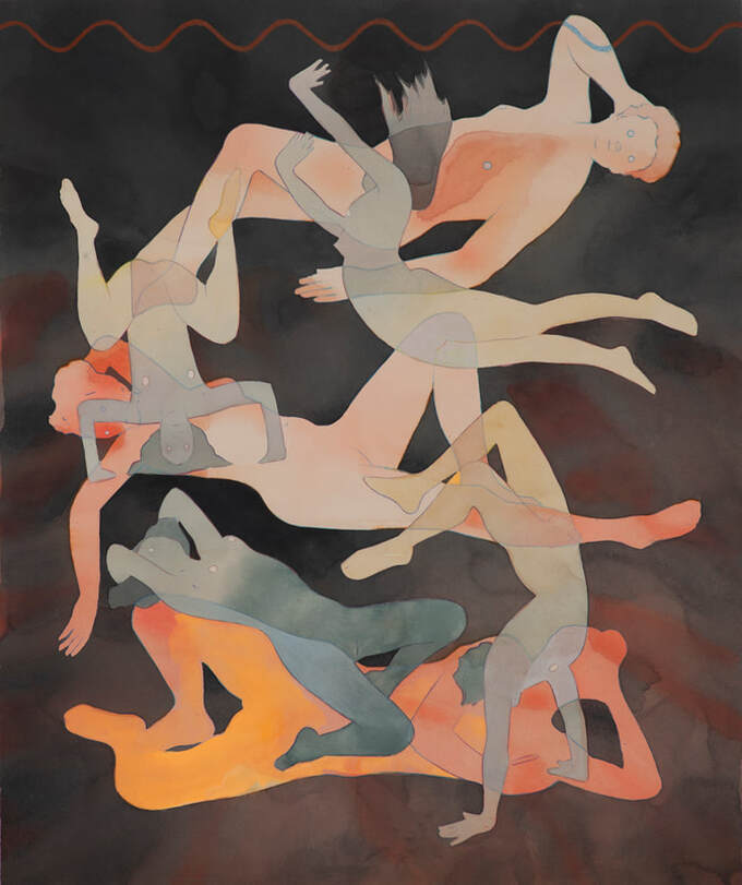
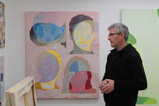
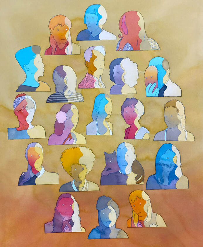
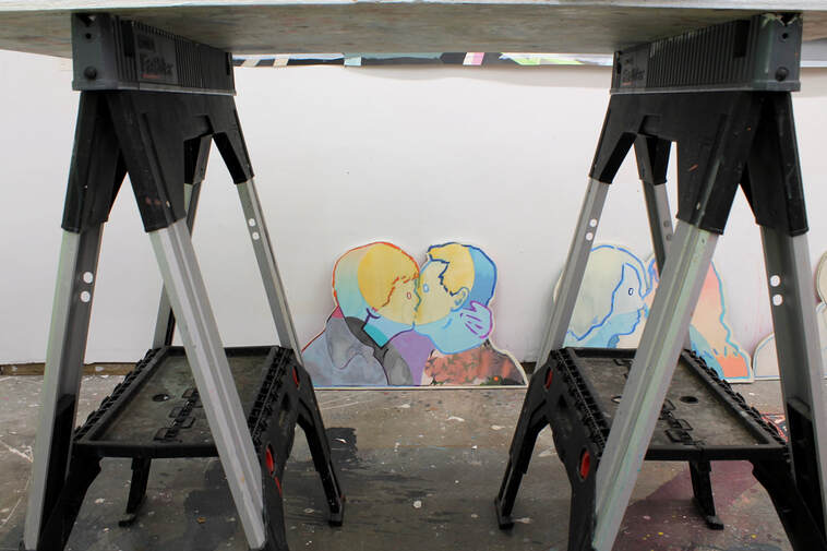
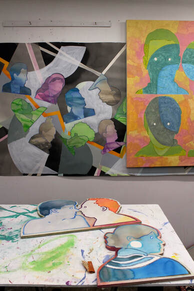
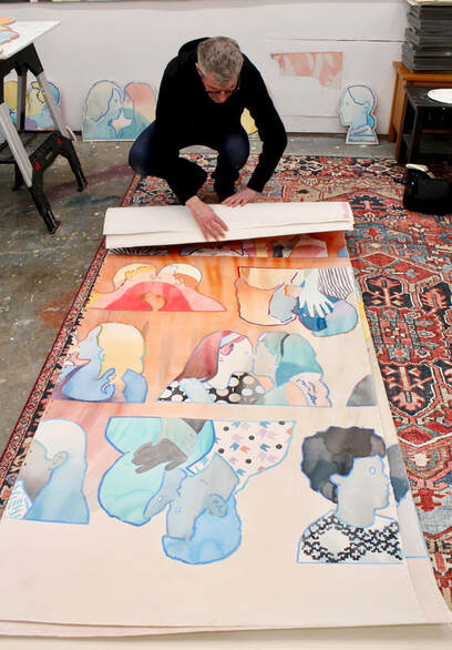
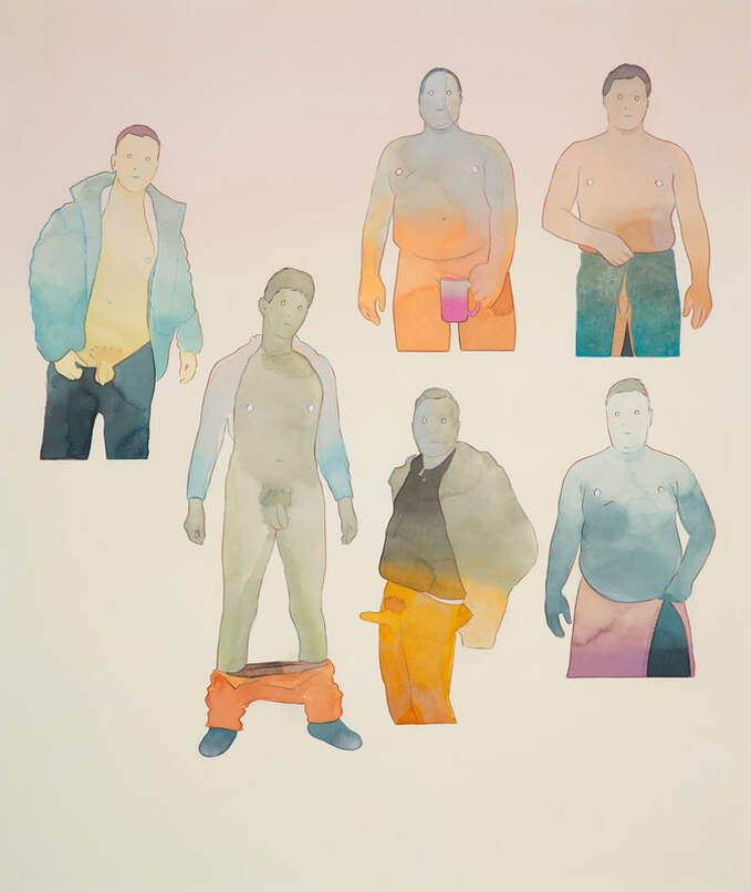
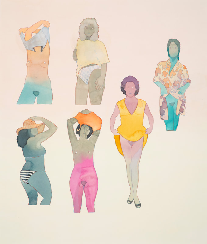
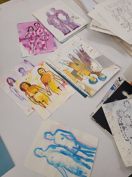
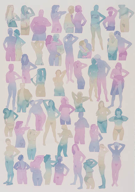
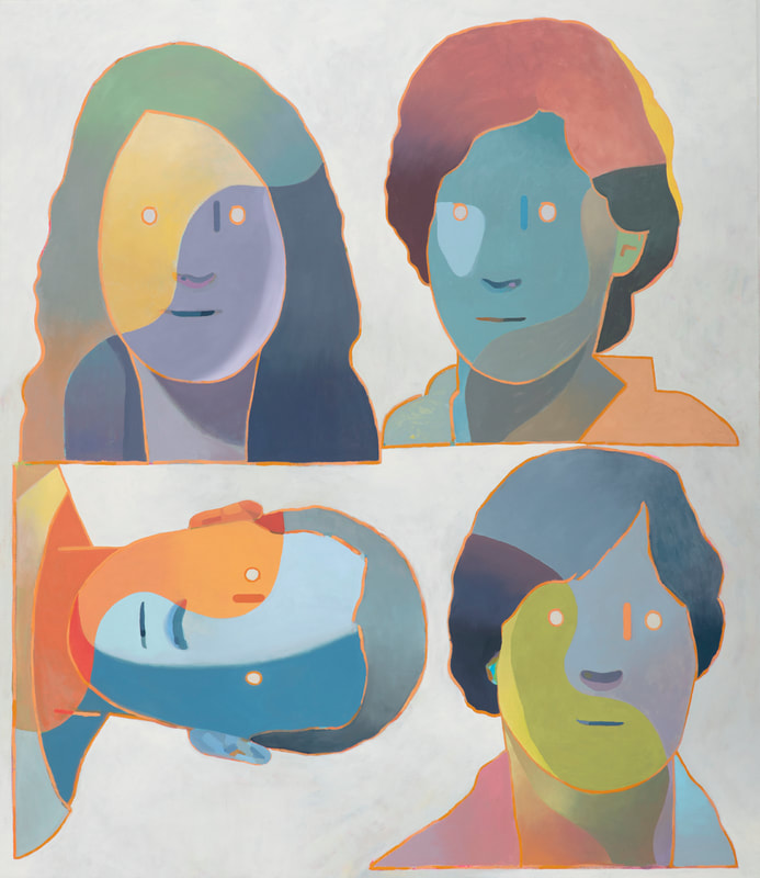
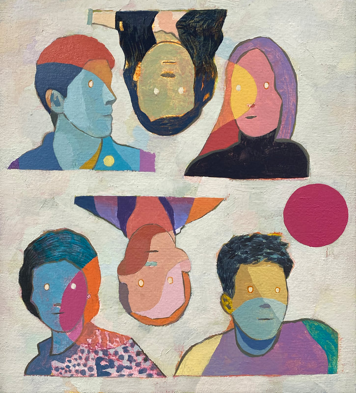
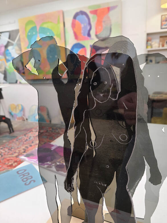
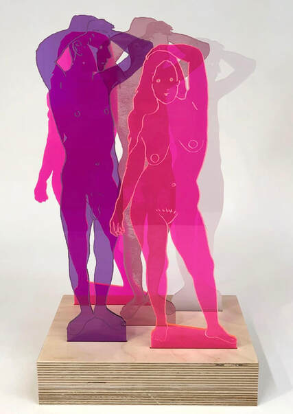
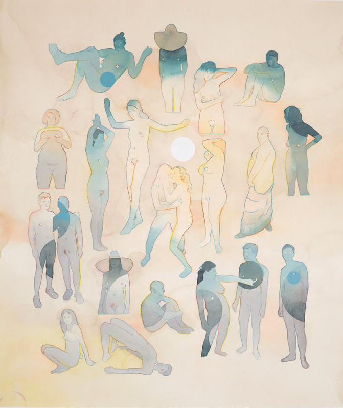
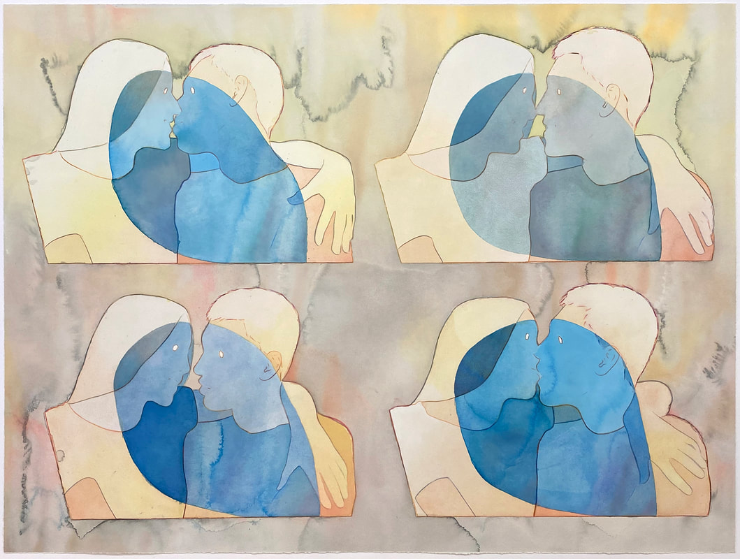
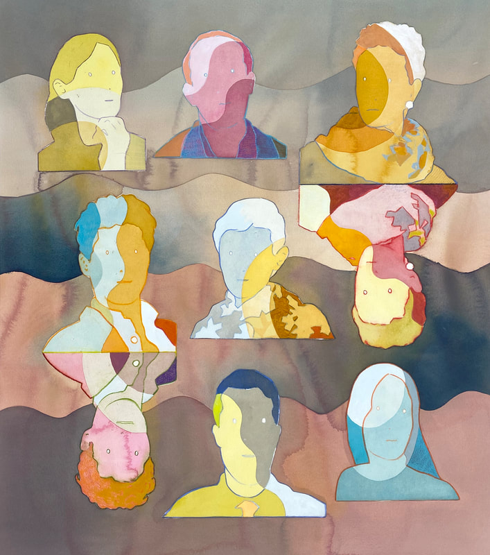
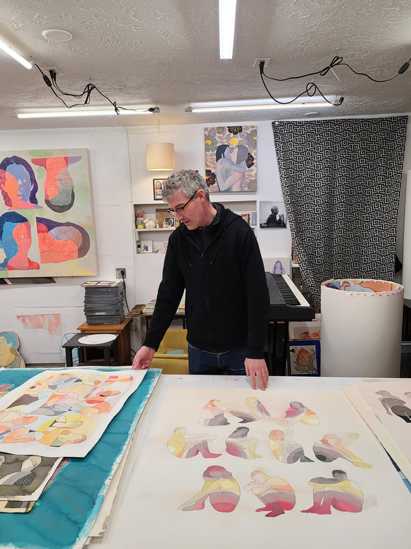
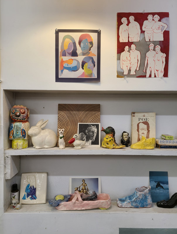
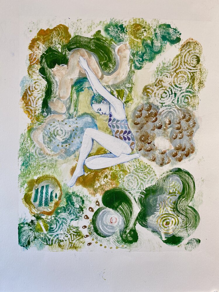
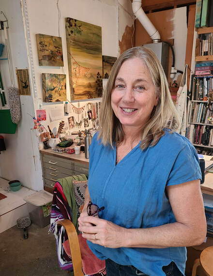
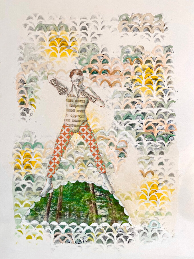
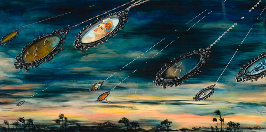
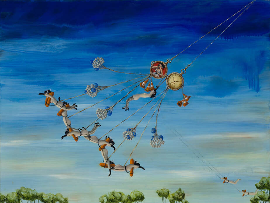
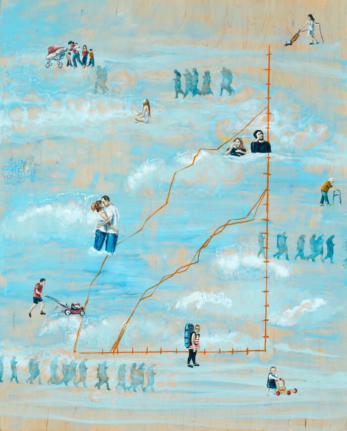
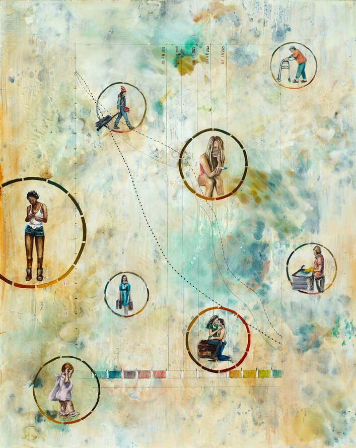
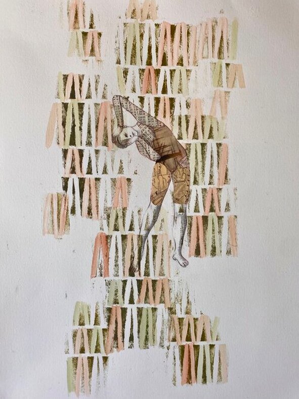
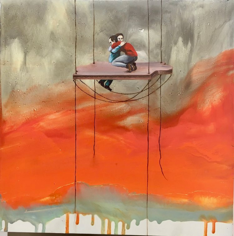
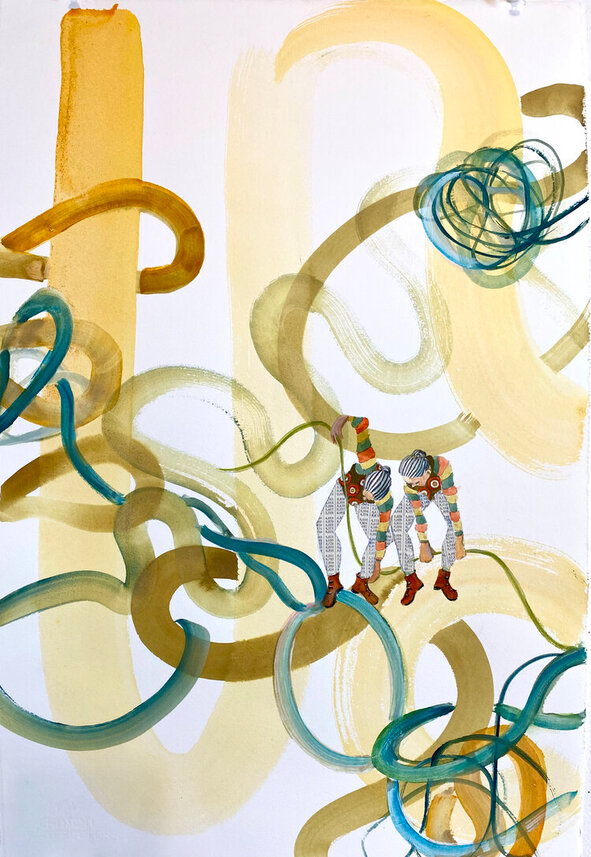
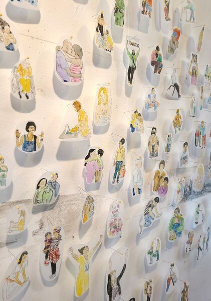
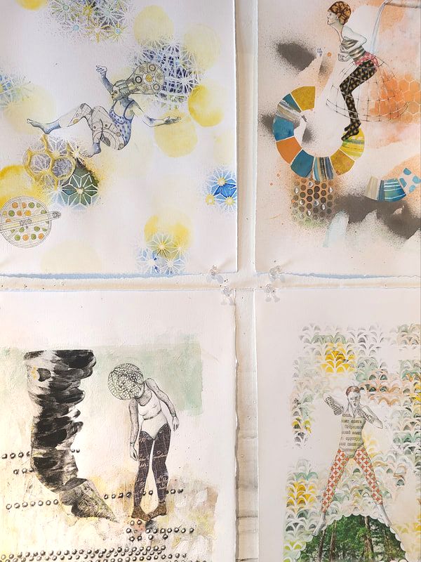
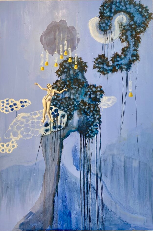
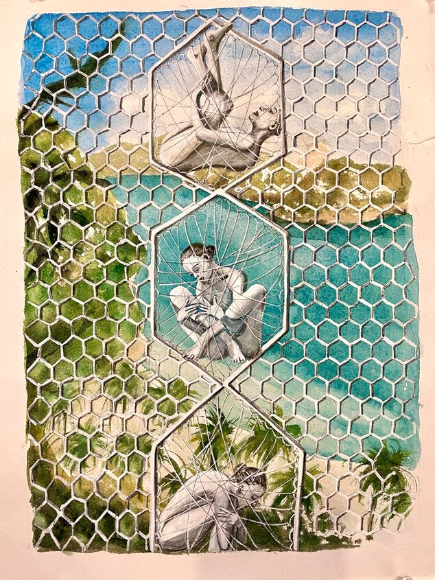
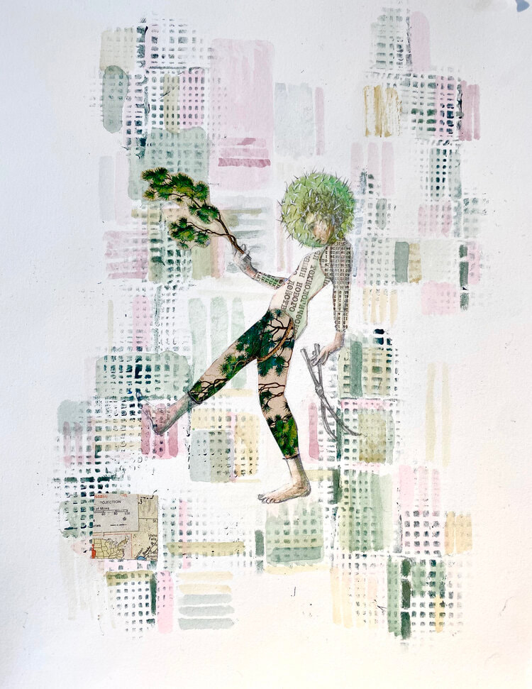
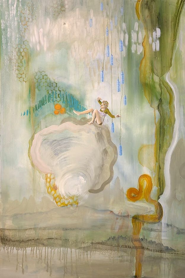
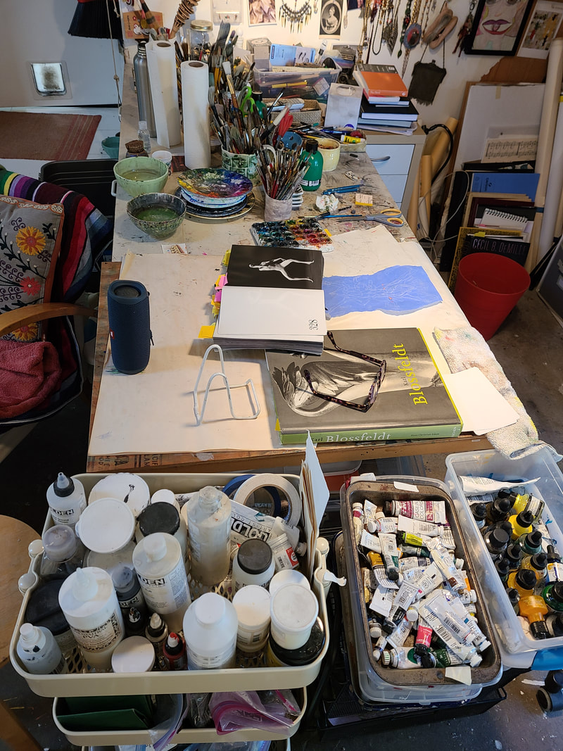
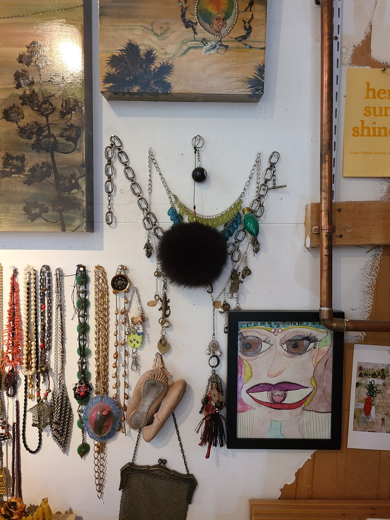
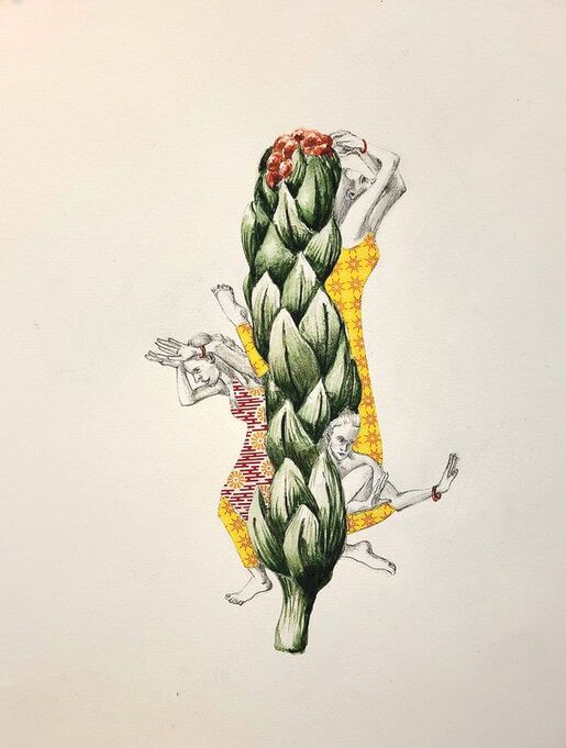
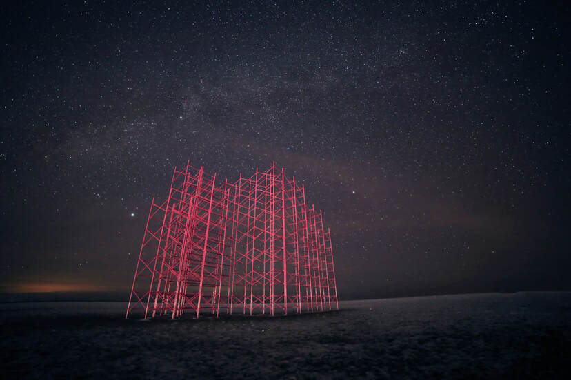
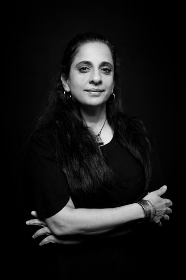
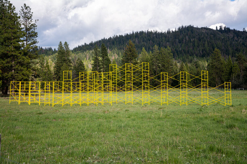
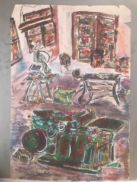
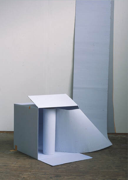
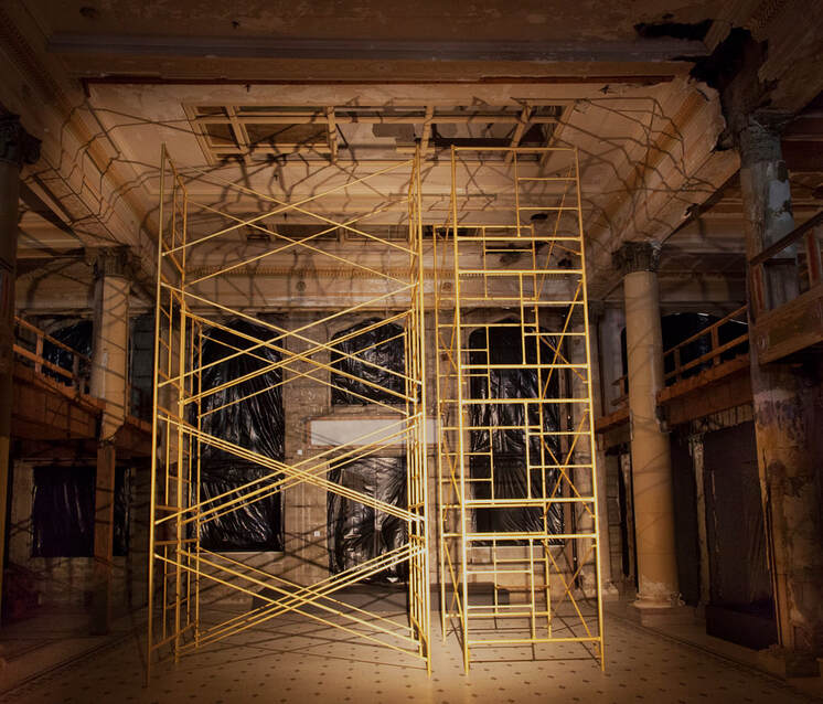
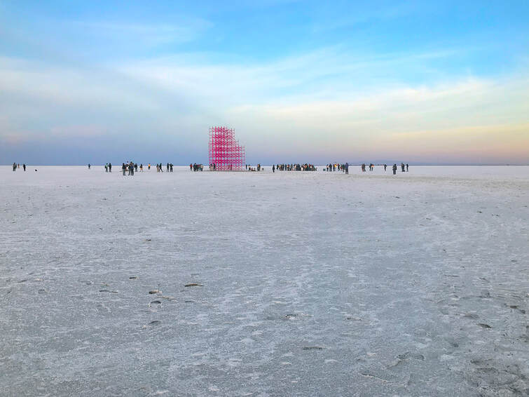
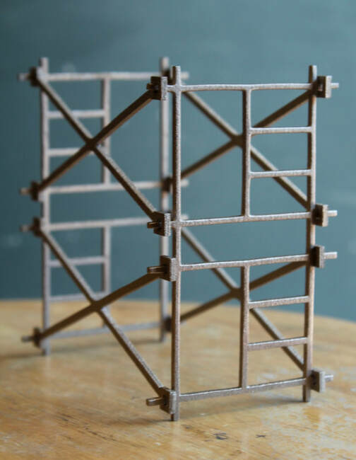
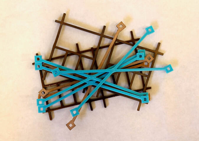
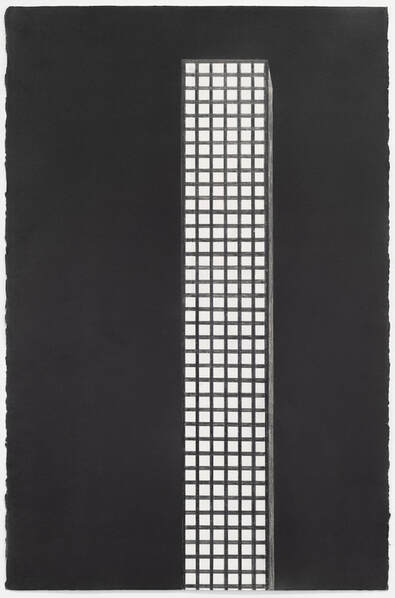
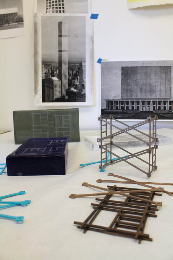
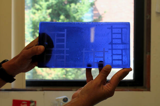
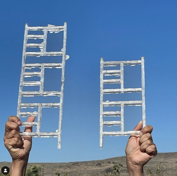
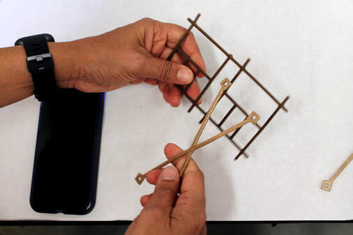
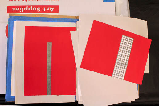
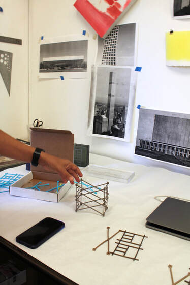
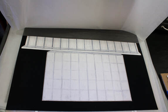
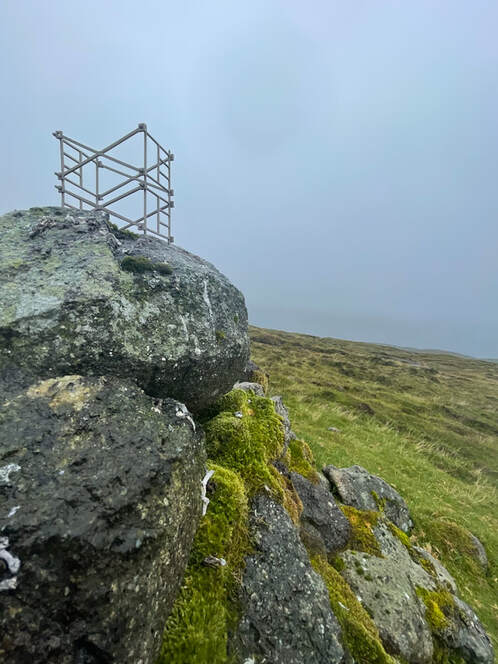
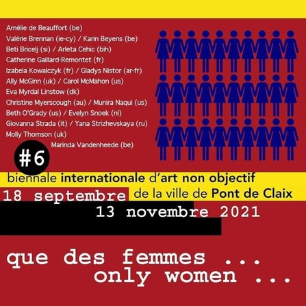
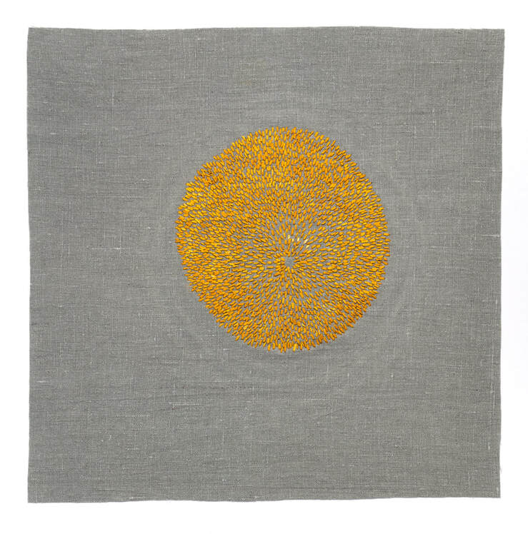
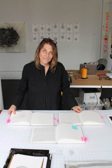
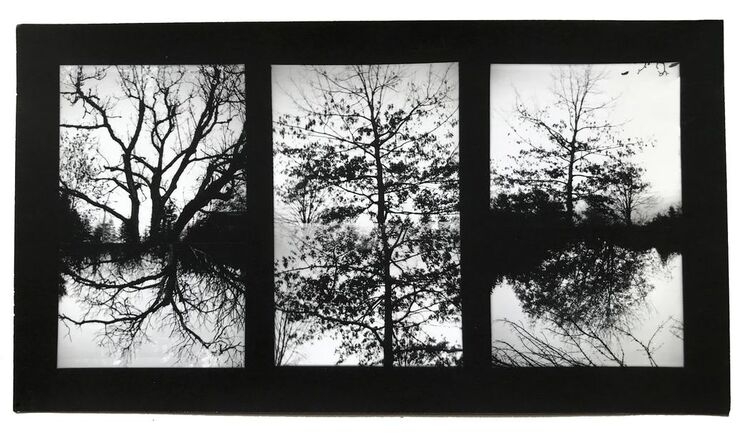

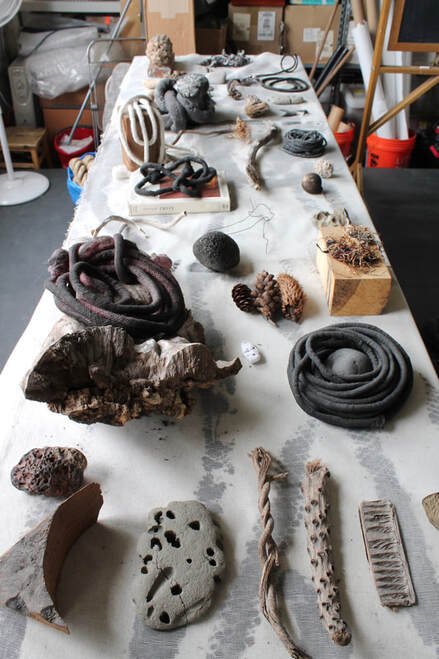
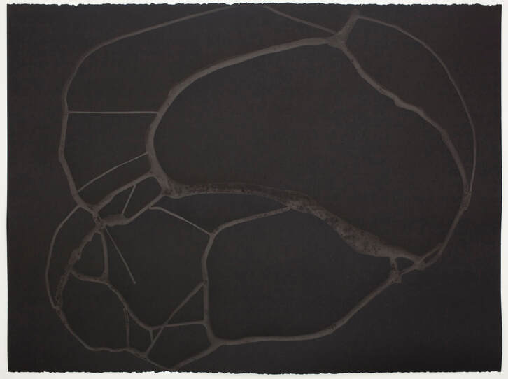
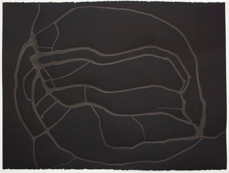
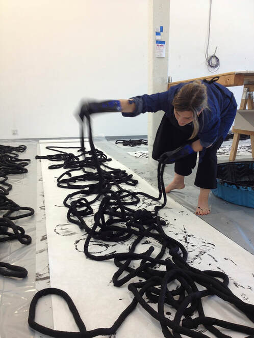
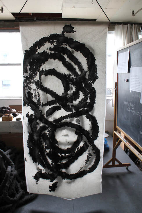
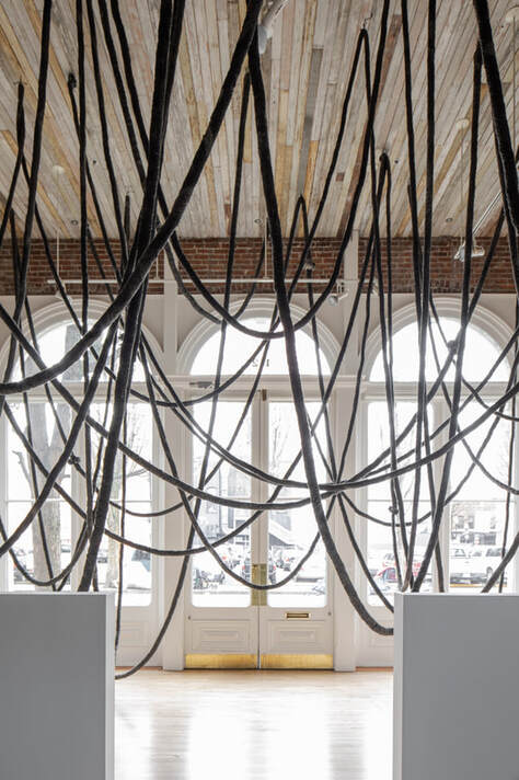
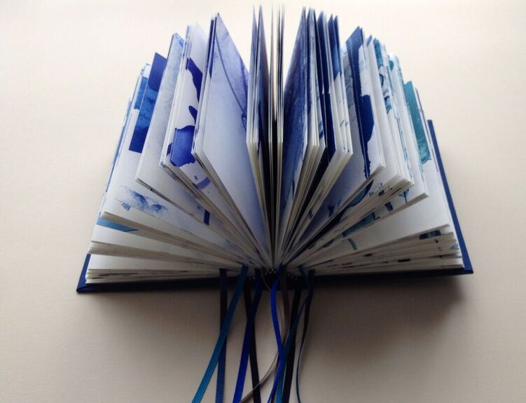
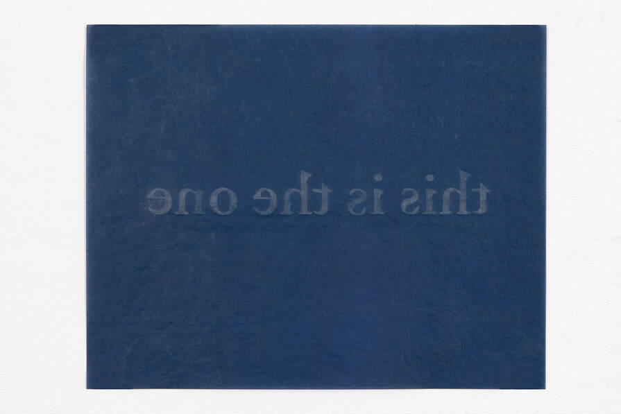
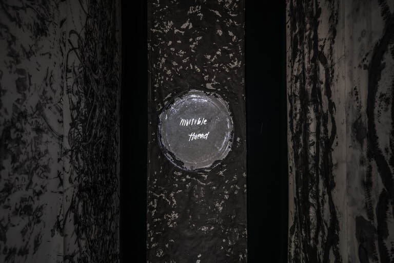
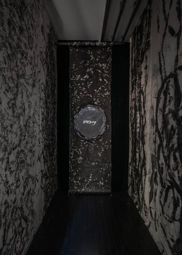
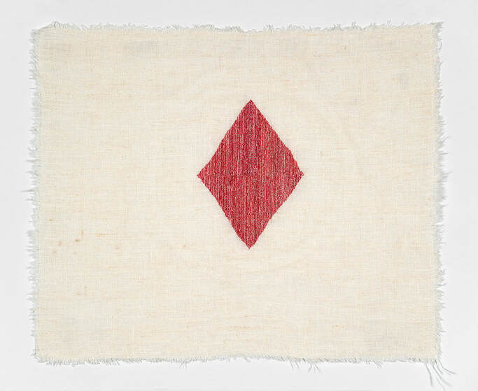
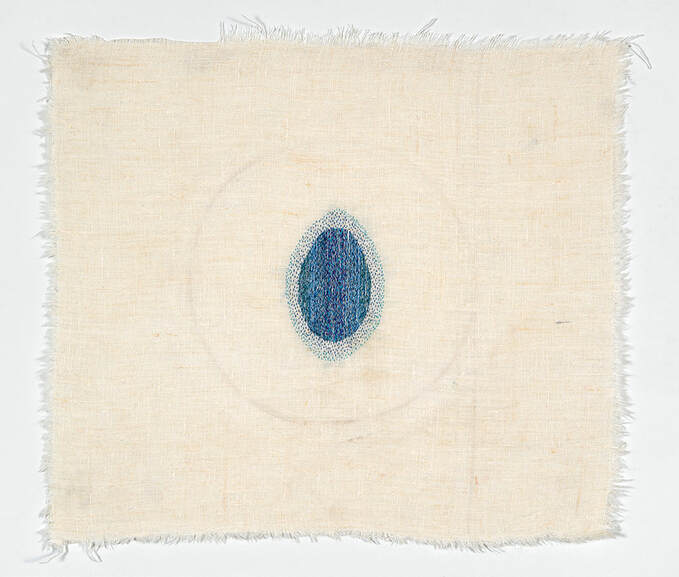
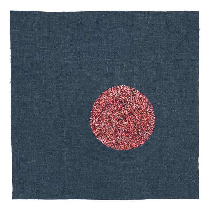
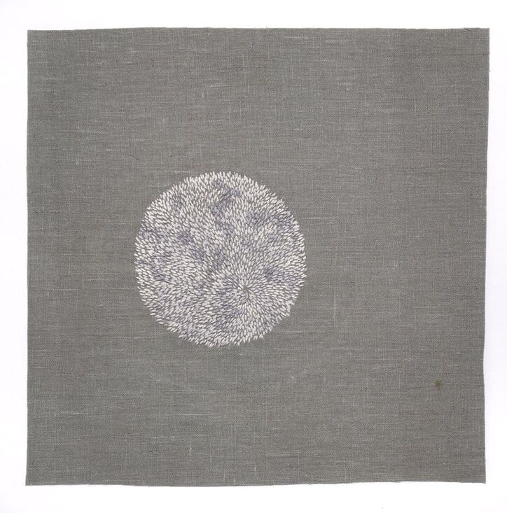
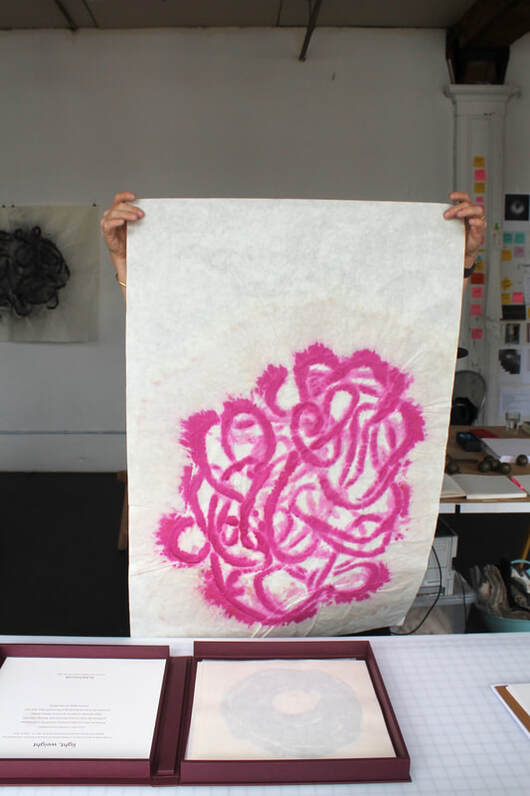
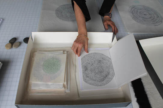
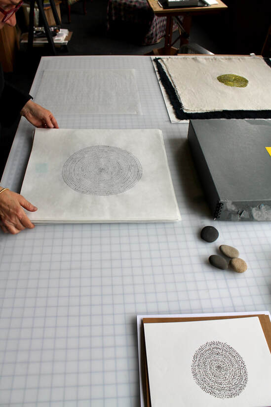

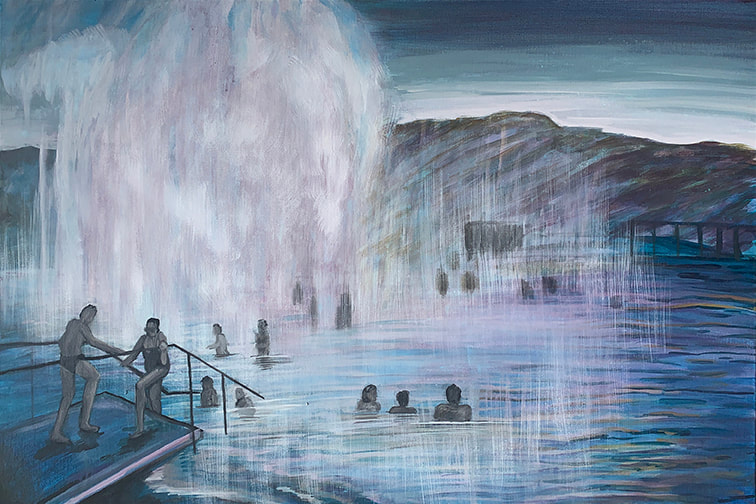
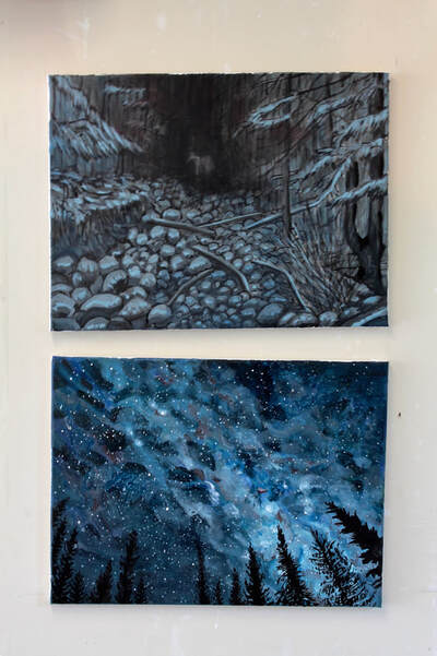
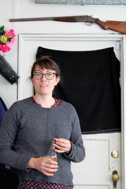
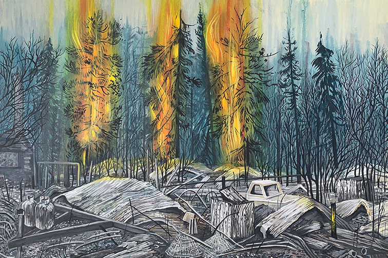
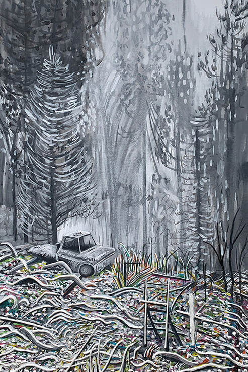
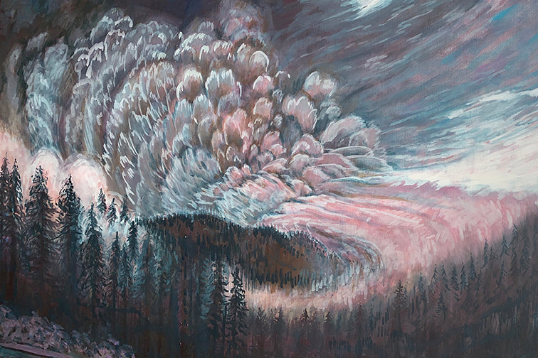
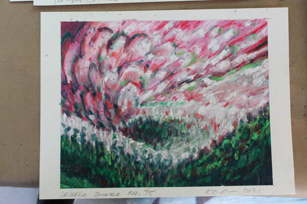
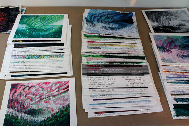
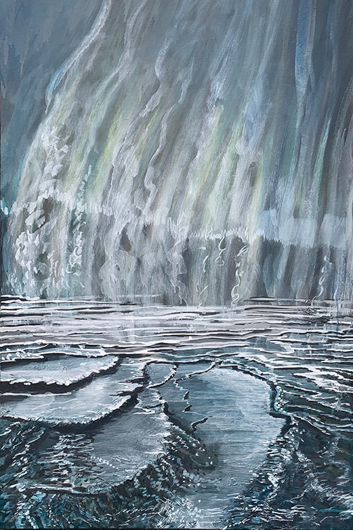
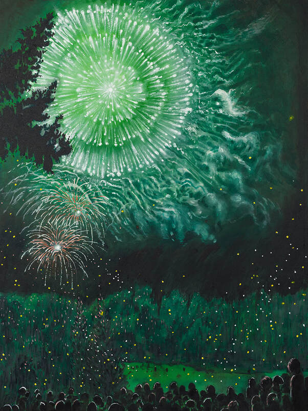
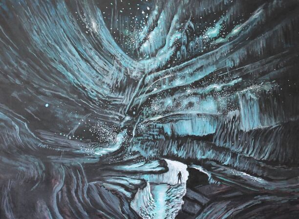
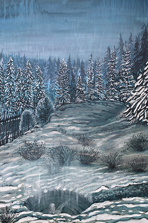
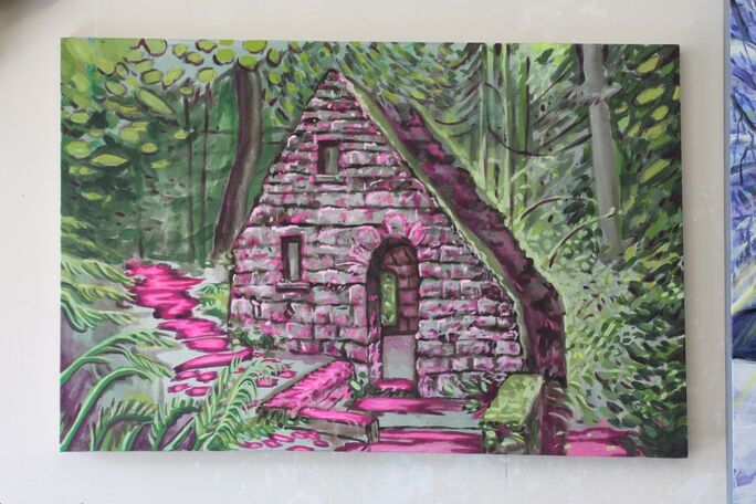
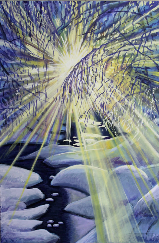
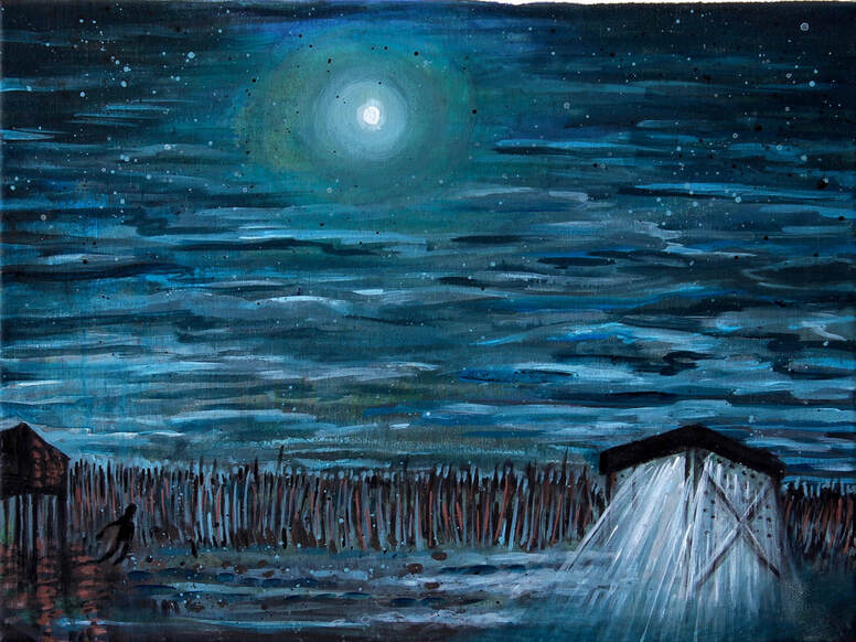
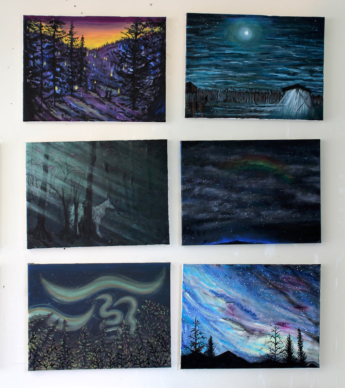
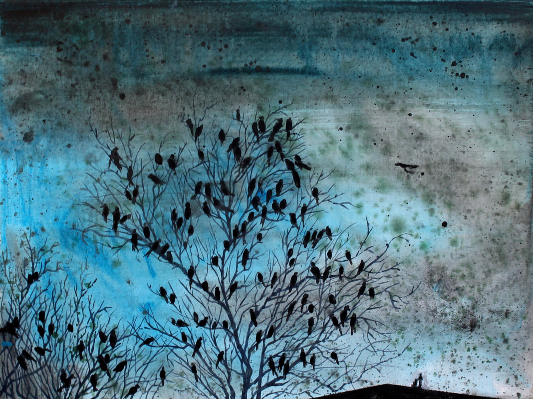
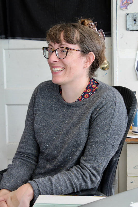
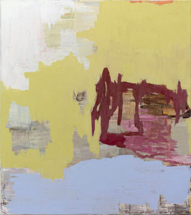
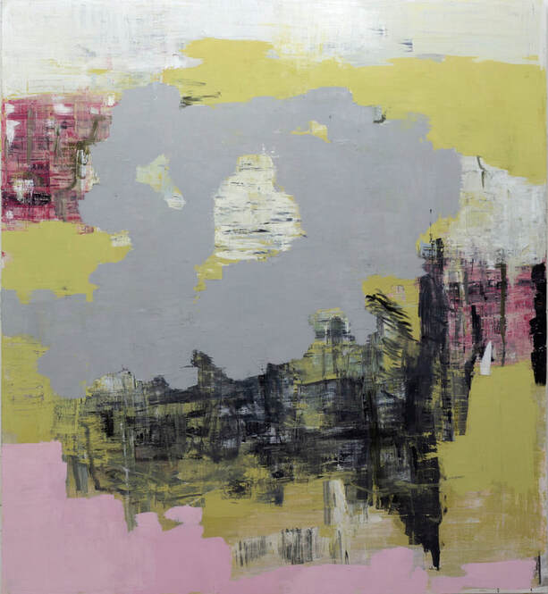
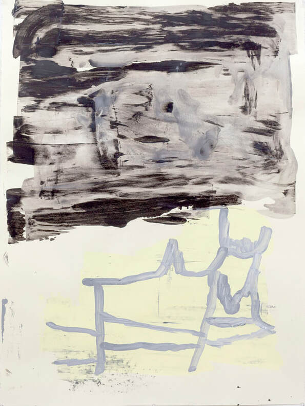
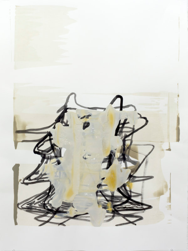
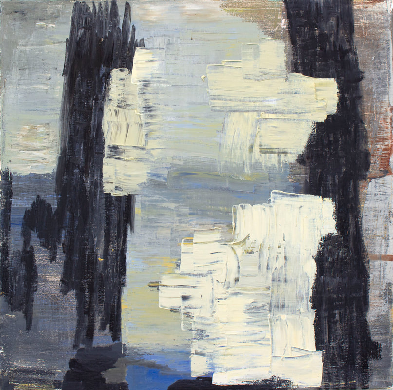
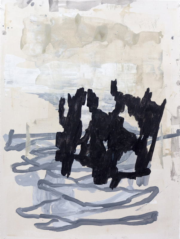
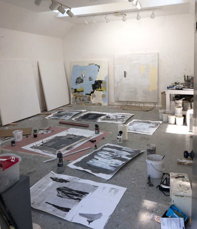
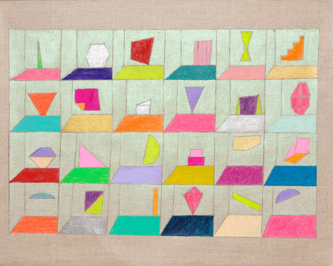
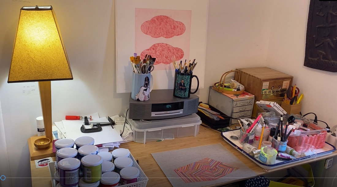
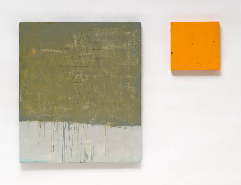
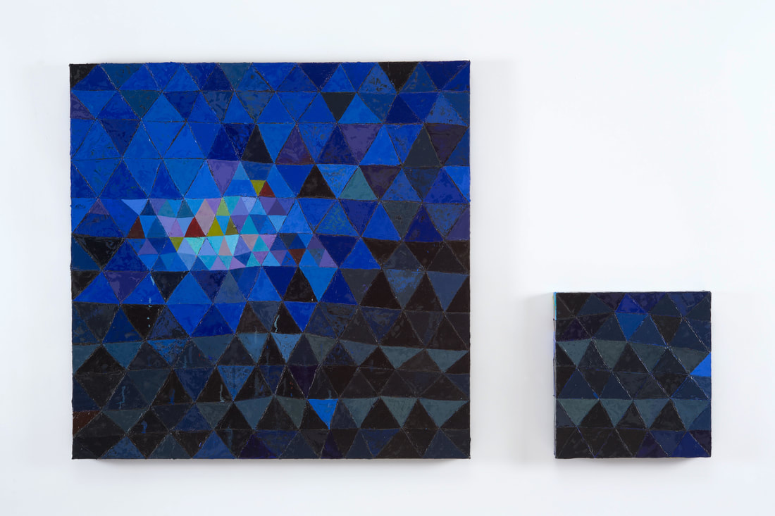
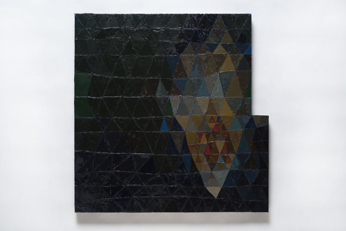
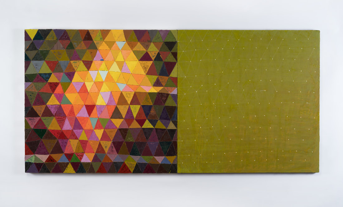
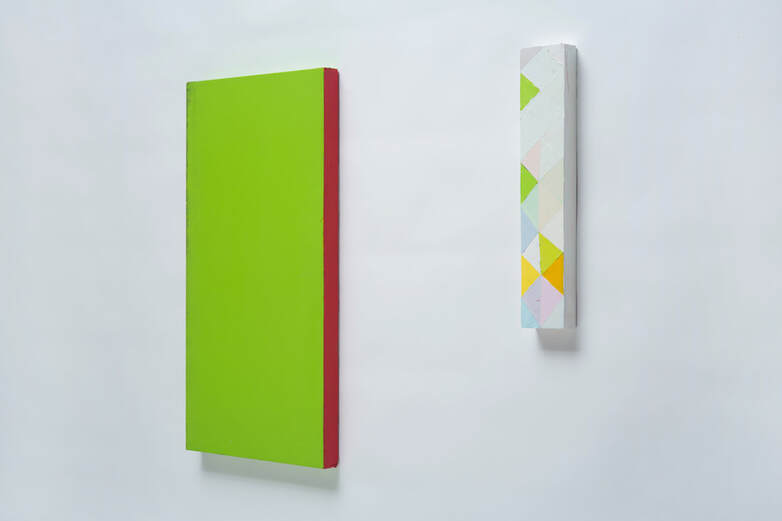
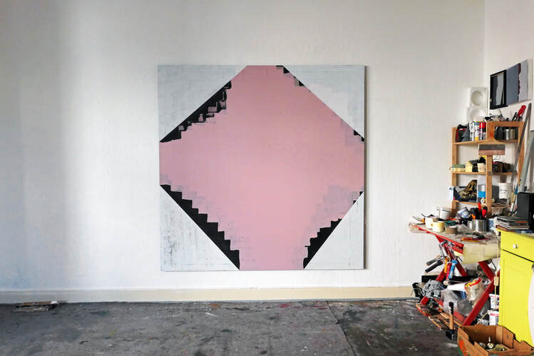
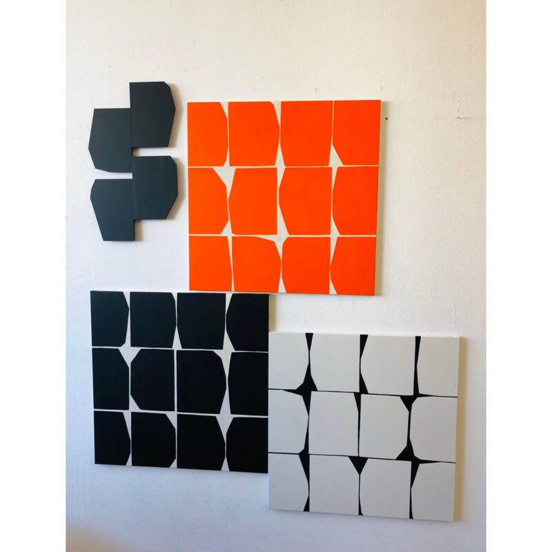
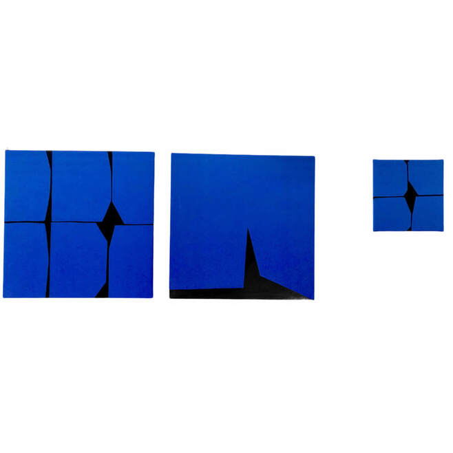
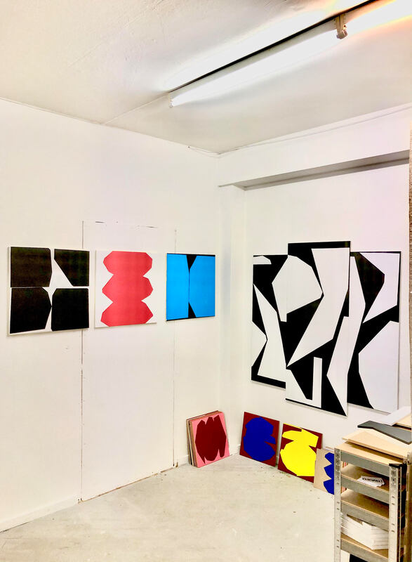
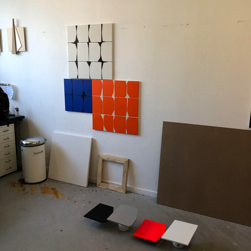
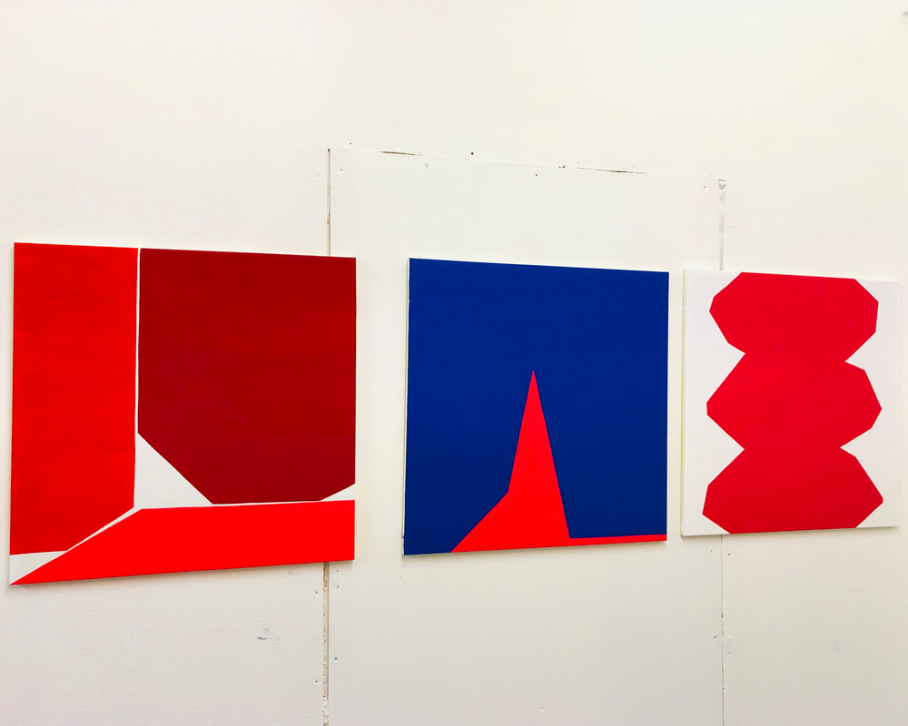
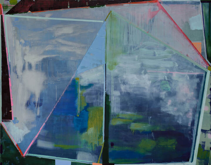
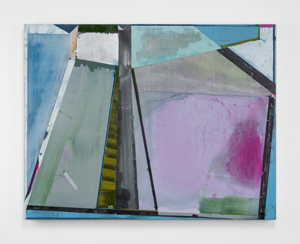
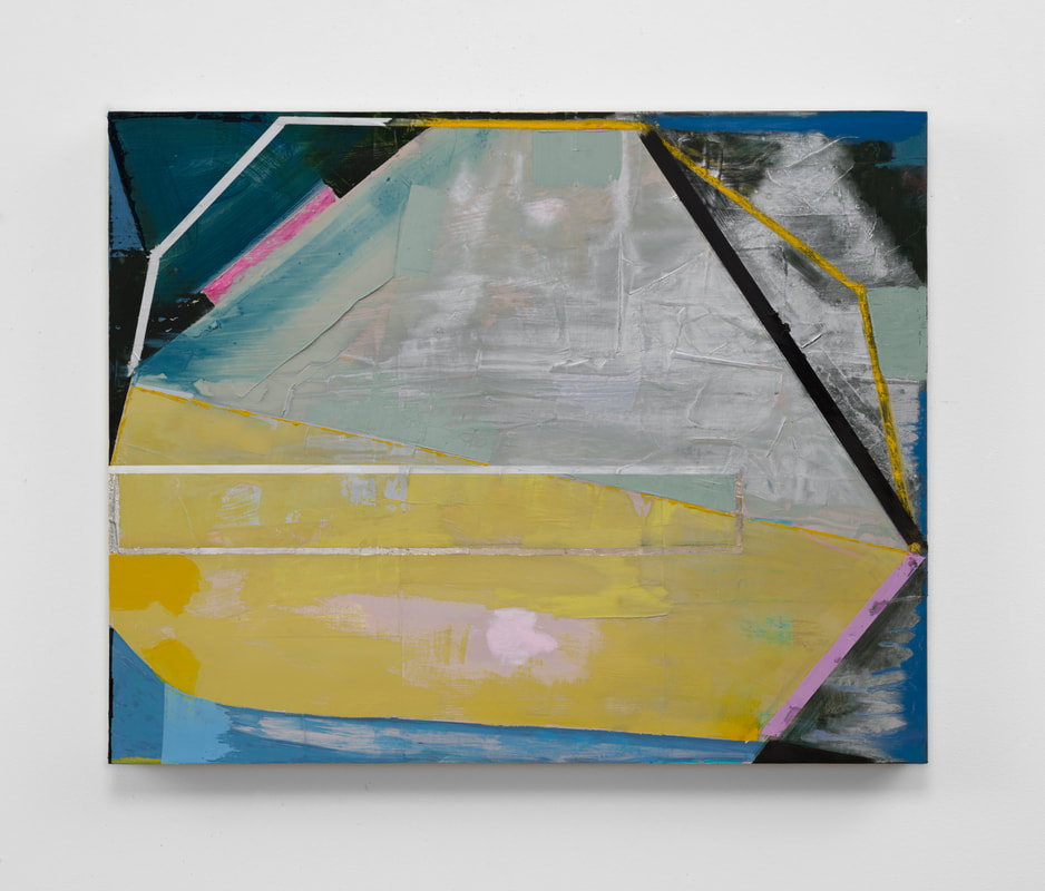
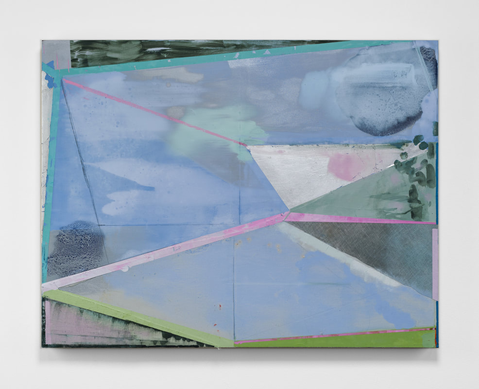
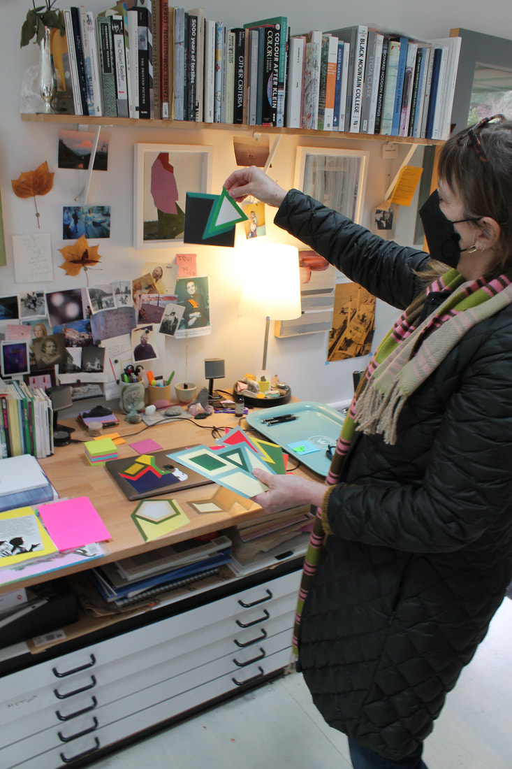
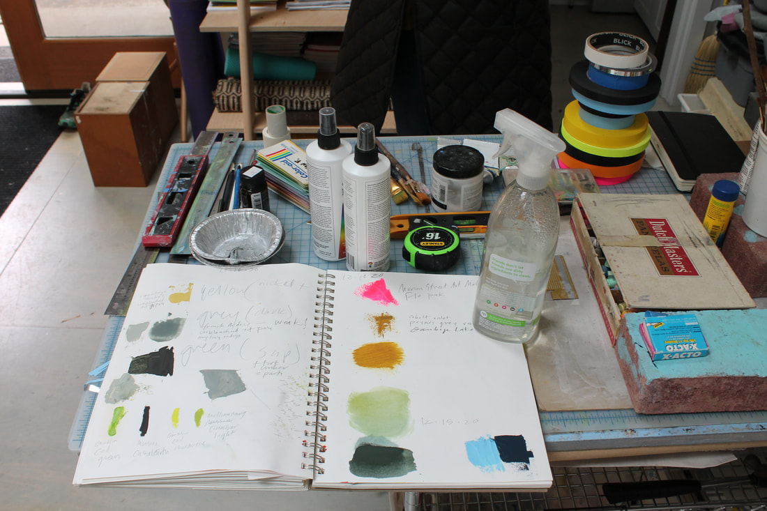
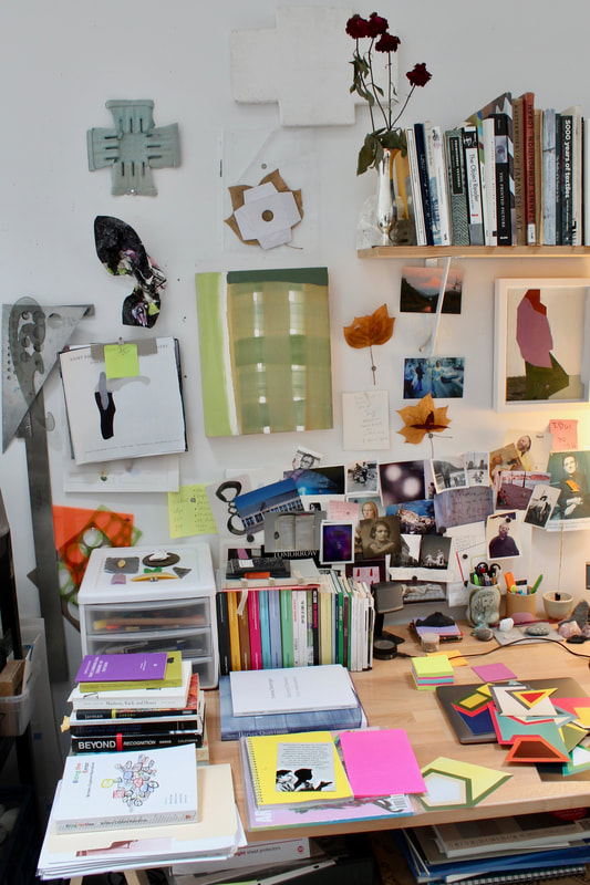
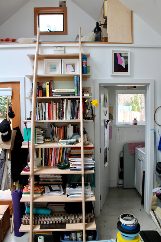
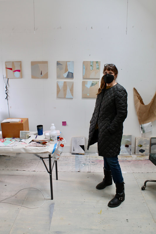
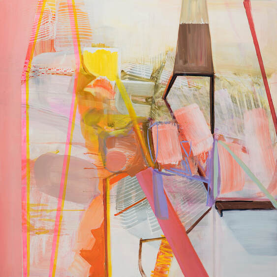
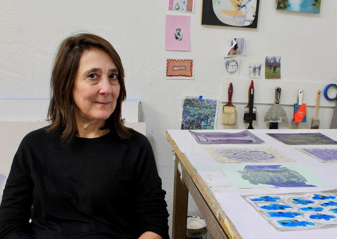
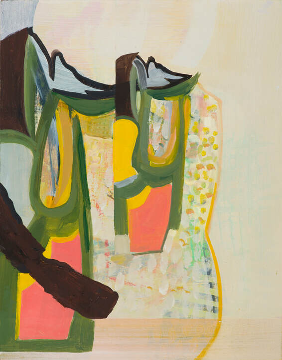
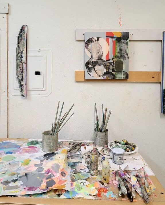
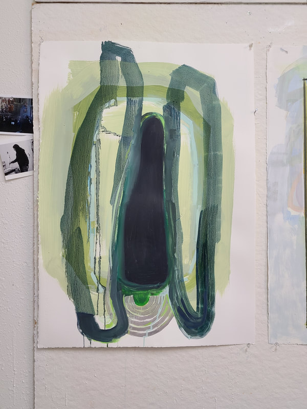
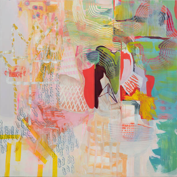
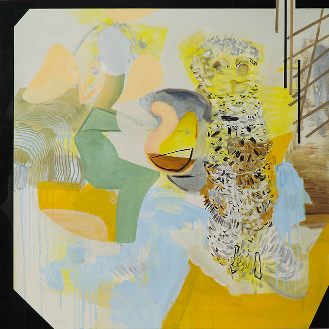
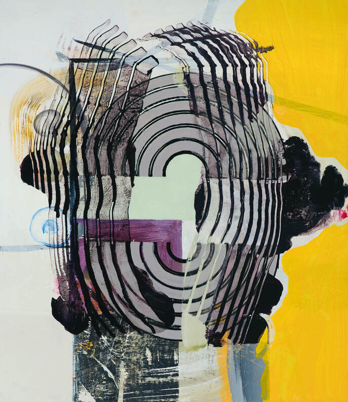
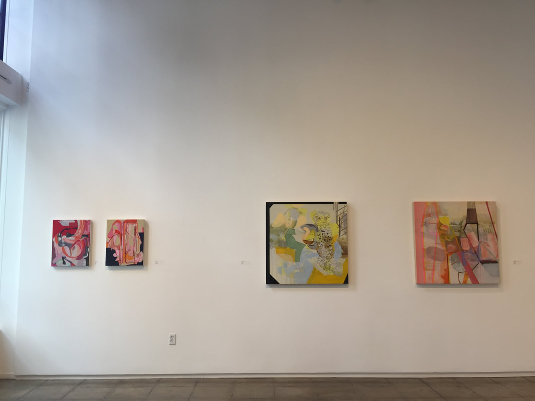
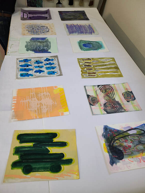
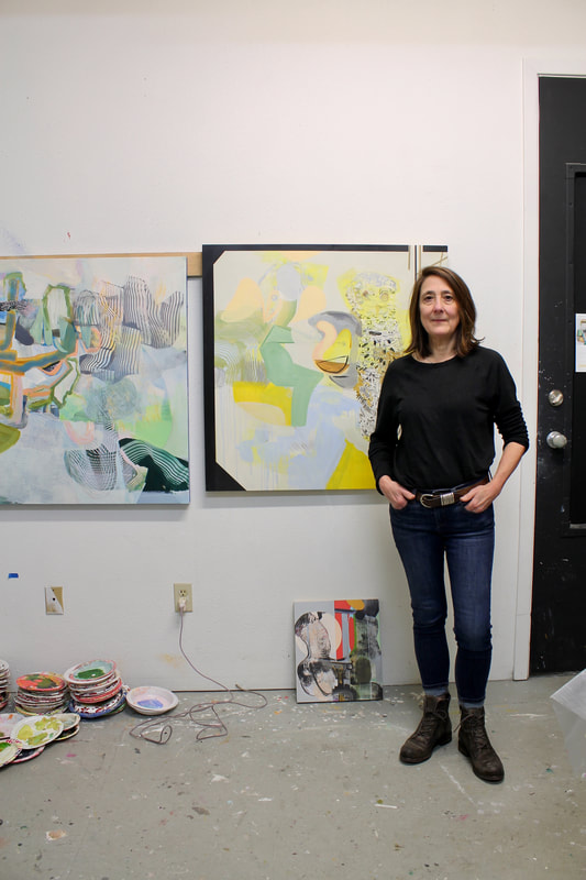
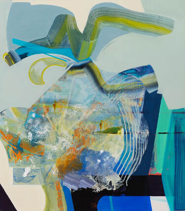
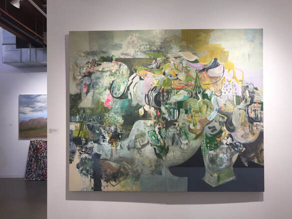
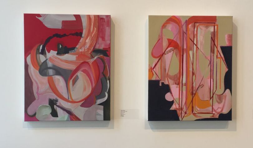
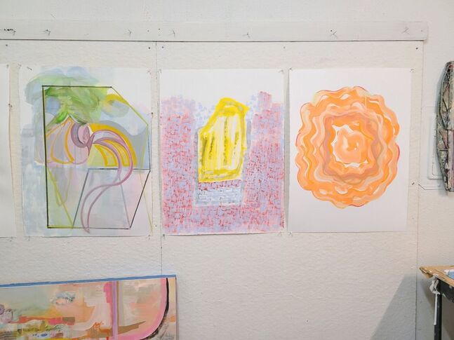

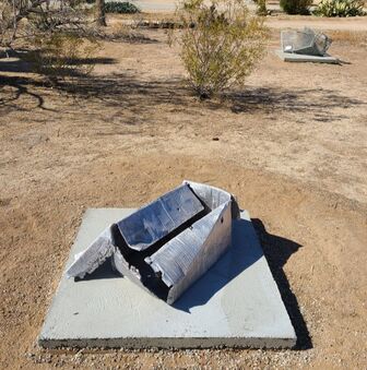
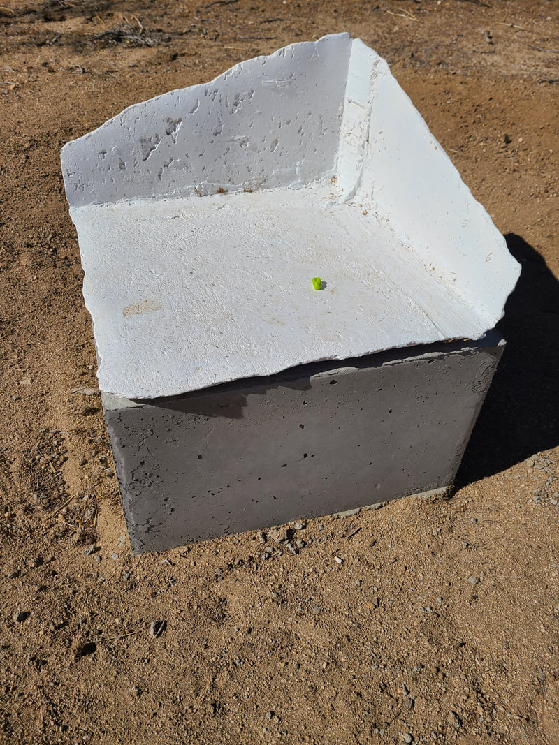
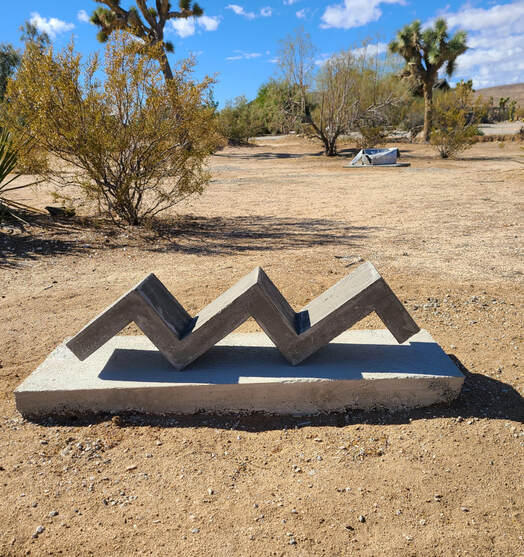
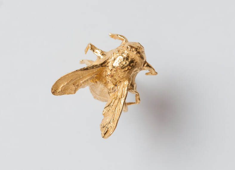
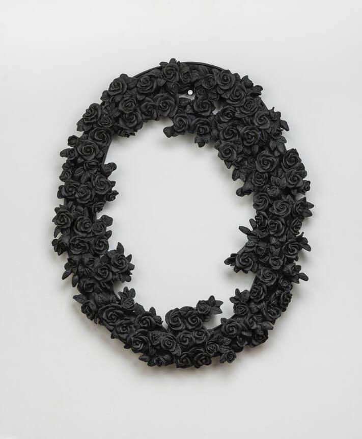
 RSS Feed