|
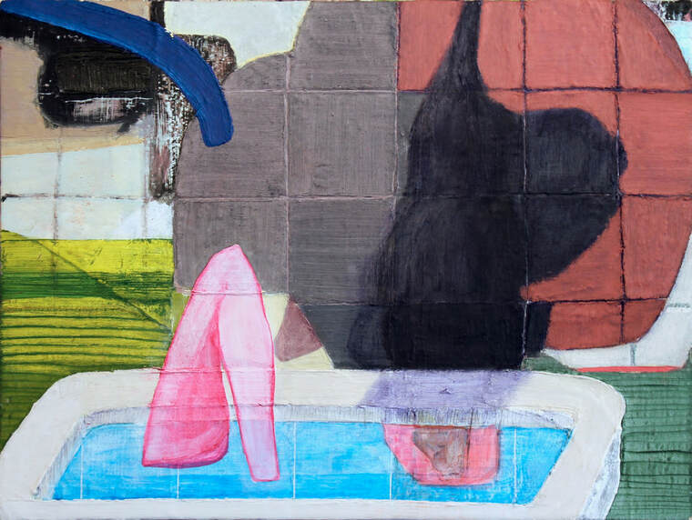
8/25/2020 THE SEMI-FINALIST IS: RACHAEL ZURFearless/Tender In a break from studio visits, this entry of The Semi-Finalist centers on Rachael Zur’s tactile and moving show, “Artifacts of Affection,” at Gallery 114. The exhibit showcases her willingness to be fearless and tender as well as her ability to be experimental and grounded in tradition. I’ve become familiar with Zur’s work over the last year or so and I’m always drawn to the way her shaped paintings of everyday objects take on an otherworldly presence and defy immediate categorization. The mix of ordinary objects with disembodied arms, wings and organs suggests stories and relationships that I want to know more about. 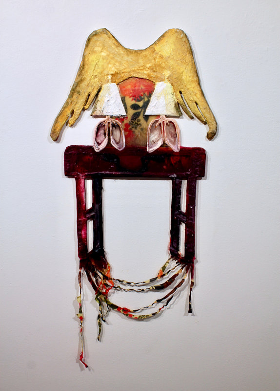 Ghosts I Make About You, plaster, wood, acrylic, spray paint, resin, 2019 Zur is also a poet, and I thought it would be fitting to start off this interview with a poem that implies through language something similar to what she’s getting at with her inventive and expressive paintings. 905 Second Street By Rachael Zur in the shed, crooked nails left to be hammered out tell me of that person’s life during the Great Depression I found a wooden block in there with “be my valentine” carved on it I kept it, because its clumsiness felt familiar under the house my husband found a gas pipe plugged with a wine cork I guess this is how people solve problems when I painted over the wallpaper in the bedroom I could see that there was a second layer of wallpaper beneath it our relationship with homes is symbiotic the building shelters our bodies, and we slow the house’s demise which comes long after us 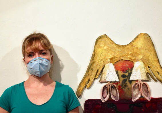 The Semi-Finalist: When I was at your show, "Artifacts of Affection," I was thinking about how fearless you are with materials. Usually I can tell if something is a painting, a sculpture, etc., but I couldn’t immediately figure out what your objects were made of. There’s a blending of materials and sensibilities in this show that’s really exciting; can you talk about how you arrived at this stylistic choice? Rachael Zur: It’s probably helpful for me to first explain what the paintings on the walls are made out of; often enough, when looking at a photograph, people assume the work is entirely ceramic. However, the forms are cut out of corrugated plastic or wood and then wrapped in plaster gauze. Most often I paint into the plaster while it is still wet, with acrylic or spray paint. Sometimes I attach a ceramic piece or fabric into a larger work, but the plaster is wonderful for blending the edges between materials. The stylistic choices that I’ve arrived at now were born out of wanting to hold together both an enthusiasm for multiple ways of handling materials and media, and my love for painting. For a couple of years, I’ve been interested in my paintings occupying a space between sculpture and installation—while primarily being in the language of painting. Elizabeth Murray, Frank Stella, and Sam Gilliam have been influences for me in thinking about the structures that can hold a painting. While I’m invested in constructing irregular structures to paint on, I’m equally interested in how a simple contour line can convey a form on a flat surface.
1936-2019, plaster, acrylic, spray paint, resin, fabric, 2019; detail of 1936-2019. "The stylistic choices that I’ve arrived at now were born out of wanting to hold together both an enthusiasm for multiple ways of handling materials and media, and my love for Painting." S-F: I saw that Amy Bay described your show as “tender” in a post on Instagram. I thought that was such a perfect word to sum up your subject matter. Tell me about your work's relationship to people, domestic spaces, and memory. RZ: Traces of the love that people have for each other lingers long after they are gone, it’s something that can be felt in old buildings or domestic objects. I’m interested in how affection can be held in the most humble and outdated objects. I am specifically drawn to depicting the objects in living rooms, whose predecessor in pre-Civil War America is the Parlor Room. Out of the many functions that the Parlor Room served, one of them was preparing the bodies of loved ones for burial. I do find a tenderness in those preparations being carried out at home. Lacking those customs, I’ve turned to honoring those whom I’ve lost through depicting items from their living rooms. I have allowed for the spaces belonging to different loved ones to merge in the work, and as my grief eased, I saw that I was in fact making work about the affection held in homes belonging to (mostly) women who had profoundly impacted my life. 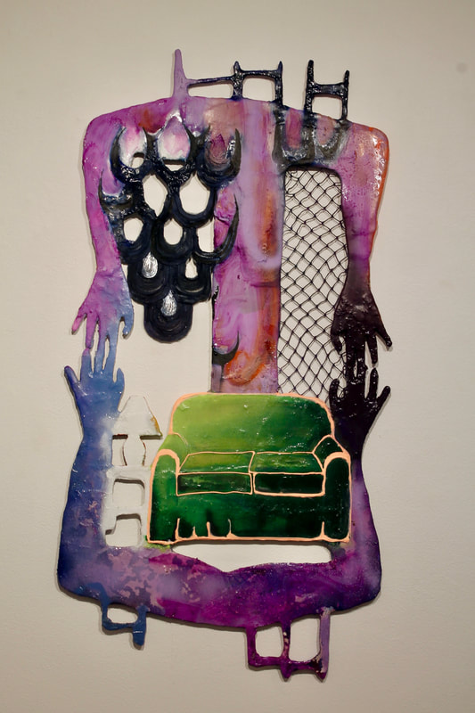 Immemorial Couch, plaster, wood, netting, acrylic, spray paint, resin, fabric, 2019 I’m also interested in how memory relates to the function of seeing. Much of what is seen is reduced to an abstraction in the eye before it is understood by the brain, the brain compares the abstraction to memories of similar, known objects in order to see the new object. It’s a very precarious process! The white forms painted on the walls are abstractions of the plaster paintings. At the same time, those forms increase in their legibility when the viewer looks at the works hanging on adjacent walls. 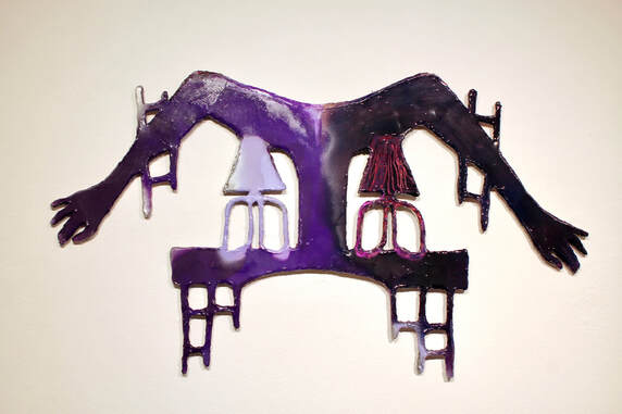 Longing Syndrome II, plaster, wood, acrylic, spray paint, resin, 2020 S-F: I’m always intrigued by artists that can turn a gallery into a theatrical setting for their show. I don’t think of you as making installation art (maybe I’m wrong!), but you’ve managed to transform Gallery 114 into a space that amplifies the themes that run through your work. How did this come about? RZ: To borrow from what you said about the theatrical setting, color sets the stage. The lavender walls allow the silhouettes of the plaster paintings to be very legible up close, but fainter from further away. The painted walls definitely amplify the main theme of the show: the residue of lives lived and the affection that can still be felt in humble objects. The lavender color shifts from grey to pink depending on where one stands and in relation to the works that it's near. The shifting in color works well with the elusive feeling of work that holds both the presence and absence of an individual. 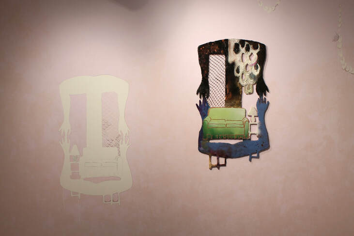 "...color sets the stage." After developing the visual language for this body of work, I began looking for ways in to make works that related to pieces I had already made. I thought about how these works could exist both singularly and directly next to each other. Leading up to the show, I spent a lot time in my studio placing these works near each other at different heights to see how that impacted how I moved from piece to piece. I don’t want to take anything for granted with how a show is installed. I consider the space fully and respond to the architectural features that I will be forced to work with. One of my favorite moments in the show is the placement of Small Ghost End Table above the vent in the gallery wall. The vent is not really something that can be ignored, so I embraced it, placing the work above it as if it had just landed there.
Small Ghost End Table, plaster, corrugated platic, acrylic, spray paint, resin, 2019; Rachael Zur at Gallery 114. "The vent is not really something that can be ignored, so I embraced it, placing the work above it as if it had just landed there."
Installation view with Matriarch (foreground) and A Place to Rest Your Crown (middle ground); wall drawings. S-F: I know that you’ve had a chance to work with some really amazing people as part of your recent MFA program. Can you talk a bit about that as well as your background, education or any other formative experiences that you think are relevant? RZ: My bachelor’s degree is from the College of Creative Studies at UC Santa Barbara. I completed my MFA in the Low Residency MFA program at the School of the Art Institute of Chicago last summer. I learned so much from each teacher that I worked with in grad school and feel very fortunate to have studied with each of them. I worked most closely with Jessica Jackson Hutchins and Kristan Kennedy--my mentors for the parts of the year I was in Portland. Kristan helped me to move my painting practice away from rectilinear supports, and to consider how works can relate to each other in an exhibition. While working with Jessica, I was building sculptures to hold my late father’s ceramics. It was a challenging project emotionally, but also formally, because my father’s work was already complete and in an aesthetic that doesn’t immediately pair well with my own. While working with Jessica, I was able to better understand what my standards are with regards to art making, and to tune in to my own voice. In addition to my formal education, my father’s ceramics left an indelible mark on me as an artist. My dad passed away when I was an infant. I grew up longing to connect with him. His ceramics were a way for me to have a connection. I could trace where his hands had been on a piece, or spend time looking at the work to learn how he built it. At an early age, I learned that an art object can tell a viewer a lot about its maker--this is one reason why I’m so invested in texture and leaving traces of my touch, because that’s part of the legacy that my father left for me.
The Other Side of the Door, metal doorknocker, wood, plaster, gauze, acrylic, spray paint, 2020; wall drawing. S-F: You also write poetry and have some on your website under the appropriately understated tab: "unseen labor." I think it's so interesting when an artist has a strong connection to language because it seems like such a different part of the brain! Did these interests - the visual and the literary- develop side by side or at different points in your life? RZ: It’s a very different part of the brain. Having a writing practice is a recent development. I’ve struggled with dyslexia since I was a child and that has made it difficult to have confidence in my writing. Initially I was hesitant to go to grad school because I was terrified of the writing component. Gregg Bordowitz, who is the director of the Low Residency MFA Program at the School of the Art Institute of Chicago, told me during my first semester in the program that he thought writing could become an important aspect of my practice. At the time, I completely disagreed with him. After working with Pamela Sneed and Corrine Fitzpatrick, I found ways of working with language that felt akin to my visual art practice by finding odd couplings of ideas, and by being earnest and direct.  Even the wall color surrounding the title of Zur's Gallery 114 show was carefully considered. S-F: What’s next for you? RZ: This December I’m in a group show called Domestic Landscapes curated by Carissa Burkett at Chehalem Cultural Center, in Newburg, Oregon. My husband and I are homeschooling our three kids this year and I will be taking them with me on a residency at Stay Home Gallery in Paris, Tennessee in spring of 2021. I have a two person show with Ruth Ross in June of 2021 at Valencia College in Orlando, Florida. You can see more or Rachael Zur's work at https://www.rachaelzur.com/ and on Instagram at @rachaelzur. Below are a few more images of Zur's show at Gallery 114, courtesy of the artist. 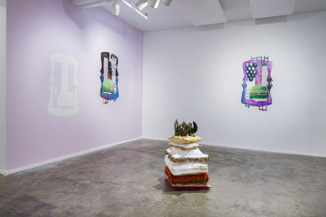 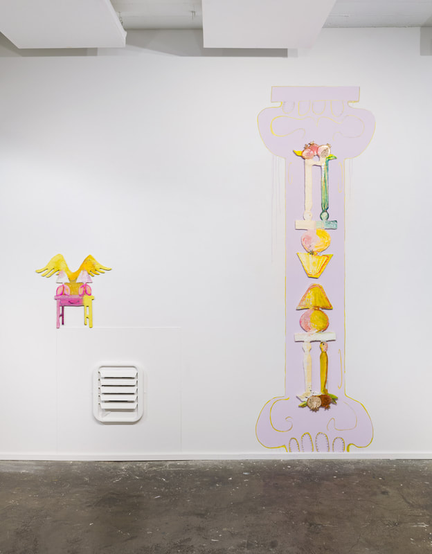 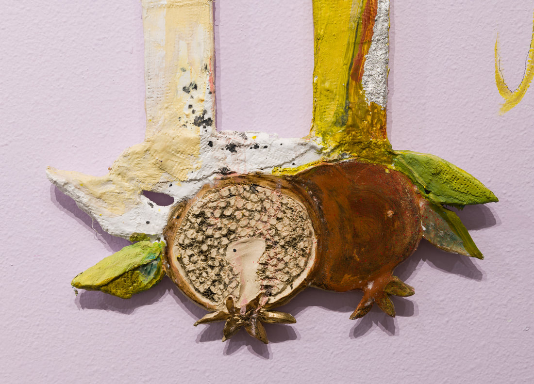 Work by: Altoon Sultan, Andrea Borsuk, Ashlynn Browning, Benjamin Terrell, Karen Schifano, Tom Bunnell (in alphabetical order by first name) The painters that I am drawn to all seem to have a few things in common, even when they’re not exclusively painting. They make work that insists the visual is as intellectual as the verbal. Their paintings demand real looking, the kind that only comes from spending time with an artwork. Their work refuses to sacrifice beauty for the sake of content. And, to loosely paraphrase a line from Karen Schifano’s artist statement, they are abstract painters that flirt with narrative elements and representational painters that fully embrace the abstract qualities in their work. When it became clear a few months ago that I wouldn’t be able to visit studios due to Covid-19, I decided to try and get artwork to come to me. I reached out to six artists whose work both inspires me and makes me think about paint’s ceaseless adaptability in the hands of creative people. “Here and There, Mostly There,” The Semi-Finalist’s first summer group issue, is the result of their willingness to share images of recent work and a few thoughts about their process and subject matter. I also asked them to describe -if relevant - how the pandemic has changed their approach to making art. I am both thrilled with and grateful for the thoughtful contributions of Altoon Sultan (VT), Andrea Borsuk (CA), Ashlynn Browning (NC), Ben Terrell (OR), Karen Schifano (NY) and Tom Bunnell (DC). Whether their work is engaged with representation or abstraction, social issues or the aesthetic investigations of a quiet poet, these six artists are continuing to make compelling and meaningful work at a time when we need it most. -David Schell Altoon Sultan 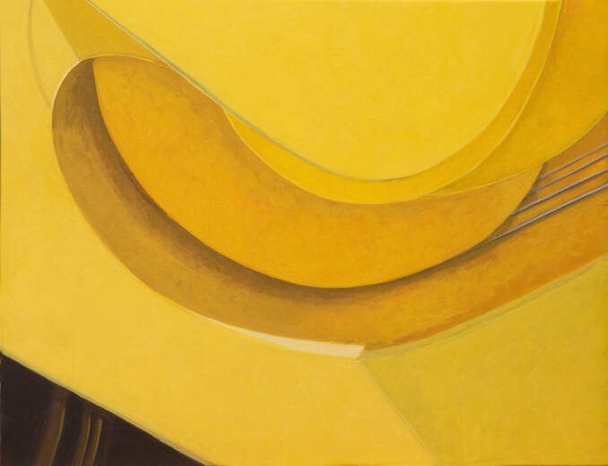 Yellow Curves, 2020, egg tempera on calfskin parchment, 9" x 12"  Above and Below, 2020, painted porcelain, 9 7/8" x 12 5/8 x 1/2" 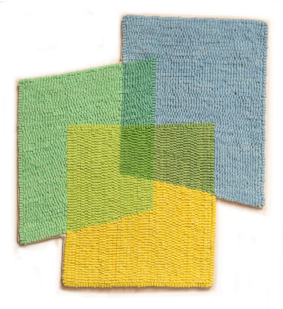 Transparent, 2020, dyed hooked wool, 16 1/4" x 14 3/4" I work on paintings and drawings at a table upstairs in my house, under a skylight. This isn’t because of Covid-19: I’ve been working here for about 10 years, since I began making small paintings and no longer needed to be in my large studio building. I work on relief sculpture downstairs in my kitchen. The virus hasn’t changed my work process in any way. In my various mediums, my work explores a range of imagery from representation to abstraction; with textiles being non-objective; paintings closer to representation with their clear form and light; and relief sculpture, paradoxically, in between. - Altoon Sultan  Sultan's studio in The Northeast Kingdom of Vermont. Andrea Borsuk  Without the Slightest Sound, 2020, oil on wood panel, 24” x 36"  A Silver Lining to All that Darkness, 2020, oil on wood panel, 24” x 36” The Virtues These paintings reveal my own efforts and tensions to quiet the mind and acknowledge that this moment is here. I am trying to stay in it and rise above it. When I began this series of paintings, I was thinking about my own discomfort in a world that is hurting. I see the figure as a barometer of this moment and its physical contortions as a reaction to the irrational and fluctuating temperature of our situation. Existing within a toxic “garden”-- a place of unfamiliar forms and fluids— requires balance, patience, acquiescence, hope, positivity, humor, and basic survival “snacks” (such as air and water) to endure challenging periods in our history. -Andrea Borsuk
Drawings and watercolors on Borsuk's studio walls in Santa Cruz, CA. Ashlynn Browning  Untitled, 2020, oil on wood 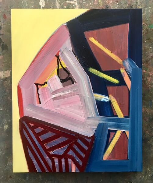 Untitled, 2020, oil on wood 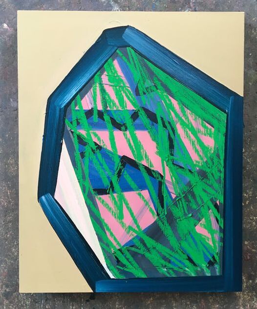 Untitled, 2020, oil and pastel on wood For the past few months I've been continuing to work in oil on wood panel but have also been incorporating oil pastel to get more gestural, drawing line qualities into the mix. I think it's been giving some new life and energy to the geometric forms. I'm going to continue working with this organic/geometric hybrid which for me speaks to the control and calculated decisions that go into the paintings, along with the freer, more intuitive side that ultimately leads the process. All of this work is very new and untitled thus far...but they range in size 10" x 8" to 20" x 16." -Ashlynn Browning
Browning's studio walls in Raleigh, NC. Benjamin Terrell  Paperbacks, 2020, oil on panel  Guston , 2020, oil on panel 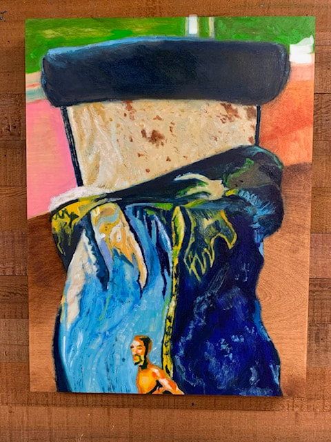 Doig, 2020, oil on panel My father was given a Cherokee name at birth but changed it legally when he turned eighteen. Life like art is a process of naming and renaming. Soon after, he traded his .22 caliber rifle to a Pawnee friend named Myron Echohawk for a Corona No.3 folding typewriter. That exchange started my father on his life long path as a writer. There is a relationship to who we are and the things we collect. Lately I’ve been painting my old LP's, books and Indian trade blankets. Art like life is a process of forgetting and remembering. I paint them for their objectness, for their spirit and so that I might recall my original name. -Benjamin Terrell
Terrell in his studio outside of Eugene, Oregon. Karen Schifano  Yes, Go, 2020, flashe on canvas, 36" x 28"  Inner Limits, 2020, flashe on canvas, 36" x 28"  Wholely, 2020, flashe on canvas, 36" x 28" My work over the last few years has jumped between reductive images of simple iconic shapes, and a series that is more pointedly concerned with race relations. Even though those issues are in the news right now, I am actually feeling more drawn to shapes that reflect a place that is timeless and beyond contingencies. The pandemic has drawn me inwards again. -Karen Schifano
Schifano's studio walls in the Brooklyn Navy Yard, NY. Tom Bunnell 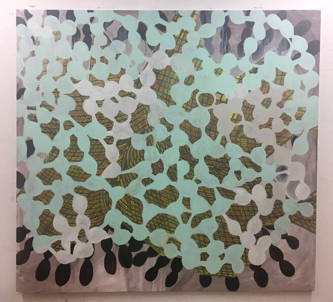 Dark Gem, 2019, oil on canvas, 60" x 64" 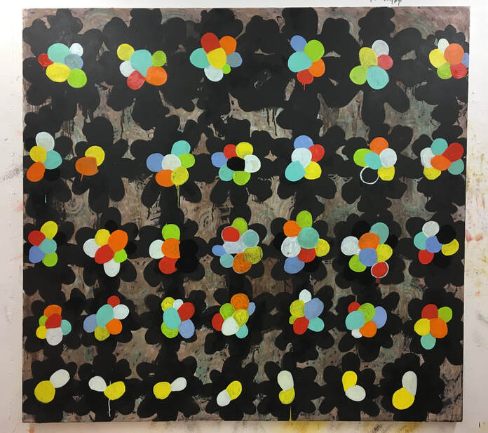 Extra Viti, 2019, oil on canvas, 60" x 64" 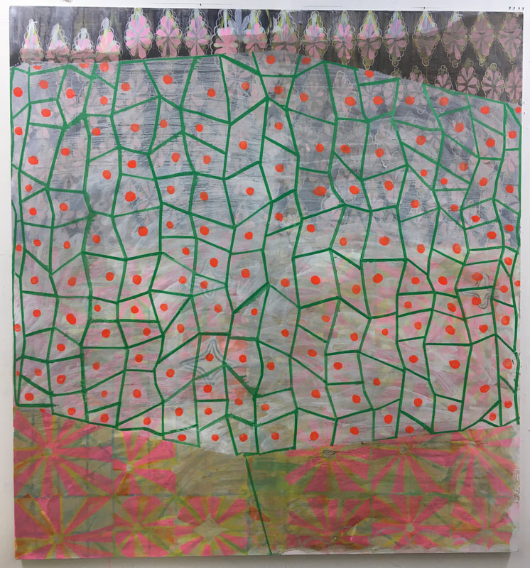 Fortune Teller, 2020, oil on canvas, 58" x 60" In these most recent paintings (last two years) I have been allowing for different patterns and impulses to coexist in the painting. It's not a new idea, but it feels right as a direction currently. All these observed and fragmented systems in our lives! The paintings are about these systems. Some are repressive, some are comical and some are subliminal. -Tom Bunnell  Bunnell's DC studio.
 Untitled Work in Progress, oil on linen, 9" x 12", 2020 A couple of months ago I came across this wonderfully succinct Edward Hopper quip: “If you could say it in words, there would be no reason to paint.” I only recently learned who the quote is attributed to, but it’s one that I’ve heard variations on over the years, used by artists and teachers to make the point that painting is its own language. Painting exists to help artists say something visually, and the paint in turn helps to shape the understanding of what is being said. Ground pigments on a flat surface can clarify meaning, but they can just as easily muddy and obscure it. In the right hands, however, this is where things get interesting. I don’t actually see the influence of Hopper in Brenden Clenaghen’s work (not at all), but I do love how Clenaghen's colors and shapes are frequently unnameable. In fact, when I’m in front of one of his paintings I often find that I'm not sure what I’m looking at. I just know that in my head words are momentarily silenced and I am able to privilege a visual experience. Whereas one of Hopper’s paintings might clearly and literally illustrate a moment of quiet contemplation, one of Clenaghen’s will suggest fragments of daily life while never fully confirming my suspicions about what is being depicted. He hints and implies but resists the obvious, a quality that I admire in his small but densely packed canvases. Below are images of Brenden Clenaghen’s work as well as a short interview that was conducted via email. The studio visit took place prior to the regional form of quarantine that currently exists in Portland, Oregon, but we still performed the awkward dance of trying to stay six feet apart. It was not easy.  Brenden Clenaghen in his studio. The Semi-Finalist: Tell me about your early days as a student and an artist. What were you interested in? Who influenced you? Brenden Clenaghen: My early (teen) visual influences were tied to music scenes I was involved with. I played in bands and produced drawings for various local 'zines in the early 80's. Artists I looked to from this time included Pushead, Raymond Pettibon and Winston Smith. Additionally, I was looking at 60's "psychedelic" poster artists. In 1986 I moved to San Francisco to attend SFAI and becme interested in Bay Area Figuration, various strains of Expressionism, Performance/Video Art and George Kuchar (in particular G.K.'s video diaries).
Untitled Work in Progress, oil on linen, 14" x 11", 2020 and a corner of the studio. S-F: When we spoke at your studio you mentioned that you sometimes work on paintings for years before calling them done. Can you talk about your process and how time plays a part in it? BC: I start many paintings at a time. At the beginning I work quickly to get information on all of the surfaces. Sometimes there are reference sketches, and sometimes I paint whatever comes to mind. Moving forward there is a lot of adding, editing and restructuring. I’m looking for something surprising or unknown, living with the paintings for extended periods allows for that. Also, the types of surfaces that are a byproduct of so much editing produce a physicality I value in the work. 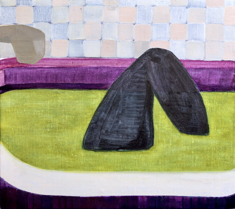 Untitled Work in Progress, oil on linen, 11" x 12.5", 2020 "The tactile surfaces suggest various types of corporeality, maybe promoting physical responses to the work: can you feel this dry, rough wall? are you touching your leg?" S-F: Your surfaces are tactile and your imagery is fragmented. Talk about that. BC: A lot of the work presents bodies existing in, and responding to, various structures. The tactile surfaces suggest various types of corporeality, maybe promoting physical responses to the work: can you feel this dry, rough wall? are you touching your leg? I think of things falling apart, being dismantled, folding in on themselves and then being remade in different ways. Some of these paintings seem like depictions of an in-between state within that imagined process. This in-between space, to me, is one of intimacy, raw self-regard, privacy, meditation, escape etc.--someplace where definitions are slippery. I resist claiming my work is about anything--it’s not a novel, it’s not hard research. It is a personal response to visual culture, and my life, and materials, and the history of painting and being alone in a studio, or a bathtub. There is meaning, but I hope it is in a state of flux.  Untitled, oil on linen, 12" x 9", 2020 S-F: You’ve been working as something of an outsider to the Portland art scene for years. How has that impacted how you think about larger trends in art and what it means to make a painting? BC: I’d say I’ve just not shown in a while. I teach. I’ll show up to events. I still talk to art pals. A friend of ours recently introduced me to someone as an “underground” painter, and I loved it. The idea that one could be mythologized for not participating has a romantic appeal. And obviously I’ve not grown past my teen punk self. I’m always looking and thinking about paintings, of now, of then. The biggest impact has been not exhibiting, and what type of headspace that surplus of time -and lack of audience- presents. The work will be shown at some point, though.
Untitled, oil on linen,12" x 11", 2020 and Untitled, oil on linen, 12" x 12", 2020 S-F: How do your color relationships develop and how do you arrive at a final decision? BC: The color develops through editing, just trying things out. But the decisions are driven by thinking about color in its various modes (iconic, as signifier, naturalistic, phenomenological, etc.) and how these might intermingle. The color should describe a type of lighting situation, vibrate in a particular way and/or be of questionable taste. 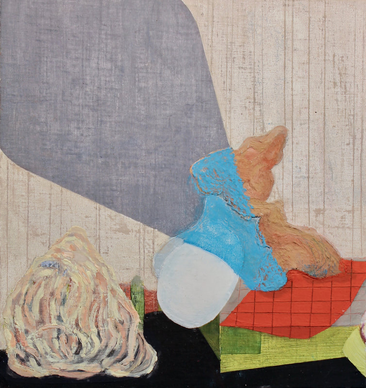 Untitled Work in Progress, oil and pastel on linen, 13" x 12", 2020 "The color should describe a type of lighting situation, vibrate in a particular way and/ or be of questionable taste."
A detail and a portrait of the artist. S-F: Whose work are you looking at and what kind of an influence do you think it’s having on you? BC: Very recently, I’ve been thinking about Maria Lasnig, Bonnard, Forrest Bess, early 90s hip-hop producers, 70s body art etc. But I have greedy eyes and look at a lot of things, paintings and other. Every move in the studio has a link to something. It’s a favorite part of the process to see what appears and think about sources, and what stays and what goes.  Untitled Work in Progress, oil on linen, 9" x 12", 2020
Studio walls. SF: Tell me how teaching and parenting have influenced your artwork. BC: Teaching keeps me in the pocket: thinking and talking about the essential components of painting/making, with students, on a regular basis. Plus, consistently being around people who are producing such a wide array of responses to the world around them, often in very fresh ways, is an incredible experience. Parenting seems to have made the work more personal, intimate and domestically oriented. Broader cultural concerns have a way of falling away when faced with the chaos, beauty and immediate concerns of being a parent. My children make me laugh, a lot. S-F: What’s next for you? BC: More painting. More teaching. A show on the horizon. Below are some earlier works by Brenden Clenaghen, and you can see even a bit more on instagram: @brendenclenaghen.  Untitled, oil on linen, 12 x 9", 2020  One Between Nothing, oil on linen, 11"x 13", 2012 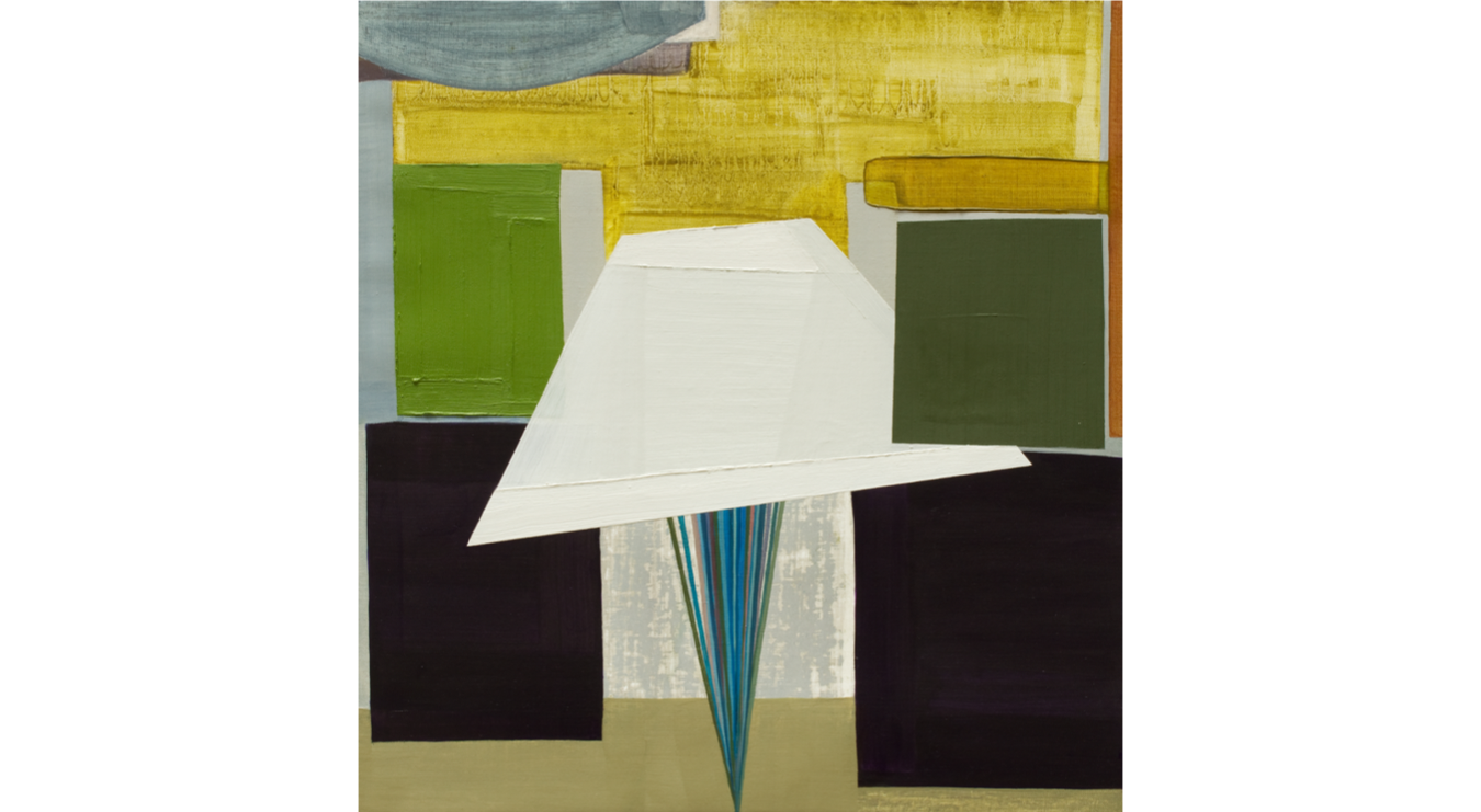 Amplifying , oil on linen17" x 16", 2012  Follow Blind, oil, acrylic, plastisol PVC and joint compound on panel,
16" x 24", 2008 The moment that we're in can be strange, frightening and full of uncertainty. One bright spot for me, however, has been communicating with past Semi-Finalists and finding out that they are all doing reasonably well. Schedules, routines, and access to materials may have been upended during the quarantine, but the urge to make something relevant has not been diminished. In the words of Tia Factor (featured below), the key to being creative in this time is learning "...to make a reduced world work, to be resilient, remain patient, practice kindness, and find moments of joy wherever you can." I recently asked past S-F participants to send studio snapshots and a brief description of how they are navigating art and life during the pandemic. The results filled me with so much hope and I'm happy to be sharing these updates from an unstoppable group of artists. Stay inside, stay healthy, and I hope this issue of S-F brings you a few moments of joy and inspiration. -David Schell (The following Semi-Finalists appear in alphabetical order. Click on the artist's name to be directed to their website or gallery.)  "I’m starting to plan for my 2021 show at Melanie Flood Projects. Making some larger paintings for this show and possibly some wall paintings. Lots of ideas swirling around in my head right now that are informing the work: histories and cultural ideas around wall coverings and ornamentation; the history of witch-hunts; menopause, aging and disease; homage; vanity; kitch; friendship; girlhood, etc." -Amy Bay
 "Going to the studio every day even if it is just to clean. It is fundamental to keep my creative practice flowing. Working from home gives me the opportunity to discern and contextualize the content of my art. Right now I am working on a life size ceramic sculpture for a public space and also on differently scaled sculptures. By working on this larger piece I'm learning how much I can push the material while solving technical problems." -Iván Carmona
"I've been staying in Eugene at my in-laws' house for the past three weeks, separated from my Portland studio. The pace is slow and simple with a focus on improving the home and property. Creatively, I'm mostly thinking about which trees to plant and how they will provide future benefit for both the urban wildlife habitat and the aesthetics of the neighborhood. Projecting into the future is keeping me distracted from our overwhelming current situation. My ongoing "Citadel" series leads me to find or produce images of simple structural shelter and calm order, with an appropriate mood of meditative solitude. Here are a few recent linocut prints and photographs." -Doug Davidovich
"I'll admit I've indulged in a fantasy of using this quiet, seemingly simple time as if it were at an artist residency. This dream lasts only moments before I'm reminded that I am extremely far from that lovely place of focus and solitude. With all schools closed, I no longer have any break from my 11-year old child. Overnight I've become her full-time companion, her ad-hoc home school teacher, and even her PE teacher! And I'm reminded that my one week off from teaching college art for "spring break" was the same week I was tasked with figuring-out how to transform my art courses into a remote format. This has been a creative time for sure, but definitely not in any of the ways I might have anticipated (or actually wanted). Its creativity is in how to make a reduced world work, to be resilient, remain patient, practice kindness, and find moments of joy wherever you can. *Images are from my home studio and a new painting I'm working on from the Private Places series, based on conversations with folks who live in gated communities. The other images are ways we've found to cope during this crazy time, from writing-up a schedule (we never seem to stick to), to making bread and making slime." -Tia Factor
"I have been making a series of hand-drawn posters and shirts. I really like being able to make quick things at the moment since I am still doing school work." -Ralph Pugay
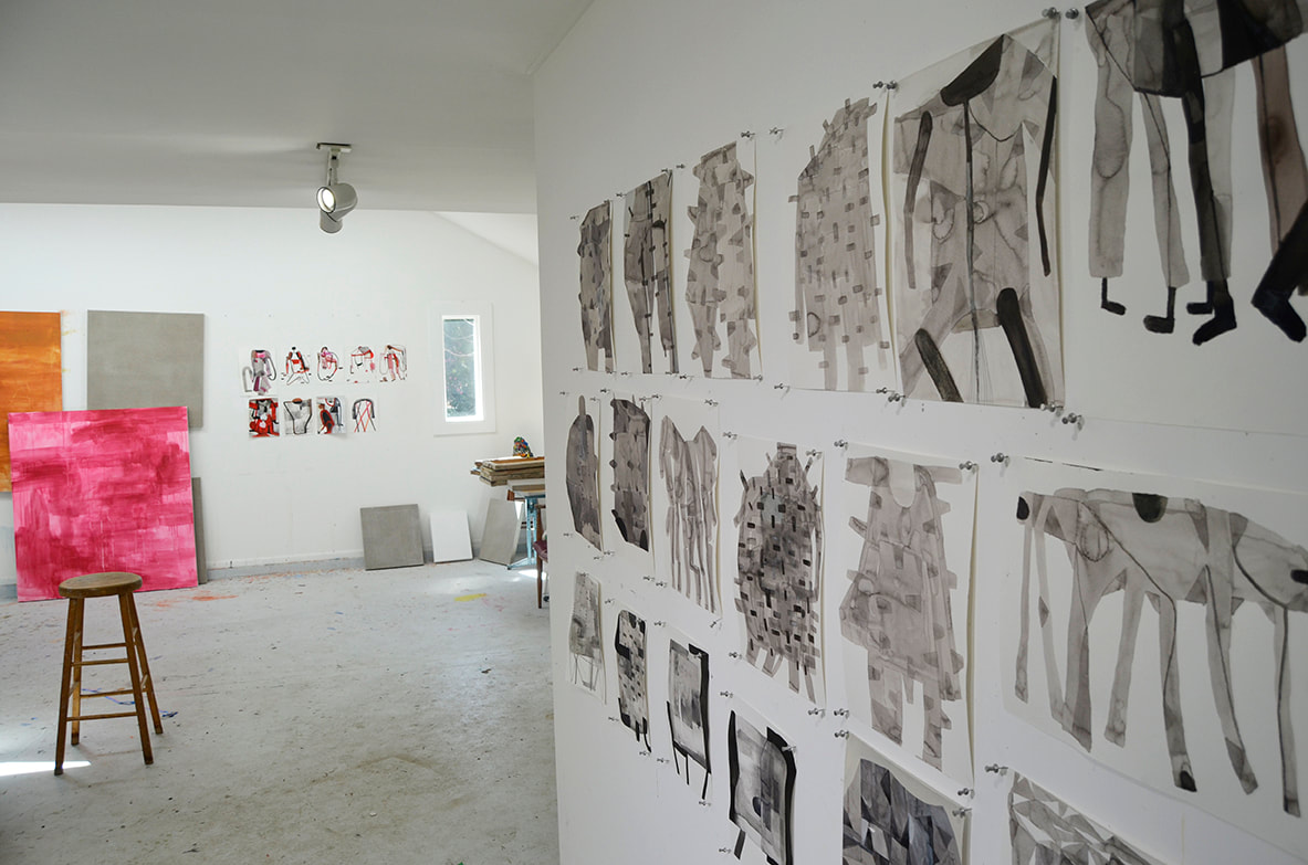 "What my studio practice looks like now:
Drawing. I have been drawing with ink on paper a lot. I find that it calms me and doesn't require the commitment of painting which is so difficult right now with the dull ache of anxiety that pervades each day. I made a little nest in my studio and use leftovers of ink, paper, crayons, and just meditatively build forms sometimes listening to music, sometimes to news. I have also been using my studio to start seedlings and sew masks for Sew to Save. I am still teaching and working really hard to make painting relevant for my students through the thin medium of Zoom. The crazy expectation that I would have more time in the studio during the pandemic has not come to pass--I am busier than ever--home farming, teaching full-time, parenting, cooking, caretaking a parent from afar, staying sane. And like everyone else, trying to understand this moment and what it means. Daily responding is necessary. 4/7/2020" -Cara Tomlinson 2/22/2020 The semi-finalist is: tia factor Nowhere Everywhere Oil and spray paint on acrylic dyed canvas over board, 48" x 60" 2018 Photo: Dan Kvitka My introduction to Tia Factor's artwork was Private Places, her show at Oranj Studio that was curated by Pamela Morris in 2018. At the time I was reading about Nicolas Poussin, the 17th century French Baroque painter known for elegantly balanced landscapes as well as biblical and historical scenes. Poussin often depicted an Arcadian countryside whose beauty was undercut by the suggestion of danger and the reality of death. What struck me about Factor's work was her personal approach to a similar theme, using the genre of landscape painting to document the darker side of utopias and communal living spaces. Like Poussin, she's not interested in simply illustrating pastoral views. Instead, the landscape is a vehicle for talking about instability and the human condition. But in Factor's paintings, instability doesn't come from nature or war, it comes from within. It is our own desire to create perfect environments and gated communities that contributes to the isolation, segregation, and conspicuous disparity that we see in our culture. Despite the gravity of her subject matter, Factor's paintings still manage to be beautiful and inviting. It's a jarring combination that makes me enjoy her work visually even as it leads me to consider troubling issues like inequality in America. Tia Factor recently agreed to be interviewed for The Semi-Finalist. Below are some questions, answers, and images of her work.  The artist in her studio. Semi-Finalist: Let’s start somewhere near the beginning. How did you get started as an artist? Tia Factor: Both sides of my family had a real appreciation for art, especially on my dad’s side. There were a lot of artists in my dad’s family. My dad’s aunt Anne was a well-known artist in Israel and had supposedly even worked with Diego Rivera on a mural or two. With all these artists in the family it wasn’t a surprise that my dad and his brother both became artists. I also loved making art growing-up and got a lot of encouragement from my parents. However, I don’t think I ever envisioned a future for myself that included becoming an artist in the career sense of the word.  Can We Just Live Here? Oil and spray paint on acrylic dyed canvas over board, 30" x 40" 2019 Photo: Jim Lommasson Having grown up with parents who embodied the classic archetype of hippies, I wanted a more conventional life for myself. I tried that on for a while in high school but eventually moved to the Bay Area and basically followed in my parents’ footsteps, who also moved from Chicago to the Bay Area as young adults, forging a non-conventional path for myself. I lived out in the country and hung out with the alternative folks, hippies, punks, artists, who all prioritized self-discovery above anything that might resemble a “responsible” career path. Not surprisingly, I ended-up in art school where the most obvious career path was to become an artist. What is surprising, though, is that I stuck with that path. The relationships with professors and peers from that period in my life were so meaningful and influential that I felt I had found “my people” as well as a guiding sensibility of how I wanted to be part of this world. While I don’t believe we are ever fixed in one identity and all of this is still evolving, I do know I will always be a person who values and finds satisfaction from the creative process and a sense of kinship within the art community.  Can We Just Live Here? (Detail) S-F: You seem to love exploring the tension between privilege and alienation, beauty and ugliness, reality and artificiality. Can you talk about the origins of these themes in your work? TF: These are definitely ideas that circulate around my work. In unpacking the origins of these ideas, I’ve often looked at my own previously mentioned “coming-of-age”. I look at these oppositional forces in my upbringing that were imprinted on me: on the one hand I was born at home under the redwoods of Northern California, the only offspring of two young and idealistic hippie artists. The beauty of that rural place and the ethos of the time cut a deep groove in my psyche. When I was only seven years old we moved back to where my parents were from, to the urban expanse of Chicago and its endless suburbs. My parents slowly cast-off their 60’s identities; meanwhile, my cultural context and physical surroundings also shifted pretty radically.  It's What Life Should Be Oil and spray paint on acrylic dyed canvas over board, 30" x 40", 2019 Photo: Dan Kvitka "Privilege/alienation, beauty/ugliness, reality/artificiality. All those concepts exist simultaneously in these constructed, aspirational, environments and, as you noted, in my paintings too." -Tia Factor The cultural values in suburban-Chicago were more conventional; the overall aesthetic of the built environment there was also more predictable and defined. The shift in surrounding landscape and the cultural context that came with it became a tangible symbol of the impact that the external landscape has upon a person’s internal landscape. Once I identified this belief, I had found my creative thesis, so to speak. This was around thirteen years ago. Since then, all my work looks at the environments that people create as a signal of their values, beliefs, fantasies, and aspirations. I look at how these environments impact how we feel- psychologically, emotionally, spiritually. Some call this psychogeography, but I feel the term topophilia more closely reflects what I’m after in my work because, as it’s defined by Yi-Fu Tuan, topophilia points at “the affective bond between people and place or setting” and it often becomes mixed with a sense of cultural identity and a love of certain aspects of place. Looking at projects like No Place, a series in which I interviewed folks who grew up in utopian experiments of the 70’s and 80’s, I think about how an environment like that separates itself from the larger society, creating an idealized place that simultaneously alienates its members from the larger culture.
Details of It's What Life Should Be. This project continued on but evolved into a darker iteration with my series Private Places. This project emerged in November 2016 when Trump was elected and I just happened to be staying in a gated community in Hawaii. I stopped romanticizing communal life and began seeing the significance of the self-segregation Americans engage in as they isolate and protect themselves in cultural cocoons, converging and finding comfort among people whose values reflect their own most closely. While this is going on in places like Portland, where I’m writing from, the most blatant manifestation of this takes the form of a gated community which can also be seen as a contemporary version of a utopian experiment; at heart we find the same impulse to live among like-minded individuals who share in our values and usually look a lot like us. Members of the community, which may or may not have an official covenant, appreciate the benefits of shared resources and closeness with other community members. While this may sound wonderful, I always have to look at the flip-side and ask the question: who is excluded in this scenario and how does that lack of diversity and challenge limit the thinking and potential growth of those who have chosen to live behind walls? Privilege/alienation, beauty/ugliness, reality/artificiality. All those concepts exist simultaneously in these constructed, aspirational, environments and, as you noted, in my paintings too.  Cimarron Oil on acrylic dyed canvas over board, 30" x 40" 2019 Photo: Jim Lommasson S-F: It was really exciting to see so many works in progress in your studio. Tell me about your painting process and how it’s evolving? TF: All my work tends to start with mark-making that is loose, ambiguous and amorphic as the underpainting. I like responding and conversing with that underpainting, or visual noise, which I also feel sets the overall tone for the work. The shift that my work has undergone lately has to do with content, as I explained earlier, as well as the general tone or emotional space that the deepest layer of the painting creates. In my current work you can see this shift in terms of my palette, which is now mostly warm hues with high-key values (lots of whites, yellows, and pinks). I stopped using the indigo dying process –indigo created a cool, internal, down-tempo atmosphere– which unified and set the emotional tone for Escapism, a series I worked on throughout 2016-17. Now I begin each painting with a Helen Frankenthaler-esque, gestural staining process with fluid acrylics. The stains flow and move across the pre-soaked canvas like pools of watercolor on paper. I love starting a painting with this sense of abandon and lack of control. When I leave the studio, the paint continues to flow, spreading and eventually drying in ways that are completely unexpected. It’s a chance-derived improvisation. I need this sense of surprise to keep myself truly curious since what I paint on top of it is fairly representational, derived from a photographic source.
The backside of one of Factor's canvasses; something being started and something near completion. TF (continued): Another new way I’m building-in less prescriptive processes is by working with my source images in design programs first. I abstract them by applying filters and unrealistic colors and then combine the underpainting stains with the photographically derived imagery. I’m excited to see how much weirder and more abstract the work is becoming because of this process. I want the work to exist in that liminal zone between recognizable places and emotionally disorienting, seductive and abstract spaces.  Inside, The Good Life Oil and spray paint on acrylic dyed canvas over board, 48" x 60", 2018 Photo: Dan Kvitka S-F: How does drawing play a role in your process? TF: Drawing is not really playing into my painting process these days. I used to print out my photo sources and make big composite drawings that were sort of drawn collages. I’d use these drawings as a jumping-off place for the painted works. But now I’m bringing the imagery into a digital program and creating a mock painting which becomes the blueprint I build the real painting from.
Small studies and a corner of the studio. S-F: Your studio is filled with books and images that you refer to as sources of inspiration. Who are the artists and what are you learning from them? TF: I’m really into contemporary painting and have so many favorite painters. Peter Doig is way up there in my pantheon of painters because meeting him when I was a grad student at Berkeley completely influenced my creative trajectory at a crucial moment. Seeing his work gave me permission to make landscape painting, which has so much historic baggage that it can feel a bit fraught. Doig made the landscape feel fresh, relevant, personal and weird all at once. I also admire Doig’s pal Chris Ofili. Ofili’s work is also weird, honest, authentic and sometimes just straight-up awkward. I want all of that to be more present in my work and what others might say about my work. I’m also really interested in Hurvin Anderson and Michael Armitage. They both articulate that drippy, colorful, magical-realism that directs the viewer into liminal landscapes while delivering cultural commentary on an almost subliminal level. A few more painters who do this and who I admire tremendously are Kerry James Marshall, Mamma Andersson, Hernan Bas, and Njideka Akunyili Crosby.
Sources of inspiration. S-F: Getting to know you and your career as an artist, it’s become clear that you do not sit still for very long. Talk about the projects that you are involved in outside of the studio. TF: A few things that come to mind are the gallery space I co-curate and my ongoing engagement with the Berlin art world in the form of leading students from Portland State University (PSU) each summer there. The gallery is called Erickson and I’ve been involved with that space for close to two years now, mostly curating emerging artists and talented recent grads from the School of Art + Design at PSU. We’ve just brought-on a new curator who’s programming shows throughout the year of work made by incarcerated artists at the Columbia River Correctional Institution (CRCI), a minimum security prison here in Portland. As a painter and curator, I’ve been a guest of the CRCI art program and plan to start going more regularly to teach classes. Going to Berlin is an amazing experience for my art and design students; it provides inspiration and connection to a broader and more diverse art scene that operates in a really different way than our regional scene here. For me, and the students, Berlin is inspiration, education and personal connection to a different art world. All of that helps me get out of my comfort zone and make better work.  Pushing the limits of the studio space. S-F: What’s next for you? TF: Something that’s coming right up and is pretty exciting is the painting symposium and exhibition, Making A Better Painting: Thinking Through Practice, at the Hoffman Gallery (Lewis & Clark College, Portland). I collaboratively curated this exhibition and symposium with a number of other Pacific Northwest painters and educators and we’ve invited Molly Zuckerman-Hartung to deliver the keynote. As part of the exhibit we also created a parallel juried student show guest curated by painters Tatyana Ostapenko and Amy Bay (a former SF interviewee). All of us who organized Making A Better Painting are having a show called A Better Painting Pop-Up at Erickson Gallery that will be the culminating event of the symposium on Saturday, March 7th. Hope to see you at one of these events! S-F: The entire S-F team is planning on attending. See you there! You can see more of Tia Factor's work and geek out on her CV here. Below are a few more paintings. 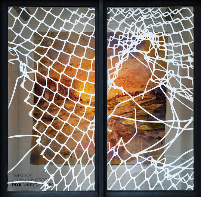 Harmony Cocoon, Factor's installation for the PDX Contemporary Window Project. Installation view: Vinyl on glass, oil on unstretched, acrylic stained canvas, 139 ½” x 94” x 63", 2019 Photo: Dan Kvitka 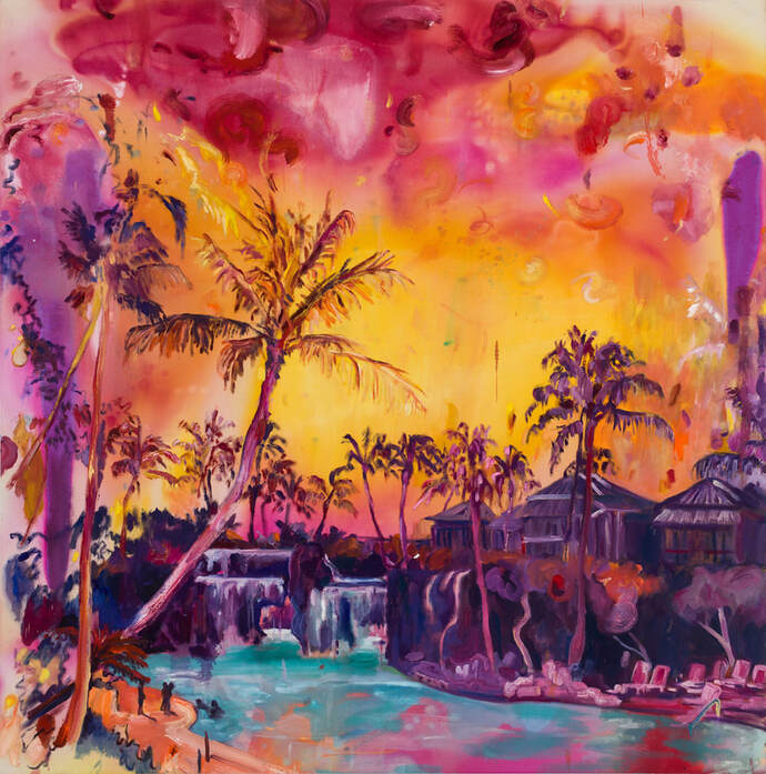 Perfection Awaits You Oil on acrylic dyed canvas, 47.5" x 48", 2018 Photo: Dan Kvitka  Skamania Oil and spray paint on acrylic dyed canvas, 48" x 48" 2018  Somewhere In Canada (from the series Escapism)
Oil on indigo dyed canvas over board, 48" x 60", 2016 1/12/2020 the semi-finalist is: ralph pugay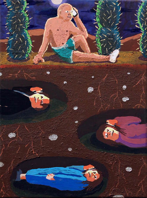 When I visited Ralph Pugay’s studio last month, I was immediately drawn to a small painting of a partially dressed man in a desert at night. He is sitting on the ground near the top of the picture, casually reclining under the light of the moon. Three figures -presumably in graves- are buried deep beneath him, exposed by a cutaway composition that lets us peer into the earth. In a surreal twist, each figure has a phone held up to the side of his or her face, so that even in this nocturnal and underground setting they are all dramatically lit with a familiar glow. The image, at once funny and somber, suggested to me the near universal need to feel connected to a world beyond our own. But rather than being blandly ironic, it speaks to a very real desire to maintain an open line of communication with people even after they are gone. The half-dressed man and his buried companions all have their phones pressed up to their ears, but it’s still difficult to tell if anyone is actually trying to talk. They are all, at the very least, listening. Below are some photos, questions, and answers from a recent visit to Pugay's studio in NE Portland. You can see more of his work at Upfor Gallery and http://www.ralphpugay.com/.  The artist in his studio. Semi-Finalist: Let's go back to the beginning- how did you get started as an artist? Raph Pugay: I dabbled in photography in high school but never really took it that seriously since my teachers would always tell me that my pictures weren’t that good. I moved to Portland State to pursue an architecture degree. That plan fell through after a week of moving to the city and after a week-long snow-storm derailed my course schedule which was already off-track to begin with since I began school in the middle of the academic year. I decided to change all of my classes and committed to dabbling in different courses for a bit. Took a drawing class and fell in-love with it, so I just decided that I would commit to art as a major.  "I like having a number of projects laying around..." S-F: Can you talk a little bit about your creative process? RP: I am not much of a planner when it comes to my paintings. I wish I was. With being a full-time professor, it would help me optimize my time better. I like having a number of projects laying around to work on so that I have some options in terms of finding what I can accomplish. If I can keep the momentum of being excited about working on something, then that is usually conducive to being excited about other potential projects. Working small-scale leaves the opportunity for feelings of excitement to keep going through the duration of realizing work. If I get bored with accomplishing something half-way through, I leave them behind in the meantime until I can imagine them having other possibilities. I have worked on project-based works that do not allow for that kind of liberating schedule, though. It is nice to have both going. Inspiration comes from listening, reading, writing, talking, and experiencing. I was working exclusively with acrylic for awhile but I have grown to love and play with other materials as well.  "I think humor is really good in drawing people in in an unguarded way..." (acrylic and paint pen on paper) S-F: You have a way of making absurd, comical, dream worlds that somehow illustrate elements of the human condition and our near universal concerns as a species- what’s up with that? RP: I think humor is really good at drawing people in in an unguarded way and I like the idea that a still image amidst all of these technological advances can still disarm people. I think that is really useful especially at a time when people are always distracted. The paintings can sometimes be about having a place to put all my anxieties and fear about the world; but they can also be about being brave and finding moments of beauty in murkiness. I like that my work kind of starts out foundationally from a place of feeling how topsy-turvy the world is, but I like that making something like paintings from it can ground you into feeling like you can still make something that is real, that is born out of a real feeling, despite how momentary feelings can be.
Works in progress. RP (continued): Humor is really good in helping us acknowledge how fragile our rules and guidelines for living are. Sometimes these guidelines provide us with a narrow viewpoint which can crystallize in our psyches and our bodies in a way that can make people rigid, angry, and ugly. I like the idea that humor is a good way to shake all of that off. The painting process in its duration actually is a really good way to determine how funny something is. If you’re painting something for a really long time and you are still interested in it by the time it’s done, then you probably have something that is really good.  Ink on paper S-F: Your drawings take on a life of their own that is quite different from the finished paintings. How do you see them fitting in to your overall body of work? RP: They’re studies that have a life of their own. They come from the same place-- but processed through a different kind of durational experience.  A corner of the studio. S-F: I know that you have a diverse range of projects that you’ve worked on, from botanical installations to animated gifs. Are you currently working on any projects outside of your paintings and drawings? If so, what are they and when can we expect to see them? RP: I will be doing a show in the Philippines and I’ve always wanted to do a project there. I have some ideas of what I would like to do as an excuse to visit more but you never really can determine if it is potent until you’re at that place. So suffice it to say, I am excited to go.
The artist and a model. S-F: You recently did a mural for Facebook. How was the experience of scaling up your work? RP: I really liked it. It took awhile to figure out how to make it work, but I really loved the large scale and makes me want to do more projects like that. S-F: You have so many great art books in your studio and a deep appreciation of art history. Who have you been looking at lately (living or dead) and are they having a visible impact on your work? RP: I am geeking out on some Horace Pippin right now. I love how muted his palette is and some of the narratives have a whimsical yet quiet quality about them.
Works on paper. Maybe done, maybe not.  Works in progress; acrylic on canvas. S-F: What’s next for you? RP: I have a couple of group shows in Oregon and a group show in New York and in the Philippines which are all happening this earlier part of the year. I am currently in the process of signing up for a summer residency to work with a master printer too which I am pretty excited about. Below: More Pugay  In the studio.  Works in progress; acrylic on canvas.  Drawings, drawings, drawings.  Acrylic on canvas. 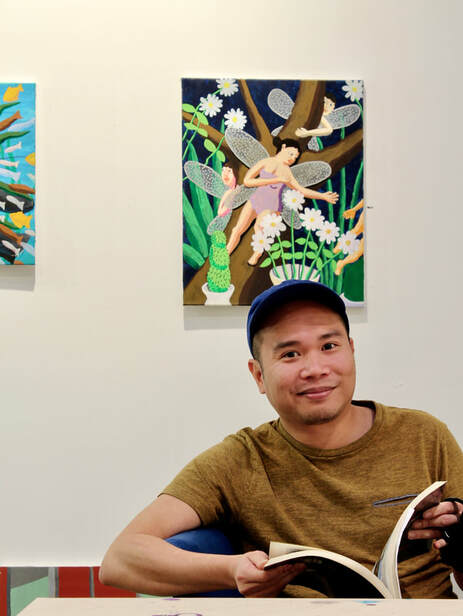 12/1/2019 THE SEMI-FINALIST IS: IVÁN CARMONA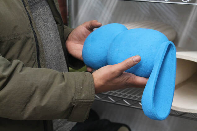 In the studio with a nearly finished piece. My first encounter with Iván Carmona’s work was seeing Imprint of Place, the two-person show that he was in last year at PDX CONTEMPORARY ART with Liz Rob. I went during the first Thursday opening and the gallery was filled with supporters, collectors, and casual onlookers, but I remember immediately feeling like I was the only person in the room. Rob’s wall pieces maintained a commanding presence from the outer edges of the space and a long table full of Carmona’s intimate, brightly colored sculptures pierced through the winter coats shuffling across the gallery. Seeing that table was like unexpectedly seeing an old friend at a party who I hadn’t realized I was missing and having them call me over for a private reunion. When I think about that moment, I don’t remember hearing a single conversation taking place in the gallery. In my mind’s eye it was as quiet as slipping under the warm, soapy water of a bath, and I can see myself walking towards the table of painted sculptures that felt like they had been conjured into existence specifically for me to look at. It was, quite simply, a transfixing visual experience. Iván Carmona recently let me visit him in his Northwest Portland studio. Below are some Semi-Finalist questions and Carmona’s responses. Many of the photos are by Mario Gallucci courtesy of PDX CONTEMPORARY ART.
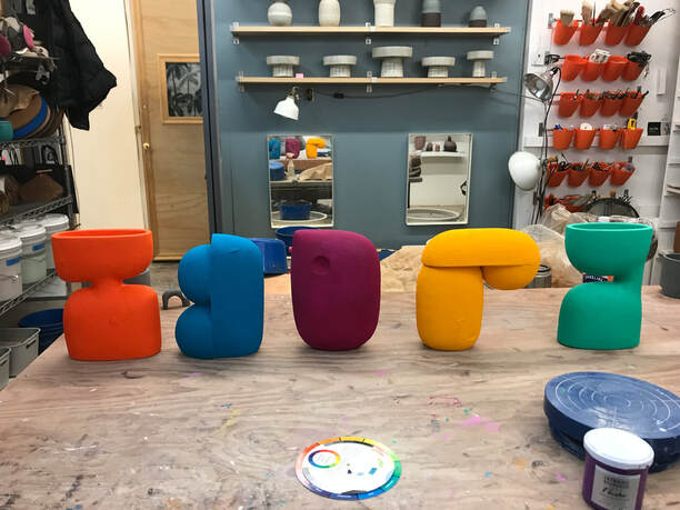
Left: works in progress in Carmona's studio. Right: Flamingo, flashe on ceramic, 2019. Photo: Mario Gallucci Semi-Finalist: Iván, your work is often deceptively simple. How do you arrive at a given form? Iván Carmona: My forms are inspired by nature, fruit, tree leaves, pebble- stones. Sometimes it is from my Puerto Rican culture or a specific time from my childhood memories. SF: Can you talk more about how memory plays a role in your creative process? IC: I think that my new body of work comes from a romantic idea of nostalgic memories of a past childhood, my first impressions of nature and cultural experiences.
Works in progress. S-F: Have your abstract vessels and shapes always been on the minimalist side, or did you arrive at this language over the course of several years? IC: No, I was always attracted to the minimalism movement. Before that my work was concentrated on human and animal figures and then I slowly turned to abstractions. S-F: I’m very drawn to the color in your work. It’s bold, direct, and completely approachable. Can you talk about your color choices and the inspirations for them? IC: In my process, sometimes the form and color emerge at the same time. The form and color activate a specific moment, a memory of my life.
Left: Abrázame, flashe paint on ceramic, 2019. Photo: Mario Gallucci Right: A corner of the studio.  Iván Carmona talking about form and memory. S-F: You’ve mentioned Alexander Calder and Isamu Noguchi as influences. What kind of impact have they had on your work? IC: The use of materials on their own and how the history of that material speaks. His (Noguchi’s) innovative work, he experimented with biomorphic forms to create unexpected aesthetic combinations. S-F: Are there other artists, living or dead, that you’re currently looking at? And what are you taking away from them? IC: Ellsworth Kelly: his use of vibrant, saturated colors and his use of negative space. Anthony Caro: suggestive shapes which he then painted with uniform colors, linear in form, and prominent in character.
Left: getting ready for the kiln. Right: Cacique, flashe paint on ceramic, 2019. Photo: Mario Gallucci S-F: What are some of the other projects that you’ve been developing alongside your cohesive body of abstract forms? IC: I love the symbolism of everyday objects and tools. With them I like to deconstruct them and create a new narrative, a personal or political statement.  An example of Carmona's interest in using found and modified objects to create new narratives. S-F: What’s next for you? IC: I’m working on a new body of work. S-F: What’s your dream project? IC: My dream project is to make a colossal piece for a public space. S-F: I can't wait to see it. 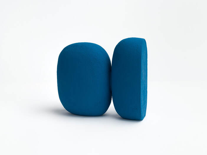 Above: Llanura, flashe paint on ceramic, 2019. Photo: Mario Gallucci Below: Huella, flashe paint on ceramic, 2019. Photo: Mario Gallucci 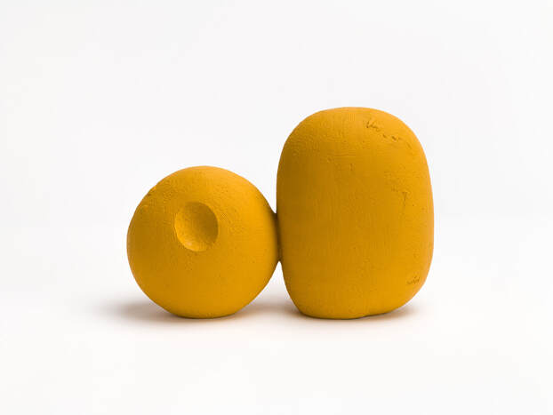 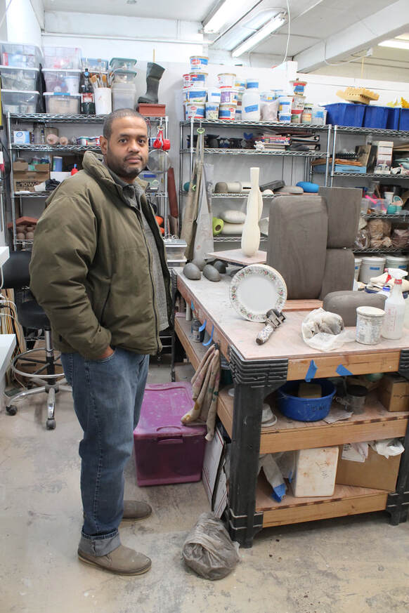 The artist in his studio.
Left: Pavo Real, flashe paint on ceramic, 2019. Photo: Mario Gallucci
Right: Ventanita, flashe paint on ceramic, 2019. Photo: Mario Gallucci You can see more of Ivan Carmona's work here. Sublime opens on December 4th, 2019 and runs through the end of the month. Full disclosure: I live with an Iván Carmona original and it makes me incredibly happy every time I look at it. 8/2/2019 THE SEMI-FINALIST IS: CARA TOMLINSON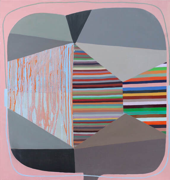 Transmission, oil on linen, 36" x 34", 2019 A few weeks ago I was fortunate enough to visit the studio of Cara Tomlinson for a Semi-Finalist interview. I've followed Cara's work since the early 1990's and have always been drawn to her subtle use of color and the scale of her forms. She somehow makes her compositions appear both intimate and monumental at the same time, a combination that has kept me coming back to look at her work again and again. Below are some Semi-Finalist questions and Cara Tomlinson's responses. 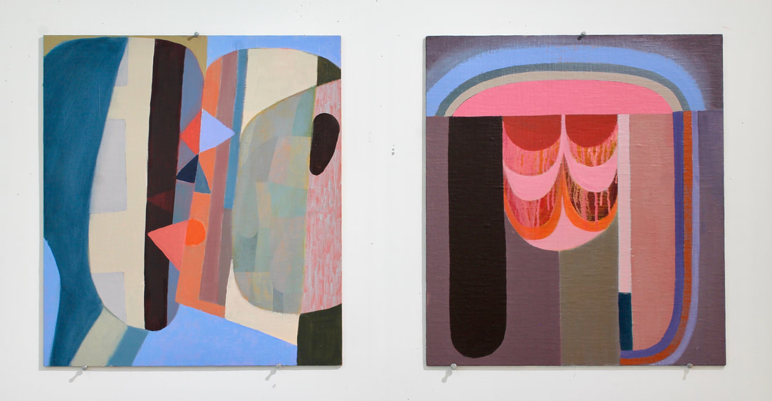 Left: Skinning, oil on linen, 20" x 18", 2019 Right: Generator, oil on linen, 20" x 18", 2019 Semi-Finalist: Talk a little bit about your background as an artist. Where did you study? Who influenced you? What were your formative years like? Cara Tomlinson: I grew up in San Francisco, Seattle and Portland. As a young kid, I identified early that art was my thing. I got up early every morning before anyone else was awake to draw and paint. My mother was creative and had lots of art supplies around. She even had a studio in the basement. After my father died suddenly when I was seven, art became a place of refuge. I was that shy girl that drew horses. In high school, I was selected to take classes at the Corcoran Museum School in DC. The summer I spent in DC opened my eyes to the rigor of making art as well as the history of art. I wandered the National Gallery daily (sometimes a little drunk since I found out that the cafeteria didn’t card), looking at 17th-century Dutch painters, Impressionists, and Italian pre-Renaissance masterpieces. Back in Portland, I took evening classes at the Museum School (now PNCA) at the Portland Art Museum. Making art in close proximity to historical art has always interested me. The idea of context, building a dialogue with the past, engaging history, both cultural and personal, is the way I’ve created the language of my work. 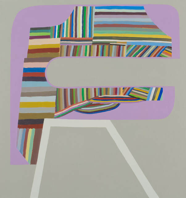 Above: Facthum, oil on linen, 34" x 32", 2017 I got my undergraduate degree from Bennington College in Vermont. The art department there was fierce. Many of my teachers were New York School second-generation Abstract Expressionists and still engaged in showing in the city. It was an intense environment with an expectation of pushing yourself as far as you could. After graduating, I moved around a bit. I was in San Francisco for a while and in Minneapolis. I got a studio and started working as an art preparator at the Minneapolis Art Institute. After surviving several winters there, I was ready to come back to Oregon for graduate school. I was accepted at the University of Oregon where I was so lucky to study with three very gifted painters: Ron Graff, Jan Reaves, and Frank Okada. This was a medium-centric education, exploring the deep craft in painting. We thought about paint, made paint, worked with the alchemy and magic of paint equaling light and color, and even made our own paintbrushes out of roadkill! All three of these artists where amazing colorists and materialists. After graduating with my MFA, I was lucky to land a teaching job reasonably quickly. I ended up at Dartmouth College for a bit and then at the University of Iowa, teaching undergrad and grad students. It was at the University of Iowa that my work really started to coalesce. At the time UI had a big and active painting program with over 30 students and seven faculty members. In the Midwest, I experienced a sense of irony, humor, and pathos that deeply affected my work then and now. 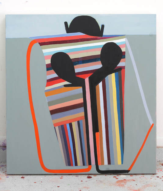 Above: Backhand, oil on linen, 36" x 34", 2019 Below: Companion, oil on linen, 36" x 34", 2019 and paint pile.  S-F: One of the things that I’ve always found interesting in your work is your relationship to space and form. Can you talk about that and how it has developed over time? CT: Starting as a representational painter, I was fascinated by the process of translating what I was experiencing in landscapes to the 2D form. I painted plein air, often seeking spaces that were in-between natural areas and industrial spaces. There is a special kind of alchemy that happens when mud becomes light—oil paint basically is oil and earth-- yet it can replicate the luminosity of light. Landscape painting was my best color teacher. Experience always supersedes comprehension—the sense of being in space can’t be narrowed to the 2D picture plane without a series of compromises—these reveal a lot about the conventions of painting. All painting is flat and abstract, even representational work. In my recent work, I’m much more interested in embracing flat planes with shallow depth. There are references to figures or bodies that are both open and closed—permeable and impermeable that have evolved into an interchangeable alphabet. The movement in the work comes from the color and from the linear striped elements. One of my longest-lasting questions is how to represent the human and animal body from the perspective of being one. Where do our bodies end and begin in the mind and the environment? How do I create a symbolic form for experience as a living body interacting with other bodies? S-F: When I visited your studio, you talked about how much you still love working within the confines of a rectangle, how relevant it still is for you. What is it about straight lines and 90’ angles that keeps you coming back? CT: Yeah, the rectangle is this really harsh limit that is completely artificial and yet deeply intrinsic to how we live our lives. It is all around us: in the grid of city planning, our architecture, in the things that fit into architecture like tables, chairs, books, and pictures. Since the painting originates as an artificial window, it makes sense that we still haven’t transformed it since it fits so well into our architecture. I mean, think about those 17th-century Dutch interiors--there are rectangles built upon rectangles. The interior is replicated in the exterior and then again in the painting as a rectangular object. This is the best kind of painting pun. Sure, it is possible to make a painting that avoids the rectangle, but the convention is so rich-- why not take it on? In my work I am interested in how this limit puts pressure on the image. The formal tension of such a rigid boundary creates a symbolic image, separating and making activities within the canvas fixed and still. I want there to be a tension between separation and the longing to belong. To this end, I strive to get the color to move and occupy a space beyond the rectangle.  Above: several rectangles in the studio Below: Coming Off, oil on linen on wood, 20" x 18", 2019 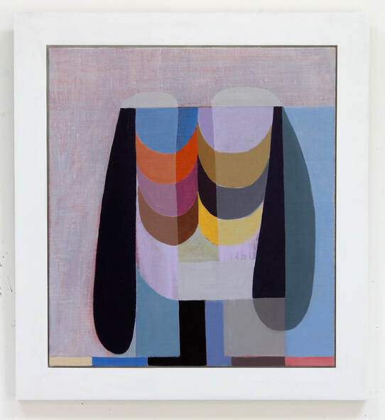 S-F: What role does drawing play in your process? CT: I’m so glad you asked this question. I draw constantly, and when I was going through all my work recently, I realized how much! I draw from life (mostly figure studies), and I draw from my imagination. The drawings are separate from the paintings. They aren’t outlines or cartoons to make a painting, but they often become the inspiration. Because it’s so immediate, drawing can be very intimate. For many years I had a diary (daily) drawing project—this was a space of complete safety and allowance. Many of these drawings were pretty raw and intense, mostly terrible, but occasionally there are a few that really rise to a different level. Drawing is a parallel practice that is really necessary to me, it's where movement happens-- in the painting, the drawing's energy becomes distilled, formalized and symbolic.  Above: Drawings, ink on paper, each 12" x 9", 2019 S-F: I’m a big fan of your color palette. You employ a wide range of hues in your work, but there’s often an overall coolness that I associate with the region that we live in (the Pacific Northwest). How has that developed over time? CT: That’s interesting you see it as a cool palette. I think you are right, color works on us very unconsciously and is deeply a part of our environment. I remember when I was painting landscapes, and I would get into a zone of feeling and mixing color. It felt as if there was no separation between my experience of environmental color and the material color of the paint. The way I build paintings now is quite different, but I still rely on intuition. Each color is mixed in relation to the next one. Once I have a whole series of these strips, I start carefully considering the choices of color that I put in other places in the painting. I taught a color course for many years and learned a lot about the rules of color, so I do think about compliments, value, simultaneous contrast-- all of that is in my toolbox. There is a lot of calibration, mixing, and re-mixing. I strive for balance, an emanation-- for the sense that the color steps out of the confines of the painting and goes beyond its limits. This is an exceptional quality of color—it hits us before form. It’s a body feeling, not a head thing.  Above: Hapty, oil on linen, 36" x 34", 2017 S-F: You recently finished an artist residency in Wyoming at Ucross. Can you tell me a bit about that experience? CT: Ucross holds a particular space in my heart—it was the second time I did a residency there. I felt so lucky to have been granted this one--at this moment in my life—I really needed it. What is so special about Ucross is the open space--the sky constantly changing the color and light. It is in the foothills of the Big Horn Mountains, 20 miles from the nearest town and wildlife is everywhere. There’s nothing quite like being given a gift of studio space, food, and support to do something as seemingly futile as making art. Working intensely and being fully supported is a pleasure like no other. I would paint and draw from early morning until late evening every day, bike home under the stars, sleep like a log and start again. Every other resident is so engaged, working so hard that when we all came together at dinner, there was a tenderness and vulnerability to our interactions. It is really possible to make deep connections to others and work. It makes the effort to move studios for a month really worth it!  Above: Faceoff (WIP), oil on linen, 52" x 48", 2019 S-F: Who are you looking at - past or present- that’s currently having an influence on your work? CT: I haven’t really been looking at very many artists in the last three months. I have been more in the just do it and trust mode. Which is kind of weird for me. I suppose right now the artist that is resonating with me is Hilma Af Klint, whose work I finally saw at her spectacular Guggenheim show last year. I am also looking deeply at some of the other women artists from the 19th century who made paintings in trance states: Georgiana Houghton and Emma Kunz. I am so glad this work was preserved and is now accessible. But I have so many influences at this point, most are subconscious and deeply resonant—artists whose work I have been following for many years: Paul Klee, Hans Hofman, Philip Guston, Jacob Lawrence, Amy Sillman, Brenda Goodman, Thomas Nozkowski, David Humphrey, Tom Burchardt, Sharon Horvath, T.L. Solien, Myoko Ito…to name a few. S-F: Dammit, your studio is organized and clean! Was that just for Semi-Finalist or are you always like that? CT: Okay, it really was because you were coming over… but I also had just finished an archiving project where I took inventory, photographed, archivally wrapped and uploaded all my old and current work to a database. I was in super organizational mode. I’m so embarrassingly proud of my neatly labeled storage stacks!  Above: The artist Cara Tomlinson. S-F: What’s next for you? CT: I’m getting ready right now for a January show in NY. This came out of the blue, and I’m really honored to show at the BDDW Annex-- a beautiful new gallery in Soho. I’m also putting together a regional (Cascadia) painting symposium which will be held at Lewis and Clark College this coming March. This will give painters a chance to get together and talk craft and everything else. It always seemed crazy that all other art mediums (Photo, ceramics, printmaking, sculpture) have conferences or have places for practitioners to discuss the practice--all except painting. Probably because painting is considered the mother of all disciplines in art? But now more than ever it feels as if the craft of painting is exciting to discuss. I’m working with some great collaborators from Washington, Oregon and Montana: Elise Richman, Cynthia Camlin, Kevin Bell and Tia Factor. We will have a keynote speaker, panels and exhibit—it should be amazing! Below: More Tomlinson. 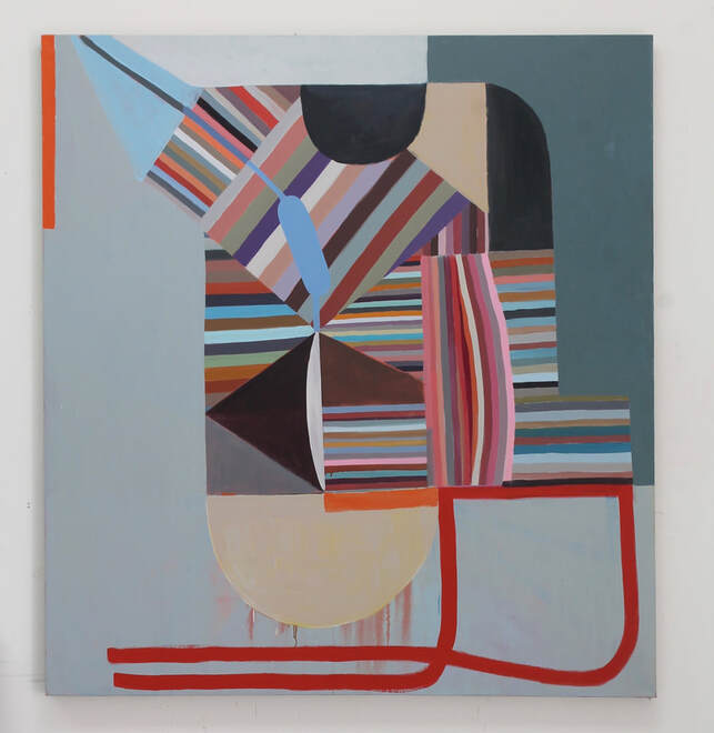 Above:The Artist, oil on linen, 52" x 48", 2019 Below: Yokem, oil on linen, 34" x 32", 2019   Above: Work in progress with brushes and a paint pile. Below: A corner of the studio.  3/19/2019 the semi-finalist is: amy bayI first met Amy Bay about a year ago when I attended one of her ART HOUR discussions at Private Places, an exhibition space in northeast Portland. The show, Teeth and Consequences, was both thoughtfully curated and rough around the edges in all the right ways. It was an exhibit that avoided easy ideas about beauty and instead celebrated rawness mixed with a personalized approach to craft that I'm often drawn to. A glass cast of cat hair by Heidi Schwegler, for example, deftly juggled being banal, gross and funny in a piece that couldn't have been more than 7" x 9". It's a work that crawled under my skin and it's still there 12 almost months later. 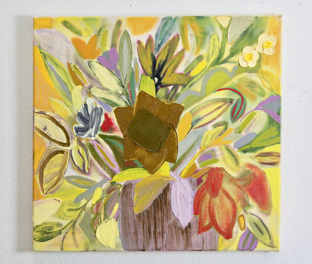 (above: I Am Curious, oil and marble dust on canvas, 18"x19", 2019) Over the course of the Art Hour, Amy had us talking about the show in a way that cracked it open and allowed me to peer in and see it in a new light. Every member of our small group was offering up insights that I'm sure I would not have made on my own. Amy, a skilled teacher as well as a dedicated artist, pulled this out of us. I bring this up because it all seems relevant to the work that Amy Bay is doing in her studio. She questions beauty without completely disregarding it and she is interested in carving out a rough, expressive style that is both physical and intellectual. Below are some photos of her work and a short written interview that she was kind enough to do with Semi-Finalist.  (the artist Amy Bay) SEMI-FINALIST: In an era of tumultuous politics, quickly transforming technologies, and an increasingly warm planet, you’ve recently been making flower paintings. Talk about that. AMY BAY: Flowers and other decorative imagery have come in and out of my work over the years. One of my first paintings, even before art school, was of a giant messy flower in encaustic. A few teachers and mentors openly discouraged me from pursuing this type of imagery so I always felt that it wasn’t valid subject matter. In 2016, I felt a kind of urgency about going back to flowers. I had a sudden awareness that women didn’t really matter as much as I had thought, which compelled me to use overtly feminine imagery in my work. Flowers are so closely linked to women- socially, art historically, etc., it felt right to unapologetically embrace them and all of their associations.  (detail of I Am Curious) S-F: The work of yours that I know best is from your show at Melanie Flood Projects: “Yes Please Thank You.” When I was doing a deeper dive on your website, however, I was surprised and kind of thrilled to see how much of your past is rooted in abstraction. How did the transformation take place? AB: I had been making these grid paintings that were heavily worked - with maximal color and body and about as much chaos as a grid can hold. I was trying to infuse some imperfect quality into the structure of the grid -- trying to make it more flawed and carry more meaning. I would pair paintings with titles that pointed to intimate email exchanges or bits of conversations or lyrics from the songs of my girlhood and teenage years -- basically things that functioned as carriers of sentiment for me. I ultimately realized that much of this was lost on the viewer and it’s another reason that I returned to the flowers. They have always been carriers of sentiment. But they also have a not-so-happy history for women. As a “serious artist” I felt I was supposed to hate them because they are beautiful and frivolous and easy. So I started to integrate them with the grids and they kinda took over. Elements of the grid can still be seen in a lot of the paintings -- sometimes a trellis-like structure in the background, a floating diamond, or a diamond-shaped center of a flower. I haven't completely let go of it. The way I use it now is much more fluid -- it can still function as an organizing structure at times, but it can become a motif or embellishment within the composition as well. It's not as static and authoritative that way. But the paintings always lean towards abstract concerns even though there are recognizable forms in them. 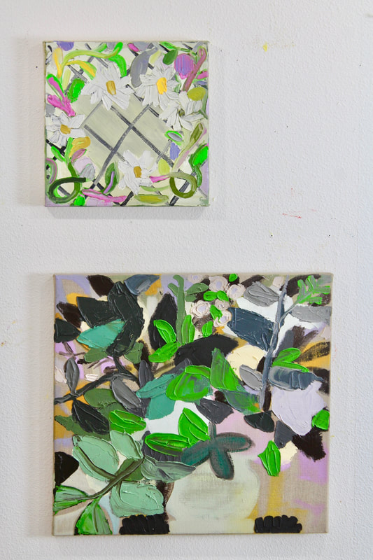 (Top: Every Morning You Greet Me, oil and marble dust on canvas, 11"x11", 2019 Bottom: Another Green World, oil, graphite powder and marble dust on linen, 18"x19", 2019)  (resources and materials) S-F: I’m interested in knowing more about the decorative sources that you draw on for your paintings. Are there time periods or regions in the world that you feel specifically connected to? Do you see yourself lifting directly from existing artworks, or are they simply starting points, springboards for your own ideas? AB: I sample and borrow imagery from greeting cards, wall coverings, textiles, still lives and such. I love patterns and always have -- it’s actually what led me to the grid in the first place! Sometimes I just pick a flower form or a pattern because it’s beautiful or strange and I feel compelled to render it in paint - the compulsion to do this can be very strong. I’m particularly interested in Early American craft traditions like Fraktur, theorem painting and embroidery. These were some of the only educational options for young girls for a huge part of our history. While that makes me feel really angry, I am also moved by the sentiment behind these objects and the ways they record familial relationships and the deeply held beliefs of the women who made them. They are markers of birth and death and love and I think that is powerful and important stuff.  (Left: La Foule (front view), oil, graphite powder, and marble dust on unstretched burlap, 11"x11", 2018 Right: Fancy Fool, oil and marble dust on unstretched linen, 11"x11", 2019) I’m not illustrating any ideas about the flowers, I’m just interested in their history, their forms and what they can conjure up for people. I’m always probing at beauty and the picturesque and wondering where they end and begin. Decorative imagery has gotten such a bad rap and I really don’t understand why.  (Last Dance Last Chance, oil and marble dust on canvas, 19"x18" 2019) S-F: In past conversations about your work you’ve alluded to the fact that you have a love/hate relationship with elements of painting. Can you talk about that tension and how you try (or don’t try) to resolve it? AB: I came to painting late -- after 20+ years of working with lots of different media. I just felt somehow that painting was not mine. Part of it was temperament; I felt out of control when I painted and did not like that feeling when I was younger. But I also didn’t see many women painters in the history of painting, or in contemporary art. It’s hard to envision following a path when you don’t see yourself reflected in it. Now I see myself as a painter. I am fully committed to the idea of medium specificity and diving deeply into the history, techniques and critical dialog surrounding painting. And that chaos that I mentioned is something that I now embrace. Maybe it has come with maturity, but I can weather the ups and downs. Not knowing where a painting is headed can be very sustaining to me, even while it can be terrifying! 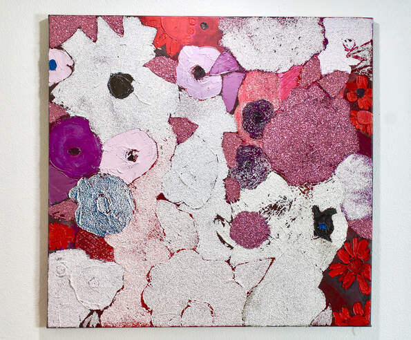 (moremoremore, oil, marble dust, graphite powder and glitter on canvas, 29"x30") -"And I'm also pretty smitten with glitter..." AB (continued): That said, I do value experimentation with other media. I find that I have trouble always sticking with painting on a traditional substrate, so I sometimes branch out to unstretched burlap, or wooden blocks or the wall. And I’m also pretty smitten with glitter, which winds up in many of my paintings. This kind of play keeps me from getting too set in my ways. 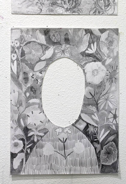 (Here I Am Where I Must Be, graphite on paper, 9"x12", 2018) S-F: Who or what are your influences? Are they contemporary, long dead, or somewhere in between. AB: I’m going to give you a big, sprawling list of women painters -- my foremothers! It feels important to name them. Some have just recently surfaced from obscurity, some are new, some well-known and some are probably younger than I am. Some don’t paint exclusively. They are in no particular order: Florine Stettheimer, Hilma af Klint, Paula Modhersohn-Becker, Carol Rama, Nicole Eisenman, Lynette Yiadom-Boakye, Dana Schutz, Jessica Jackson Hutchins, Lynne Woods Turner, Alma Thomas, Vanessa Bell, Agnes Martin, Anni Albers, Gunta Stoltz, Anne Truitt, Susanna Coffey, Lois Dodd, Loie Hollowell, Shara Hughes, Mary Heilmann, Helen Frankenthaler, Lee Krasner, Laura Owens, Howardina Pindell, Gina Beavers, Cheyenne Julien, Amy Sillman, Katherine Bradford, Rose Wiley, Sylvia Sleigh, Moira Dryer, Frida Kahlo, Alice Neel, Summer Wheat, Holly Coulis, Sonia Delaunay, Barbara Rossi, Gladys Nilsson, Anne Vallayer-Coster, Rachel Ruysch, Lynda Benglis, Yayoi Kusama, Sarah Cain, Rebecca Morris, Alicia Gibson, Vaginal Davis, Susan Bee, Joan Snyder, Alice Tippit, Varvara Stepanova, Christina Quarles, Janet Sobel, Maia Cruz Palileo, Pat Passlof, Celeste Dupuy-Spencer, Joanne Greenbaum, Jenny Saville, Joan Mitchell, Keltie Ferris, Judith Linhares, Pamela Fraser, Charline von Heyl, Deborah Kass, Clarity Haynes, Brenda Goodman, Louise Fishman, Jay Defeo, Maria Lassnig, Etel Adnan, Polly Apfelbaum, Vija Celmins, Miriam Schapiro, Joan Semmel  (the studio) S-F: I love that list! Our interests definitely overlap and you’ve also named a few artists that I’ve never heard of. I need to sit down with a computer and do some research. What’s next for you? AB: I have a few works on paper that were just in The Barker Hangrrr at the Other Places Art Fair in San Pedro, CA, but I’m still getting back into the groove in my studio after my show at Melanie Flood Projects last summer. Painting requires so much time and I’m trying to stay open and see what unfolds as I work. I’m also following all the impulses that come to me, even if they don’t totally make sense within the work. Some I will likely abandon after a while, but I just need to let myself do it all. You can see more of Amy's work and nerd out on her CV at HTTP://WWW.AMYBAY.COM/ .  (flowers, flowers, flowers) (Below: more Bay) 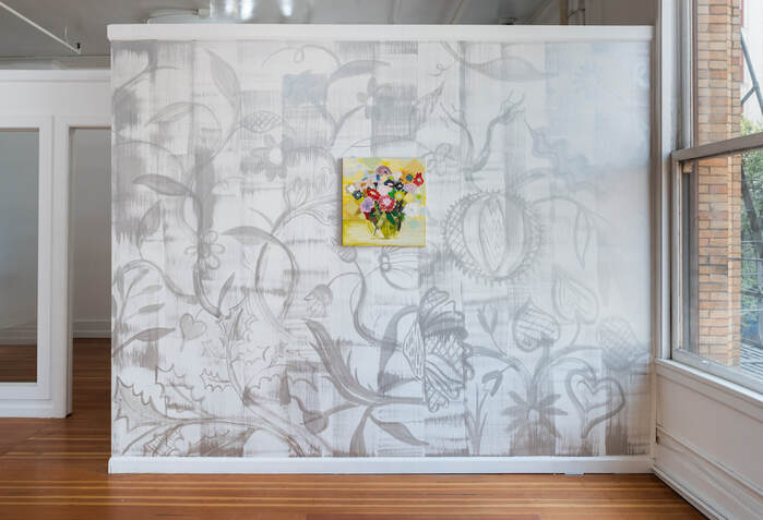 Installation View, 'Yes Please Thank You' at Melanie Flood Projects Shangri-La, flashe on wall, 2018 Kindest Regards, oil, flashe, marble dust and graphite powder on linen, 19”x18”, 2018 photo credit: Mario Gallucci 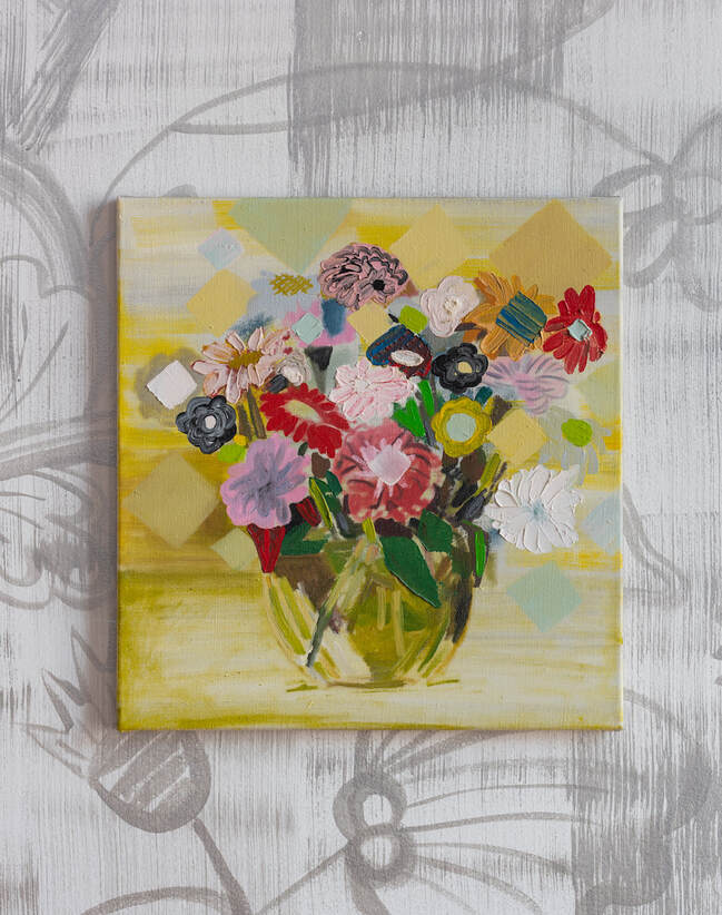 Kindest Regards Oil and marble dust on linen, 19”x18”, 2018 photo credit: Mario Gallucci  Alpenveilchen
Oil and marble dust on canvas, 7”x5”, 2018 photo credit: Mario Gallucci 12/7/2018 The semi-finalist is: doug davidovichI recently had the chance to visit with Doug Davidovich at his studio in Portland, Oregon. If you haven't had the pleasure of meeting Doug, the first thing you'll notice when you do is that he's a big, angular guy. And in my opinion, his artwork invariably resembles him. Even when he's working small, Davidovich's prints and paintings seem larger than the surface that they're on. I've been a fan of Davidovich for a long time, so I'm really pleased to have him as our first Semi-Finalist. Below are some questions, answers and photos of his work.  (WIP from the Citadel series) Semi-Finalist: OK, let’s get started. The first question seems obvious, but I have to ask it: the 70’s… why? Doug Davidovich: I grew up in Southern California during the Seventies! The sun-soaked colors and clarity of light really shaped my visual experience and aesthetic. Mid-Century Modern architecture and design was predominant, as was the Brutalist and International style. The structural & material simplicity, set alongside minimal landscaping, had a big impact on me; along with the bold shapes of Seventies graphic design and the influence of surf & hippie culture. The warm tones of film and polaroid photography are my default filters that continue to guide my color palette. 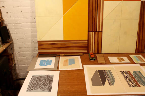 (Recent lino block prints and partial view of paintings from the Flat of Angles series) S-F: I’m often drawn to artists that don’t fit neatly into a category. You seem to love hanging out in that lawless, untameable space between abstraction and representation. Talk about how you navigate that world. DD: It’s really a great space to be in. I definitely carry along skills learned from my early years of landscape and still-life painting. Photo realism was never the goal. As I moved through Impressionism & Van Gogh, and then to the Symbolists and Modernists, the idea of emphasizing an emotional/spiritual meaning behind certain representational shapes, lines and colors became more interesting than simply capturing a particular scene or motif within a traditional composition. Since I’m still using referential elements and visual logic from the objective world, I retain some basic rules of observational painting & drawing. This gives me a necessary parameter to work in. I’d go overboard without some kind of restrictive navigational guide to follow. 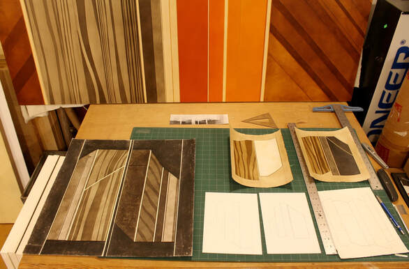 (Above: work table with paintings and drawings on paper Below: close-up of a work in progress) 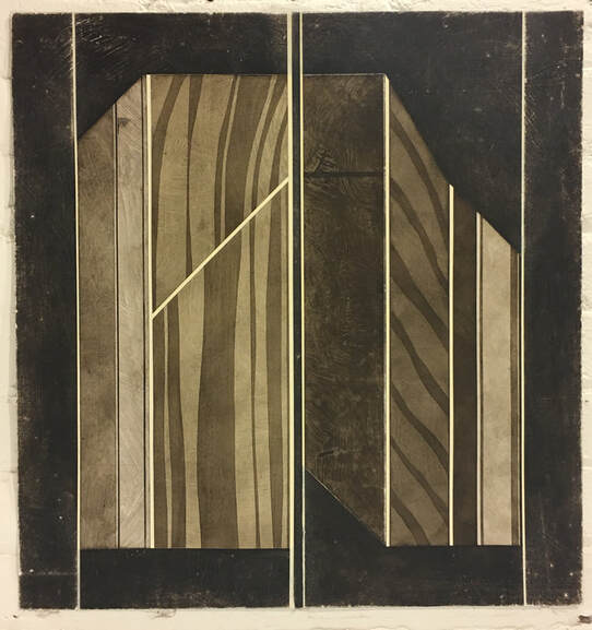 S-F: Who or what are you looking at these days and what are you taking away from them? DD: I’ve been learning and studying photography; which is a great tool for composing space and isolating subject matter. Naturally, I’m checking out the work of many photographers: Bernd & Hilla Becher, Robert Adams, Lewis Waltz and Aaron Siskind are some of my favorites. Most are focused on landscape and architectural/structural imagery. Folk art and craft: the textures and surface treatments of ceramics, textile art and wood carving. Architecture: both interior & exterior - a constant influence & inspiration for geometry, scale and structure, defined & illusionary space and dimension. 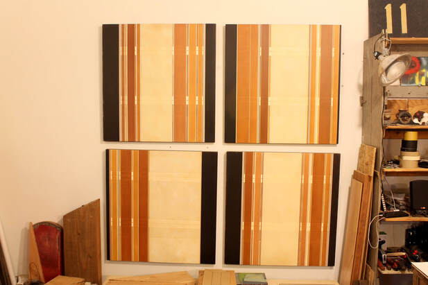 (Above: a wall of earlier work, Llano Road #8-11, acrylic on panel, 2010 Below: a close-up) 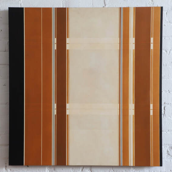 S-F: You spent a lot of time studying with representational artists when you were a student. When did your work shift away from the influence of your professors? DD: Yes, two amazing painters in particular had a major influence on my development; Ron Graff at University of Oregon and Stanley Lewis at American University. And that’s a tricky question because I still hear their advice playing in my head while painting. So their influence is still totally with me even though my work now has shifted significantly away from their styles. I was drawn to abstraction and started experimenting with some non-representational elements at U of O. In grad school, the real change in direction was instigated by Stanley’s discussions about the underlying structure in the compositions of traditional landscape painters like Constable. That really inspired me to look at things differently and set me off on my own course. There definitely was a progression, but I’d say it took another four years to develop a personal style. 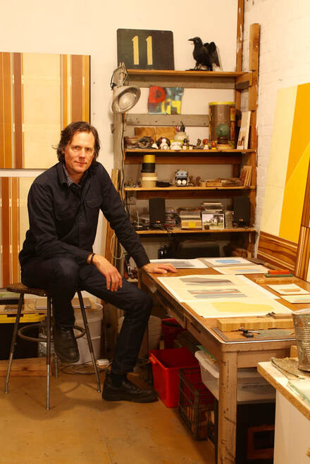 (The artist in his studio demonstrating angularity) S-F: Rulers, hand drawn, or both? DD: Both! I use hand drawn sketches for quickly working through initial ideas, then ruled lines to enlarge the drawings to the scale I want for a finished piece. I also make great use of masking. 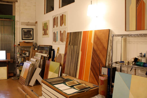 (The studio) SF: What’s the ideal setting for your work? DD: I’m really attracted to the dynamics of a structured environment, and always consider the role my work will play in activating a particular space. Though I’m naturally drawn to modernist style urban interiors, I love the idea of creating a visual dialogue by combining minimalist aesthetics within a more traditional or rustic space. Ideally my work will play an interesting role in that conversation. You can see more of Doug Davidovich’s work and contact the artist through his website at https://davidovichstudio.com/ and at https://www.desousahughes.com/. (Below: more Davidovich!) 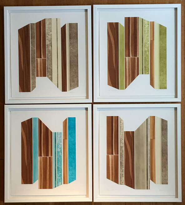 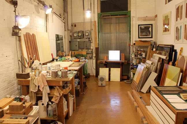 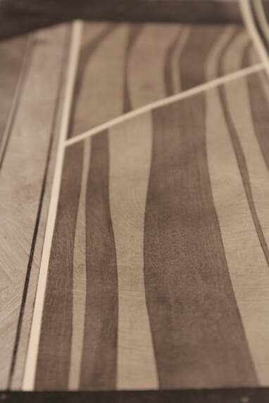 |
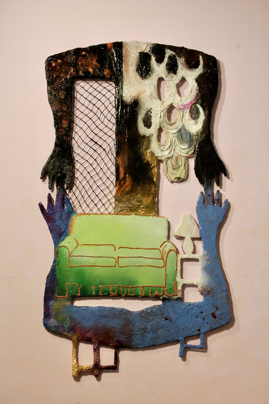
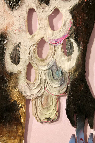
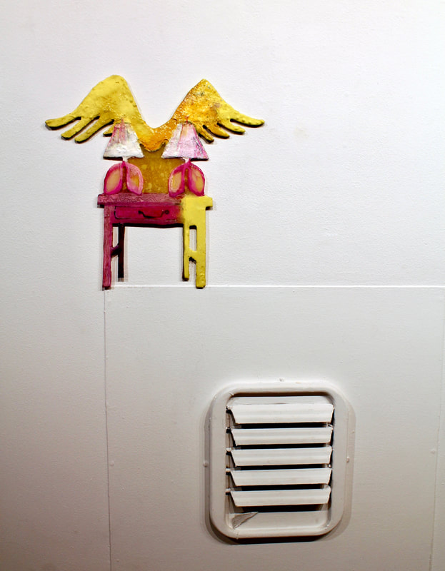
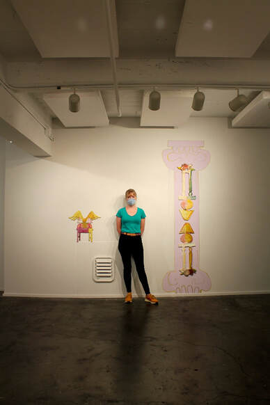
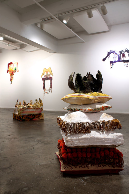
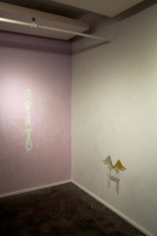
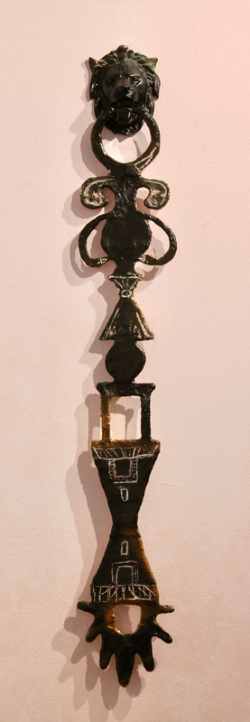
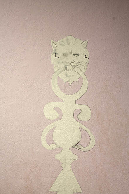
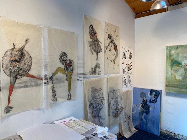
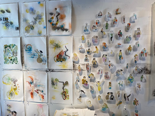
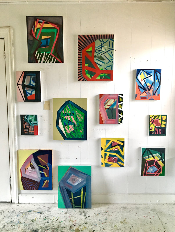
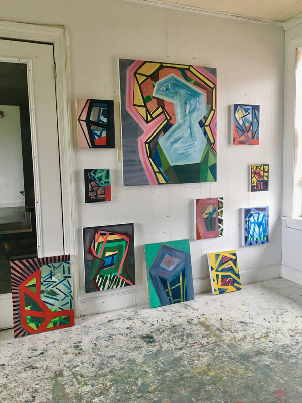
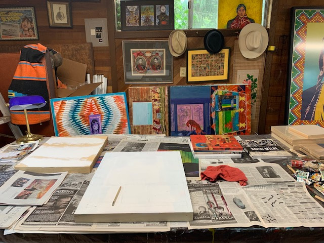
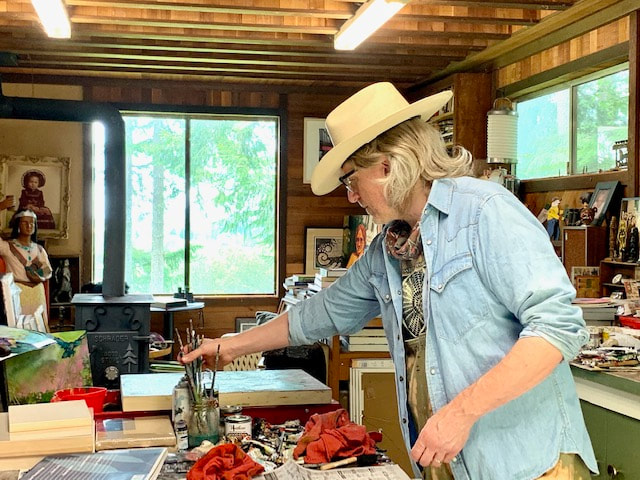
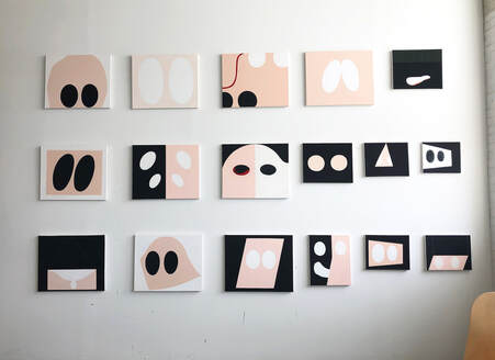
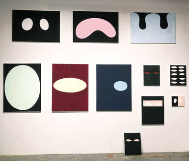
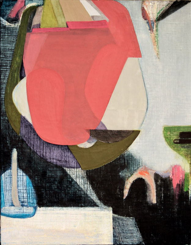
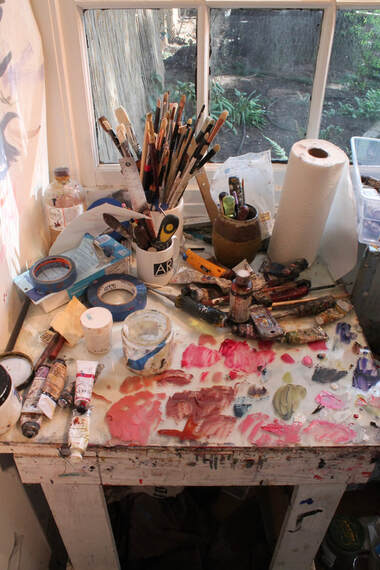
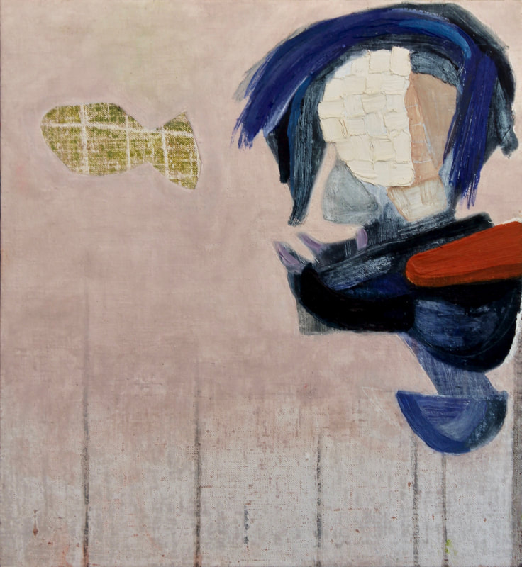
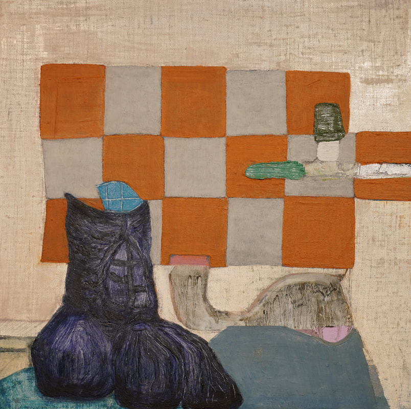
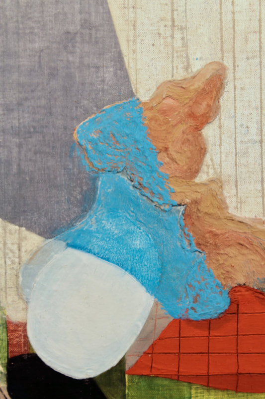
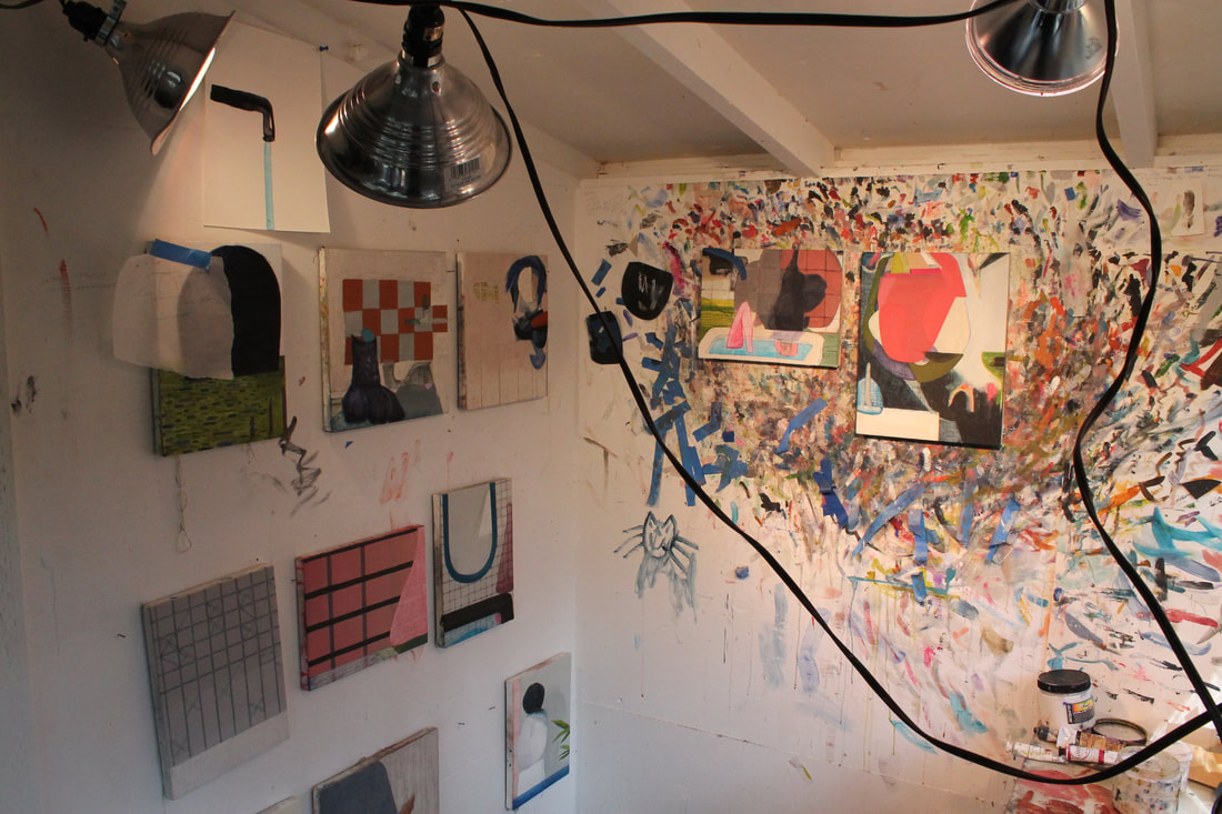
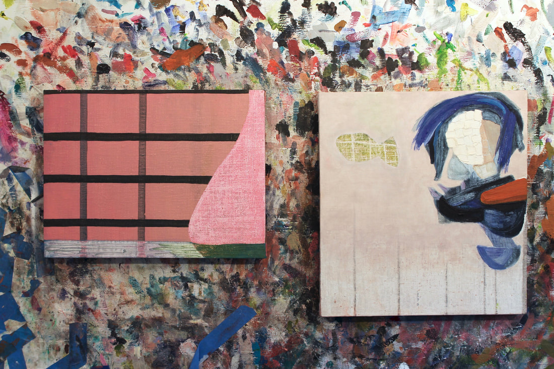
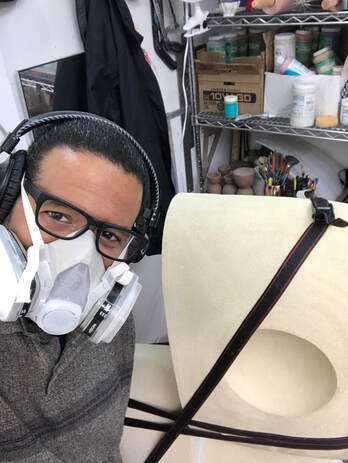
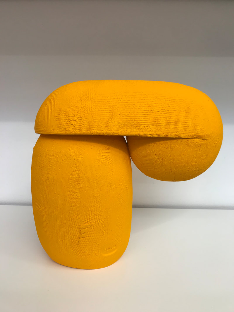
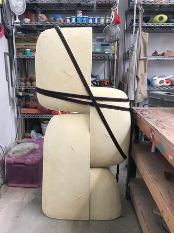
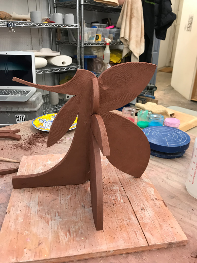
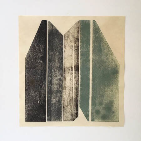
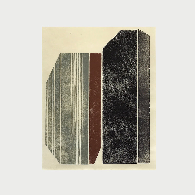
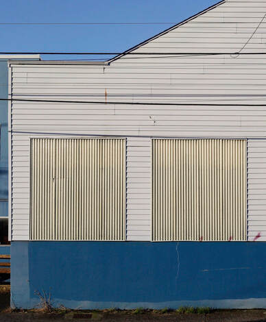
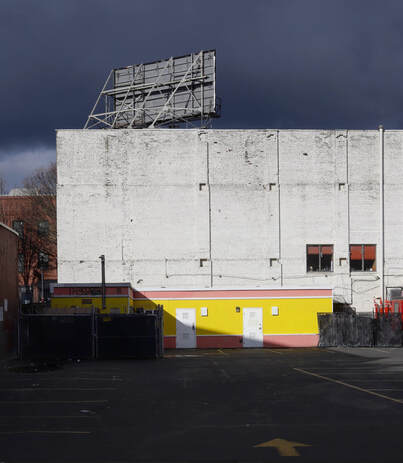
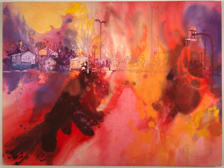
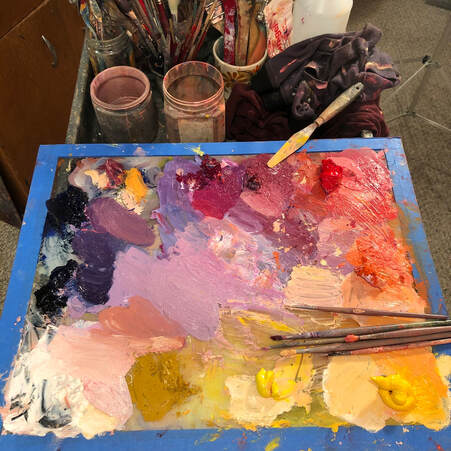
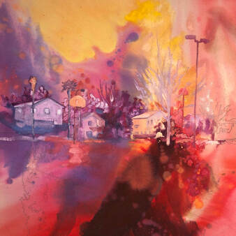
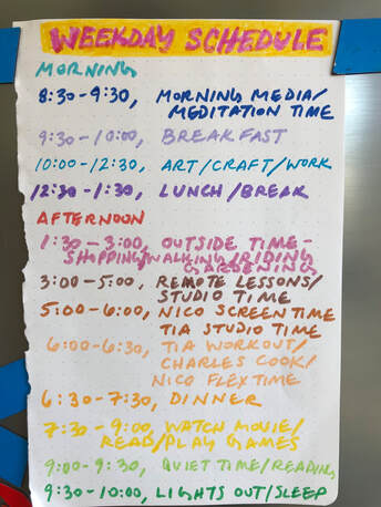
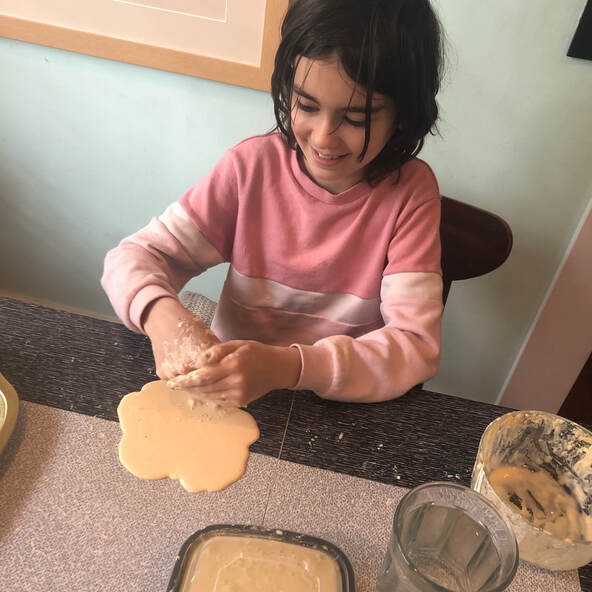
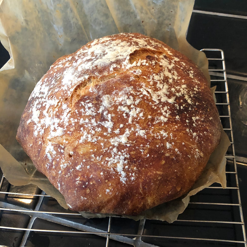
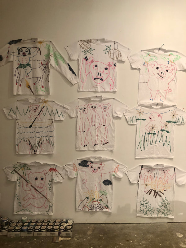
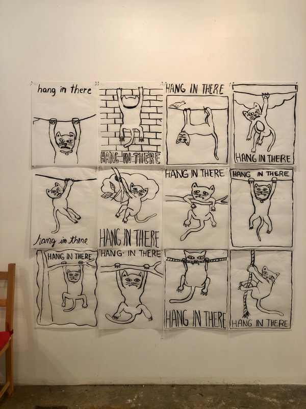
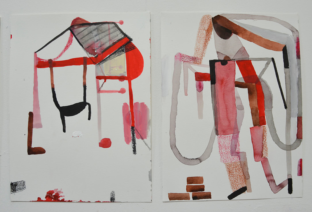
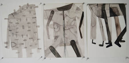
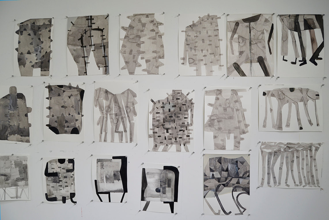
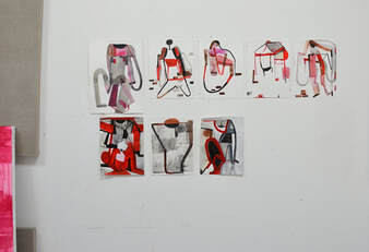
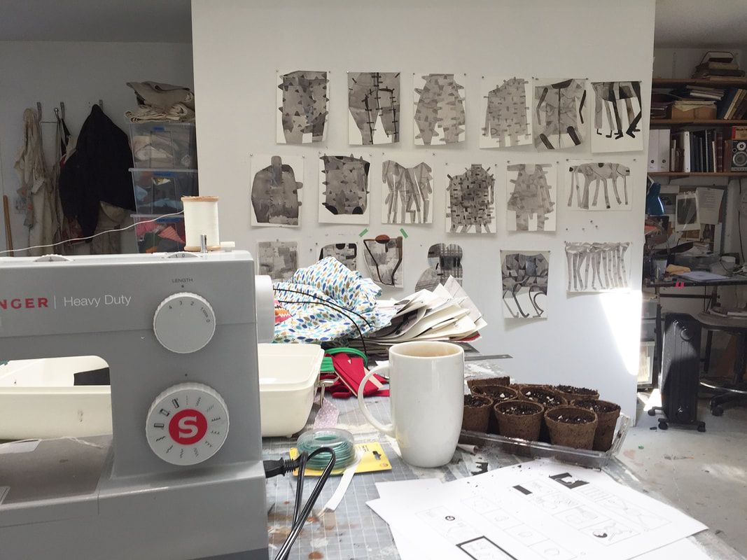
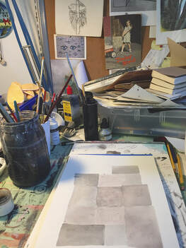
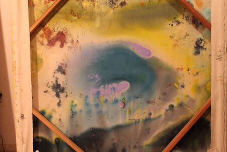
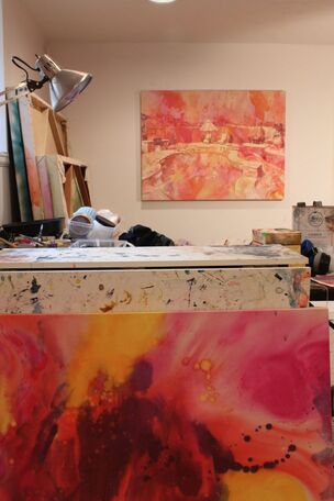
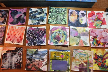
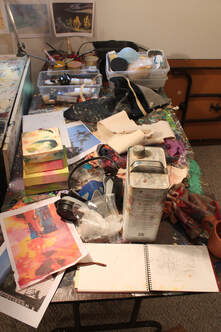
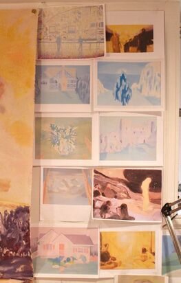
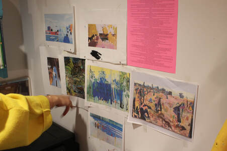
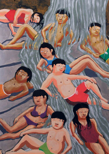
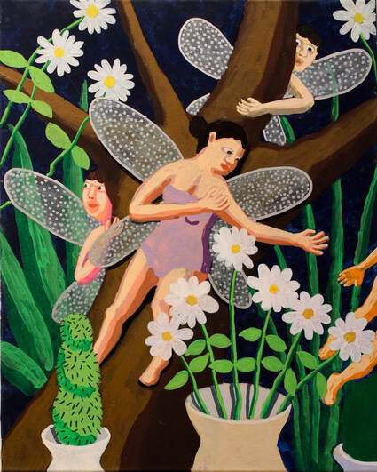
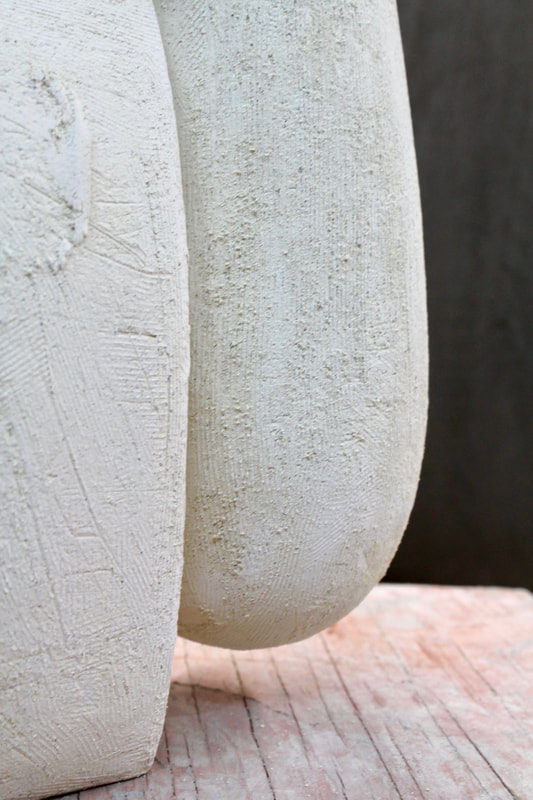
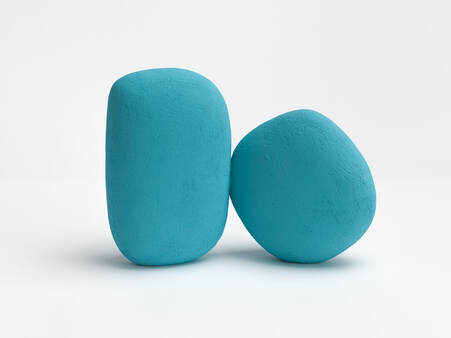
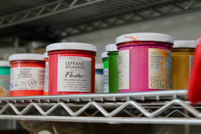
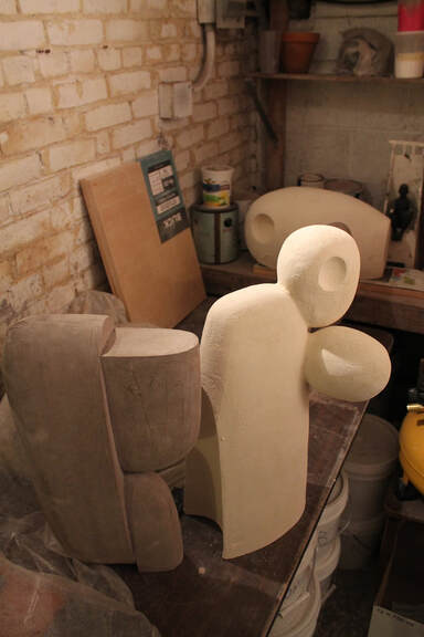
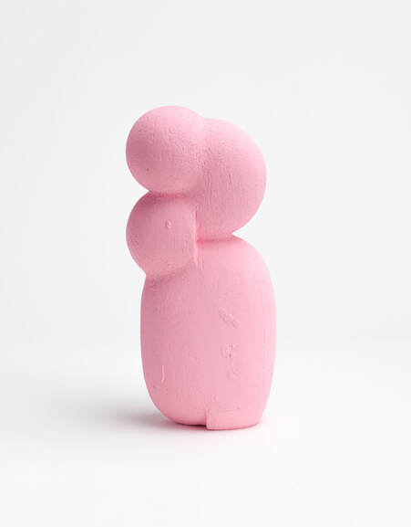
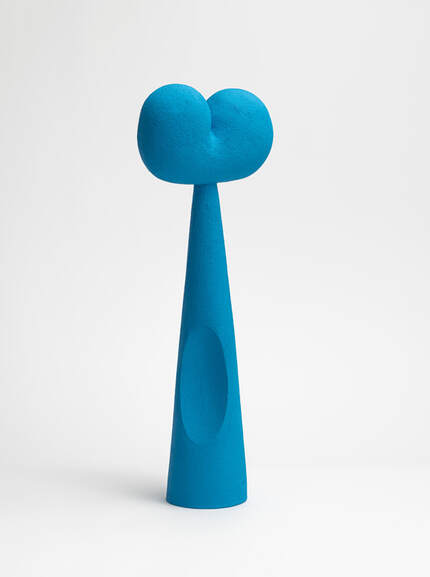
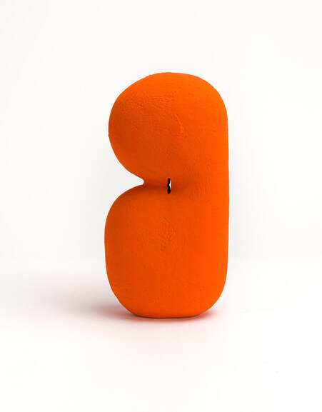
 RSS Feed